If 2013 marked a year of frenzied growth in the land of experience design, 2014 could be a year of downright explosive expansion.
There’s no arguing that connectivity will increase and more and more citizens of the planet earth will carry magic glowing mobile lozenges in their pockets. All of them will prefer rewarding digital experiences.
The possibilities that emerge as technology continues to improve and pervade are often as exciting as they are daunting to unlock. It doesn’t hurt to have one eye fixed on the horizon.
When we asked our contributors and other members of the UX community for their notable trends of 2013 we also asked for some predictions about what will be big in experience design next year. We asked why these things would matter, if they would be positive for users and practitioners, and how they might evolve over the course of the year.
There was more talk of the Internet of Things, plus warnings about user shyness, ponderings on the increased sophistication of our interactions with machines, a formidable winged horse, and more.
Grab yourself a mug of something spiced and get ready to look into the future of expereince design.
Rise of the Pegasus – Wayne Greenwood
Unicorns were the big story of the last few years, referring to designers who added production-level coding chops to their skill sets. Unicorns being rare by definition, an even larger population of designers—call them the thoroughbreds—focused their energies solely on interaction design, visual design, and prototyping, leaving the production code to the engineers.
Meanwhile, product design is now commonly recognized as a strategic advantage, its business impact made obvious to even the most skeptical of analysts by the success of Apple. Ironically, as companies have become more design savvy, some designers have felt marginalized when early stage, strategic product design decisions fall to business executives and product management.

In 2014, more designers will take their career down a third path, learning everything they can about market and business needs to evolve into more of a designer/product manager hybrid—a Pegasus, winging its way to a 10,000 foot view of the business. Their goal is to influence product strategy early and often, to ensure that the best products and features make it to the marketplace. Not to mention grooming themselves to fill the VP Product and Chief Product Officer roles of the future.
I Got My Degree in Customer Experience – Shep Hyken, customer service expert and New York Times bestselling author
We are going to see more and more colleges recognizing the importance of customer service and experience in academia. A business degree, even a masters or PhD, with a specialty in customer experience design will become a new offering.
More Rounded Content Strategists – Ben Barone-Nugent
Agencies and businesses are going to recognize a lot more diversity in what content strategists can offer the experience design process. We’ll start hearing about content strategists who specialize in UX design and others who extend UX and business objectives across things like branded content. Obviously, these two disciplines are hugely important to the design of in-product experiences, and pre and post-product experiences.
While branded content has been burgeoning for a while, its connection with UX-focused content strategy hasn’t been fully explored. It makes sense that the underpinnings of the experience should extend beyond a single product or touchpoint, and a lot of content strategy roles are emerging for people who are able to cohere these two important fields.
This will be particularly good for the broader experience of a product or brand. Instead of just having a consistent experience across the website or app, we’ll the see the core of it brought into other areas, like advertising. In terms of its real impact on the experience design process, hopefully it allows us to better cohere marketing initiatives with the experience we actually design for our products.
More Targeted Gestures and Possibly Better use of Buttons and Taps – Mary Brodie
When we first designed for the Web, we were all guilty of “overdesign.” What is the <blink> tag but proof that just because you can, doesn’t mean you should? This is true for gestures in apps.
As companies watch users interact with their apps, they will see the conflicts of multiple gestures in the same general locations and the annoyances they cause, and look for solutions. It will be a learning experience through trial in error, almost like the Web in its early days, because there isn’t really a manual and this is all so new.

Over time, there will still be a lot more gestures, but probably not a large number of gesture combinations in the same area of a screen—there will be some boundaries. There may also be the introduction of “states”—an edit state to delete or remove; a scrolling state to view everything; a watch state that requires two taps to play a video (not to be confused with the initial tap for a swipe, which could play a video as you scroll down a page).
Skeuohaptic Response – Nick Cawthon
To touch is to feel, and attempts will continue to be made to provide feedback through emulated reactions, trying to make a 2D interface feel tangible. Items “dropping” into carts upon click. Initiated download icons wooshing into one’s folder. Dismissed menus poofing away in a cloud of smoke. Designers should avoid this at all costs, it is the <blink> tag for our generation.
Responsive Iconography – Jason Cranford Teague, UX Lead at Gannett Digital Marketing Services
In 2014, we’ll see an increasing use of iconography to help simplify and streamline designs as part of the more general trend towards flatter, simpler design. You can find examples of iconography at IcoMoon and see icons in action the Solar Energy Industries Association site. 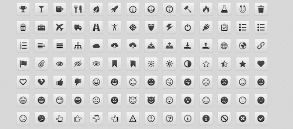
As designers and developers embrace webfont iconography (using glyphs in a Webfont instead of images), we’ll see a growth in the use of icons as they become easier to deploy. This will lead to simpler more visual interfaces with less text.
Stroke and Fill Icon Selection – David Ly, Product Designer at JW Player
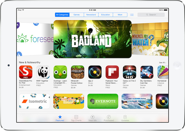
With the release of the radically less skeuomorphic iOS 7, stroke and fill selection indicators diverging from the “pressed-down” approach in iOS 6. Tab bar icons, such as the “Featured” star icon in the App Store, and scope bar definitions, such as “All Categories,” use a fully-filled blue key color while other inactive elements are stroked. This simple approach to the visual design of indicators makes recognition of active tabs, segmented controls, and toolbar buttons significantly more straightforward.

![]()
The use of contrast as the main visual indicator for active and hover states instead of just a key color avoids accessibility issues for the color-blind, who cannot decipher color-only active states. With the significant adoption of iOS 7 and many apps transitioning from iOS 6 visual design principles, the use of the inactive stroke and active fill states will become extremely popular in the next year and standardized in the near future.
Over-Use of Navigation Icon – Hana Schank
Over the last month or so many desktop sites have jettisoned their main navigation, sometimes in favor of the little three-line icon used to represent navigation in mobile interfaces. Some sites do this in part because they are moving towards a responsive design (or they have one already) so creating one consistent navigation structure makes life easier for both the site designer and the user. But other sites seem to simply be using the icon because it’s a cool little thing that signifies all things mobile. Because the icon is used inconsistently across the web, there will be increasing confusion as it pops up more frequently over the next year.
![]()
Take a look at Slate.com, which launched a complete redesign in September. The new site offers a mobile-first approach, and part of that includes the complete removal of navigation from the traditional top portion of the page. Users will now find the navigation neatly tucked under the three line icon on the top right of the site, just as you might on a mobile app.
![]()
A variation of the icon also appears in the new Mac OS Mavericks
![]()
And in some cases the icon pops up as though it were a bullet point, seen here on Mosey
There are going to be some missteps and some experimentation as designers sort out the proper application of the navigation icon. While Slate is using the icon to represent navigation, Apple uses the icon in their OS to simply represent a panel that slides out. And Mosey is using it as a non-functional piece of iconography. Overall, the related trend toward hiding or minimizing navigation will be an interesting one to watch. As users get more accustomed to navigating sites on mobile devices they may become so used to needing to click to access navigation that we’ll wonder why we ever did it any other way. But while we work to get to that place, it would be nice if everyone could agree on a consistent use of the three-line icon.
Minimal, Human-Focused Design – Andrés Max of Ideaware
Bloated design and buzzwords can only go so far. Websites are moving to a richer, content-focused experience that appeals to our human side. Companies such as Mashable have seen great benefits from removing clutter and tailoring their experience to the user. 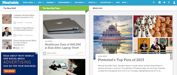
Minimalism in web and mobile has been around for a bit. With the downfall of skeumorphism started by Apple, this trend is picking up fast. You can see it in most current web apps and some blogs. A great example is the publishing platform Medium. This is most definitely a great thing for experience design. As Joe Sparano said: “Good design is obvious. Great design is transparent.”
In Conversation with Objects – Fjord
Everything from watches to pill bottles to basketballs are connecting with us and collecting data that could influence our behavior. Businesses that previously did not consider themselves as digital now need to assess the additional value that can be gained by the “smartification” of their products. These devices are beginning to quietly talk to each other, leaving us to go about our day as they recede into the background to make smarter choices for us. As more objects get smartified, deep challenges to social conventions will emerge.
Thinking (and) Machines – Hunter Whitney
An increasingly better understanding of the workings of the brain will propel technology and conversely new technologies will help us better understand our brains. The differences between pure pattern recognition done by computer and human intelligence will become less distinguishable.
De-Commodification of Devices and Information – Thomas Wendt
Chances are, you’ve heard of the Internet of Things by now. One of the most interesting aspects of this movement, I think, is that it’s not really about things: it’s about the information that connects things and our relationship to those connections.
Philosopher of technology Albert Borgmann articulated what he called the “device paradigm,” which characterizes the relationship between humans and modern technology as one of commodification. One of his core examples is a wood-burning stove versus a central heating system. The stove requires active engagement with raw materials: the user must chop the wood, light the fire, and actively maintain the fire to keep a dwelling warm. The central heating system, on the other hand, merely requires setting a thermostat. Automation takes care of the rest. Heat becomes a commodity divorced from the user’s bodily engagement with the technology that produces it. Much of Borgman’s grim outlook on the future of human-technology relations stems from this observation.

Contrast Borgmann’s thermostat with something like the Nest thermostat. Sure, Nest is beautifully designed and it’s cool to control your heating from a mobile phone, but the interesting part about it is that the user stays actively involved with something usually considered a “set-it-and-forget-it” background technology. It allows a de-commodification of heat by maintaining that relationship.
The Internet of Things is interesting in the sense that it brings back a focus on tangible objects, but I think this relationship layer is going to grow exponentially in 2014. It’s probably more of an implicit outcome, but nonetheless, I expect to see the Internet of Things changing our relationship to technology in more profound ways beyond cool toys. If executed well, it has the power to deepen the relationship we have with intimate technologies.
Building an Internet of Silos – Steven Hoober
I have been an avid follower of the Internet of Things (IOT) concept for years. I’ll never get my jetpack, but maybe I can connect my thermostat, fridge, car, and everything else to the Internet for improved control and functionality. And after a half-start in 2013, you are likely to hear that 2014 will be the year of the IoT.
But my prediction is that this won’t happen. Oh, sure, I have no problem believing that by 2020 there will be 30 billion connected devices, and I’d probably even say there will be a lot more than that. But no matter how many times “Smart” is included in a title or printed on the side of a box, the products are still going to be dumb, limited, and constrained.
All because they insist on being part of limited ecosystems, either connecting only to one device, or keeping their data in useless formats, on proprietary servers. It’s not just me, just last month, ARM CEO Simon Segars said, “Most IoT applications are so narrow, with one device only talking to one service … We need these items to talk to each other more, in order to prevent an internet of silos.”

You can prove this yourself. Find anything that connects by Bluetooth to a smartphone: Almost all work exclusively on iOS, or exclusively on Android. Check out how the data is used for your smart, connected widget: It connects to your phone, alone, or at best to a proprietary database with no open API. No one else can extend it to cleverly use other data sources. You will not see Google Now reminding you to adjust the thermostat or turn off the oven until we have an Internet of Everything.
With all of these new slightly-connected Things, we’re about to commit wholly to design principles that are anti-ethical to the first few—more open—iterations of the Internet and the Web, not to mention setting aside the possibility of really solving user needs.
Intelligent Interfaces Enter the Mainstream – Joseph Dickerson
We interact with scores of interfaces every day, and the processing power that drives these screens has never been higher … and yet, the UIs tend to be one-size-fits all, with limited personalization. With this increasing computing power, one of the only places left to go is leveraging data to create a bespoke experience.
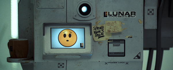
GERTY from Moon (2009)
Early steps have already been taken: you see some of this in the Windows 8 “live tiles” functionality, and Amazon’s ubiquitous recommendations, but that’s just the tip of the iceberg. The fantasy of personal dashboards that intelligently surface important information to the user is now possible, if not probable. Will they catch on? It depends on striking the proper balance between innovation and user control and freedom. UX professionals need to focus on finding that balance.
Positive Computing – Dorian Peters
In 2013, economists measured happiness, neuroscientists put monks into MRI’s and consumers began to expect their digital devices to be good for the mind. We’ve seen a global shift in priorities that has put psychological wellbeing center stage, and the tech industry is ripe to join the party. From apps like SuperBetter and Uplifted to Apple’s appeal to emotion at the last developer conference, we’ve watched an interest in design for wellbeing take hold. In 2014 it will take flight as the industry takes on the brief with passion and method, leveraging the foundations being laid by the new field of “positive computing” (see the MIT Press book due out next year).
The potential for what matters most in our lives to guide the design process is incredibly powerful stuff for UX but we’ll need to watch out for “well-washing.” Companies have already shown it’s too easy to slap “happiness” all over packaging or shove marketing material beside pictures of the brain to leach off genuine public interest and genuine scientific discovery. However, armed with the weapons of integrity and a relentless demand for scientific rigor, we, future designers for wellbeing, could see positive computing become a shift in practice that changes digital experience, and our expectations of it, forever.
Conscious Digital Experiences – Ariel Grace Snapp
In the digital space, we are responsible for finding new ways of bringing human connection back into our systems. New personal responsibility is needed to counterbalance destructive and addictive qualities in software and online tools in the digital space. We need to re-invent the direction that technology is headed.
The most popular social tools out there are focused on manipulation rather than intrinsic motivation. People are feeling more disconnected than ever due to the addictive nature of the systems that have been devised thus far. We need to make sure that we do not encourage loneliness instead of genuinely supporting humanity. Gamification, for example, needs to be replaced with deeper problem solving as to the why behind human motivation.
The trend toward creating conscious digital experiences is a result of the global trend of being more responsible with how we build human systems. It is presently starting to crop up in new startup ventures, but the possibilities for the impact of this trend are still unexplored. It will be very good to begin digging deeper in 2014—deeper into the why and how behind the experiences that we are creating.
Good is one example of a platform that is focused on consciousness and community which is not intrusive or manipulative. Even within this context, there is room for exploration on how to move from competitive based user manipulation systems, such as voting for popular articles, to systems that are truly supportive in nature while still sharing the most useful data for a user.
Shy Public Self – Joe Macleod
People will become aware of the long term impact of their personal content online. Many companies are built off the backs of people’s personal content: Facebook, Twitter etc. With big stock market debuts users will see that these cool tech start-ups are big multi-nationals with taxes to pay, and appetites will change regarding what users share.
Last year saw a number of public figures experience phone hacking and an enormous political debate ensue between the U.S. and Europe over privacy issues. The will continue to raise interest in the business and politics of privacy. In the short term, this will mean dealing with some challenging and delicate design issues. In the long term, I think we will become better designers for considering some of these rights of use in a public place and the philosophical issues that are attached.
Meaningful Serendipity – THE MEME
As technology around us gets smarter we have become used to products and services tailoring to our individual needs. But in many cases excessive personalization can remove valuable aspects of surprise, playfulness, and happenstance. For 2014 we see a growing trend for digital experiences that aim to surprise users by offering opportunities for random and spontaneous discovery.
Labeled as an “experimental photo exchange platform” Rando allows users to send a photo (or “Rando”) to strangers in anonymytiy, whith only location data shared. Social discovery apps like Highlight and Banjo are evolving in to robust tools for serendipitous realtime discovery of relevant social connections, activities, and events. Stumbleupon is enabling a different web-browsing experience where presonal preferences allow for playful recommendations of randomly selected sites. Netflix recently added a “random picks” in response to the sometimes cumbersome process of selecting content from a vast personalized catalogue of multiple categories.
Augmented Reality – Rousi Rebekah
Google Glass should be released for retail in April 2014 and it can be seen as the first step to mainstream consumption of augmented reality facilitated by wearable computing, as well as the first step to freeing us from highly un-ergonomic and annoying handheld mobile phones.
This trend has been gradually developing since the 1960s in projects such as Ivan Sutherland’s The Sword of Democles (1968). Discussions, projects, and predictions have been made regarding the prospect of synthesizing the real and virtual worlds ever since, but until now, the most prominent implementation of augmented reality can be seen in augmented reality advertising campaigns such as Coca-Cola’s Arctic Home Campaign and McDonald’s McMission campaign, as well as applications such as Google Goggles and Layar. These are currently facilitated by tablets, smartphones, laptops, and PCs, which tend to break the realism of the experience. But software and hardware alike are developing at a rapid pace.
The upside of these developments is that, little-by-little, with every device and application that’s developed, and every mistake that’s made, we learn something new and come one step closer to getting rid of handheld mobile phones for good.
On the down side, people have such high expectations of the technology and its capabilities for application in areas such as education and gaming, that unfortunately it does not look like it will deliver half of what they are expecting within the near future (five years or so). Many will probably be disappointed with the limitations and short-comings that arise from this technology, which is still in its infancy.