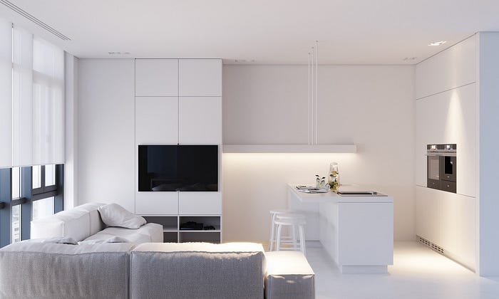
Lead banner: Comparison of a mall parking lot in the 80s (more colorful cars) vs current day parking lot (more black & white cars). Source: https://twitter.com/culturaltutor/status/1672646124799180802
Are we losing color in our world? As odd as this question may seem, a closer look at the color choices in various industries from cars to fashion, consumer electronics, and architecture reveals an intriguing trend toward monochromatic palettes. Could this perceived loss of color be indicative of a broader cultural shift towards productivity and efficiency?
Vibrant hues seem to be gradually disappearing, replaced by colors black, white, and shades of gray.
This begs the question, is our world losing its color? What might be driving this cultural shift?
In what way is the world losing color?
Over the past few decades, there has been a notable gravitation towards neutral colors across multiple industries. In 2020, researchers at the UK’s Science Museum Group analyzed the colors in over 7,000 photographs of everyday objects in their collection dating from 1800 to the present day.
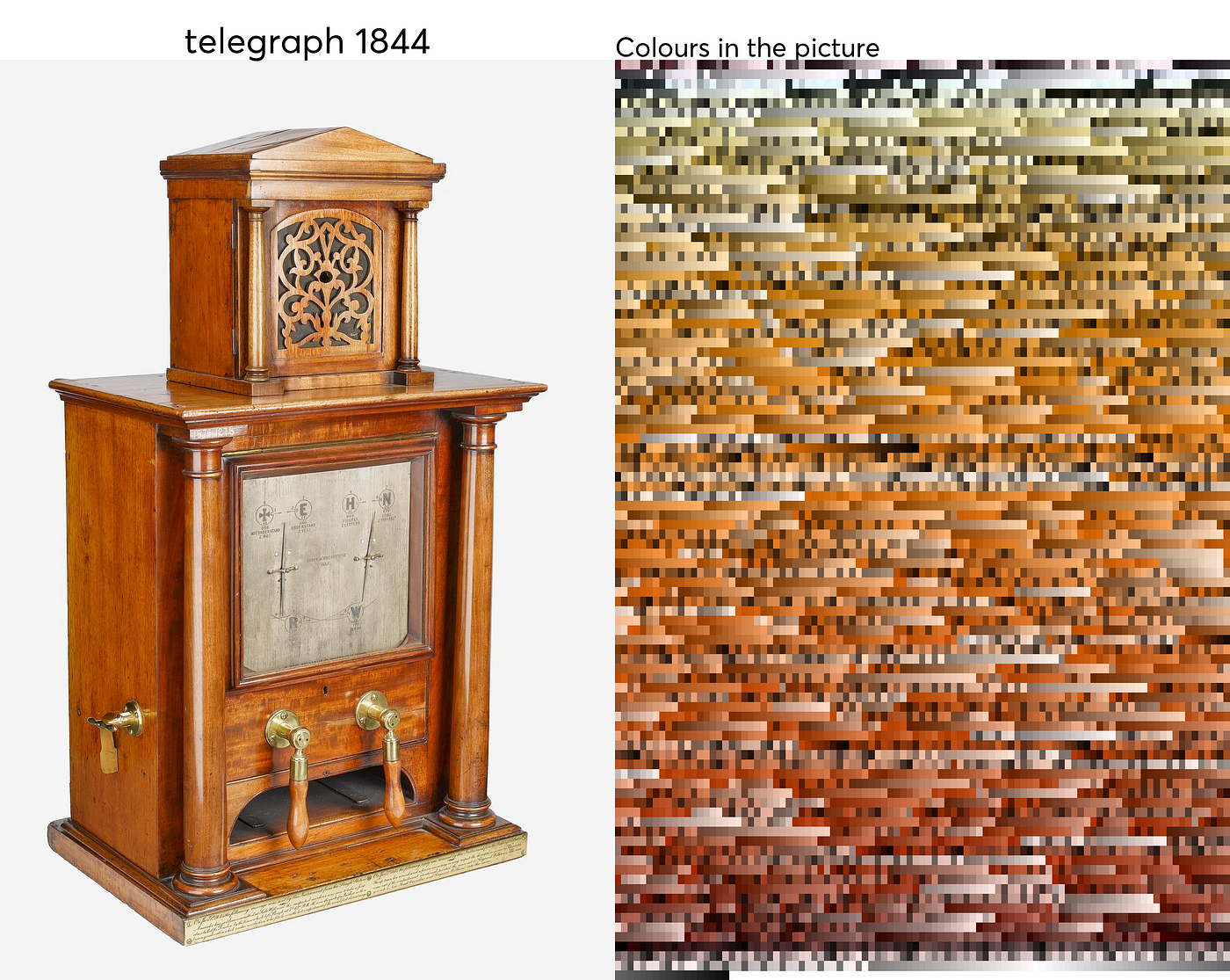
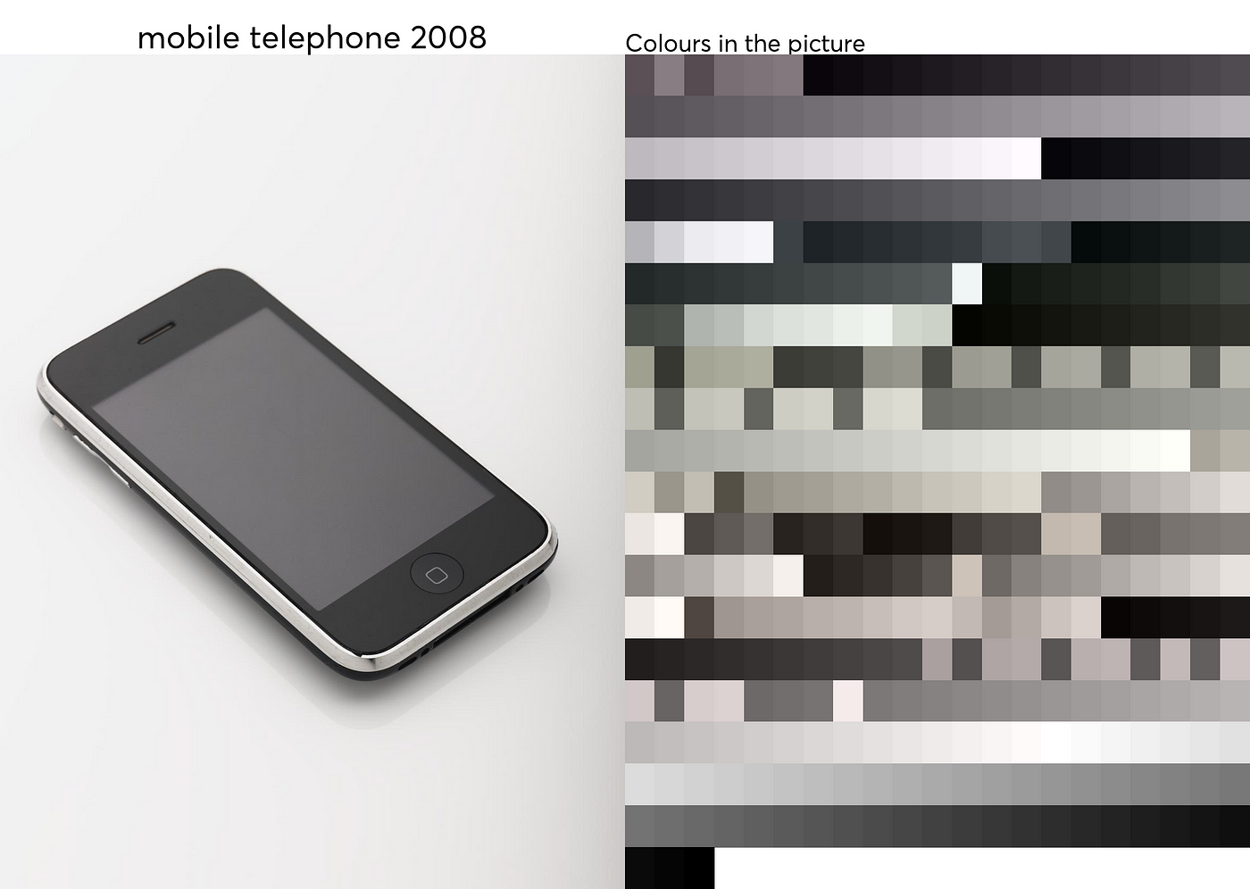

The results were striking as beginning around 1900, the color palette of these objects grew progressively more gray and less diverse over time.
This trend is echoed across various sectors ranging from the auto industry to consumer electronics.

Consider the automobile industry. Leading paint suppliers like Axalta and PPG Industries consistently note a consumer preference for white, black, and gray vehicles in their annual reports. White has been the top choice globally for several years running.
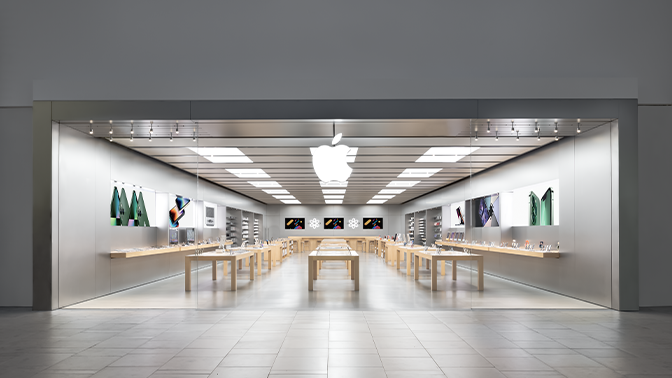
Consumer electronics present a similar landscape. Tech giant Apple, known for their trend-setting designs, predominantly offers its iPads, iPhones, and MacBooks in neutral shades of space gray, silver, and gold.
Fashion, too, demonstrates a tilt towards the neutral. Core wardrobe items such as suits and dresses often come in versatile and timeless blacks, whites, and grays. These shades, seen as perennially stylish, offer a ‘safe’ choice for consumers and can be effortlessly paired with other colors.
The clearest shift towards neutrality, however, is visible in the architectural world. The surge of minimalism and modernist design styles has led to buildings featuring predominantly white, gray, and black tones, a stark departure from the multi-colored architectural landscape of the past.
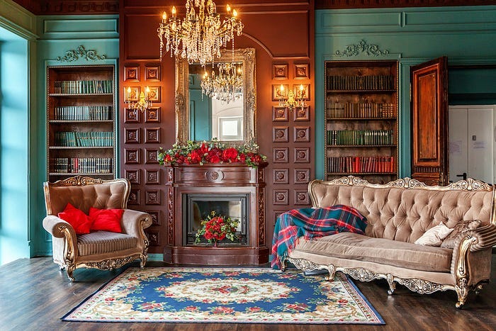
To comprehend this shift fully, a glance at the past provides insight. In the 1800s and early 1900s, the built environment boasted a diverse palette. Structures were crafted from brick, stone, and wood, each bringing its unique hue to the cityscape. Painted surfaces were not shy of showcasing a broad spectrum of colors.
Victorian Era Home:
Modern 21st Century Home:

As urban development marches on, older buildings are often replaced with newer structures, reflecting contemporary tastes and materials. Today’s popular building materials such as concrete, glass, and steel which are typically present in grays or blacks, have become a defining feature of modern cityscapes.
Is minimalist design to blame?
Social theories and explanations
This progression towards a seemingly color-reduced, monotone world aligns with several social theories that shed light on how modernization can strip away character and vibrancy.
“efficiency, calculability, predictability, and control.”
In other words, a McDonaldized world is where unique local characters are often sacrificed for the sake of mass production and standardization. As Ritzer explains,
“The drive towards uniformity has spilled over into architecture and design, contributing to a preference for easily replicable, neutral aesthetics over unique character. The proliferation of sleek glass, concrete, and steel construction reflects this shift.”
- Efficiency: The focus on optimizing construction and design for maximum cost-effectiveness and ease of replication would imply the reduction of “edge cases”. Bold colors, ornamentation, and unique design elements are likely seen as inefficiencies and eliminated to streamline mass production.
- Calculability: Emphasis on quantitative aspects like square footage, construction timelines, and material costs over qualitative aspects such as aesthetics. In other words, it is easier to estimate costs based on readily available materials. Colorful design may be harder to quantify from a profit perspective.
- Predictability: Mass production often implies cookie-cutter methods such as copying and pasting floor plans to provide a standardized experience across locations. Unique local colors are replaced by familiar corporate aesthetics heavy on grays, beiges, and whites.
- Control: Centralized control over design and construction by corporate chains and monopolies leaves less room for individual creativity and flavor. Color palettes and materials are often dictated from the top down.
This is further supported by John Tomlinson’s theory of cultural imperialism, where the perceived loss of color and character in modern design could be seen as a manifestation of the cultural transformations brought by the spread of Western cultural influence.
It is a process of cultural loss and not of cultural expansion.
Cultural imperialism refers to the imposition of one dominant culture’s values, practices, and way of life onto another. Typically through economic and political influence rather than direct force. In modern contexts, cultural imperialism is often associated with the global spread of Western culture. Critics argue this “Americanization” of other cultures occurs through the mass export of American media brands, and lifestyles.
The global trend towards minimalism, and neutral-toned architecture could be seen as bearing the imprint of Western modernist aesthetics, but not in a purely Western form. Tomlinson sees the spread of stripped-down “colorless” design as part of the broader diffusion of Western notions of modernity.
Implications for UX and Design
From a UX perspective, there are no other colors that contrast better than black and white. Hence the reason why most of the text you see is either shades of black on a white/light background or shades of white on a black/dark background.
With UX/UI and digital products specifically, we often see minimalist designs with productivity apps such as Notion and Todoist. As well as in the design space, we often see web UIs that are experimental and creative with their use of monochromatic palettes and typography.

As neutral colors become more prevalent, it poses a challenge for designers to make their work stand out and be memorable. It creates a landscape where differentiation may require going beyond color schemes and exploring innovation in shapes, materials, textures, patterns, or the ways users interact with a design.
The emotional impact of designs might also undergo a shift with the reduction in color variety. Colors can evoke strong emotions and associations, with vibrant reds capable of stirring excitement, while cool blues might be calming or invoke trust. With more limited color choices, designs may not elicit such powerful emotional responses, making it more difficult for them to establish a connection with the user.
Moreover, as color becomes less of a distinguishing factor, the focus of design might further shift toward functionality, simplicity, and user-friendliness. These elements are core aspects of good UX design and might receive more attention in a world that leans towards a neutral color palette.
At the same time, the move towards more monochromatic or neutral designs presents its own set of challenges, particularly in terms of accessibility. Ensuring sufficient contrast and legibility in designs is a vital consideration, especially for users with visual impairments. A limited color palette might make fulfilling these requirements more challenging, pushing designers to find innovative solutions.
The evolution of aesthetic preferences might be another consequence of this shift. Over time, users might develop a preference for these monochromatic trends, which could in turn influence future design trends and further perpetuate the dominance of neutral colors.
Final Thoughts
The evidence of an increased preference for neutral colors is mounting across various domains, it’s critical to note that color is not disappearing completely. Cultural preferences are not static as they evolve and shift over time. What may seem like a world losing color could just be a temporary swing of the pendulum in design trends.
Regardless, it is an interesting observation picked up by the research team at The Science Museum in UK. In addition, this is also a viral thread on Twitter by The Cultural Tutor. Curiosity and questions lead us to amazing discoveries and creative problem-solving.
This current shift towards a more monochrome aesthetic might reflect deeper societal changes, from our increasing focus on efficiency and productivity to the homogenizing effects of globalization. But just as societies evolve, so too can our aesthetics.
Perhaps the current trend towards neutral colors is merely a phase, a reaction to our rapidly changing world, and in time we might see a resurgence of vibrant color as a counterbalance. In the end, the colors of our world are a reflection of our collective cultural mood, shaped by countless invisible forces.
This article was originally published on Medium.