As we mentioned last week when we gave you the top UX trends of 2014, it’s been a big year for experience design. 2015 shows all signs of being an even bigger one, with experience design sinking deeper into products, services, organizations, and the lives of those who interact with them.
Without further ado, here are some predictions for 2015 from our contributors:
A Rise in “Slippy” UX – Shannon Copfer, JW Player
Up until now, we’ve seen a lot of focus on creating “sticky” user experiences—experiences that engage the user and keep them interested, as well as bringing them back for more. “Sticky” has been considered one of the most desirable design traits possible—a way for digital experience designers to show off their talent, eliciting “oohs” and “ahhs” from consumers, critics, and peers alike.
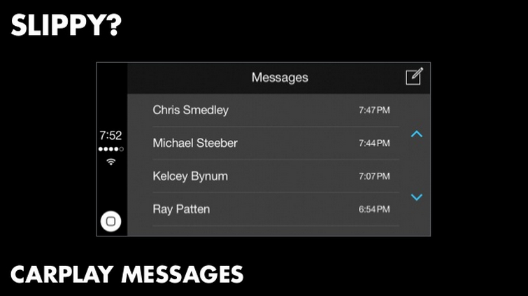
What we will be seeing shortly, however, is a purposeful trend towards “slippy” experience design. Jake Zukowski, Assistant Creative Director at Frog Design (and the coiner of the term “slippy” in a UX context) has a particularly poignant illustration of this concept: digital automobile screen design. Here, UX literally finds itself in a life-or-death situation: can a digital experience in a car operate effectively, yet invisibly enough to not affect the safety of a driver and her passengers? A successful design in this concept is “slippy” because it is designed for glance-ability, minimal copy, and use in potentially high-stress situations.
Jake Zukowski, UX in Automobiles
“Slippy” UX makes sense particularly in the context of a connected home—nobody would want a house that is constantly interrupting them. It’s the opposite; a truly successful connected home would operate without even being seen. Once set up, it would deliver seamless service and an experience that enhances other, analog activities: laundry, sleeping, comfort, conversation. Wearable device UX design will also necessarily follow this pattern, if people are going to need to be so close to their devices as to have constant skin-to-skin contact, those devices had better tangentially enhance their world and their personal experiences (both digital and analog) rather than interfere with them.
The Death of Web Design – Sergio Nouvel of Continuum
2015 will be the year when web design finally dies of irrelevance. High-quality templates are everywhere, and the value of a “custom-built” design is no longer evident; self-service web design is close at hand and every year more it becomes effective with the addition of artificial intelligence. Facebook Pages have become the “de-facto” web page for small businesses, and, most importantly, without a proper strategy (which must include SEO and social media) even the most beautifully crafted design is destined to have an audience of two: you and your client.
Web design patterns are already mature. Trying to reinvent the wheel in contact or checkout forms is pointless and likely to produce sub-standard results. Stripe, for instance, is leading the payment services providing not only a layer for processing credit cards, but also ready-to-use and massively tested interface design for checkout forms. This has happened as well with log-in functionality (now provided by social media services), and it’s likely to happen with other components of classic Web design.
We can no longer understand and design web pages as self-sufficient entities. We are in the product design business, and this involves designing and managing an ecosystem of touchpoints and services to deliver value. So where does this leave us as designers?
We’re in the product design biz, managing an ecosystem of touchpoints and services to deliver value
2015 must be the year where we shift our focus to unsolved problems, especially ones we’ve been inadvertently feeding all these years: the overload of information. The world needs designers to simplify, not to add up to the noise. Artificial intelligence is becoming the way of extracting sense and relevance of seas of information we have no human bandwidth to process. As professionals meant to be the experts in the creation of sense, this challenge needs us on board.
The Race from Good to Great Customer Experience Intensifies – Harley Manning, Forrester
2014 wasn’t a good year to be average. Since 2007, the average customer experience in the industries that Forrester tracks has gone up across the board, and the number of truly awful experiences has dropped like a rock.
In 2015, the race from good to great CX will speed up. Smart CX teams will increasingly use customer data from diverse sources like social listening platforms, campaign management platforms, mobile apps, and loyalty programs—to personalize and tailor experiences in real time so that they inherently adapt to the needs, wants, and behaviors of individual customers. And as companies strive to break from the pack and gain a competitive edge through the quality of the CX they provide, we’ll see the battleground shift to new areas like emotional experiences.
Our latest research shows that emotion has a bigger impact on customer loyalty than either ease or effectiveness. And so in the shadows of Deloitte’s purchase of Doblin and Accenture’s acquisition of Fjord, expect a land grab for design agencies that can provide emotional intelligence to traditionally left-brained companies. In 2015, the likes of Bain, McKinsey, and Pricewaterhouse Coopers will compete to snap up firms like Continuum and Livework. And the prices on these deals will reach some dizzying heights. Why? The consultancies will have to bid against aspiring CX leaders like Delta Air Lines and Verizon that want to match Capital One’s recent bold move to acquire Adaptive Path.
Deeper Integration of Digital and Physical Experiences – Anders Arnquist, Veryday
With the rise of the Internet of Things, the line between digital and physical experiences has blurred. To bridge these two dimensions, we must take the user context into account. We are transitioning to a world where physical products are expected to come with a digital experience—for information, for added value, or for administration and configuration. But in 2014, there was still a frustrating disconnect between digital and physical experiences.
Take a home furnishings company as an example. The time you spend surfing their website while sitting on your couch gives you nothing in return when you enter the store—not in the layout of the merchandise, the display of the offers, or in the signage. There is, in short, no communication between the physical and the digital experience of the brand. In order to remedy this disconnect and become more relevant in service communications, we need to be able to determine user context.
Over the past year, small, cheap Bluetooth sensors (“beacons”) that interact with smartphones have been used to build indoor navigation systems that will help us acquire the contextual information we need to bridge the experience gap. The technology is constantly changing and becoming more tailored to the task and we now see systems that combine multiple technologies, such as analyzing magnetic fields, Wi-Fi signals and light.
These indoor navigation solutions fill a blind spot by tying people to specific places and objects, thereby giving services the valuable data they need to make their information more relevant and timely. In order to further explore and investigate how new technology may be harnessed to benefit users, I created REC, a prototyping tool that makes it easier to build customized indoor navigation systems using Bluetooth sensors. In 2015, we’re going to see digital and physical experiences come closer together than ever before.
House of Cards – Will Hacker
Card-based design became really popular in 2014 and its use will continue to expand in 2015. The trend reflects both the continued increase in the use of mobile devices and their smaller screens, and a corresponding increase in people’s desire to consume information in bit-sized chunks. Cards are widely used in social media like Twitter and Facebook when users share content with their networks. Google Now relies heavily on card-based design, as does the Notifications panel on iOS devices. The beauty of cards is that these small, bit-sized information chunks can be combined and assembled in novel ways based on user preferences, device type and screen size, the user’s location, or the time of day.
Twitter on a mobile device (left) and Twitter on the web (right) both use cards as a way to organize information
More Celebrity-Driven Apps – Josh Tyson, UX Magazine
Apps created by (or on behalf of) celebrities were a notable trend in 2014—one with the ability to draw deeper connections between famous folks and their fans. A couple of celebrity app entries from late in the year suggest that the trend isn’t slowing down and that it might even mature a bit.
While it certainly doesn’t sound all that mature, Yo, Bitch (or YB), an app released by Aaron Paul of Breaking Bad fame deftly combines two disparate bits of pop culture ephemera. Paul’s character on the show, Jesse Pinkman, managed to turn a very basic nugget of profanity, “bitch,” into a catchphrase, and he’s combined it with the basic premise of the Yo app for a slighty enriched experiece.
The official app description reads like this:
- Want to say hello to someone? Say “Hello, b****!”
- Want to make your special someone feel loved? Say “I need you, b****!”
- Fed up with your friend? Say “Why, b****?”
Definitely not a sohpisticated experience, but a nice bit of hybrid satire. A far more considerate and cool app comes from former White Stripe, Jack White, whose THIRD-D app employs the Viewmaster-esuqe Google Cardboard to give users a 3-D concert experience.
So what’s next? We’d like to see a Michael Keaton app that lets you appy a Birdman skin and vocal effect to your personal videos, but that’s just us.
The Ascent of User Experience as a Business Strategy – Scott Plewes, Macadamian
User Experience continues to move to the forefront of what differentiates products and the organizations that produce them. It fundamentally matters to those of us who love and see the value of UX, because if you influence the business/product decision makers in an organization you influence the product and, potentially, society. Recently there have been a number of design firm acquisitions by large corporations, UX hiring sprees across a wide range of businesses, and, perhaps just as importantly, hiring of senior UX personnel in Director, VP and other influential positions within companies.
Exactly where and when UX began its most recent and impacting ascension is arguable. It is probably a combination of factors but user expectations in consumer products have now spread to enterprise, and organizations are reacting by adopting UX as a key marketplace differentiator. As part of growing importance of UX, companies are recognizing that successful execution requires UX professionals at all levels across the organization.
The more sophisticated among these companies are adopting UX as part of an overall customer experience design and adopting “design thinking” across their operations. While, in some ways, aspects of this trend have been around for many years now, the culmination of (senior) hiring, influence, decision making, acquisitions, market positioning, process adoption, and other fundamental indicators of the importance of UX to a company’s business model and strategy have never been higher. It is a great a time to be in UX.
More Targeted and Tailored Experiences for Different Device Types – Doug Hopkins, Isobar
In previous years, the “first wave” of adaptive and responsive design philosophies focused on delivering experiences that sought to be as universal and similar across device types and screen sizes as possible, typically taking a mobile first approach that would work back to larger screen sizes and view ports.
Now that many brands have accomplished this, the next wave of design approach is about extending and tailoring the experience to the native device type and size in order to deliver an optimized experience. These techniques include things like parallax scrolling behaviors and other rich navigation schemes that best lend themselves to larger screen sizes. We’re also seeing smart contextual menus and interactions that are especially handy on smaller, hand held form factors. Furthermore, predictive navigation and suggestive wayfinding will migrate out of standalone app experiences such as Google Now and Microsoft Cortana and begin to appear as mainstream offerings, especially for smart phones and tablets.
More evolved and robust development frameworks that have many more built in, native abilities to render responsive experiences are enabling teams to push further beyond the efforts to standardize experiences across device types. More time and effort can now be spent applying design and development to tailoring experiences outside of the core symmetry across devices, and to think in terms of more optimized experiences that are truly suited to context of desktop, tablet, or smartphone user needs and interests.
Embracing the Materials of Design – Steven Hoober
Google did something truly good this year with Material Design and I hope that it will be fully-understood and embraced by the design community and other OS makers in 2015 and onward.
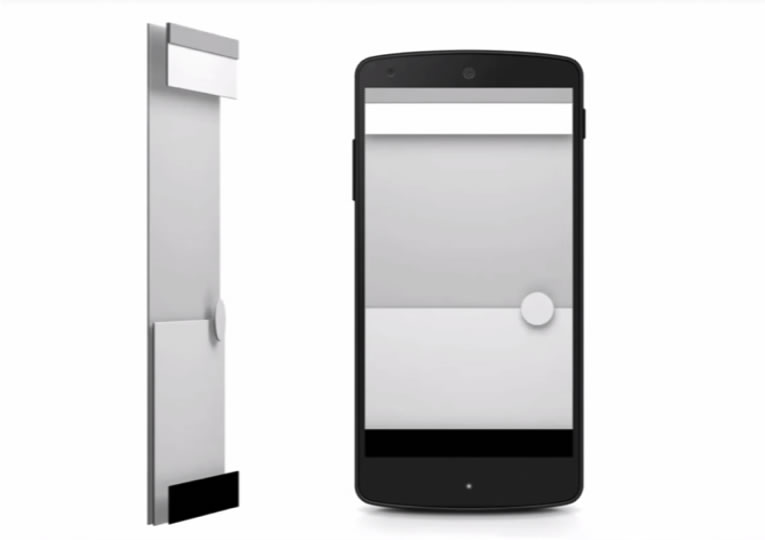
A lot of people still call this flat design, but the key feature is that it has dimensionality. Some are therefore insisting it is skeuomorphic, which of course is bad without explanation. The principle is we’re forcing flat phones to be dimensional by pretending they are made of bits of paper layered up behind the display.
But phones are not flat. For the entire history of GUIs there has been a concept of layering. Items are displayed on top of others. In Android, “the stack” has always been what they called the software-driven principle of displaying views of information. Not just dialogs that appear on top of content views, but that the current view is literally on top of the previous view, and hiding it. Putting transparent parts on your view will let the other show through. Pressing back takes the user to the previous view automatically.
So it’s not skeuomorphism in the bad sense of trying to impose some other style onto digital. It is Good Design in the 1950 MoMA sense. It embraces, contextualizes, and builds on the forms and materials we use in digital spaces.
This is one of those things I have been lamenting and hoping—barring my own ability to start the discussion—someone would bring about. An actual, permanent, material-based design ethic for digital media that everyone can understand and embrace.
Prepare for a World of Automation – Rebekah Rousi
In 2015, the reality of vehicles, devices, and helpers which are fully automated becomes ever more nearer. Particularly with the development and sales of self-driving cars, people are beginning to question what their lives will be like when they don’t need to bother worrying about who will drive when everyone’s tired. And naturally, issues about work will also be on people’s mind—when there are robots that can dance, serve dinner, assemble delicate machinery, and perform surgery in a matter of minutes, what will the role of people be?
These issues have been the stuff of dreams for decades—f not centuries—in the realms of science fiction and philosophy, but more and more in the fields of IT and particularly human-computer interaction, we are seeing evidence that concerns in the near future do not pertain to how people learn to use technology, but how technology learns to adapt to humans. Just take a look at the CHI conferences as well as discussions by people such as Don Norman and Marc Hassenzahl, that will give you a clue.
Due to its longevity in the minds of dreamers and scientists, this trend is inevitable. And for the most part, the trend element is just the era of adjustment for people entering into this new world. It comes with pros and cons. Pros possibly include fewer accidents and mistakes, more accuracy, and more satisfaction when we receive our burger made “just right.” The cons are of course concerns with employment, and let’s face it, if we expect consumption and growth to continue people do need jobs. But this might mean new opportunities, too. Certainly, many are concerned about the human touch, particularly in the healthcare sector. But then there is deliberation between the current deficient conditions of understaffing, risks of neglect and error, and the possible alternative of robot helpers that don’t forget, neglect, or suffer emotional ups and downs.
Online Learning Comes Into its Own – John McGloon
In 2015, instructional designers, educational technologists, and user experience designers will form alliances to improve the delivery of the massive demand for online learning. Major universities and private companies will employ user experience designers to make their educational offerings much more usable for learners.
Security and Privacy – Mary Brodie
With the growth of data devices for health and fitness, digital wallets and other digital financial services, and now wearables, there is the opportunity for collecting an abundance of personal data. Where will this data be stored? How will it be used? Could it be leaked or hacked? How will we confirm our identities online or offline if something happens? This is one of the next challenges awaiting us. We will need to solve these questions for users so they start using the devices and it becomes part of daily life:
- How do we communicate security and data safety to users?
- How do we make a high-security site easy to use, from gaining access to accessing data, without it requiring insane levels of passwords?
- What are the best methods of securing personal data (e.g., voice or custom gestures)?
- How do we confirm identity online and offline, beyond using fingerprints or retinal scans, which can also be “hacked” in real life?
These are the key questions we need to consider in the coming year if we want more personal devices to be used and leveraged.


