This was another big year for experience design. Biggest one yet? Sure, why not. There were too many developments, surprises, and shakeups to count, so we sent the call out to our contributors to give us their picks for the trends—both good and bad—that stood out from the rest.
Wihtout further ado, the top UX trends of 2014:
Welcome Back Social Media, We’ve Decided You Are Useful – Rebekah Rousi
After years of deliberating the benefits and popularity of social media, with conflicting views and sentiments over whether it was healthy or not—promoting loneliness through abundance of “friends” but no real relationships and of course the deflated interest levels of disgruntled users filtering through waves of selfies and “words of wisdom”—people have decided that services like Facebook are once again “a good thing.”
The figures alone explain the growth in popularity of Facebook in particular. In 2014 the number of active monthly users has been 1.35 billion, up from 1.23 billion in 2013. There is no doubt that statistically the figures have increased each year, but discussions over whether Facebook and other SNSs are a good or bad thing have tended to sway towards the negative in the social psychological arena (check out some of the talks given by internet psychologist Sherry Turkle).
Yet, while the direct social and personal use of social media is highly debated, the importance of its integration into business practice in terms of online presence and information flow has become a necessity rather than an option. If a site or online solution does not have a social media function (for customer-to-customer or customer-to-business interaction) or at least connections to social media activity, customers and other users immediately want to know: “why not?”
If you consider users’ and consumers’ sense of influence and control in the direction of product development and application a good thing, then yes, it’s great. From an experience perspective, consumers and users are taking on a more active role, and the findings of a recent study suggest that facilitating consumer empowerment through social media leads supports value creation and development. Or on the other hand, you might want to question the amounts and types of information people are freely giving corporations—and yes, that information has staying power, but do we want that?
The Best Jobs in UX Started Moving In-House – Dallas Sargent, Design for Experience
This year, the big shot heard round the UX world was the acquisition of Adaptive Path by Capital One. In a blog post titled “Where We’re Going Next,” Jesse James Garret followed the announcement with the statement “I know, weird, right?” He said that no one at AP was more skeptical than he was, but that, “when it comes to truly human-centered thinking, Capital One is among the top tier of all the organizations I have worked with in 15 years of consulting.”
While this left plenty of practitioners scratching their heads, plenty of us were nodding them instead. UX isn’t a boutique offering anymore. There are still scores of agencies out there doing incredible work that pushes the boundaries of experience design, but the value of putting users at the center of it all is now widely understood. That’s why we are seeing more companies and organizations investing in in-house teams. My guess is that we might see more mega institutions buying agencies, but being very cautious not to disrupt the finely-tuned environments that keep their work fresh and their teams happy and engaged.
As Peter Merholz noted in a blog post earlier this year, “In the past, agencies could say, ‘Yes, but we respect and value design in the way that in-house companies don’t, and you’ll get to work on a range of things, instead of just one thing over and over.’ That doesn’t hold true anymore, and most of the interesting design work is emerging in-house, and designers want to be where the action is.”
So while agencies will have to find ways to compete with the bigger salaries that tech behemoths and industry juggernauts can offer, these new in-house operations will have to work harder to make sure their teams feel challenged, appreciated, understood, and rewarded, which may prove to be even harder than it sounds.
The Desktop Hamburger Menu – Brenna Randlett, Yellow Pencil
This trend has a few names: the Three Horizontal Lines, the Pancake Stack or, my favorite, the Hamburger Menu. The icon is usually found on the top left or top right of a page and when clicked, the main navigation slides out. Normally seen on mobile, the Hamburger Menu has been appearing on the desktop versions of sites such as Time, Serial podcast, Tictail, and Gawker.
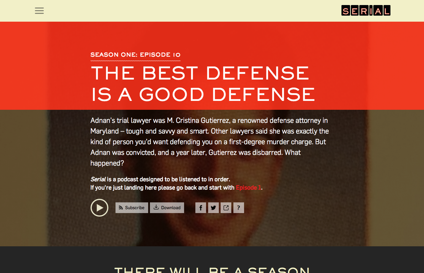
Desktop hambuger at Serial
Desktop hambuger at Time
A slide out menu on mobile can save precious space but some strongly advise against the Hamburger Menu entirely. The three stacked rectangles represent a minimal view of a list and, although simple and clean, it doesn’t always effectively communicate a main navigation. So why is this icon appearing on desktop sites that have the visual real estate for an entire navigation? I believe we can point a finger at responsive web design for this 2014 UI trend. Somehow we looked at the mobile and desktop versions of a responsive site and thought, “Dude, just keep the menu the same, it’ll look cleaner.”
I say no to the Hamburger Menu. It limits discoverability and doesn’t communicate clearly. While the slide out menu on desktop websites is acceptable in certain circumstances, if you’re going to hide a menu then slap a minimal icon on top of it—you’re going to lose some usability. If you must have a navigation that’s so large it needs to be hidden away on a desktop view or if you want that minimal and spacious look, consider using the word menu. This communicates language to the user. We’re killing global navigation with this Hamburger Menu business.
Retina Everywhere, or Death of the Pixel – Shannon Copfer, JW Player
Though resolution- and device-independence have been growing for several years now, there are a few notable things in 2014 that have helped to dig the grave for the “pixel” as we know it, which might be setting the stage for a tidy “burial” in 2015.
Among them are:
- Mobile’s ongoing push for the highest resolution possible. As of the release of the iPhone 6 and iPhone 6 Plus this year, Apple now requires support for current device sizes that span, at minimum, from the 1136×640 iPhone 5c up through the 1920×1080 iPhone 6 Plus (with even higher resolutions for iPad apps, and even lower resolutions for iPhone 4 support). And on the Android side, this year’s LG G3 has a 2K (!) screen. Phone screen resolutions will only continue to rise. Even outside of what’s officially “supported” by the Apple or Android dev communities, developers and designers who wish to effectively address the needs of as many of their users as possible will need to take into account the likely substantial number of those users who aren’t constantly upgrading their devices with every release.
- The rise of 4K monitors as well as content. This year, Netflix began supporting 4K streaming of some shows, and Amazon Studios began shooting their original series in 4K as well. Apple even released a 5K desktop screen. From here, it’s only going to get harder to design for (and even keep track of!) all the device sizes and resolutions in use (as if it weren’t hard enough already!).
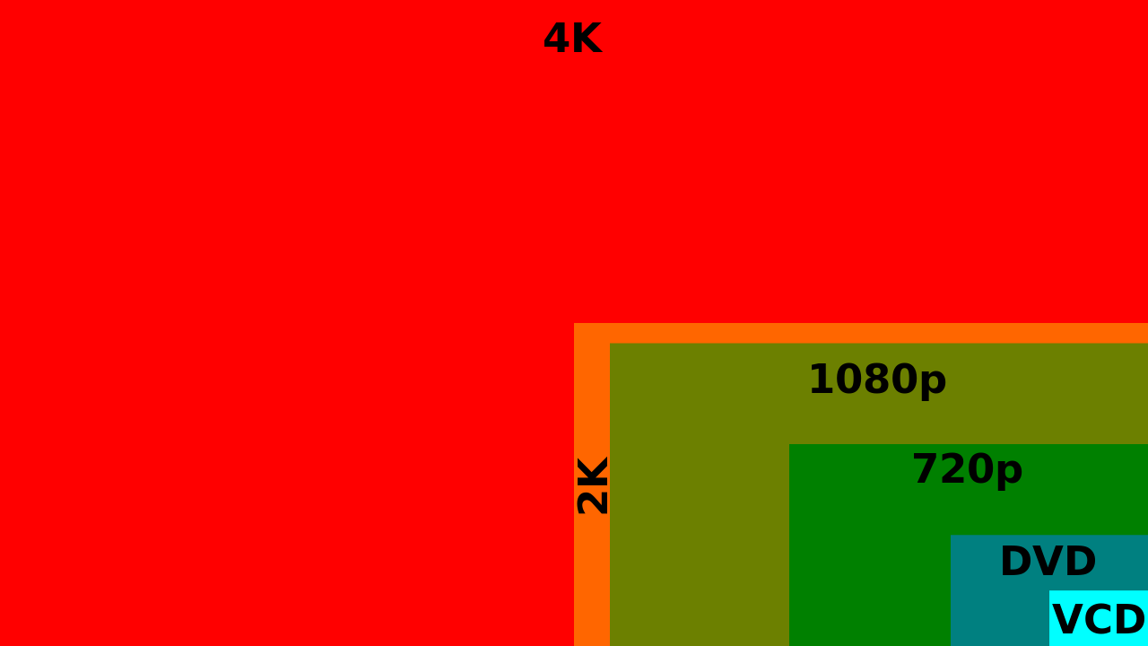
Wikipedia, 4K Resolution
We’re already getting more thoughtful in our approach to responsive type and graphics overall. Here are some exciting examples of interesting resolution-independent design possibilities in action:
- Designer Joe Harrison’s “Responsive Logos”
- Strategist and designer Jason Pamental’s concept for designing and coding beautiful, responsive typography
From a user standpoint, true resolution independence (done right; with vector graphics, fluid layouts, and well-planned breakpoints) is the best answer. It might make early-stage UX and product planning slightly more complex, but in the end a smooth transition between screen sizes will allow for a better overall experience and fewer design bug fixes and layout tweaks down the line.
Celebrity-Driven Apps – Josh Tyson, UX Magazine
A few years ago, most celebrities had their own websites. These days, a true public profile seems incomplete without a personalized app, and this year saw some interestnig ones. The most high-concept entry came from writer and performance artist Miranda July, who unleashed Somebody, an app that promised to send a stranger to deliver your message to a friend. Basically, users compose their message and are given the option of adding emotional and physical directions. Then they choose a Somebody user in the area to deliver the message.
The app was immediately hobbled by a myriad of technical issues, but July recently announced that she’ll be releasing a fully-functioning version of the ambitious project in the near future.
One celeb app that burst from the gates ready to go was Hanx Writer, which turns your iPad into a virtual vintage typewriter, complete with the sounds and movement of the real thing. The Hollywood star behind the app? Typewriter enthusiast Tom Hanks, of course. There were other apps as well: a celebrity adventure app from Kim Kardashian, a greeting card-creation app from Taylor Swift, a zombie-fighting game from Shaquille O’Neal, and Snoopify, an app from Snoop Dogg that lets you spruce up your photos with stickers of things he likes (joints, pot leaves, et al.).
Sure it all seems a little silly, but in a world where Domino’s has an app that let’s you whimper, “I need pizza” into your phone and place an instant order, why shouldn’t William Shatner have an app that lets you hear your poetry read in his inimitable voice?
These apps, when created with a solid sense of the celebrity’s public image, can forge a deeper connection with their audience while also growing their fan base—in a sense bringing users closer to their favorite celebrities and maybe even forging an emotional bond. When they offer lazy or lackluster experiences (like Madonna’s app) they seem to fall by the wayside without causing much collateral damage. A bit of a win-win.
The Year The Customer Experience Laggards Stepped Up – Harley Manning, Forrester
Forrester’s annual Customer Experience Index (CX Index) measures the quality of the customer experience provided by major US firms. By comparing data over the past seven years we see that the overall number of brands earning a “very poor” or “poor” rating from their customers has declined drastically.
This year in particular we saw just 1% of brands rated as very poor and only 10% of brands rated as poor. That’s a big drop from 2013 when customers rated 8% of brands as very poor and 17% of brands as poor. Which companies stepped up into the “okay” and “good” categories? Unsurprisingly, they were mostly from the industries that dominate the bottom of our rankings year after year, like health insurance providers and cable companies.
This trend is a direct result of changes in the competitive environment. To put it bluntly, companies that have to fight for customers can’t afford to ignore customer experience. New healthcare laws started a battle for health insurance customers, especially the younger, healthier customers who pay more in premiums than they get back in claims. And a range of new entrants plus alternative solutions like streaming video has turned the once monopolistic cable industry into a customer battleground, as well.
This trend is very good news for consumers, who already see a decline in the number of truly horrendous experiences they encounter. It presents a new challenge for brands, however: Now that okay is the new poor, firms can’t gain a competitive edge by being less awful then their rivals. Instead, companies will have to learn how to exceed their customers’ expectations and engage their positive emotions.
And now, here are a few of last year’s predictions that came true, or at least came close to coming true.
Thinking (and) Machines – Hunter Whitney
An increasingly better understanding of the workings of the brain will propel technology and conversely new technologies will help us better understand our brains. The differences between pure pattern recognition done by computer and human intelligence will become less distinguishable.
Whitney was right that new technology tied to the brain and it’s fucntionalities would make some waves. Case in point, earlier this year, Philips, Accenture, and Emotiv announced a project involving a piece of headgear and an app that allows users to control Philips products using their brainwaves. The intent was to give patients with Lou Gehrig’s disease (ALS) and other neurological diseases greater independence—letting them make a call, send a pre-set text or email, or turn lights and television sets on and off.
This was an impressive release, but as Whiteny notes: “[These types of products] are fairly easy to use for sensing brain activity, but they do have drawbacks. Imagine there’s a raucous party and you are standing in an adjoining room. If you put your ear up to the wall at different places, you may be able to discern a few clear patterns in all the noise. For example, you might know what kind of music is playing and even get a sense of some conversations. If you put a cup against the wall, you could get a clearer sense of what you are hearing. Similarly, our brains are filled with a cacophony of electrical signals, which are a fundamental part of how our brain cells communicate with each other.”
Shy Public Self – Joe Macleod
People will become aware of the long term impact of their personal content online. Many companies are built off the backs of people’s personal content: Facebook, Twitter etc. With big stock market debuts users will see that these cool tech start-ups are big multi-nationals with taxes to pay, and appetites will change regarding what users share.
Last year saw a number of public figures experience phone hacking and an enormous political debate ensue between the U.S. and Europe over privacy issues. The will continue to raise interest in the business and politics of privacy. In the short term, this will mean dealing with some challenging and delicate design issues. In the long term, I think we will become better designers for considering some of these rights of use in a public place and the philosophical issues that are attached.
The massive leak of nude celebrity photos that were stolen from iCould accounts gave everyone a reason to stop and think about where their information is kept and how secure it is. Just this month, the Guardian published a story exploring the resurgence of flip phones, noting that many celebrities burned or scared by the aforementioned hacking scandal have gone back to the basic, and presumably more secure, clamshell.
Meaningful Serendipity – THE MEME
As technology around us gets smarter we have become used to products and services tailoring to our individual needs. But in many cases excessive personalization can remove valuable aspects of surprise, playfulness, and happenstance. For 2014 we see a growing trend for digital experiences that aim to surprise users by offering opportunities for random and spontaneous discovery.
Labeled as an “experimental photo exchange platform” Rando allows users to send a photo (or “Rando”) to strangers in anonymity, with only location data shared. Social discovery apps like Highlight and Banjo are evolving in to robust tools for serendipitous realtime discovery of relevant social connections, activities, and events. Stumbleupon is enabling a different web-browsing experience where personal preferences allow for playful recommendations of randomly selected sites. Netflix recently added a “random picks” in response to the sometimes cumbersome process of selecting content from a vast personalized catalogue of multiple categories.
While not the same thing as meaningful serendipity, the rise in big data and sensor technology has meant more opportunities to reach out to customers in context, creataing a similar feeling. For instance, a store’s app can enable a “shop mode” that is triggered on the device by a geofence when a user enters the store, and have that functionality displayed prominently so users don’t need to dig through screens to pay for their purchases.
Image of hamburger courtesy Shutterstock.