We are thrilled to be able announce winners in the inaugural international Design for Experience awards. Presented by UX Magazine, the DfE awards recognize excellence in all aspects of experience design and the winners in each category were chosen in large part based on what the UX community can learn from their achievements.
Academic Program
California College of Arts – Interaction Design Program
The mission of the Interaction Design Program at CCA is to humanize technology by creating a new breed of human-centered specialists. Students are taught forward-looking core skills in systemic and behavioral design, as well as visual design and technical skills. This is a brand new program, but the judges were impressed with the balanced and robust infrastructure and see potential for the program to be highly influential in the UX/IxD education landscape.
Accessibility
Tobii EyeMobile
A complete gaze control system consisting of hardware and customized software that allows users to control a Windows environment using their eyes, the Tobii EyeMobile enables people with limited speech or physical access abilities, such as Cerebral Palsy and ALS, to control a consumer tablet with Windows 8 without any assistance. The judges were impressed with this novel use of eye-tracking technology and with the design of the hardware, which combines the eye-tracking component and a tablet into a single construct that can be mounted to wheechairs or propped up on a desk.
Adoption of Experience Strategy
Citrix – Customer Experience
A cloud company known for products that enable mobile workstyles, Citrix has a Customer Experience organization lead by Senior Vice President Catherine Courage. Her team is focused on empowering all divisions of the company, from executives to individual contributors, to make innovation and customer experience central to their thinking. Judges were impressed by a robust program that spreads design thinking throughout a large organization using a multi-layered organizational approach, and felt like the documentation provided with the application could be useful to the experience design community.
Bottom Line Impact
DDB & Tribal Worldwide, Amsterdam for McDonald’s
In the Netherlands McDonald’s approached DDB & Tribal with task of improving their existing app to better serve business needs in a way that would inspiring enthusiasm in users and driving brand preference and sales. The judges were impressed with the clarity of the situation, the actions taken, and the results. It was easy to see what they did and the impact it had, providing a clear example to learn from.
Bringing Order to Big Data
Roambi
The team at Roambi wasn’t happy with the way that legacy software prescribed exactly how data had to be analyzed and reported, and sought to allow users to unlock the value of their data from multiple database sources, reasoning that the combination of these sources in one interface would make data insights even more powerful. The judges agreed, and were impressed with the overall functionality and interaction design.
Bridging Digital and Physical Experiences
Lorenz Potthast – Decelerator Helmet
Designed by Lorenz Potthast, the Decelerator Helmet changes a users perception of the real world to slow motion. Inside the helmet, a video-signal is processed by a small computer. The slowed down images are displayed right before the users eyes using a head-mounted display and shown though a monitor on the outside. The judges responded to this as an interesting piece of art and technology, commenting that it caputred the spirit of this category, by using physical and digital experiences to foster reflection and commentary.
Complete Customer Experience
Workshop Cafe
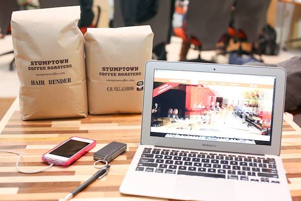
A hybrid coffee shop and workplace designed to accommodate laptop workers and enable a creative, usable workplace, Workshop Cafe is the product of a large user research project centered on the needs of on-the-go workers. Judges were impressed with the focus on service design, the way the cafe occupies the space between cafes and co-working spaces, and the integration between the physical space and the app.
Consumer Product
Lumosity
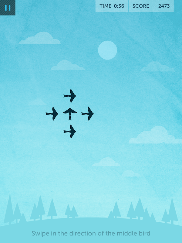
A neuroscience research company at its core, Lumosity has an interest in broadening the understanding of human cognitive performance. Members have access to more than 40 games designed to challenge and train five cognitive areas: memory, processing speed, flexibility, attention, and problem solving. Among other things, judges saw Lumosity as a great example of a product that uses gaming for a purpose and were impressed with the amount of research and prototyping that went into their products.
Cross-Platform Experience
Vantage
Vantage is a manufacturer of intelligent control systems for luxury residential and commercial spaes, specializing in fully integrated automation solutions. Judges were impressed by their ability to get a multitude of devices to communicate with one another and to synchronize display behaviors with controller states.
Effective Agency Team
JUXT
The JUXT team is made up of a diverse blend of practitioners with different personalities, backgrounds, and areas of expertise. “Some of our people come from the information architecture tradition, others come from developer backgrounds, others come from the spatial design, visual arts and film making. The beauty of the team at JUXT is how we complement each other by leveraging our various backgrounds to bring different perspectives to a problem.” The judges were won over by specific info about the composition of their team, the premium put on communication, and the fact that they let the work speak for the team online.
Effective In-House Team
NASDAQ OMX
The Product Design team at NASDAQ OMX leads the design strategy and delivery of web-based products that serve communications, public relations, and investor relations professionals. The team’s focus on diversity, the finesse they show in balancing work with remote team members, and a general all-hands-on deck approach to problem solving impressed the judges.
Experience for Children
Night Zookeeper Teleporting Torch
Night Zookeeper Teleporting Torch is a tablet app that challenges children to complete daily drawing missions like drawing the ocean without the color blue, or turning a boring picture of an old shoe into a magical animal. Judges found Teleporting Torch a little spooky and mysterious while also offering a rich experience that isn’t condescending in the way many children’s games are.
Experience that Makes a Difference
CaringBridge
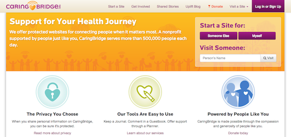
CaringBridge is a nonprofit social network that keeps families and loved ones connected during any type of health event. Their focus on user experience includes comforting color schemes, minimalist design strategies, and smooth navigation patterns. The judges were impressed by the way CaringBridge meets a need in the community and by the level of engagement users have with the product.
Foresight of User Needs
InSites Consulting
InSites Consulting is exploring new territory in online research communities. Their Consumer Consulting Boards allow companies to build strategic and consultative consumer connections and they connect online with consumers over a long period of time to engage with them through online discussions, bulletin boards, and mobile ethnography. The judges were moved by the amount of information about their process that they share with the community and felt like their approach adds to the body of knowledge of user reasearch.
Innovative Technique or Tool
Lookback
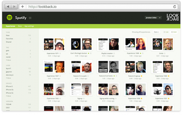
Lookback is a new approach to mobile user experience research that simplifies and complements current practices of lab-based testing and complex hardware setups. The judges were impressed with the novel approach to mobile testing—a remote recording tool that uses nothing more than the app itself to track not only the screen but also the touches, face, and voice of the user.
Interaction Design Innovation
SapientNitro for LensCrafters – MyLook
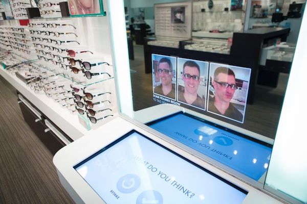
MyLook is an interaction design innovation created by SapientNitro that allows users shopping for glasses at select LensCrafters locations to try on new frames in front of a special mirror installation that takes their picture and lets them view the images after they put their prescription frames back on. They are also able to share the images with friends on social media to make an informed decision. The judges responded favorably to a genuine innovation that solved a clear problem all while staying in brand.
Interactive Component of an Advertising Campaign
McKinney for Big Boss Brewing – Beercade
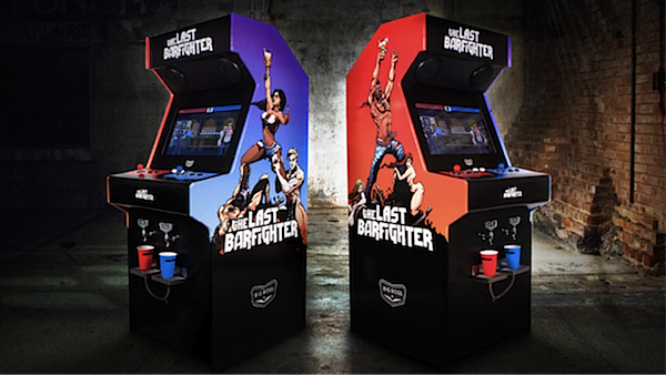
Challenged with helping a small regional brewer, Big Boss Brewing, stand out in and win over new customers, McKinney created the beercade, featuring The Last Barfighter game. With cupholders in place of typical coin slots, players fight three rounds with their opponent, and the last one standing receives a trial-sized pour dispensed automatically from the chilled keg inside the machine. The judges loved the inventive nature of the Beercade that taps into nostalgia, creating a strong brand association and meeting user and business needs in a simple and enganging way.
Mobile Solution or Application
we are experience for Transport for London
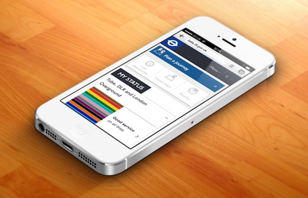
Working in collaboration with TfL’s online marketing team and build partner Detica, we are experience set out to create a responsive site that would work on any device and provide a consistent experience—bringing together big data, live updates, and location-based services for the world’s most complex public transport network. A clearly outlined design process that would be very easy to use as a resource for teaching, a solid roll-out strategy, a good system for collecting and synthesizing customer feedback, and analytics to support their story all made an impression on the judges.
Promoting Empathy for Users
Atlassian
Atlassian is an enterprise software company that develops products for software developers and project managers best known for its issue-tracking application, JIRA, and its team collaboration product, Confluence. The judges were impressed with their enthusiasm for customers and, on a more granular level, their devotion to helping developers understand customers better. They also did a good job of providing examples of these things in action.
Public Sector Experience
Joel Mahoney and Objective Subject – Discover BPS
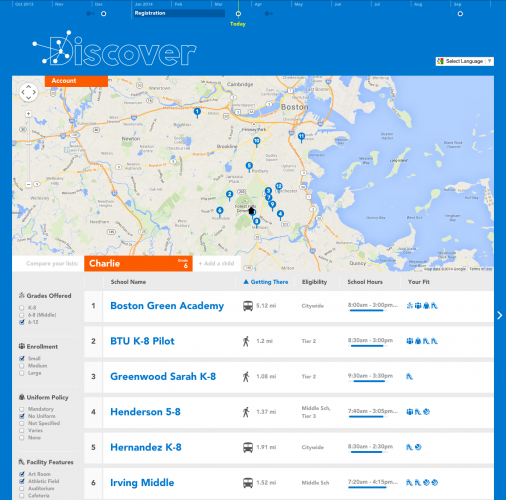
DiscoverBPS is a search engine for Boston Public Schools that was conceived during a 2011 Fellowship at Code for America, where Joel Mahoney saw an opportunity to improve the experience of parents trying to find the right schools for their children. By entering their home address and the grade level of their child, parents see a personalized list of schools on a map and are able to sort and compare their schools, ranking their final selection in a way that optimizes their odds of admission. The judges were impressed with the way the search engine made a very difficult and alienating process easier and by the way it improved relations between parents and school administrators.
Strategy to Execution
DDB & Tribal Worldwide, Amsterdam for Heineken – Ignite
Launched during Milan Design Week in 2012, this project envisioned the future of nightlife as conceived by a cross-disciplinary team of club-going creatives. DDB & Tribal Amsterdam were tapped to help them create a club experience, moving quickly though the prototyping process and creating a bottle that interacted with the club environment. Judges were intrigued by the unique strategic goals and a case study that included process points that others can learn from.
Union of Design and Engineering
HealthPartners
Two years ago the teams at HealthPartners were operating under a stagnant waterfall methodology. There was little communication across teams, confusion over roles and ownership, poor processes, frustration with legacy technical debt, and little outreach to their broader business base. Unhappy and in trouble, the teams challenged the idea of excluding development from discovery and worked together to raise technical issues to high-level business partners. The UX team created standards and a pattern library, which reduced guesswork, documentation and effort for UX, development, and QA. The judges were really enjoyed this success story, finding resource value in their approach. They were also impressed with their founding of a local Lean group.
+
AppFolio
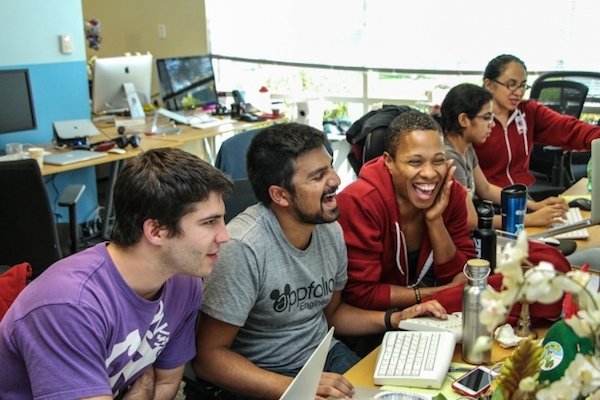
The UX team at AppFolio was created in late 2010, joining a team of agile software engineers who had already built a product with ease-of-use as the key competitive advantage. Over the past three years both teams have worked to redefine the traditional role of UX from “deliverer of design solutions and user feedback” to “facilitator of collaborative design.” The judges liked the impressive amount of effort that has gone into creating true collaboration.
Work Environment for Digital Practitioners – Agency
Digital-Telepathy
“I have a ritual for beginning my work day at DT. First, I slip into my fuzzy koala bear slippers. Then I drink a smoothie that our Manager of Company Culture just made from our weekly CSA delivered fruits … This is my ritual because I work in a space where something like this CAN be my ritual; where openness, comfort, and wellness of self is king.” The judges liked that Digital-Telepathy has created an environment that focuses on real, positive outcomes for their staff, and that they believe in living culture instead of planning it.
Work Environment for Digital Practitioners – In-House
Citrix
Citrix recognizes that their digital creative team solves problems using resources they gather primarily outside the workplace—from books, movies, museums, conversations, and the like. They consider these things as the fuel creative folks need to solve problems and view the work environment they create as a source of that fuel: “It’s not just about refilling the creative reservoir, it’s also about providing a place that attracts and retains top talent.” The judges were intrigued by the WorkAnywhere concept and applauded its full application as opposed to just impromptu collaboration spaces in otherwise-ordinary office environments.


