2013 marked another year of frenzied growth in the land of experience design. As connectivity has increased and mobile saturation has become a global reality, users expect more ease and sophistication than ever.
Researchers and designers are put to the test with every new product that appears on the scene, and we’re often left looking to what’s clicking in the marketplace for inspiration.
A lot has happened over the last 12 months, so we turned to our contributors and other members of the UX community for their notable trends of 2013. We asked why these things mattered, if they were positive for users and practitioners, and what kind of future the trend has in 2014. Along with some dynamic discussion of the Internet of Things, we heard about UX going mainstream, context-aware computing, Pinterestization, good old flat design, and more.
Now, grab an eggnog and settle in for our retrospective of 2013 UX trends.
Bad UX Goes Mainstream – Joseph Dickerson
UX got a high-profile case study thanks to the high-profile UX fail of Healthcare.gov. UX has been “discovered” by the mass media, and while the media rarely uses the term “user experience,” almost every report covered the usability and latency issues that plagued the site. The “bad UX as news story” phenomenon didn’t start here, but this was certainly the most coverage such a story ever received. With our increasing reliance on technology, I expect we’ll see more such stories in the future.
Quantified Self – Chris Smith, Creative Director for User Experience Design at Netflix
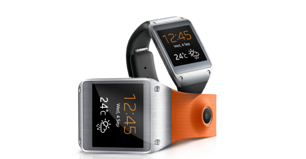
In 2013 the proliferation of self-tracking devices and apps reached a mainstream level, with Fitbit, Fuelband, and the newly revealed Samsung Galaxy Gear. After people flocked to purchase their life monitor they then went on share their daily activity in social feeds. The personal data reminded and encouraged users to engage further in their fitness endeavors.
The fact that people actually adjusted their lives based on the digital feedback of a glorified bracelet was an amazing accomplishment for designers. As we all know, physical behavior change is one of the hardest challenges an experience designer can tackle.
Overall, I think that the personal tracking is a good user experience. It’s made people more aware of themselves and has helped some achieve personal goals. It’s also made more people aware of how to use data. Perhaps in the future it can be used to monitor multiple aspects of a person’s life. I can imagine an app that monitors work life balance, productivity, one that charts a child’s homework versus TV time, and something tied to your vital statistics that could save your life. Now the future isn’t fully rosy here, the red flag being the question of who else has your personal information and what they can do with it but, of course, isn’t that always the fear?
Context-Aware Computing – Thomas Wendt
Academics and practitioners have been working on context-aware computing for about two decades now, but 2013 was the year it became a certifiable “trend.”
From 1994 until 2012-ish, most applications in this area were prototypes and experiments run in academic labs, with people like Gregory Abowd, Anind Dey, Louise Barkhuus, Bill Schilit, Paul Dourish and many others helping define a field of computing based on the utilization of contextual data.
In the past few years, products like Easilydo, Osito, and Tempo started to hit the market. While these products helped to introduce the concept of context-awareness, it wasn’t until the release of Google Now that the promise of delivering the “right information at the right time” began to take shape.
Google Now caused two shifts in the context-aware space by 1) Providing all the right data, and 2) Taking design very seriously. Beyond the interface, context-aware computing calls for a deep examination of user behavior and complex interaction patterns. This blend of data and design is the essence of the context-aware computing trend as it relates to user experience.
Either one of these components on its own can never provide the power of their combination. Data sources give us the material, while good design helps us make meaning and see the connections between components. Smaller companies like Aviate are now taking the cue and designing systems with the right blend of data and design, completely rethinking how users interact with their mobile devices.
The tech pundits are quite optimistic, but the truth is that we’re just seeing the beginning of this trend. We have a lot of work to do as designers: How do we account for something as complex as situational context? What is the “right information at the right time?” What is the line between useful and annoying?
It’s going to take a massive interdisciplinary effort to sort out these questions. Designers and technologists will need to join forces with anthropologists, cognitive scientists, psychologists, sociologists and anyone else involved in designing human-technology relationships.
Internet of Things – Rousi Rebekah
The interconnection of services, user accounts, and devices and the synthesis of everyday low-tech or mundane elements (fridges etc.) with the ubiquitous world of Internet technology reinforces the actuality that we are living inside the Web.
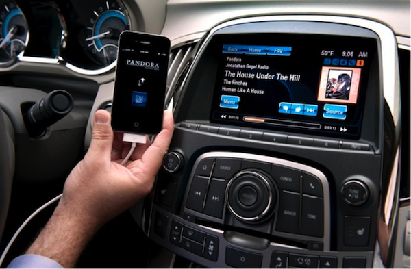
This year, Bluetooth technology facilitated via smartphones has been supporting interactions such as in-vehicle phone conversations and teleconferencing when traveling by car. The same technology is also enabling inexpensive means of controlling things like temperature in the home (smart thermostats), security systems, and even light bulbs.
All of this is good and bad. On the up side, it should make life more convenient: hands on the steering wheel instead of the phone make driving safer, and wondering about the status of appliances in the home (i.e. did I leave the oven on?) may soon be a thing of the past. On the down side, the higher the connectivity, the higher the vulnerability to hacking, fraud, and other security threats. There is also the control issue, and the other practical element of everyone in a vehicle willingly or unwillingly participating in a phone conversation.
The Maturing of the Internet of Things – Lennart Andersson, Director Interaction Design at Veryday
This was the year when the Internet of Things reached new levels of maturity. Sophisticated technology is now small, affordable, energy efficient, smart, and easy to build. On top of this, crowdfunding services like Kickstarter and Indigogo have made life easier for entrepreneurs to test promising ideas and find funding to bring them to the market.
One of the most exciting aspects of all this might be indoor navigation, which brings the capacity to totally change how we interact with things around us by adding a new dimension of contextual and personalized information to everything from car settings to gaming to shopping experiences. Apple—known for making advanced technology accessible for consumers—silently announced iBeacon, which is already functional on millions of mobile devices and can recognize other iOS devices and blustooth signals. Others innovations like Bytelight are jockeying for their share of the market and we’ve hardly even seen the beginning of indoor navigation and where it will lead.
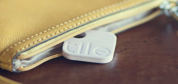
One elegant solution is Tile, which offerings a simple solution to a problem as old as man: lost belongings. These small white tiles attach easily to objects without a connection, like keys or wallets. Tile can then be easily located with your smartphone, should it be lost. However, the smartness is not only about finding things at home, but how a network of users silently can position objects that are truly lost, like a stolen bike. This of course requires a large community to work as intended, but Tile’s overfunded crowdfunding campaign shows how successful Tile has been so far.
In another exciting example, Coin takes on the task of consolidating the numerous credit and gift cards in your wallet into a single smart card: no thicker than one of the cards it replaces. It’s first version address a problem that might be obsolete in a few years (as the IoT continues to mature) but Coin claims to have more aces up their sleeves.
Immaturity in The Year of Things – Steven Hoober
This year I worked even more than usual on products involving sensors, and using Bluetooth or WiFi to connect your phone to other devices. The news was relatively full of neat work in the Internet of Things (IOT) space like this, from the next Nest device, to beacons usable for interior location and transactions, to the first wave of copycats; there are now many Internet-connected lightbulbs to choose from, and every big thermostat maker has a version out there. 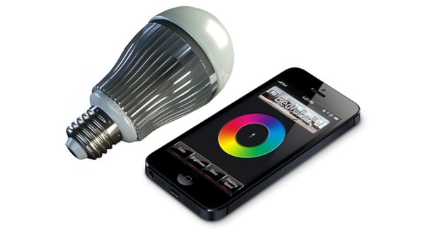
But I am still mostly disappointed by the results, which I see reflected in the low consumer usage of these products. We have the technology, but keep using it in narrow, shortsighted ways. In fact, hardly anything I see is truly Internet connected. The CEO of ARM (the big chip maker) Simon Segars said recently, “Most IoT applications are so narrow, with one device only talking to one service … We need these items to talk to each other more, in order to prevent an internet of silos.”
Rather, you can connect that light bulb to your phone, and more often than not: nothing else. There’s a disappointing lack of vision regarding what “connected” and “Internet” mean. Tying two devices together is neat, and I live by things like my Pebble. But so far most of what we’ve done is replace stupid devices with what are functionally wired to other, smarter devices.
Even when cloud-connected, the cloud is too small. As Liat Ben-Zur said way back in May, “So what’s the problem? Aren’t all these hot new connected IoT devices connected up to the cloud? Well, that’s the problem. We are oversimplifying the landscape. Each specific device seems to connect to its particular cloud service. There isn’t really one cloud. Every manufacturer has their own cloud service, and often these clouds are closed, proprietary environments. Devices that live in their own siloed cloud cannot speak to one another, meaning they cannot benefit from the data, context or control of nearby IoT devices.” It certainly hasn’t gotten better over the last two-thirds of the year.
Smarter Transitions – Himanshu Sareen, CEO of Icreon Tech
Now that 55% of adults own smartphones, everyone seems to be a backseat designer. This makes for an especially discerning audience that expects perfection from digital experiences. In addition, screen resolution and clarity have increased tremendously thanks to high end tablets, smartphones, and laptops. HD and Retina Displays have resulted in users being able to notice any minute imperfection in the aesthetic of a UI design.
Higher quality screen displays and pixel counts have users expecting more fluid interactions with applications and websites. The now common experience of interacting with a highly seamless software like a solid mobile app has set expectations much higher. Heading from a homepage to an inner page should be a visually pleasing experience. Rather than the static transition of clicking a link and watching the webpage reappear in a clunky fashion, web development will continue to take a cue from mobile apps until all transitions begin to feel app-like.
This trend will push web development to stress fluid transitions, and for the most part, it will be ideal for users of high end laptops and PCs. But rendering content in a browser is inherently different than doing the same in a mobile app, so obvious concerns about browser compatibility, and page performance will be key points to note.
New Web Typography – Jason Cranford Teague, UX Lead at Gannett Digital Marketing Services
As important as responsive design and single page design have been, it is typography where the greatest strides were made in 2013, allowing other trends to even be noticed. Imagine single page designs in 12px Arial. 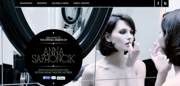
Although the mechanics of web typography haven’t changed a lot in terms of layout possibilities, the wide–scale adaptation of web fonts has made experimentation more worthwhile. Additionally, the trend towards larger more bold type continued in 2013 as designers began to expand their skill set, shaking off almost 20 years of monotonous typography. Take a look at the Nerdery site, Co.Design, and Anna Safroncik’s page for examples of great typography in action.
“My Marketing group wants an iPhone-type experience” – Steve Tengler
Products you would never even think of having touchscreens now have high-fidelity graphical user interfaces being put to alll sorts of uses:
- Hairdryer
- Dancing soda machine
- Vending machine for cellphone case
- Smart watches galore
- DJ Remix board
This has driven down the cost of touchscreens across the board leading to non-traditional products implementing touchscreens to seem up-to-date (10 years ago only cars had touchscreens and only ~10% globally at that).

This trend has been good for the vast majority of the buying public, as it allows easier updates post-launch and enables user-defined languages or interfaces. The trend has been bad for the blind (makes braille essentially impossible and accessibility typically an after-thought) those with epilepsy (flash animations beyond recommended limits) and relations between marketing and engineering. Typically marketing wants a $500 bill of material experience whereas engineering has to meet the $25 allowable piece cost.
The trend will likely for quite a while because it permits reskinning and updating without the cost of rebuilding the entire platform.
Experience Driven UX – Gaurishankar Krishnan, Director of User Experience at Roundarch Isobar
As we head into 2014, a trend that we’re seeing in the world of user experience is the move away from a Web 2.0 model based on simplifying tasks and getting users from point A to B as quickly as possible, to a model of serendipitous experiences based on location, context, and intent. This change is exacerbated by the evolving way people interact with technology, and how our behavior is changing at a much faster pace than two years ago.
This is creating tension wherein rigid UX processes are resulting in products that are outdated before they even come to market. Lean/agile UX shows a lot of promise, but is unrealistic given most companies’ structures that are built around a two-year production cycle. Hopefully a hybrid approach to UX in will emerge in 2014 that is adaptive based on user data, but works within the framework companies need to ship digital products. An adaptive approach to UX will also mean that products have a longer shelf life, as incremental upgrades can keep a product feeling relevant and avoid twice yearly sweeping redesigns.
Content Curating – Beth Lingard, AnswerLab
We’re living with information overload and users are increasingly seeking out ways to curate content. With platforms such as Twitter, Blogs, Youtube, and more that give everyone a voice, there’s more and more content for people to sift through, discover and validate.
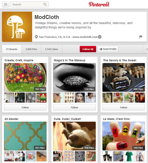
We’ve already seen an increase in products that help people find articles or products of interest, such as Pinterest, Twitter, Zite, Flipboard, and Indeedly. While conducting ethnographies across multiple industries, we’ve seen people curate their own meaningful feeds of products, services, or information using these tools. Now we’re starting to see companies create meaningful curated collections or tools that help customers curate their own collection into their existing products. Features on e-commerce stores such as ModCloth’s Style Gallery or Etsy’s Community Tastemakers are great examples. We’re even seeing tools for curating financial investment education and news.
With more information, products, and services becoming available and users having less time to interact with all of them, this trend helps people find the latest products, services, or information that matters to them, quickly.
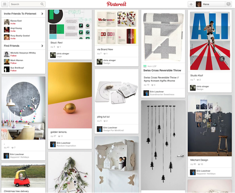
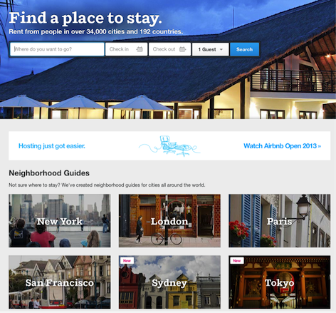
Pinterestization – Hana Schank
This year, we saw a trend that started to take hold late in 2012 with the rise of Pinterest spiral out of control—namely that a good chunk of the web started to look like Pinterest, with blocky images replacing content and navigation shunted to the side.
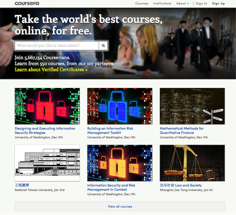
Many smaller sites, like foodgawker, just use Pinterest’s UI wholesale. Others, like Coursera and Airbnb, keep the general Pinterest vibe without including Pinterest-like functionality.
On the plus side, these sites are pretty to look at. In cases where the overall aim of the site is to surface visual elements and allow you to browse using large, clearly representative pictures, this interface works great. Unfortunately a lot of people seem to have looked at Pinterest and thought, “I’ll take one of those!” They then applied the design to their site without giving much thought to whether a highly visual site made sense for their content.

Coursera, for example, attempts to create a visual representation of one of the least visual things out there: people taking an online course. Not surprisingly the site ends up defaulting to lots of stock photography and repetitive imagery before giving up all together on a visual interface once you move off of the home page.
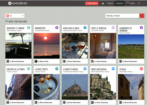
Everplaces, another site using the Pinterest interface, is so faithful to the Pinterest way of life that the site ends up having nothing to do with the way people actually plan travel. How many destinations have you been sold on due to a pretty picture of the corner of a building?
Aibnb, on the other hand, has managed to apply the interface in a way that gets users excited about their assorted destinations while still retaining functionality that is relevant to users wishing to book rentals.
My hunch is that we’ll look back in a few years and wonder why so many interfaces were a group of pictures in boxes. Here’s hoping that this trend is on its way out.
Mobile-First Interfaces – Andrés Max of Ideaware
With an outstanding adoption of mobile devices worldwide, it’s only natural for companies to start considering a mobile strategy for their services and apps. Most of the work we did at Ideaware in 2013 was mobile-first. By building an interface that’s not only responsive, but also mobile-first you cater your service to a wide range of users. In our opinion, companies benefit from the fact that they maintain one code base for an app that works in a world of devices. As long as we still use tablets and smartphones, this trend has staying power.
Flat Design – Nick Cawthon
Ever-trending towards a minimalist zen, Google was the first to implement flatness on a wide scale. Following not far behind and hoping to hit a home run with iOS 7, Apple bungled it’s implementation, but still everyone copied them both anyway. 
It takes a subtle hand to implement flatness without sacrificing usability, as square, plain elements blend into the background—a note of caution when considering implementing flat design on essential interface elements such as buttons and controls.
A New Member of the C-Suite – Shep Hyken, customer service expert and New York Times bestselling author
Customer experience continues to evolve beyond customer service. Over the past few years, customer experience was thought to be a fancy term for customer service. No longer. Companies have been recognizing it as much more: the total engagement the customer has with the company. It’s become so important that more and more companies are announcing the hiring or promotion of a person into the C-Suite with the title Chief Experience Officer.
Beaconing – THE MEME
In 2013 smartphone users began to use their high-tech devices in a decidedly archaic fashion, not as an information interface, but as a light beacon transmitting rudimentary signals across distances too fine-grained for GPS. People have been pushing up their cel phones instead of lighters at concerts since the early 2000s, but the expressive and communicative potentials of the glowing mobile screen have only recently gained social nuance, particularly in relation to new location-based forums for dating, gaming, and commerce.
![]()
When an Uber driver in an unmarked car approaches a busy intersection to pick up the passenger who summoned her, holding a glowing smartphone face-out has become the de facto signal for confirming engagement. Likewise, team members coordinating movement through real-world space of Google’s augmented reality game Ingress also flash their smartphones to coordinate location. In 2014 we see location-based applications nurturing their communities’ nascent signaling behaviors as well as developing new service features based on emitting and sensing patterns of light.