With all of its potential difficulties, the task of installing a new thermostat is usually something people have to hire an electrician to do.
Shutting off the electricity, pulling wires apart, drilling dainty holes into drywall, and calibrating the new device are easy things to muck up.
Nest—a thoroughly modern-looking thermostat that learns your schedule and programs itself—cuts the specialist out of the process thanks to some very well-crafted unboxing and installation UX.
Team UX Mag recently had the opportunity to install one, and from the outset the experience was welcoming. The packaging was attractive and high quality and it was clear that it had been carefully designed—a first impression that set the tone for the rest of the unboxing experience.
The attention to detail present in the design of the total packaging, unboxing, and installation experience of Nest inspires awe. Even the most minute detail feels carefully designed to be easy to accomplish with just a screwdriver (which is included).
A simple but telling example of this level of deliberation is in the bit of adhesive plastic used to seal the box. Usually these are stuck fast and have to be cut with a knife or picked away with a fingernails. The one on the Nest box, however, had a small blue tab that made it easy to pull and peel off:
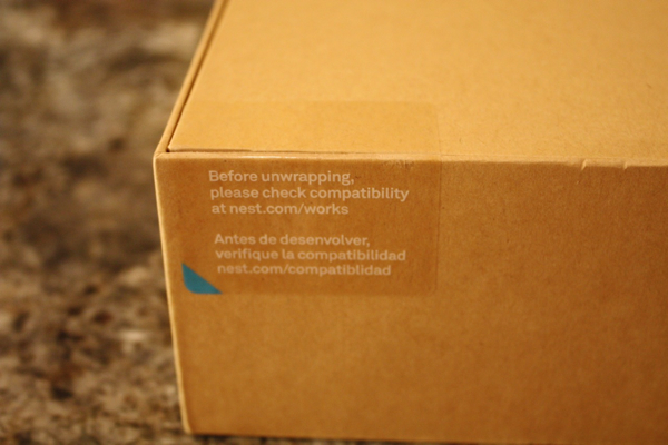
This might seem like a minor detail to focus on, but it’s a clear indication of the care the package designers took. It costs extra money to print a blue tab and leave the adhesive off part of a piece of plastic, and Nest was willing to spend that extra money to ensure the experience of opening the box is easy, pleasant, and tool-free.
Inside the box a benign silver Cyclops stared up at us, looking eager to flicker to life. The bold simplicity suggested things would be easy-going.
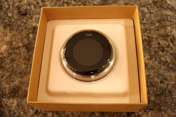
In fact, everything in the box presented itself in a way that was tidy and purposeful—once again beautifully servicing the notion that this was to be in no way an intimidating experience. The tools supplied for our campaign were a modern white and did not overwhelm, making less daunting to flip off the electricity and dig in.
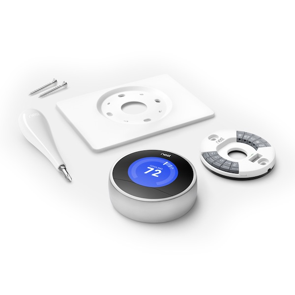
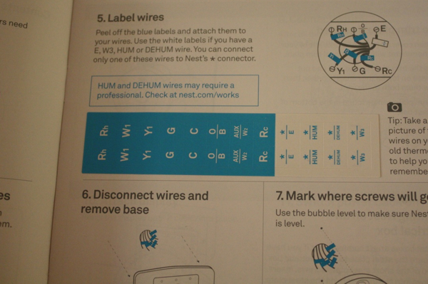
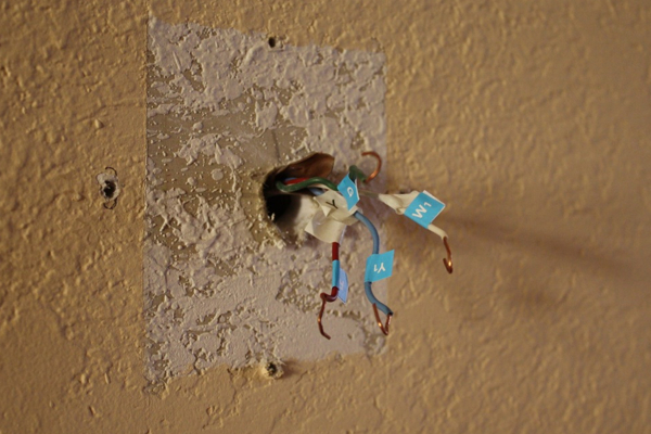
One of the first and potentially most overwhelming complexities you encounter while installing the Nest is removing the old thermostat and discovering a jungle of small wires—as many as 12 depending how your system is set up. Each of these wires is attached to a port on the old thermostat that’s labeled with letter codes such as “R,” “W,” Y,” and “G” that are meaningless to a non-professional.
No printing expense spared, the slim installation manual contains little labels in the form of adhesive flags for wrapping around the wires as you untwist them from the old thermostat. The wires we found behind our old thermostat were already tagged, but this method of keeping them straight was very easy to follow and made what could have easily been the most formidable aspect of the installation a cakewalk.
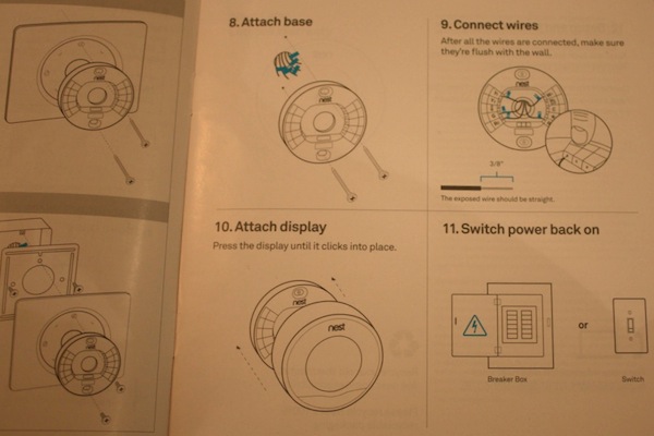
For added ease, the mounting plate can be made to fit the existing holes left behind by most old-guard thermostats, but Nest looks best hovering alone against the paint. After feeding the wires through the baseplate, marking two new holes was a cinch using the teeny level built into the disc.
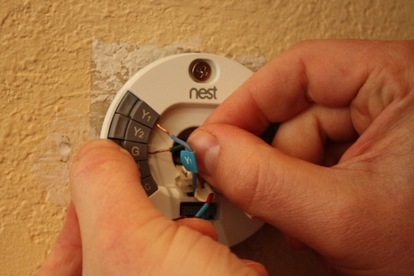
Connecting the wires was easy: following the comfortingly Scandinavian instructions we matched the little flags on the wires to their corresponding ports. Mounting the thermostat onto the baseplate was as simple as plugging it into a micro USB port.
There are few frustrations as acute as thinking you’ve hooked up a piece of electrical equipment correctly only to plug it in and see no reaction. With their finely attuned unboxing process, Nest seems to have all but obliterated this dour possibility.
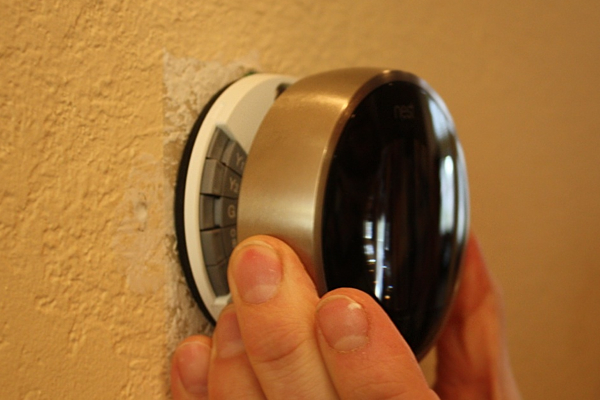
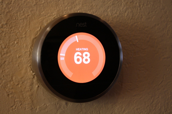
Once the power was back on, we were quickly basking in the glow of the circular screen—a thrilling affirmation of the prowess the designers had so subtly lent us.
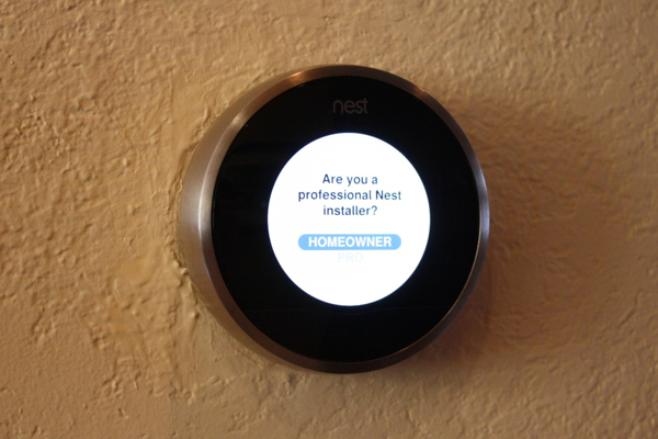
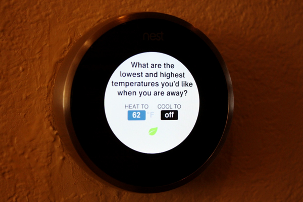
The intuitive nature of Nest’s interface is harmonious with the unboxing process: the screen poses basic questions about your preferred temperature and your schedule. We were eager to provide answers, because if you tell it everything it needs to know, Nest can lower your heating and cooling bills up to 20%.
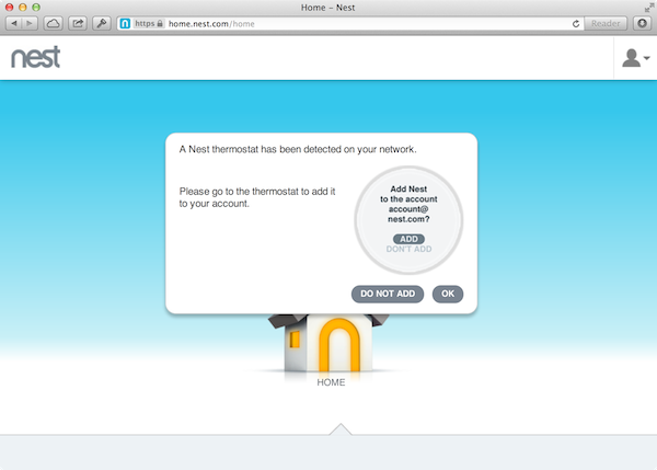
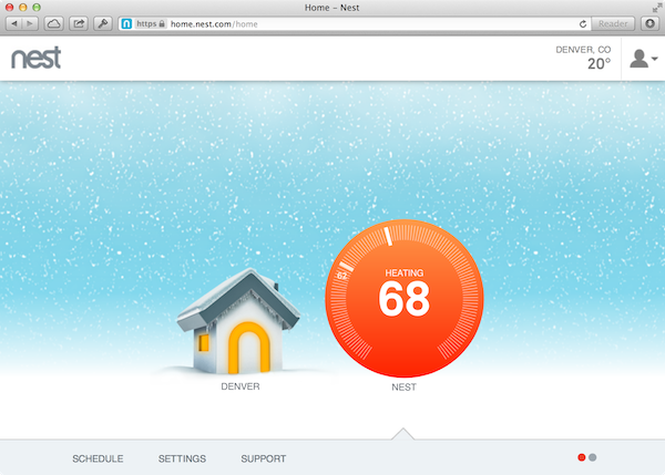
Creating an account online was simple as well, and adding our thermostat gave us direct control of the device from a smartphone: a new experience that made us feel more connected to our “home” than ever before, and one that also felt like an extension of the theme of empowerment that seems central to the ethos of Nest’s unboxing and installation experience.
Now that it’s up an running, we’ve noticed that it’s easy to catch ourselves staring at Nest for long moments, marveling as it makes the wall look positively SciFi.
The bigger reason we find ourselves gazing at Nest is that seeing the new thermostat at work reminds us of an experience that was designed to reward us with empowerment at every turn.