Save
Steve Krug famously said, “Don’t make me think.” This statement is simple, profound, and especially true in the case of mobile interfaces. With smaller screen real estate, increased app fatigue, and decreased user adoption rates, there has never been a better time to revisit these words.
The key to keeping apps ticking, alive, and successful is captured right in that statement. Create an intuitive user experience; don’t make the user think.
User experience is the art of weaving together context, design, ease of use, uniformity, context, relevance, and consistency. On mobile, this experience is what sets apart the successful apps from the rest. Every interaction that the user has with the app turns into an opportunity to be seized to turn it into a deeper, longer relationship. This can be accomplished in two ways:
- Through colors, design, and typography—the purely visual end of the user experience spectrum. Designers can use these elements to create visual continuity, pleasing interfaces, readability, and functionality.
- Another equally important and oft-overlooked aspect is controlling the front end of mobile apps (the mobile UI, screen layouts, and elements) from a back-end (such as the server or Content Management System or Web application). This philosophy makes it so that screens can be built at runtime allowing them to be either data or user driven.
Reams of digital paper have been written on achieving user experience through purely visual elements. Let us delve a little deeper into the latter approach.
The Over-Arching Process
- The back-end, be it the server or CMS first identifies the context.
- Depending on context, this back-end generates screen element information and selects the content to be displayed in the app.
- This information about the screen elements and content is sent to the front end, which is the mobile app.
- The mobile app renders the screen accordingly.
What Impact Will this Have on Users?
A superior and more convenient user experience. Period.
By getting rid of screen widgets that are not needed for a particular kind of user or a kind of data, we can offer users an uncluttered app interface. We can re-use the same screens for different use cases. We can make the application scale automatically and enhance functionality without having to deploy new code.
Getting rid of screen widgets that are not needed … can offer users an uncluttered app interface
Check out a few real world contextual usage scenarios:
Context 1: Users
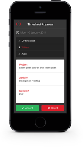
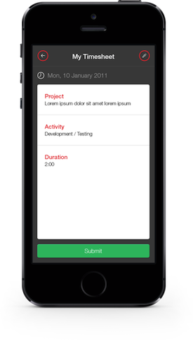
Identify user groups based on login and display screens accordingly. Let’s take the example of an enterprise iPhone app being used by employees of a company to fill in timesheets.
- Upon login, an employee views just his or her timesheet and has the option to fill in the fields with hours spent and project worked on before submitting it.
- If the user is a senior manager, however, upon login, his or her screen would show his or her own timesheet and additional links or buttons to see the timesheets of team members and approve them.
- The back-end identifies not just that this user is a manager but also the employees that are in his or her team, allowing access to only their timesheets.
- For managers, the screen could also throw up a dashboard for analysis such as a chart of employees vs. time spent on work.
Context 2: Data
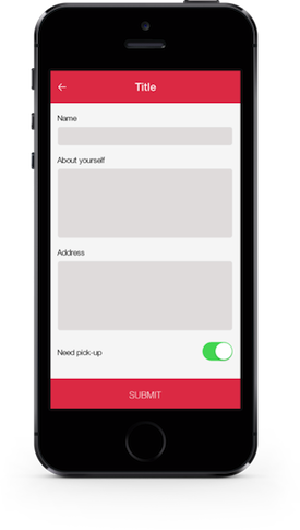
Identify the data structure and display content accordingly. Let’s take the example of a mobile app that requires users to fill a form with different fields.
- The back-end application can be built in such a way that it allows for fields to be added with names and their types. For example, Name would show up with a text field, whereas a “need pick-up” option would show up with a toggle switch with “yes” or “no” options.
- If we take another case where the data type is a list, this is identified and sent to the mobile app along with the list contents. The app will then display a widget that can hold a list.
- The fields can also be reordered exactly the way the mobile app has to display them.
- When the business requirement changes to show new fields in this form or to hide this form altogether from the mobile app, it can easily be accomplished using the database or a content management application.
Context 3: Input Fields
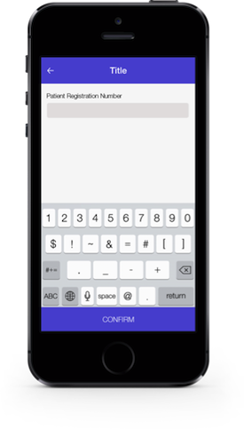
Identify the input field and display appropriate attribute field. For example, an admin user uses a CMS to create a form for patients to fill up in their mobile app.
- This user can create a field “Registration Number,” which is a text field, and specify its attribute as “numeric input.”
- Accordingly, in the mobile app, that form displays a text field that shows up with a numeric keypad when user tries to enter information.
Context 4: Geo Location
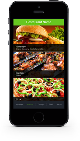
For this example, a mall has an app that visitors have downloaded.
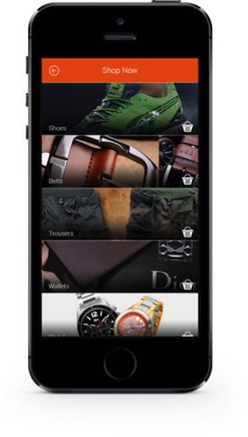
- As they move around, visitors will see trending offers and coupons on their screens related to the stalls they are closest to.
- Also, depending on where they are, they see screens getting refreshed with relevant content. So, if they were close to an apparel store, the UI would be a product catalog whereas if they were near a restaurant, they would see a menu listing.
Context 5: Operating System
For cross-platform apps, this could be a real boon.
- The app could show iOS style buttons if the device is detected as an iPhone or hide the “back” buttons if it is an Android phone that has the device “back” option built in.
- The true advantage lies in retaining the native feel even with cross-platform or web-based apps.
Context 6: Screen Resolution
Let us take the example of an app that has images coming into the app via web services.
- The exact number of images would be known only at runtime, so a single image will have to be shown and centralized on the screen, but multiple images would require an image gallery.
- Similarly, large devices can show a grid of thumbnail images and allow users to pick one to see full screen view. For small devices, the grid would not work because each thumbnail is too small for the user to make out anything.
- So, the best UI would be to use a carousel or a horizontally scrolling set of images for the user to browse through the entire set. Another option would be to have the same grid style, but bigger-sized boxes in it.

Dissecting the Pros and Cons
The advantages that this approach offers designers and users vary from more innate user interactions to reduced code deployments. Specifically:
- Reduced number of screens in the application
- Reduced number of clicks to get to a feature/functionality
- Gets rid of unwanted screen elements making for a cleaner UI
- Enhances user experience by keeping content contextual to user/data
- Retains flexibility to introduce new screens or new screen elements by giving a few user controls in the back-end system, which also allows for scalability
- Reduced need to deploy new code on the web/mobile application each time you want the screen to look different—especially true with mobile apps, where every code change will need a new version of the app to be uploaded on to the app store
- Give clients the power of self-styling their screens
- Render widgets according to the OS, browser and screen resolution of the device
That said, there are a few data points to abide by:
- Stay away from introducing unnecessary complexity
- Try not to integrate unnecessary logic into the screen-building, keeping in mind that since this happens at runtime, you don’t want screens to take ages to load (Take the case of inheritance of widgets: if widget A is present show widget B with X content else if widget A is absent, show widget C with Y content—avoid this kind of logic if not really necessary)
- Use intelligent data structuring—building web response templates in a way that the mobile app can easily use means processing time on the mobile device can be kept at a minimum
- Use this approach only in cases where it makes sense to do so—there’s no need to follow this approach of building screens dynamically at runtime if: functionality can be easily achieved by controlling it at the front end; functionality can be easily achieved by hard-coding the screen layout; there are not too many varying contexts in the scope of the application
Conclusion
When the goal is an app that delights and engages, user experience is the key—this is a universally acknowledged truth. But, with mobile apps, decoding user scenarios and coding your app accordingly will surely get you on the path to a longer user commitment.
Illustration of smartphone coutesy Shutterstock.
- Analytics and Tracking, Android, Apple iOS, Business Value and ROI, Content and Copy, Customer Experience, Design, Design Tools and Software, Development, Flow and Immersion, Information Design and Architecture, Input devices, Interaction Design, Interface and Navigation Design, iPad, iPhone, Location-Based Services, Mobile Applications, Mobile Technology, New and Emerging Technologies, Product design, Strategy, Tablet, Technology, Touch, Usability, User Adoption, Visual Design
Nithin Rao is the President at Boston Technology Corporation, a custom mobile and Web application development firm. The role he truly relishes, however, is that of Chief Experience Officer. With expertise in interaction design and usability, his focus is on getting his team to deliver a winning user experience with every app. Every pixel matters and no detail is too small to him in his quest for creating apps, that users love coming back to.


