
From a design standpoint, we’re starting to think of apps more as interactive experiences and less as passive objects. This shift in mindset can largely be attributed to Apple’s iOS 7 overhaul, which emphasizes physics-driven animations. Since then, we’ve seen a slew of interesting animations work their way into some of the most popular apps.
With all the exciting motion UI elements out there, it’s easy to get caught up in the fun, while forgetting about the opportunity costs. On the other hand, spending the extra time on the right animations, for the right reasons, can increase usability, help define your brand’s personality, and create delight. In this post, we’ll examine animations and interactions implemented with purpose and consider whether they make sense for your brand.
Usability
For some apps, interactivity is a core component of the flow. In these instances, interactions guide users through the experience, keeping them oriented and contextually aware of their place in the app.
One of my favorite examples is in the Pinterest iPhone app. Using swipe gestures, users can swipe through pins and collections. The inclusion of this interactivity helps users navigate the app in a less cumbersome manner.
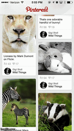
Swipe down to return.
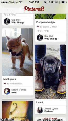
Swipe left to continue in feed.
Swipe up for new feed
Circa App
Another app that does a great job of providing context through the use of interactivity is Circa, a news app that tracks stories you’ve followed, giving you periodic updates as they become available. A scrolling animation acts as a sort of visual timeline, with a dot denoting each new development in a story.
In both examples, the animations aren’t just frivolous inclusions. They actually provide real value to the app and its usability.
Personality
For other apps, interactions act as a way to communicate distinct brand characteristics and aid in users’ understanding of your brand. In this case, animations are a part of the branding exercise. Is your brand playful or serious? Robotic or bubbly? Choosing the proper animations will heighten users’ understanding of—and connection with—your brand.
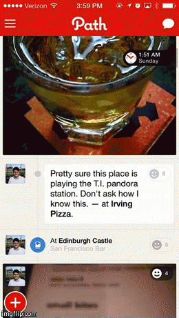
Path & Tumblr
For Path, mobile is their only platform. By limiting users’ experience with their brand to this one context, they really have an advantage when it comes to using interactions to help define what Path is all about. Following suit, their animations are approachable and playful.
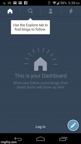
Tumblr’s Android app has also been experimenting with this playful feel.
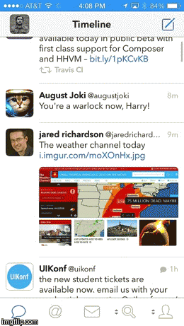
Tweetbot
Tweetbot is another app that uses distinct animations to communicate something relevant about their brand. Compared to Path and Tumblr, the Tweetbot app feels snappy and mechanical.
@Tweetbot’s animations contribute to the sense that the app is a robot and give it unique character
These animations contribute to the sense that the app is a robot and give the app unique character.
Delight
Other times apps include motion UI elements because they’re—for lack of a better word—fun. However, the amount of time put into designing and implementing these catchy animations can be a huge expense. Because of this, you will rarely see cash-strapped startups include these animations and interactivity. Overall, animations that fall into this category are going for the awe factor over the purpose factor.
Flickr
If you flip through the introductions screens of the Flickr app you probably won’t notice anything special initially. Slow down, and you’ll see that a lot of thought went into how the images animate. A combination of parallax layers and clever masking allows the drawing to transition in and out with a very illustrative quality as seen in the GIF below.
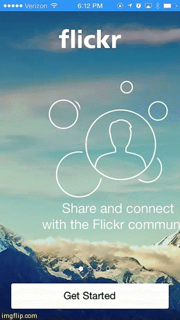
While it’s certainly a nifty little animation that caught our attention, it doesn’t make the most business sense for startups concerned with maximizing limited resources. Flickr is way past the initial funding phase and has the time and money to devote to dazzling end users with thoughtful details.
Conclusion
Striking a balance between creating a heightened user experience and acknowledging business constraints will ultimately determine the success of your app in the long run. Be mindful of why you are using an animation or interaction in your app before devoting precious resources to it. Do this by asking yourself if an animation is for usability, personality, or delight. If it doesn’t naturally fit into at least one of those categories, it’s probably not worth the effort.
For more motion UI design resources check out this post from BeyondKinetic.
Illustration of mobile gestures courtesy of Shutterstock.


