You can now build an elegant, fun, clickable user experience in minutes for your product without any specialized knowledge of design, using AI. In this article, we’ll show you how. We’ll share step-by-step instructions that leverage v0.dev to transform ideas into a working frontend 100 times faster than traditional coding. We’ll also create a design system and critical product management assets that will aid in maintaining a cohesive experience beyond our initial prompts.
Zero to UI in five minutes
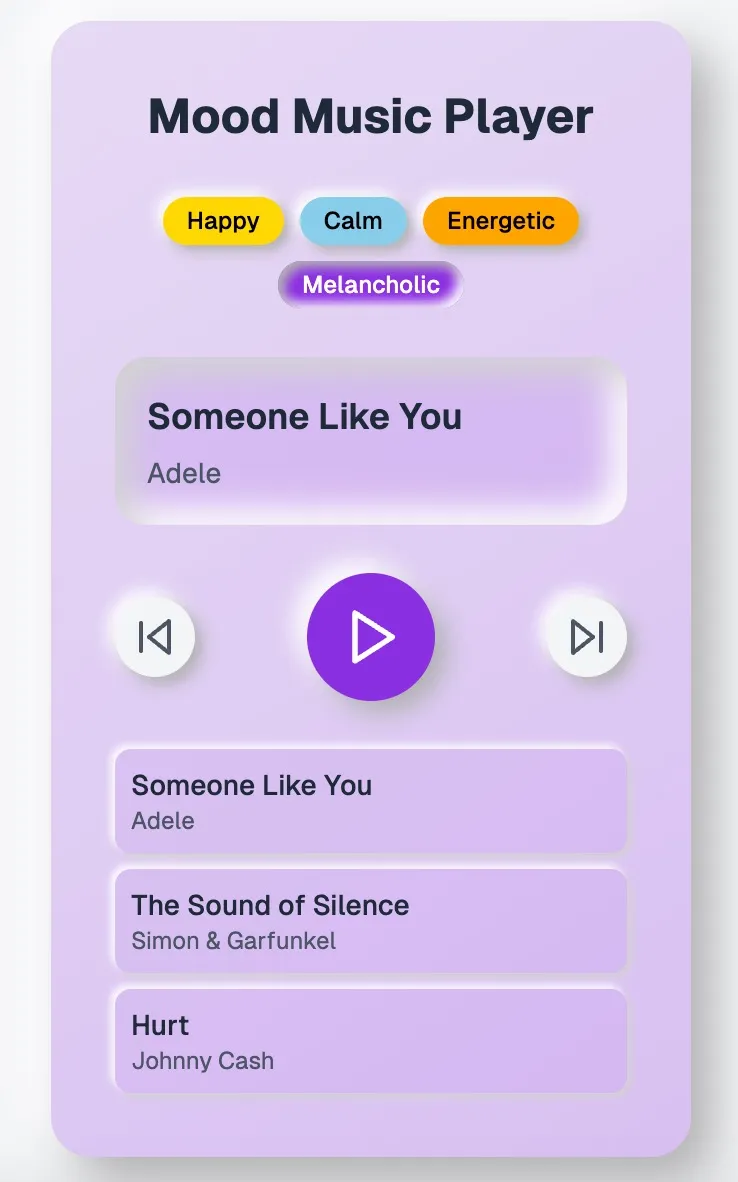
Before diving into a full project, let’s get something working quickly to feel the rush of rapid development. Visit v0.dev and try this simple prompt: “You are a principal UX designer. Make a music player that changes its interface and playlist based on the user’s mood selection. Use a neomorphic design motif. Give one interface element a vibrant color to provide a visual focus. Make sure the color changes based on the selected mood.”
Just like that, you’ll see a working React component appear in the preview window, complete with Tailwind CSS styling and responsive design. While it might need refinement, you’ve just created a functional UI, using a very trendy design motif called “neomorphic” with some simple controls for creating an emotional connection with your user. All of this in seconds rather than days. Export the code, integrate it into your project, and congratulations — you’re already a design creator!
Now that we’ve gone through a warm-up, let’s hop into our main topic of using AI-first design principles to not only create a functional UI but accelerate the product & design scaling process.
The product development flow
We can jump straight into asking for what we want, but we urge a little patience up front. Instead of presupposing that our implementation will be best, let’s first brainstorm with the AI. For this post, we’re going to build a productivity tool called a Pomodoro timer and we’ll also give it some task management features to spice things up a bit. Instead of trying to enumerate everything ourselves, we can hand off the challenge to AI by asking it to specify a PRD (product requirements document) for our challenge:
Prompt: “Help me write a PRD: Pomodoro Timer with Task Management.” (Try ChatGPT, or if you’re really ambitious, try ChatPRD.)
Below is an extract from the full response, and it reveals several key user needs we might not have thought of.
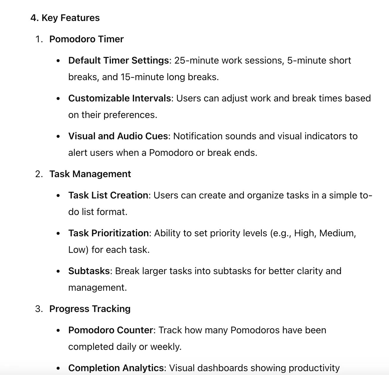
This systematic prompting approach helped specify a full set of features that could work in the wild. Now let’s set up our initial design system so that v0’s outputs remain consistent from iteration to iteration.
Systematizing the design
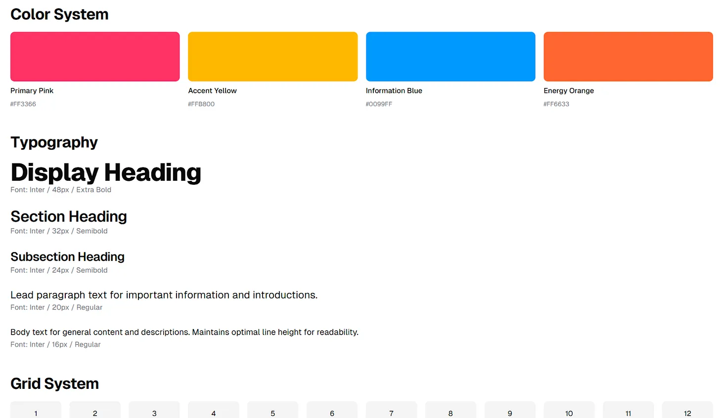
While v0 generally creates a consistent design with minimal direction, as the UI grows more complex and spans multiple screens, inconsistencies begin to pop up. Just like with human teams, having a design system in place can protect consistency as we scale our UX. Luckily, v0 can generate design systems from either an image or prompts. For this example, we created an image in Midjourney (you could also use ChatGPT and ask for an image) that keeps with the theme of time efficiency to align with our Pomodoro timer app.
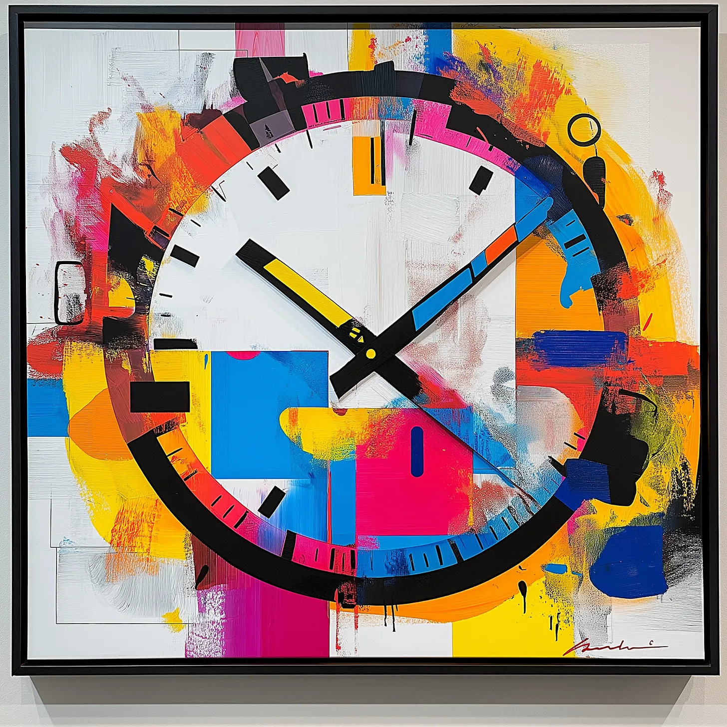
Here’s a quick prompt that should yield a design system. Make sure to upload the reference image above (or the one you create!) first.
Prompt: “You are a principal UX designer with deep knowledge and experience, especially with design systems. Using the image as inspiration, create a design system. Make sure to include items such as colors, font hierarchy, button states, and a grid system.”
Response:
Now that we have a design system, let’s get to creating the first version of the Pomodoro timer using v0.
Time management with a twist
App stores have dozens of Pomodoro timer applications, so let’s see if AI can make ours stand out a bit by making something a little unexpected for our initial build. Also, let’s make sure we put our job story document and design system to good use with the following prompt.
Prompt: “You are still a principal UX designer. Using the job stories document as a reference for what to make, and the design system for how it should look, make a Pomodoro timer with a task manager. Also, add in one unexpected and fun feature. Make sure the feature is on theme with time management, but it’s your choice to make it about helping with time management or make it harder.” (Make sure you have included the documents if they are not already a part of your chat with v0)
Response:
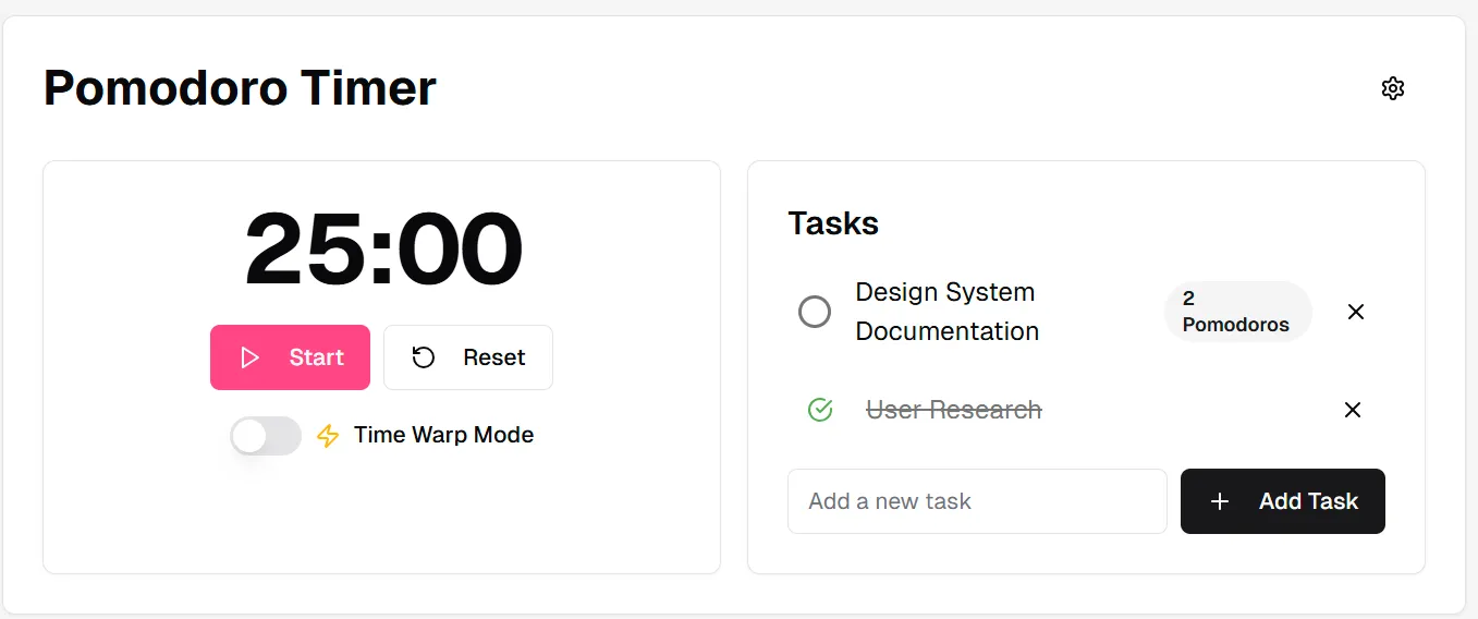
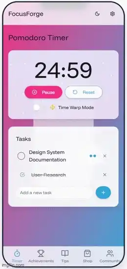
In response to that prompt, we get an okay-looking Pomodoro timer and task manager, along with a surprise feature called a “time warp.” v0 describes the time warp feature as:
- “When enabled, the Time Warp Mode adds an element of unpredictability to time management.
- It randomly alters the perceived passage of time by applying a random factor (between 0.5 and 2.5) to each second.
- This can make time feel like it’s moving faster or slower, adding a playful challenge to the user’s time management skills.
- The feature is toggled using a switch component, accompanied by a lightning bolt icon to represent its dynamic nature.”
However, there are a couple of issues with the design, which could probably exhibit more sophistication, and this app feels like it should be for mobile instead of desktop. Here are a couple of prompts to refine the design:
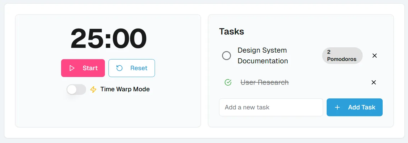
Prompt: “It looks like the design system might be missing colors for background fills for items such as the home container, header, etc. Add those items to the design system, then apply them to the Pomodoro timer.”
Response:
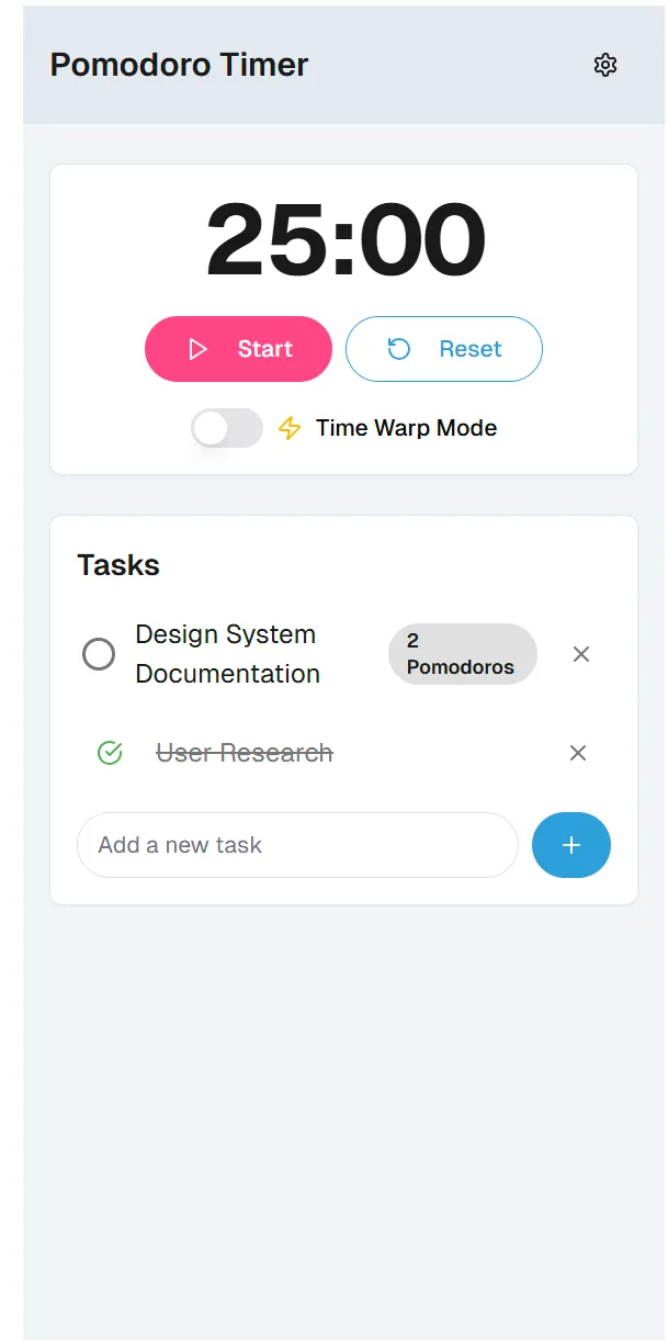
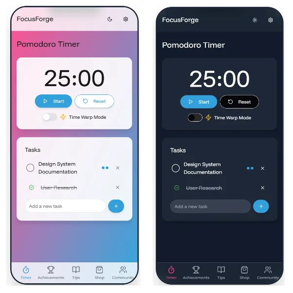
Prompt: “Redo the proportions so that the application mimics an iOS app on an iPhone 15 display size.”
Response:
However, it still looks rather drab; let’s kick up the colors.
Prompt: “The design has a lot of gray in it. What can I do to liven it up?”
Response:

It’s worth noting that, without prompting, v0 made the design decision to add a dark mode to the interface when transitioned to a mobile form factor. There are some little issues — such as the “Reset” button having a white label, so it looks like it disappeared — however, it’s not bad considering we didn’t ask for it. This exposes the level of agency and pattern recognition that v0 engages with to make design decisions.
Before we move on, let’s troubleshoot the reset button label.
Prompt: “Why can’t I see the icon and label of the ‘reset’ button when the app is in dark mode? Fix it.”
Response:
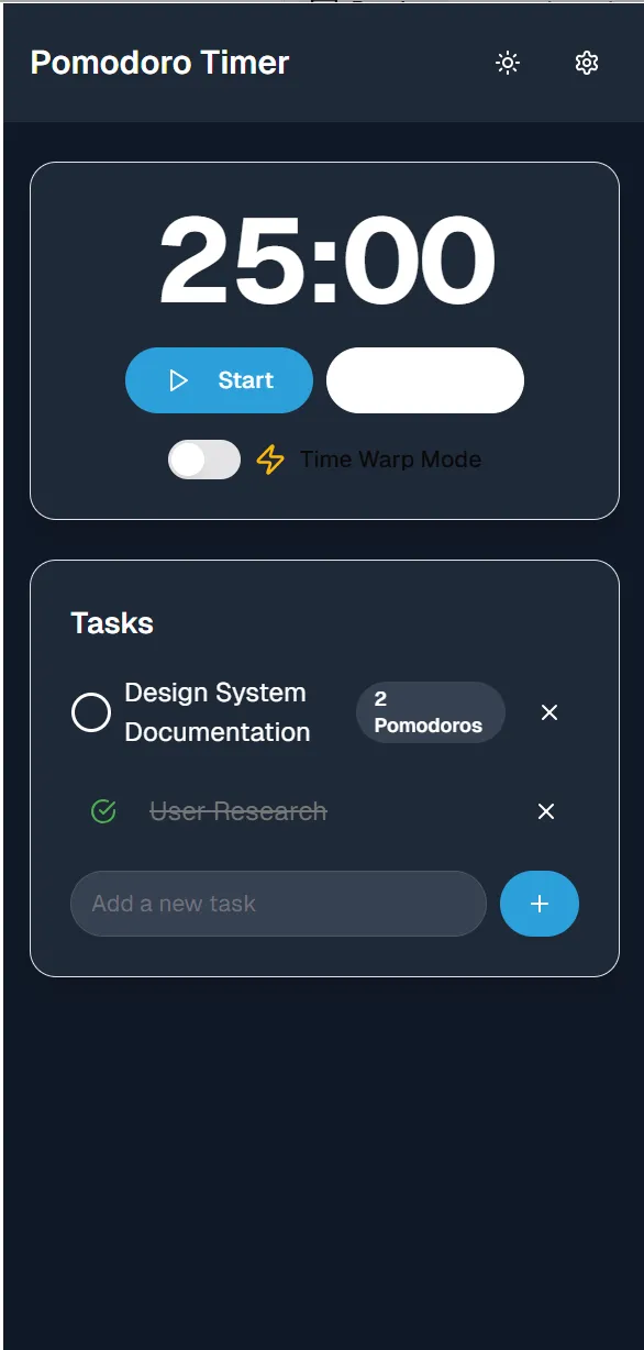
Well, that didn’t fix it. Sometimes you have to ask v0 several times to fix an interface issue before it succeeds. We tried three more times and failed. However, we have a prompt chain that has fixed previously sticky bugs before that we’re going to share with you now. It’s a chain that’s designed to slow v0 and take comprehensive actions.
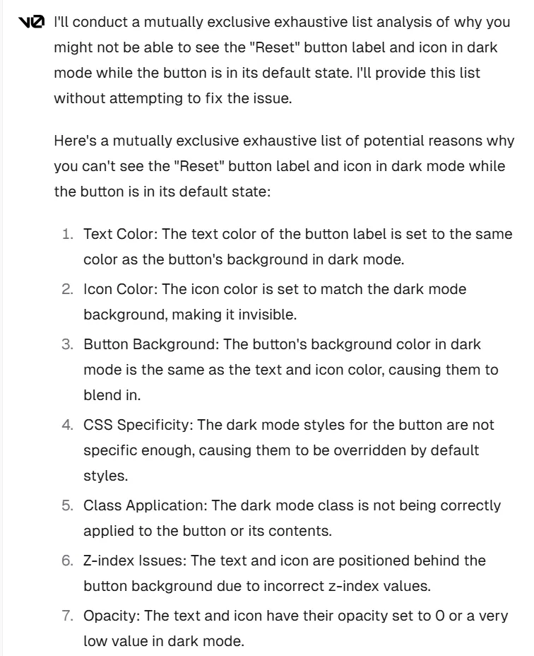
Prompt: “I still can’t see the “reset” button label and icon in dark mode while the button is in default mode. Conduct a mutually exclusive, collectively exhaustive (MECE) list analysis of why I cannot see the button content. Do not attempt to fix it. Just provide me with the list.”
Response (only partial response shown due to length):
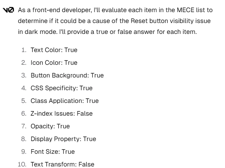
Prompt: “You are a front-end developer. Check the reset button issue against the MECE list to determine if each item in the list could be a cause of the issue. Provide an answer of true or false for each MECE item, with ‘true’ meaning the item could be the cause of the issue and ‘false’ meaning that it is not a cause of the issue.”
Response (only partial response shown due to length):
Prompt: “Based on your MECE analysis, fix the reset button label and icon to make it visible in default state while in dark mode.”
Response:
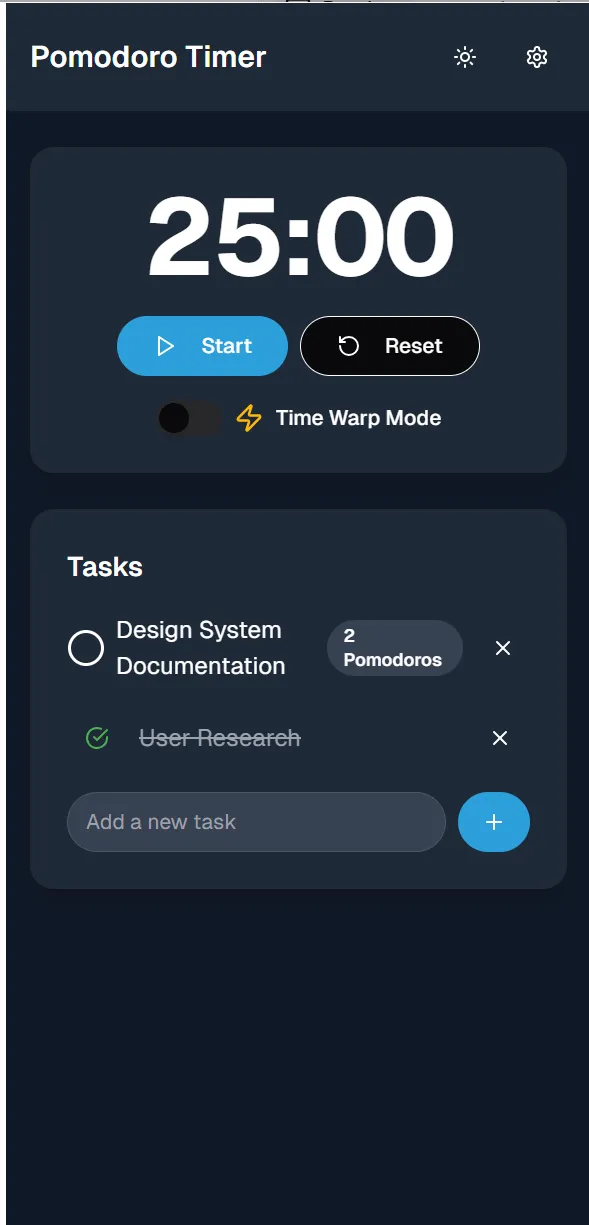
There we go. One MECE analysis later and the label is fixed. While we haven’t conducted a rigorous study on the effectiveness of the MECE approach, we have used it repeatedly to debug UX when the AI gets stuck, and it works more often than not.
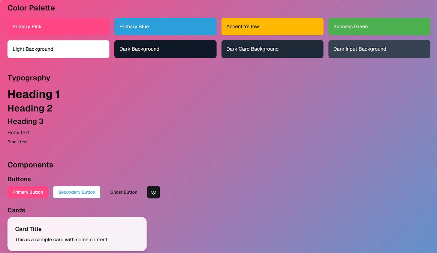
With the bug fixed and the visual refinements in place, we need to make sure that our design system stays up to date, enabling consistency across the UX as we build out new features. Let’s update the design system (notice that the colors have not only been updated but that v0 added the elements for the dark mode and new core components, such as cards):
Prompt: “Based on all the changes you just made, update the design system to match.”
Expanding the feature set
So far, we have two features on a single page — the Pomodoro timer and the task manager. Let’s see how we can use v0 to expand the app. One challenge that occurs in human teams when adding new features is what’s often called “franken-tech.” Franken-tech refers to when product teams tack on features over time that feel like they don’t go together, creating a less cohesive experience. We’ll use v0 to avoid the franken-tech effect by doing a quick two-prompt exercise of:
- Asking v0 to brainstorm 20 feature ideas that could go into the app with the Pomodoro timer.
- Organizing those features into four or five subsets based on themes.
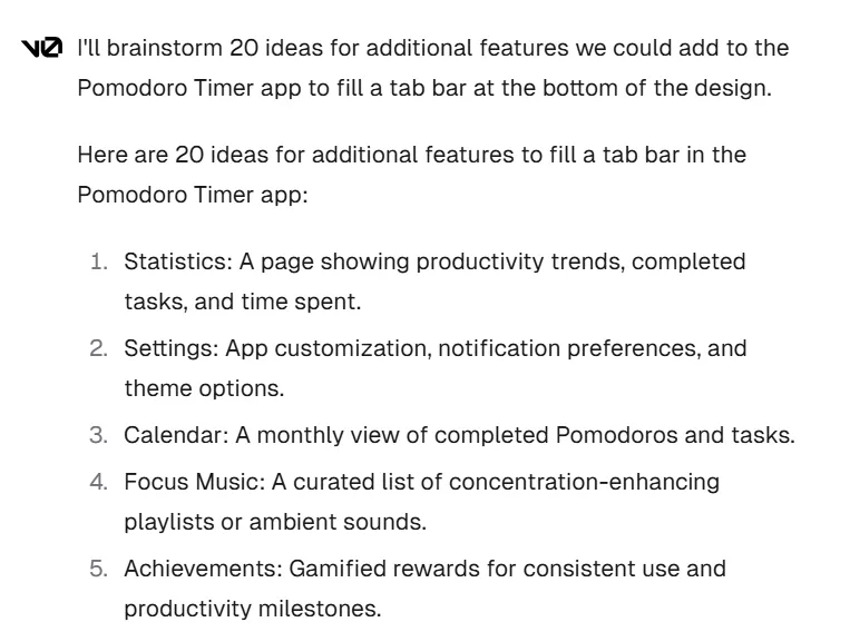
Prompt: “The bottom of the design looks empty. I want to add a tab bar. What are some additional features we could add to the app to fill the tab bar? Brainstorm 20 ideas.”
Response (partial response shown due to length):
Prompt: “Organize the 20 ideas you gave into four to five feature sets that make sense to bundle together. Provide a rationale for why you’ve bundled them the way you have.”
Response (partial response shown due to length):
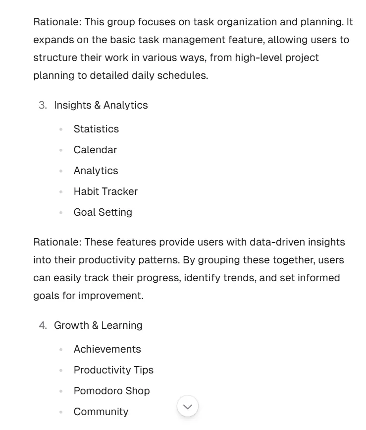
v0 grouped the 20 ideas into five bundles, two of which we show above. We’re big fans of personal development, so let’s select Group 4, “Growth & Learning.” As with the Pomodoro timer and task manager feature, we use v0 to create job story documents to build the UI from. Fast-forward a few prompts, and we have our user stories in place for future development. However, to give this UI a sense of completion, we’ll add a tab bar with icon buttons to access these future pages.
Prompt: “Let’s use number 4, growth and learning. Create a tab bar that contains icons and labels for the four features plus the timer feature.”
Response:
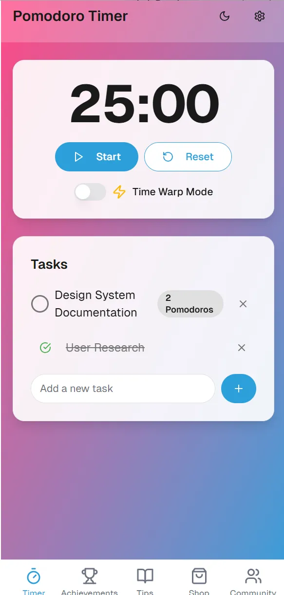
While we won’t go through the development of these new features here, we can see how v0 can assist with very quickly getting to a cohesive feature set that makes this project feel more like a full app. Now, there’s still work to do to refine our UX. However, let’s take a shortcut by learning to prompt batch changes.
Final revisions
Here’s a quick method for making batch refinements of the UX so that you can save time while producing a crisp interface. First, we ask v0 to examine the interface and provide a list of potential changes that could make it more sophisticated but not make any changes to the interface. We’ll go over why in a moment.
Prompt: “What’s missing from the design to make it more sophisticated? Do not make any changes, only provide a list of recommendations.”
Response (partial response shown due to length):
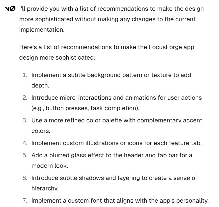
In total, v0 provided 20 recommendations. Some of them are listed above. However, notice that item 4 recommends “custom illustrations or icons.” v0 cannot generate custom illustrations or icons. While the recommendation is valid, the feasibility of the recommendation is not valid and could cause v0 to throw errors. When brainstorming, v0 will often produce multiple ideas that it cannot fully implement, and if you do not tell it in your prompt to only provide ideas and not generate code, it will start coding, which will break your UX. Since we asked it not to make code changes, we can review the list ahead of time and choose which recommendations we want to batch implement.
We’ll select the following recommendations:
- Item 1: Implement a subtle background pattern or texture to add depth.
- Item 5: Add a blurred glass effect to the header and tab bar for a modern look.
- Item 6: Introduce subtle shadows and layering to create a sense of hierarchy.
- Item 11: Add subtle particle effects in the background during active Pomodoro sessions.
- Item 18: Introduce a more visually appealing way to display Pomodoro counts for tasks.
Pro tip: v0 can incorporate external fonts from Google to further brand your interface. Go to https://fonts.google.com/ and find a font you like. Now we’ll batch all of these changes for the interface.
Prompt: “Implement recommendations 1, 5, 6, 11, and 18. Also, implement item 7 by importing Funnel Display from Google Fonts.”
Response:
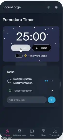
Lastly, we’ll give the app a bit more cohesion with some ambient graphics that match the cadence of the timer countdown. While not necessary, it gives the design intentionality and makes the functionality of the “time warp” feature more prominent. It also demonstrates one of the v0’s more powerful capabilities regarding animation.
Prompt: “Create an ambient background animation that only activates when the Pomodoro timer is counting down. Also, make the animation sync to the countdown.”
Response:
Now check it out. v0 also committed the same updates to dark mode.
After one last update to our job stories document and design system, we can move on to expanding our feature set.
In closing
While it’s been a blast sharing our take on the Pomodoro timer app, what’s really important to emphasize is the workflow. v0 can work either okay with minimal effort or, with a little planning upfront to develop lightweight product reference documentation and a design system, you can build some rather refined designs. Additionally, iteratively refining your design system as you mature your designs will result in a scalable asset that you can apply across multiple projects to create reliable UX with minimal time and effort as you continue your journey to becoming an AI-first product developer.
Link to a clickable full final design.
The article originally appeared on emergentproduct.com.
Featured image courtesy: Ryan Brotman.