Save
Digital design paradigms are shifting faster than ever before. In less than a decade, we have moved from point-and-click to skeuomorphism to flat design. This pace of change impacts designers who need to keep up with ever-changing standards, companies that have to manage increasing fragmentation and updates across platforms, and it also affects customers who have to process and adopt novel patterns while seeking familiarity in the tools that they use. In an omnichannel, ever-evolving world, how can designers manage all of this disruption?
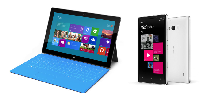
As we look forward to what’s next in Apple’s iOS 8, we can learn from the influence that iOS 7 has had on driving mobile interface design. iOS 7’s shift to flat design has impacted both the design of new services and how existing ones are updated. Although flatness predates iOS 7 with Windows’ first mainstream introduction of the flat look in 2012, now that Apple has adopted a flat design language, they’ve created the benchmark for a new aesthetic style, which is shaping customer expectations.
Left: Windows Surface – Right: Nokia Lumia 930
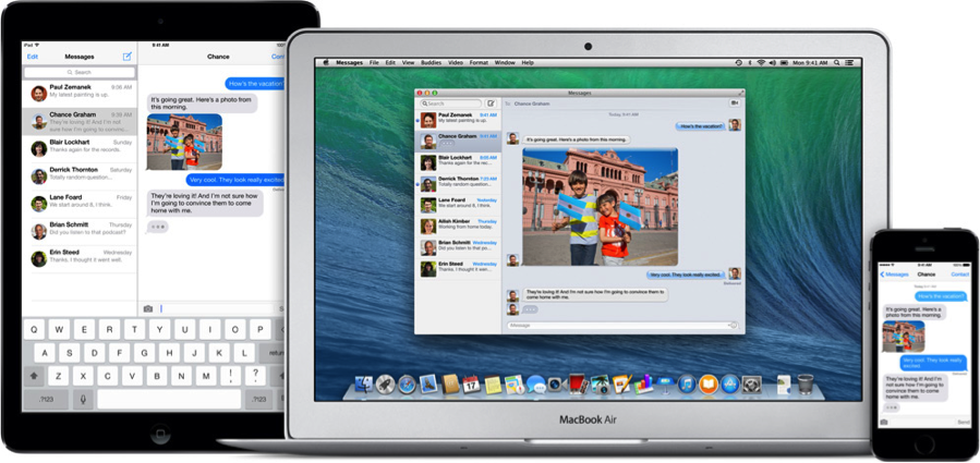
While there’s a desire to embrace the “new” and stay up-to-date with current standards, there needs to be a balance between maintaining the brand’s unique design language as well as ensuring consistency across channels as the market gets more saturated and complex experiences across devices become fragmented. Despite iOS 7’s new design language, Apple’s latest updates on the Mac OS have yet to embrace flat design, which introduces discrepancies between desktop, tablet, and mobile.
Messages App on iPad, Mac, and iPhone
Changing design aesthetics play a significant role in shaping user perception and, in turn, how one designs for these users. As new design styles are made mainstream, they provide us with completely new capabilities, from how we communicate and manage information to how we present ourselves and interact with others. These capabilities lead to the mass adoption and participation in a newly shared visual language.
In the digital world, design is an always-evolving and never-ending project. Once a design language becomes widespread, that same design is continuously iterated upon. When designing for a brand that spans several touchpoints—such as a bank, which offers their services at ATMs and through the web, mobile, and tablet—it’s important to consider how design can flow seamlessly across device types, while retaining nuanced system-specific components. With the proliferation of devices, designing services through the lens of the device type is no longer an efficient or scalable design strategy. In a device-agnostic era where users adopt multiple devices and operating systems—and expect brand consistency across touchpoints—digital design now requires a holistic approach to take users’ disparate multi-platform lifestyles and create one, seamless experience.
Left: Instagram iOS 7, September 2013 – Center: Instagram Windows Phone, November 2013 – Right: Instagram Android V5.1, March 2014
An effective design strategy must account for all of the different platforms and touchpoints it spans. In fact, this is what iOS 7 is setting Apple up to do, similar to how Microsoft’s Metro design guideline helped create consistency across their portfolio of products.
With the advent of a new design aesthetic comes unexpected patterns of change, such as the speculation that Apple’s iOS 7 look and feel will allow Apple to reach beyond their products, touching a wider portfolio of digital devices, like in-car dashboards and smart watches.
But, how should other brands balance their distinct languages with the interaction and visual paradigms of the platforms they are accessible on?
There is certainly no obligation to adopt the “flat” look, but designers must place their users at the center of visual design decisions. Given the impact of Apple on design standards at large, it’s important to take into account what users are accustomed to and expect to see in order for the service to feel current and intuitive.
In big or small ways, good design improves people’s lives. It helps them do what they need to do with greater ease and delight. As designers this is our goal: to always strive to create engaging and useful experiences. Creating a design strategy that remains cohesive as users toggle between devices and touchpoints will help keep users engaged, consistently deliver value, and build a coherent experience for your brand.
Illustration of cross-platform devices coutesy Shutterstock.
- Android, Apple, Apple iOS, Consumer products, Content and Copy, Content Strategy, Customer Experience, Design, Flow and Immersion, Information Design and Architecture, Input devices, Interaction Design, Interface and Navigation Design, iPad, iPhone, Mac OS, Microsoft, Microsoft Windows, Mobile Applications, Mobile Technology, New and Emerging Technologies, Product design, Product Releases and Redesigns, Strategy, Technology, Touch, Usability, Visual Design, Windows Phone
Nour Diab Yunes
Designer and entrepreneur with 10+ years of experience as a consultant in the design and tech industry, currently based in London. She founded Femmes Designers Ltd, which has grown to 15+ women since its launch in 2022. Femmes Designers is a creative community launched to inspire the next generation of makers while championing the work of artists, designers and scholars interested in how the contemporary arts and design interact with people, science and technology.
Formerly, Nour worked as Service and Interaction Designer at Designit, Sapient and Fjord. Beyond project work, she is deeply passionate about the intersection between art, science and technology, where design can contribute not only aesthetically or within its field of practice, but can also contribute to various layers of daily life, such as to the evolution of behaviour practices, whether social or environmental.
Instagram @femmesdesigners


