Did you know 1.2 billion people access the web from mobile devices? Mobile traffic accounts for over 15% of all Internet use globally, and mobile-based searches make up a quarter of all searches.
It’s no big surprise we need to optimize for mobile usability and mobile conversion paths, but what types of mobile sites work best? What’s been tried and tested, and how can we replicate the success of early pioneers?
How Does a Mobile-Optimized Site Impact Engagement?
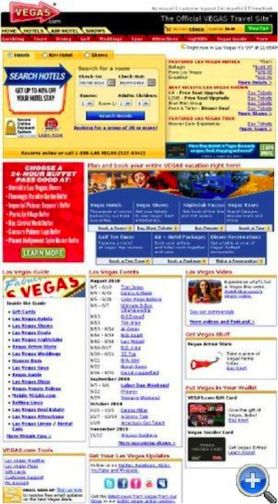
In a published A/B test, Vegas.com ran its mobile-optimized page pictured below against the standard homepage all visitors see, measuring how visitors behaved when viewing the site on mobile devices.
Their mobile-optimized page showed a 16% lift in page views, 14% lift in hotel searches, and a 22% reduction in bounce rate. That’s a massive improvement, especially for a business that relies on hotel searches and stickiness as the lifeblood of their revenue stream.
It’s easy to make the case that having a mobile page will almost always improve engagement
Sure, this is traffic-dependent—among other things—but it’s hard to argue that the clunky pinch-and-zoom experience of a desktop site on a mobile device won’t turn away potential conversions. It’s easy to make the case that having a mobile page will almost always improve engagement.

vs.
Using Mobile Design to Influence Visitor Behavior
One of the unique characteristics of designing for mobile is limited screen real estate. How that space should be used depends on several factors: the type of online business, the profile of the target customer, and, ultimately, the customer’s desired behavior.
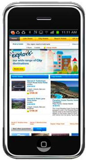
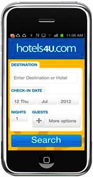
In a May 2013 study, WebTrends tailored a hotel booking engine search page specifically for mobile devices, as pictured below, and demonstrated tremendous lift over the existing site. The “search page” for mobile increased flow through all stages of the funnel and overall conversions by over 14%, with mobile visitor search use up 61%, an increase of 32% in the number of visitors proceeding to the search results page, and 14.5% more people going through online check-out.
vs.
Those conversion jumps are massive by any standards, and they make an attractive case for trying a focused mobile page that guides customer behavior. If your visitor is likely to search, making that mobile page all about search is a strong move.
You can blow up more than just a search box. If it’s a lead capture or a form fill-out that you count as a conversion, mobile-friendly forms have been shown to increase conversion rates substantially.
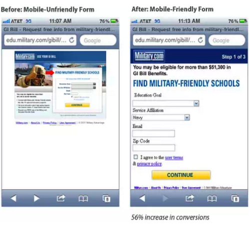
SiteSpect, working with Military.com, ran an A/B test looking at how they could best convert visitors interested in military-friendly schools with GI Bill Benefits. They tested their standard desktop page and form against a form designed exclusively for mobile (images shown side-by-side below) and saw a 56% increase in conversions and 130% increase in confirmed leads.
A Few Considerations for Mobile Landing Page Design
We all know that email gets opened on the go using mobile devices. Email looks good on most smartphones these days, but not all landing pages those emails point to are quite as pretty. How much can we expect to improve conversion if we optimize mobile usability from a landing page standpoint?
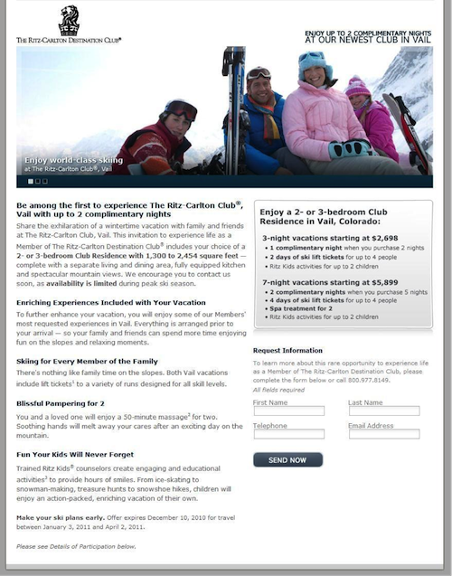
In one study published by Marketing Sherpa, Ritz-Carlton discovered mobile-optimized landing page design could mean a 40% conversion rate jump for iPhone users. Looking at the original and mobile versions below, what’s most surprising is that the mobile version isn’t even that slick. The type is larger, the content looks good on the tall rectangular iPhone screen, and there’s a single clear call to action, which seems to be enough to tip conversion rate in the right direction.
vs.
Sometimes resource constraints mean that mobile design prioritizes function over form, and the Ritz-Carlton example shows that you can notch a win without committing to building the prettiest mobile landing page.
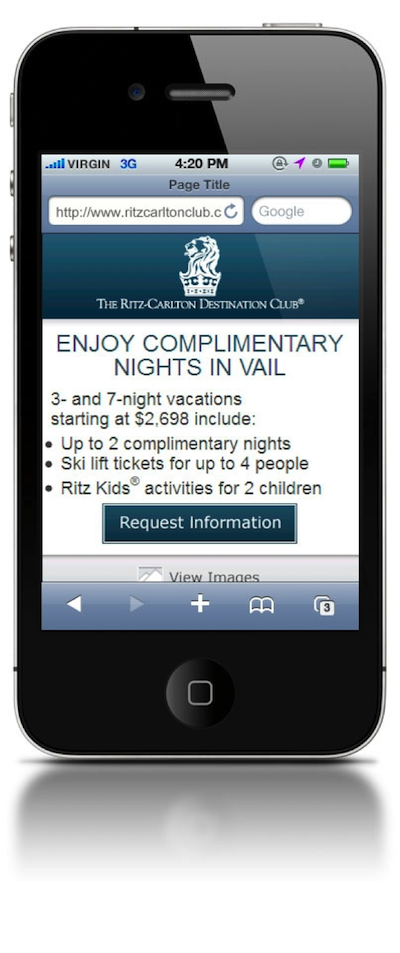
It’s another story if you dedicate resources to a mobile app. In this 2013 study, Art.com explored whether pointing users to a mobile app download would outperform showing the site as-is to mobile visitors. It was no surprise that the version directing users to download the mobile app—even though it required an extra step on the visitors’ behalf—clearly demonstrated an appetite for the mobile app. Art.com confirmed, in this experiment, that it was worthwhile to segment visitors and optimize for mobile.
vs.

Keys to Mobile Usability Success
How are conversion leaders shaping their sites that cater to mobile users? Let’s look at some key takeaways in terms of mobile usability and conversion-friendly design using high-profile examples.
1. Large calls to action and easily clickable links are easy for mobile users to navigate. Look at how Amazon structures their mobile site:

By contrast, you don’t want to go down this road:

2. Just as you would for PC users, reserve space above the fold for the most important info and links. Limited real estate in mobile design will lead you to do things like shorten the nav bar and prioritize which links are critical. See how streamlined the Salesforce.com mobile site appears:

3. Use mobile-friendly dropdowns.
4. Take advantage of mobile-only features such as click to call, like Rackspace does below.


The Trek Continues
Although we’ve focused primarily on smartphones in this survey of mobile conversion data, the tablet market is growing rapidly and deserves dedicated attention as well. Nearly half a billion tablets will ship in 2013 and 2014. Businesses with significant sales and traffic volume have already shifted to dedicated sites for tablet users, who often require elements that are a hybrid between the minimalist smartphone-friendly approach and “all the news that’s fit to print.” The businesses that perform best in the coming decade will be those paying tremendous attention to the growing percentage of web traffic cruising through on a touchscreen.
Image of tropical jungle courtesy Shuttershock