Save
In our last post, we introduced the concept of “Designing for Place,” which explains how you can gain a better understanding of your app usage and its functionality, and how you can make strides to becoming an even more vital part of your users’ everyday lives. We did this by breaking down how to analyze app feature functionality by location, as precise location data has quickly become essential to providing richer insights into your users’ behaviors and interests.
Armed with this kind of contextual data about your users, you can take the findings from your analysis and apply them towards your existing app features, helping you to better categorize and personify your user. We call this process “appticipation.”
Categorize Your App Features
Next, you’ll need to categorize your functionality so you can aggregate by type. Some examples of functionality types include Discovery, Social, Profile, or Payment.
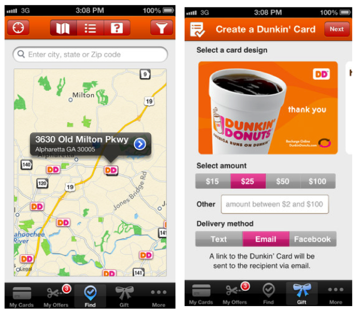
For example, the Dunkin Donuts app has the following functionalities that can be categorized into a few of these aggregate types: You can load cards and pay with the app (Payment). There is also a search functionality that helps you locate the nearest shop (Discovery).
While you are doing this exercise, consider this: if a user can’t find the functionality, it does not exist. So while you might very well have the ability in your application for users locate a store nearby, if it’s buried three screens deep and no one can find it, it may as well not exist.
Leverage Location
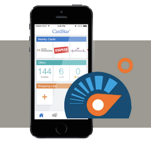
You need a balance between the list of features your app displays with when and where they are useful to your users. Not every feature in your app is useful to your users at all times, in all locations. There’s an interesting trend emerging now where apps are slowly starting to incorporate “modes” into their functionality. Retail apps such as those offered by Walmart and CardStar use intelligence gathered from their users based on location to best serve them the functionality they may need. For example, when you enter a Walmart store, your entire app experience shifts to a “Store Mode” that lets you take advantage of coupons, deals, and other relevant store information to help you make decisions while shopping.
We take this notion of “modes” a step further at Skyhook by defining where you are as who you are. Where you go and what you do define who you are as a user with our Personas capability. For example, among our out-of-the-box profiles available, we have personas like the Luxury Shopper, as a user who visits beauty supply shops and high-end clothing stores and who has an income of over $200k.
Imagine the kind of experiences you can deliver to users once you know who they are. Using appticipation, which is based on what we know about what users do in the different places they go, we can create app modes based on the functionality they need in these different locations. Suffice to say, this level of audience intelligence can do wonders for your customer experience and your KPIs.
Understanding App Usage with Personas
While it’s great to know what features your users are engaging with, there’s more to the story, which is why we stress the importance of looking at where your users go by getting a high level view and then diving down. You can do this by segmenting your users into high, medium, and low usage categories to find out where the power users are and to compare that to others. Then look at the functions they use by place to get a sense of what’s important in the places they go. Looking at ratios of usage over total number of visits (your Vital Ratio) tells you how vital that function is in that place.
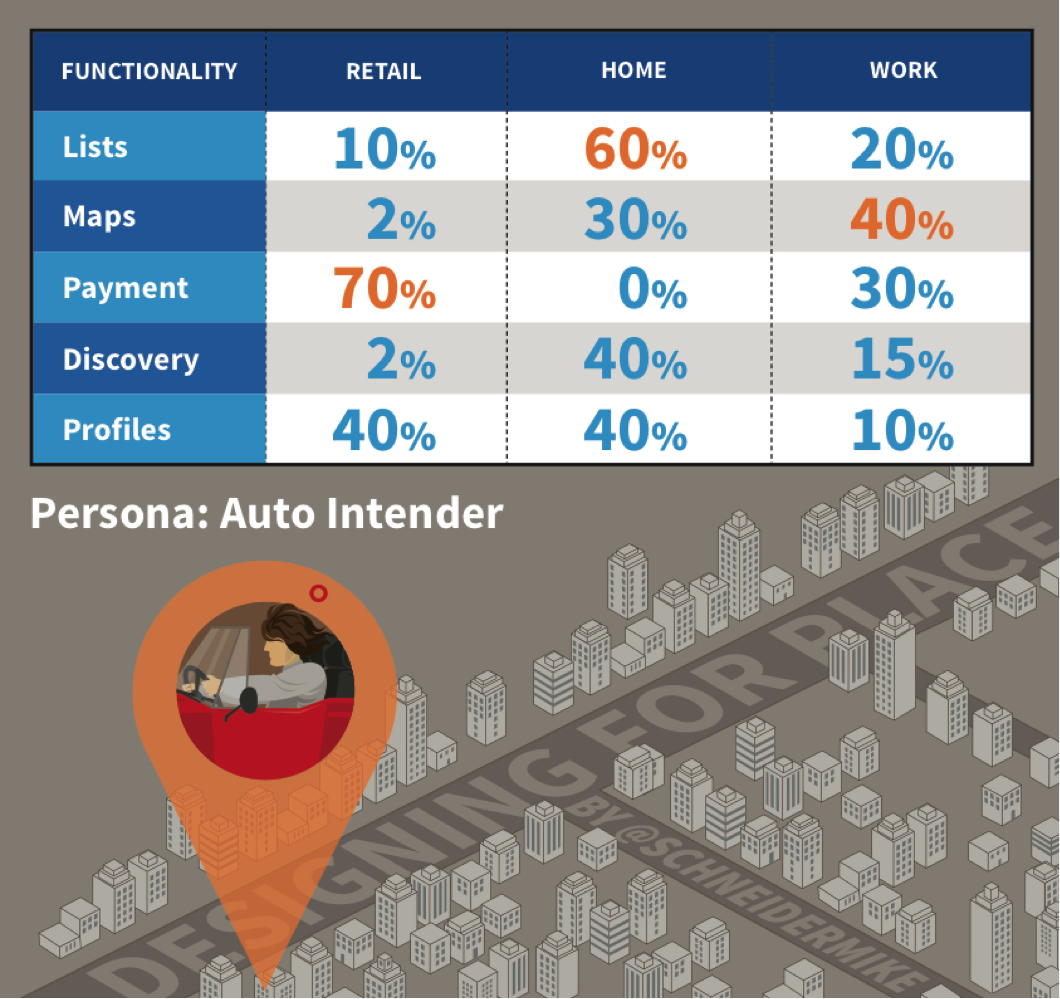
For example, in the chart below, we can see that our Auto Intender persona accesses the payment functionality of our app 70% of the time when in a retail location. If we rank our payment functionality as one of the most vital features of our app while in a retail location, what can we do to the design of our app to get that number up to 100%? The answer may be to enable a “shop mode” that is triggered on the device by a geofence when a user enters the store, and have that functionality displayed prominently so users don’t need to dig through screens to pay for their purchases.
Designing for Place
This level of contextual data is critical to delivering the most relevant and valuable experiences to users in real-time, as well as driving global optimization of an app to suit the entire audience better. Dynamic user experiences can respond to users’ intent, adapt to their location, change based on time of day, and tune to their skill level. Implementing a dynamic user experience will ultimately result in better ratings and reviews, helping your app stand out in the app store, leading to lift in average session length, an increase in daily active users, and growth in the number of sessions per day.
Our next post will dive deeper into how different type of apps can leverage all of this contextual user information, envisioning new modes based on existing app features and functionality.
Want to learn more in the meantime? Check out this case study on how the CardStar app doubled its user engagement with location-based context.
- Analytics and Tracking, Business Value and ROI, Consumer products, Content and Copy, Content Strategy, Contextual User Studies, Customer Experience, Design, Design Tools and Software, Flow and Immersion, Information Design and Architecture, Interaction Design, Interface and Navigation Design, Location-Based Services, Mobile Applications, Mobile Technology, New and Emerging Technologies, Product design, Strategy, Technology, Ubiquitous Computing, Usability
Mike Schneider
This user does not have bio yet.
Skyhook Wireless
Skyhook Wireless is a worldwide leader in location. In 2003, Skyhook gathered the world’s Wi-Fi access points and combined them with GPS and cell tower locations to build a global, 1st-party network providing the fastest, most accurate and battery-friendly location results. Today, Skyhook handles billions of requests, powering location and context for devices, apps, publishers, ad-tech, wearables, media, mobile device management, digital rights management, device recovery and more. Skyhook Wireless is a wholly owned Subsidiary of Liberty Media and True Position. To learn more about Skyhook, please visit skyhookwireless.com.


