In our previous articles, we argued that precise location data can provide richer insights into your users’ behavior and interest and that you can turn those insights into “appticipation.” Having this contextual data on where and when your users are accessing your app and its functionalities can help you to design your app to become vital to the daily life of your users, with the end goal of delivering personalized app experiences to each and every one of them.
The usage analysis we outlined can help give you a better understanding of your app usage and functionality: now, we’ll take those findings and see how a retail app like The Home Depot’s can apply them towards existing app features to better categorize and personify users with appticipation.
The Home Depot Has a Smart App
The Home Depot is smart. Their app not only allows customers to effectively browse their tools and building supplies, but also enables users to choose their optimal way to purchase products. They correctly recognize that there are a lot of ways to do this and that they should cater to shoppers based on their location to make the experience flow the way they expect. But we can take this a step further with appticipation.
Realizing that their customers need a way to categorize their desires for their projects or maintenance needs, shoppers can create product lists in the Home Depot app
Today, The Home Depot gives users three ways to make a purchase:
- Order and have merchandise sent to your preferred store
- Order and have it shipped to your home
- Show the user where the items on their list can be found in the store
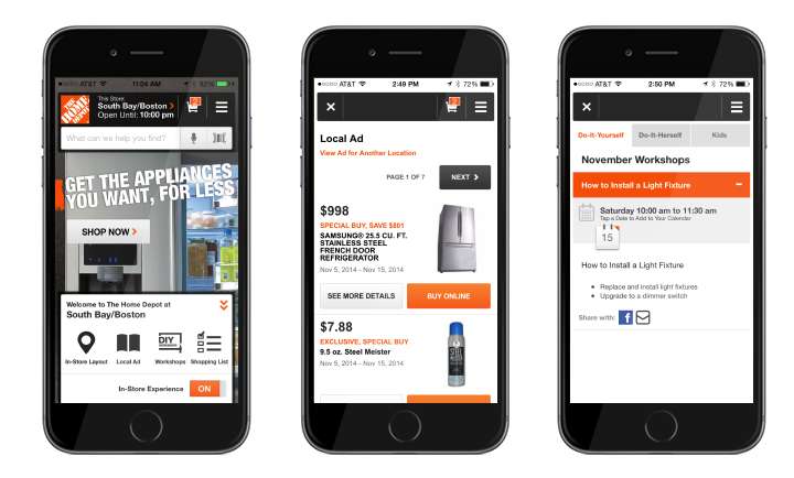
The Home Depot is using location and context to reduce the friction between the user opening the app and finding their desired experiences. The app has two experience modes: the Default Mode, which is the standard app experience, and In-Store Mode, which is switch-activated by the user to indicate they are in the store. When in In-Store Mode, the app allows you to pick a specific store, set a preferred store, or discover the closest stores.
In-Store Mode
The Home Depot app makes certain functionality more apparent in “store mode” to cater to the shopper’s needs and overall experience:
- Store layout display
- The store’s local ad with the current specials
- Customer’s shopping list
- The shopping cart
When customers are in the store making decisions, they want different content than when they are out of the store and planning their projects. Today, the biggest difference between The Home Depot Default and Store Mode lies in the shopping cart experience. The default mode allows the user to see if The Home Depot near you has what you need in stock on your list, have the item shipped to your home, or have it set aside in their preferred store.
@HomeDepot can add context to their app and anticipate their users’ next moves
When in-store mode is on, the user is told whether the product is in stock and where the product lives by aisle and bay in that particular store. This simple subtlety shows that The Home Depot cares about the experience by understanding when a user is in store or not.
Imagining the Future
The Home Depot isn’t a Skyhook customer, but we can’t help ourselves when it comes to imagining what the next generation of appticipation might look like. Many users are engaged in projects at home. By conduct our recommended usage analysis of their data, it would be possible to uncover how and when users are accessing which of their app’s functionalities. To make the process more fluid, we would recommend making the most vital In-Store mode features to The Home Depot app experience prominent once a user enters a Home Depot store.
Here’s what we think The Home Depot could do by using appticipation:
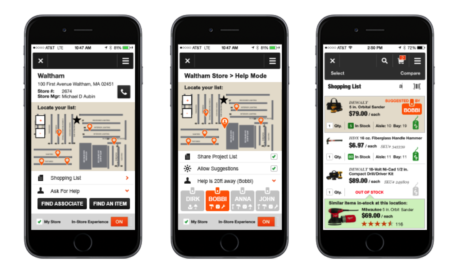
Screen #1, Screen #2, and Screen #3
Screen #1: Store Mode
The app UX should change once the user enters a store. In the first screen (far left) we envision a new version of Store Mode: if customers have projects to work on, they can create a shopping list oriented with that project and categorize it so that The Home Depot knows what their users aspire to do. The layout of the store you are in appears on-screen, and it automatically pulls from your project shopping list, highlighting where all of your items are located in the store. Your list is also easily accessible as the first item in Store Mode.
Also on the home screen, right below the user shopping list, we’ve placed an option for Help Mode, so that when a user enters a store and needs help, they can press a button to request assistance.
Screen #2: Help Mode
In Help Mode (the middle screen), we envision functionality that enables users to opt into sharing their project list and allow for suggestions from store associates. Users could select from The Home Depot associates based on their expertise, or who is available at the time.
With beacons enabled, users and employees can all be accessible on the layout map of the store. Employees could see what aisle the user is in, and the app could show a photo of the user to the employee and employee to the user so they know who to look for. Not only does this assure users that help is on the way, but this functionality would help to determine how close help is, who will be helping them are, what their specialities are, and allow messaging between the customer and the employee for limited time in the case they one person can’t find the other.
Screen #3: List Mode
Once users are able to connect with the right associate, they can pull up their project list (third screen) to review with The Home Depot employee. This functionality could give associates access to customer lists easily to make edits or recommend additional items that might be of interest. List items would be stamped was “suggested by EMPLOYEE_NAME, their avatar, and / or store number for later reference.
If the app is synced up to the correct store’s inventory, specials relevant to that store location that day could populate into the user’s shopping list so customers can use them at checkout. If an item they need is out of stock, they can see other relevant product suggestions.
With these enhanced capabilities, The Home Depot can add context to their app and anticipate their users’ next moves, making their lives easier and The Home Depot app more vital to their project experience.
Want to learn more about designing for place? Check out this case study on how the CardStar app doubled its user engagement with location-based context.