Save
When users download an application, how does their initial intrigue to transform into the feeling that the app is a vital part of their daily existence? The definition of “vital” differs depending on what kind of app users are looking for (e.g. productivity, utility, gaming), but a vital experience transcends basic functionality for each of these app categories. Creating a vital experience makes an app something that a user doesn’t want to—or can’t—live without.
What Makes Your App Vital?
Apps generally achieve can’t-live-without status by offering users vital features that do one or more of the following things:
- Make a user more efficient or productive
- Give them something useful
- Allow them to discover what they are looking for easily
- Enable them to make quick decisions or surpass obstacles
- Free them to use the time saved to do something else
Apps are more dependent than ever on offering a vital experience because keeping users engaged is about more than improving usage metrics, it is also about increasing revenue. So how can you get there?
Which Features Are Vital In Your App?
When it comes to figuring out which features are vital in your app, knowing a user’s precise location can help provide richer insights into behavior and interest. Having this contextual data can help you to understand how to become vital to the daily life of your users, delivering personalized app experiences to each individual user.
As designers and developers, we can insist that a feature is vital, but you need to substantiate these claims with real user data before you can sell those assumptions to stakeholders. One way to do this is by defining a list of features that you think are most important to your app, and comparing that list to the features your users actually use. A comprehensive list of your app’s features, sorted by number of times used, can give you figures for feature popularity. Then you can begin to ask if your vital features are at the top and why they are (or why they aren’t).
Thanks to location data, it’s possible to know more about your users, providing richer insights into their behavior and interests. During this analysis stage, gathering and interpreting as much contextual data on your users as possible will help you build an app that can become a vital part of the user’s daily life. As an app developer, the end goal should be delivering personalized experiences to each individual user.
Thanks to location data, it’s possible to provide richer insights into users’ behavior and interests
While you can do this by gathering feedback from your users on a continuous basis, we find the best way to do this for your most vital features is through your app’s Vital Ratio, which we define as app feature usage divided by total app visits. This ratio will help you look at a deeper cut of your app data, looking at usage by place.
Understanding Your Vital Ratio
Looking at features by location can be overwhelming at first, so it’s helpful to aggregate data to make it useful. Any app with location enabled can extract this data in the form of location requests. Overlaying the location (latitude and longitude) information with a venue database helps you understand where your users go. This can be a laborious, manual process, but on-device software can automatically deliver the contextual data you need. Location-based context allows you to categorize places so that you can aggregate information in ways that make more sense than looking at usage based on each individual coffee shop, retail store, airport, and so on.
Once you have this location data, roll up places by brand (Dunkin Donuts, Starbucks, CVS, Walmart, etc.) or category (retail, pharmacy, coffee shop etc.) instead of trying to make sense of each address or location point. By comparing your Vital Ratio across these locations you can see if users are getting the value you expect or if they are finding the functionality they need in the place that they are. Understanding this will help you prioritize how to design for place.
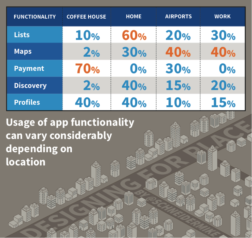
In the charted example above, we’re looking at an app’s specific functionality breakdown by where the user is accessing it. Looking at functionality, usage, and place, it looks like users are deploying the payment functionality of this particular app 70% of the time when in a coffee house to pay for their purchases.
In order to maximize usage of this vital feature, the app must make the functionality as frictionless as possible when the user is in a coffee house. That means fewer screens to dig through to use the functionality when they want it. This requires designing your app for place, with different modes for your app being made available when users are in different locations. Going back to this example: that means when a user enters a specific coffee house chain, the venue’s geofence is triggered and their app serves up “Buy Mode,” with the payment functionality featured prominently so the user can easily pay for their coffee.
When it comes to designing for context, this is just the start. Next we’ll discuss more about how to categorize your features and the possibilities for adding additional layers of personalization using this context data.
Want to learn more in the meantime? Check out this case study on how the CardStar app doubled its user engagement with location-based context.
- Analytics and Tracking, Business Value and ROI, Content and Copy, Content Strategy, Data visualization, Design, Design Tools and Software, Development, Flow and Immersion, Interface and Navigation Design, Location-Based Services, Mobile Applications, Mobile Technology, New and Emerging Technologies, Product design, Psychology and Human Behavior, Research Methods and Techniques, Strategy, Technology, Usability, Working With Stakeholders
Skyhook Wireless
Skyhook Wireless is a worldwide leader in location. In 2003, Skyhook gathered the world’s Wi-Fi access points and combined them with GPS and cell tower locations to build a global, 1st-party network providing the fastest, most accurate and battery-friendly location results. Today, Skyhook handles billions of requests, powering location and context for devices, apps, publishers, ad-tech, wearables, media, mobile device management, digital rights management, device recovery and more. Skyhook Wireless is a wholly owned Subsidiary of Liberty Media and True Position. To learn more about Skyhook, please visit skyhookwireless.com.
Mike Schneider
This user does not have bio yet.


