Save
Instagram is a great product and I use it often. It lets me share stories of my life with friends and anyone else who’s interested. But sometimes, it is pretty challenging to use just one photo to tell a compelling story. No wonder a Google search for “how to make a collage on Instagram” returns over 9 million results.
I noticed that many Instagram users post photo collages—pictures with multiple photographs arranged in an artful way, often telling a little story. But to get these collages into Instagram, they have to use third party apps that don’t offer the same great user experience that Instagram does (and are often quite buggy).
@Instagram users post collages, but have to use 3rd party apps that don’t offer the same great UX
To solve this problem and let users share multiple photos at once—easily, simply, and beautifully—I created the prototype in the video below.
Read on and learn how I put this together.
Building My Prototype
As a design challenge, I researched, ideated, wireframed, and prototyped a collage feature for Instagram, acting as the user researcher and product designer, developing personas, design stories, user task flows, wireframes, interface designs, prototypes, and usability tests.
Design Stories
Writing design stories is a very helpful agile technique to capture product functionality. They are detailed descriptions of what the users can do. Here are some of the design stories for my feature. Users can:
- Take/select multiple pictures and use them to create a photo collage
- Edit photos in photo collages
- Choose collage templates
- Reposition and replace photos in collages
- View collages
- Cancel making a photo collage
- Add captions to the collage
- Add location
- Tag people in the collage
- Share the collage
Personas
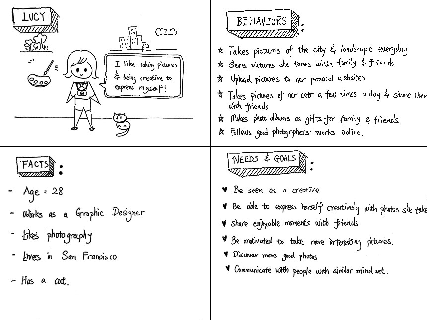
To try and understand the people I’m designing for, I created a persona to guide my feature development and help me focus on the key problem I am solving. It makes the design decisions less abstract and more human. Below is the persona that I created for this photo collage feature. Meet Lucy:
User Task Flow
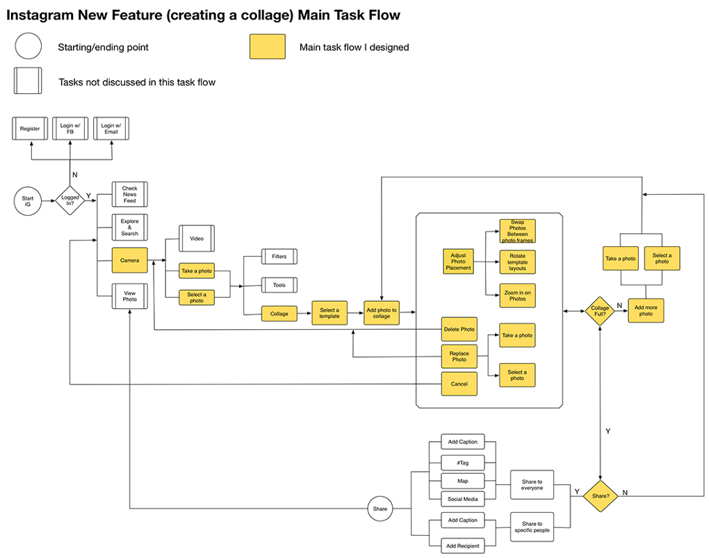
Some people think of Instagram as a camera and some people think of it more as a photo editing app. Instagram recently added a lot more editing features, but they kept the camera experience very clean. I chose to preserve this user flow, and put my new photo collage feature within Instagram’s editing section. I’ve included my user flow chart below. The highlighted section is the main flow of my new feature.
Wireframes
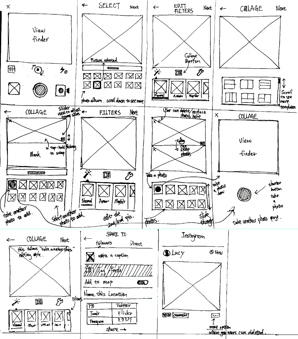
My next step was to visualize my new user task flow. I started with sketches on paper. I had a few different versions, but ended up deciding that the version below was the most promising. After some quick usability tests, I discovered that this version enabled users to create collages the quickest and easiest.
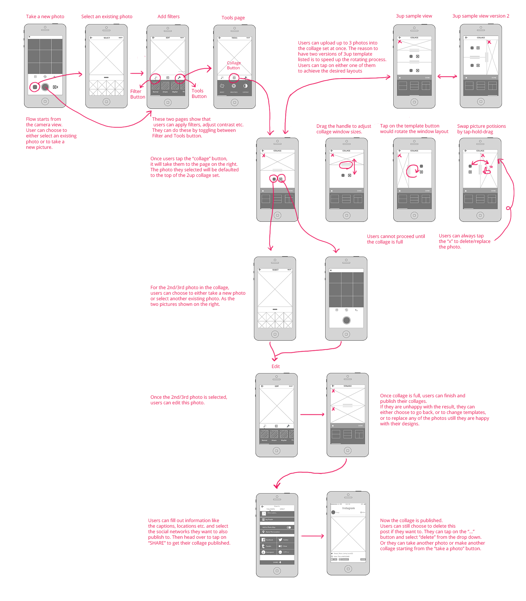
Below are the detailed wireframes I developed based on the sketches above. I assumed that maximum of three photos in a collage would be ideal for the first release of the feature, because it would give users just enough flexibility and control to enjoy the process of making and sharing photo collages. This is still a hypothesis that needs more testing. My assumption is based on user interviews, the size limitation of the mobile devices and the ease of use to create something with quality.
Prototype
I tested my low fidelity wireframes with some colleagues and created a quick high fidelity prototype to test more. This prototype helped me further test my user task flow and catch any errors in the early stage. I am going to do more usability testing in the future to validate this design.
Conclusion
To be clear, I do not work for or represent Instagram. I chose to do this feature as a design challenge. As an avid and happy user of Instagram, I had a great time working on the project and would love to see my collage feature in the real app someday—given the number of people looking for a way to build collages that they can post to Instagram, I think there’s an audience for the addition.
- Content and Copy, Design, Design Tools and Software, Facebook, Google, Information Design and Architecture, Interaction Design, Interface and Navigation Design, Mobile Technology, Motion and Animation, Personas, Product design, Product Releases and Redesigns, Prototypes, Research Methods and Techniques, Sketching, Social Networking, Storytelling, Technology, Usability, User Acceptance Testing, Visual Design
Lin Wang
Lin Wang is a full-stack designer and front-end development enthusiast who is passionate about technology. She loves creating user expereinces that make people's lives more enjoyable. She lives in San Francisco.


