Aspiration and inspiration are big parts of the UX racket, both for users and designers.
Science fiction can be a powerful source of both things, in part because SF interfaces have the unfair advantage of being untethered from pesky constraints such as possibility, testing, efficiency, cost, or even the laws of physics.
As Nathan Shedroff and Christopher Noessel write in their book Make It So, “… if an interface works for an audience, there’s something there that will work for users.”
Our goal here is to think about a coherent and useful framework to help “design down” from science fiction. Does fantastic technology offer value to the user? If so, what is that value? And can we keep any of this value as we design back down to the possible?
The Framework
With SF technology, the normal process of usability testing is not an option. But heuristic evaluation principles (HEPs), first proposed by Nielsen and Molich in 1990, can provide a framework for thought-based discovery of user value and give us guidance in bringing this value to what we build today.
Nielsen and Molich originally thought of heuristic evaluation as a “discount method” for quick data on user interfaces. The process is well suited for evaluating nonexistent or even impossible interfaces, as the focus is on identifying usability issues through small scenarios, without actual prototypes.
This article will attempt to build a process for designing down from SF.
The Original Project
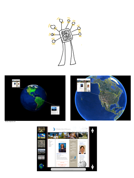
To help illustrate the process, I’ll apply it to a past prototype. Vox Populi was an idea for an interactive museum kiosk by Pop Up Archive co-founder Bailey Smith and myself when we were graduate students at the School of Information at UC Berkeley. The goal was to allow users to discover the independent and situated voices of blogs, local reporting, and personal sites.
Our first prototype was a multi-touch tablet interface. Users could rotate or zoom in on a globe to see thumbnails of each web page visibly “tied ” to a location. An array of speakers around the user’s head would broadcast the text-to-speech “voice” of each page, with the audio “moving” from speaker to speaker, as the page moves on the screen. Users could tap on a thumbnail to see the web page, as if in a browser.
This was a quick prototype, so please be kind.
Designing Down
Stage 1: Discovery
Looking at SF interfaces can be regarded as a competitive analysis, if we think of the competition as everything that isn’t currently possible. After all, we flattered ourselves that we were designing the future. This forced us to break down the elements of Vox Populi in a new way: instead of surveying existing tools and implementations, we had to abstract our elements and goals.
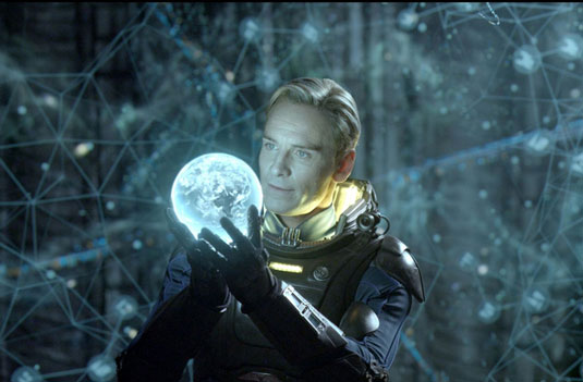
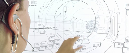
We went back to the basics of noun-verb pairs. Our base words seemed to be “globe,” “item,” “navigate,” “point,” and “space.” This opened up a surprising set of SF interfaces—think of the scene in Prometheus where David interacts with some sort of astral navigation interface.
Following Shedroff and Noessel’s categorizations, we see:
- A volumetric projection
- Direct manipulation
- A gestural interface
Let’s follow just the tech of the volumetric projection (VP), which Shedroff and Noessel point out is the proper term for what we normally call a “hologram.” We will uncover user values of a VP, and try to incorporate those values in an achievable design.
Here, a VP allows David to walk around the entire interface, and even enter it. User input in this scenario can come about two ways: direct interaction, or the simulation of such through a gestural interface.
Shedroff and Noessel define direct manipulation as “transliterations of physical interactions,” allowing the user to enact their verb of choice without intermediary controls such as a pointer or magnifying glass cursor, for example. As we see, David can touch and manipulate items in the VP.
Gestural interfaces, Shedroff and Noessel note, were largely defined in the public imagination by Minority Report, based on the real-world work of John Underkoffler and Oblong Industries. Input can be through motion-sensing (as with Microsoft Kinect) or having the user carry sensors (as with the Playstation Move).
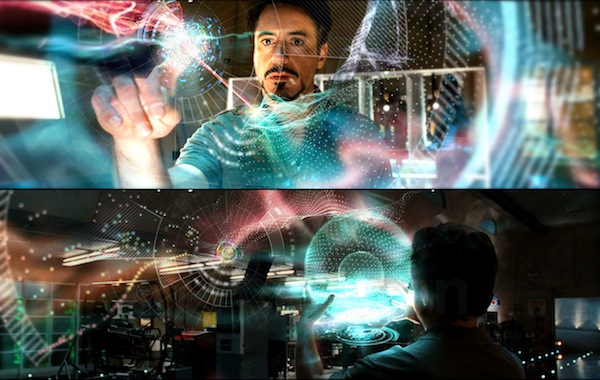
We can also see these elements in the 3D interface Tony Stark uses in Iron Man 2; we see arm motions similar to pinch and zoom.
This could create a fantastic interface for Vox Populi. The world would float in mid-air and blog pages would rotate above the surface like low satellites with tethers of light. Users could wave to zoom in or tap a floating web page to call up its content. A 3D model invites discovery, while direct manipulation short-circuits potential heuristic disconnects between input and result.
But we have not measured anything. How can we start to uncover what’s so compelling in these interfaces, so that we can use it?
Stage 2: Draw the Tech Tree
The next step is to chart out the SF techs. If you’ve played certain video games, you’re familiar with the concept of a tech tree (where building up “ranged attack” skills, for example, could limit “develping close attack” skills). Then we need to think about the implications and dependencies of each tech.
By themselves, VPs do not offer interaction. What we think we see in these SF examples is users “touching” light constructs that offer haptic feedback (their hands don’t pass through items), and the system registering their touch. This is so far into Clarke’s Third Law as to be useless for our design thinking.
So if we are to retain some sort of VP interface as we design down, we have to evaluate the options for input: control surface, controller, sensors, or gestural.
The options for input with a VP seem to break down to:
- The VP itself detecting and acting on touch
- Kinect-like detection of the user’s gestures
- Users wearing something like gloves (Minority Report) or holding controllers, like the Playstation Move
- Something like a game controller or console
If input is too burdensome to users, rethink presentation:
Don’t let this happen to you
After Stage 1 and Stage 2, we can see that a VP presentation either needs to simulate direct manipulation or add an intermediating layer—controllers or remote console controls—between the user and the display. Kinect-like tech could offer a partial solution, but in the case of Vox Populi, we thought this would not be optimal because: 1) much of our project involves selecting items, which is most problematic with VPs and 2) such tech works only with a single user in a constrained space after calibration, which is definitely not the context of a museum.
Sharing an exhibit at the Exploratorium
We realized that many of the SF features could be available without using a VP, and at least one (direct manipulation) could be better served with a different presentation technology. Abandoning the VP lead us to a physical, projected globe that would preserve much of the user value seen in the VP interfaces.
Stage 3: Navigate the Tech Tree:
This is where the relevant HEPs allow us to assess and appropriate the best values for users for our design.
We pared down Nielsen and Molich’s original list to:
1. Visibility of system status: users can see “Where am I?” and “Where can I go next?”
VPs display and update the entire globe; no point is obscured or inaccessible, inviting discovery. VPs also extend the concept of transparency: elements float like satellites in actual 3D, showing relationships and data without obscuring.
2. Match between the system and the real world: “The system should speak the user’s language, using words, phrases, and concepts that are familiar to the user.”
As Shedroff and Noessel write: “VP … matches how humans sense most of the things in the world around them—in three dimensions. Our binocular vision … and use of motion parallax are major inputs to interpreting the information that is contained in 3D space.”
However, VPs do not allow users to directly manipulate the items they see. The system fails when the first user sees a projected image as a control, and his or her hand goes right through it. Ironically, this would match “real” real world expectations perfectly, but break our SF-conditioned expectations.
3. Recognition rather than recall: “[Users] shouldn’t have to remember information between different parts of their dialogue with your site. Instructions for use of the system should be visible—or at least easily retrievable—whenever your users need them.”
Items are represented by (basically) themselves. What we have learned from SF interfaces actually works well in training us to work with VPs. Shedroff and Noessel recommend us to “share the joke” that users have entered a SF interface, noting that the whole UI concept has largely been defined by what we’ve seen in SF.
The ability to project images (still and motion) into 3D space is still young, but developing. These images can be pre-recorded or interactive, generated from data and user input.
But VPs appear to be incompatible with direct manipulation. Intangible elements that seem to invite touch break the experience. Another issue with intangible interface elements is that, as Shedroff and Noessel point out, touch interfaces are very sensitive to movement: projections do not provide the static friction and resistance that our shaky hands rely on for precision.
Some labs are working on “precision free-air interaction input” and holographic input but being limited to a small planar area would break the Vox Populi visual metaphor of blogs as satellites.
Barring the magic of force fields, we will not achieve haptic feedback with VPs. Careful layout of controls and items (that is, none directly in the touch path of another) could reduce errors, but it’s still an invitation to user frustration.
A projected 3D interface in The Matrix: Reloaded shows layers of intangible touch controls
Stage 4: Match Values to Design:
So we can list a lot of potential values for users locked up in SF tech, and some caveats.
Presentation:
- The value in a globe, rather than a flat display: discoverability, matching the real world, intuitive manipulation.
- Users see value in directly showing relationship/connection of items (use transparency and animation).
- “Letting users in on the joke” by leveraging SF-looking presentation may backfire. The more “SF-looking” a presentation is, the more it may encourage users to attempt unsupportable interactions (such as expecting VPs to be tangible).
- Users may be prepared for the presentation being physically displaced from their control gestures (as in Iron Man 2).
Interaction:
- Limit interface elements to active controls; for example, a thumbnail of a web page should be a selectable/touchable control that does something, such as display the entire page.
- Touchable items need some tangible “backstop” to reduce imprecision, especially when they are layered to suggest relationships.
- Layered and transparent items should behave like physical items if they offer direct manipulation, such as “leaping” from one display to another (animation).
- The closer to “established” gestures/controls/interactions, the better. This layers SF expectations on top of real-world experiences.
- Setting constraints (e.g. museum) may impose unique limitations on input options (such as putting on gloves, or calibrating, or clearing an area).
Synthesizing these findings, we find that:
- VPs show promise, but are not yet suited for shared experiences and quick in/out users: Kinect/Playstation Move/Minority Report hardware and gestural interfaces require a single user in a cleared space, and carry the burden of calibration. This is better for professional or demonstrational use. Plus, the issue of lack of haptic feedback invites imprecision.
- Direct manipulation does not need to require direct touch, but feedback and direction should be clear (animation can help).
A Possible Design Strategy
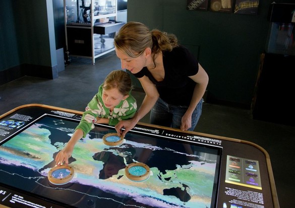
To enjoy the user values a VP globe offers, but not the interaction failures a VP is tied to, one solution could be a projected globe with a multi-touch surface—offering discoverability and heuristic values, but in solid form. Some of this tech is even available in interactive projection globes, a “dynamic globe”, and 3D snow globes” with Kinect. Multi-touch surface gestures should include tap, pinch, and spread, with two- and one-handed ability to “spin” the map. Blog thumbnails could be semi-transparent and stacked at locations.
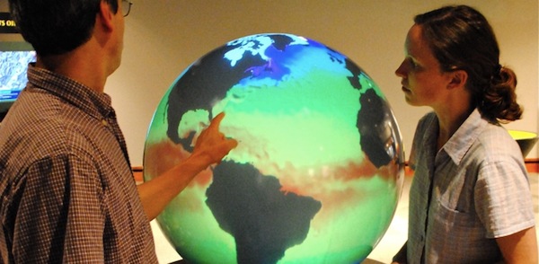
Photo from Montshire Museum of Science
Displaying blogs on the globe’s spherical surface violates at least one of our HEPs. However, users interact with blog elements only by 1) tapping on thumbnails on the globe to expand for full reading, 2) reading, and 3) dismissing it back to thumbnail.
This would be a good case for using a VP: when the user interacts to expand the blog thumbnail, it could be “called up” to a VP acting as a second screen. The semi-transparent nature of the VP would well suit displaying the relationship of the location on the globe to the projected content. Animation could serve to “move” the thumbnail image to its expanded projection, guiding the user’s eyes.
Conclusion
Foraging future tech quickly reveals examples of ideas that excite us, and it’s important to discover not just what is exciting about them but also to get a sense of why. It turns out that there can be good reasons to want SF interfaces implemented and in our hands.
The result of this process may not be a product, but it can give a good direction to a design (or redesign) document. We now have a much more exciting and potentially more usable concept for Vox Populi: should we ever leave our day jobs and build it or pass the torch along to you, dear reader.