Flag

We stand with Ukraine and our team members from Ukraine. Here are ways you can help

Get exclusive access to thought-provoking articles, bonus podcast content, and cutting-edge whitepapers. Become a member of the UX Magazine community today!

Home ›› Android ›› It’s Time to Push the Limits of UI Design

It’s Time to Push the Limits of UI Design

by Dominic Quigley
3 min read
Share this post on
Tweet
Share
Post
Share
Email
Print

Save

We can push the limits of learned interaction patterns, paradigms, and visual language and trust users to embrace new UI experiences.

There’s no doubt that digital design has grown in leaps and bounds over the last five years, and service design even more so. The merging of user experience, customer experience, interaction design, and creative technology has contributed to the greater good, and helped form robust rules, patterns, and a user interface language that people have come to recognize. Yet I can’t help feeling that something has died along the way.

Fire up your Mac, tablet, or mobile device and you’re faced not only with similar apps promising to offer the same service, but also the same interaction paradigms and UI kits downloaded from the Internet. Why is this? Is it because of laziness, pressure from the client to deliver, or an “if it ain’t broke don’t fix it” mentality? It’s probably all or some of these factors at different points, but perhaps the main reason we’re seeing the same thing everywhere is that we don’t always give users the credit they deserve, especially when it comes to finding their way around a UI.

Don’t get me wrong, I’m all for making it easier for the user—not quite Steve Krug’s “Don’t make me think,” but no site or digital service should be so ambiguous that nobody knows how to use it. Instead, it should make the user think just enough to keep them engaged. Delight can come not just from the content, but also how it is displayed and navigated.

A good example of how we should all be thinking is Clear, a to-do list app with no content apart from what the user decides to type in. No pictures. No video. Just lists, based solely on the use of gestures and haptic feedback; swipe right to add an item or left to clear, pull down to add an item, pinch apart two items to insert an item in between, pinch together to close the current list and view all lists. The app doesn’t even entertain buttons or navigation in the UI sense, yet it’s still easy to use and has personality. It uses very little and delivers a lot. As humans we love getting something right, especially if we’ve found it ourselves.

Apps like Clear show us that the marriage of UI design and interaction design will set the world alight. We don’t need to choose one over the other. It’s time to start pushing the limits of learned interaction patterns, paradigms, and visual language and trust the user to embrace new UI experiences. If it doesn’t fit, change it. If it doesn’t exist, invent it. And don’t copy for the sake of copying. Just make sure you remember your craft, and keep it simple enough that users can learn.

According to Constance Hale, “Shakespeare coined new words when he needed—or merely wanted—them.” He didn’t settle for words that didn’t do the job. Instead, he created new ones, ones that tested the understanding of his listeners, ones that would need to be accepted and learned, “swagger” and “rant” being two of my favorites.

As designers we should see ourselves as Shakespeare, challenging and pushing the digital language, and encouraging interaction designers and visual designers to become “star crossed lovers.” Don’t be frightened of making people learn just a little, it’s what keeps our curiosity alive.


Image of asteroid collision courtesy Shutterstock.

post authorDominic Quigley

Dominic Quigley
Focusing on visual design, UI design, and the experience, Dominic is a key member of the Fjord London team. Over his 15 years experience he's worked with a wide range of clients including financial services, retail, telcos, property, travel and transport and technology brands. Dominic has led transformative projects at Fjord by leveraging key insights and strong experience in a wide range of design principles to bring to life innovative multi-channel, multi-context services. Fjord is part of Accenture Interactive.

Tweet
Share
Post
Share
Email
Print

Related Articles

Discover how breaking down silos and embracing cross-functional collaboration can lead to smarter, more user-centered design — and better products for everyone.

Article by Rodolpho Henrique
Beyond the Design Silo: How Collaboration Elevates UX
  • The article explores how siloed UX design practices can hinder product success and argues for cross-functional collaboration as essential to creating meaningful user experiences.
  • It outlines the benefits of working closely with product managers, engineers, and stakeholders to align user needs with technical feasibility and business goals.
  • The piece provides real-world collaboration examples across research, prototyping, design systems, and accessibility to show how teamwork leads to more innovative and effective UX outcomes.
Share:Beyond the Design Silo: How Collaboration Elevates UX
4 min read

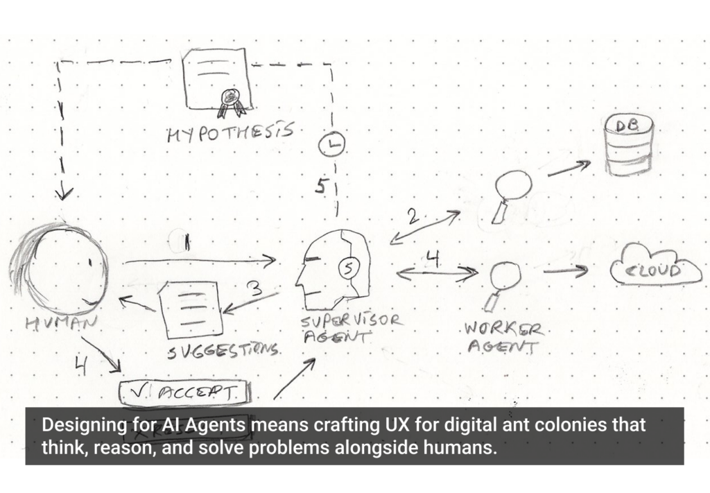
Designing for AI? Know what your agent can actually do. This guide breaks down the four core capabilities every UX designer must understand to build smarter, safer, and more user-centered AI experiences.

Article by Greg Nudelman
Secrets of Agentic UX: Emerging Design Patterns for Human Interaction with AI Agents
  • The article examines how UX designers can effectively work with AI agents by understanding the four key capability types that shape agent behavior and user interaction.
  • It emphasizes the importance of evaluating an AI agent’s perception, reasoning, action, and learning abilities early in the design process to create experiences that are realistic, ethical, and user-centered.
  • The piece provides practical frameworks and examples — from smart home devices to healthcare bots — to help designers ask the right questions, collaborate cross-functionally, and scope AI use responsibly.
Share:Secrets of Agentic UX: Emerging Design Patterns for Human Interaction with AI Agents
10 min read

Design systems were meant to streamline design and boost creativity — so why do they often do the opposite?

Article by Itai Vonshak
The Broken Promises of Design Systems: Why Following the Rules Won’t Get You to Great Products
  • The article questions whether design systems really help create better products.
  • It explains how they often limit creativity, are hard to maintain, and don’t scale well.
  • It suggests we need more flexible, AI-powered tools to support great design.
Share:The Broken Promises of Design Systems: Why Following the Rules Won’t Get You to Great Products
3 min read

Join the UX Magazine community!

Stay informed with exclusive content on the intersection of UX, AI agents, and agentic automation—essential reading for future-focused professionals.

Hello!

You're officially a member of the UX Magazine Community.
We're excited to have you with us!

Thank you!

To begin viewing member content, please verify your email.

Tell us about you. Enroll in the course.

    This website uses cookies to ensure you get the best experience on our website. Check our privacy policy and