Flag

We stand with Ukraine and our team members from Ukraine. Here are ways you can help

Get exclusive access to thought-provoking articles, bonus podcast content, and cutting-edge whitepapers. Become a member of the UX Magazine community today!

Home ›› Business Value and ROI ›› 6 Key Questions to Guide International UX Research ›› Crowdsourcing Is Social, but Does Not a Social Network Make

Crowdsourcing Is Social, but Does Not a Social Network Make

by Shay Ben-Barak
3 min read
Share this post on
Tweet
Share
Post
Share
Email
Print

Save

A loyal Waze user thinks the move toward social networking in newer versions of the app is a wrong turn.

Waze is a great app that runs on the great idea of crowdsourcing map creation, updates, and traffic status. Every user contributes variables like their location and speed, and can proactively report accidents or other traffic issues. The data is sent to the server where it is processed and used to optimize user routes, making driving experiences better for everyone involved. You contribute your share to the community and you get valuable information in return.

Waze also utilizes a gamification model that rewards users with points and badges for desired behaviors like reporting road hazards and allows users to thank one another for their reports. Personally, I don’t give a damn about the points and badges—I’ve been a Waze user for years, and they never meant anything tangible to me. The thanking mechanism is nice, however, because it provides feedback that my reports were beneficial to others, which encourages me to contribute my share and report next time.

It’s all about helping the community when you can, and about being helped when you need it. It’s not about getting to know the Waze community or about making friends, and that’s what makes Waze a crowdsourcing app rather than a social app (and a damn good one: according to Yahoo! report, in June of 2013, Waze had nearly 50 million users!).

Waze is on the wrong route of “What can users do for me?” instead of “What can I do for users?” blvd

Lately, Waze has changed things up a bit, adding social features of its own and pushing away other social competitors from the main usage course. These changes seem to suggest that Waze is aiming for the social arena where communities are established around members sharing personal information.

This is how the “share drive” screen looked in previous versions (Android in this case). Direct share was available via e-mail, text, or Facebook. The <More> button was used to open the standard sharing screen of the platform and you could select other apps. All that seemed to be missing was the option to configure the three buttons next to <More> and replace them with my favorite apps (e.g. add Whatsapp, omit FB) in order to regularly share drive info or my ETA with friends on those apps.

Old Waze sharing screen

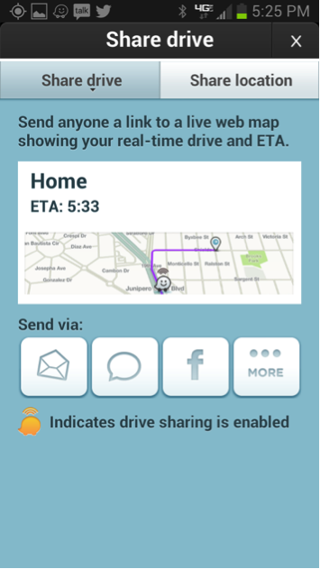
Old Version of Sharing Screen

Current Waze sharing screen

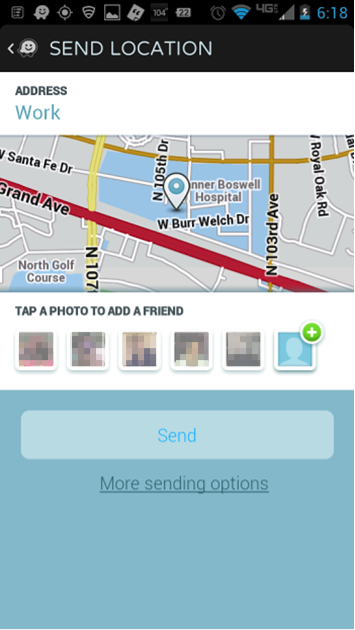
Current Version of Sharing Screen

Recently, Waze has instituted a new approach that sends tentacles into users’ Google contacts, cross-checking for other Waze users, and putting them up front in a cumbersome display of tiny thumbnails that are often unrecognizable. The whole thing seems designed to make the user share drive info using Waze while ensuring the user on the other end gets it via Waze. The thing is, in most cases, the user who is driving only needs to share their ETA, which it is preferrably done by sending a text message.

This desire to easily share information with people who are not necessarily Waze users has been overlooked in favor of trying to create a self-contained social network. Instead of moving more relevant sharing tools forward, the ones I used to enjoy have been concealed. Now, if I want to send a text message, I need to tap the ‘More sending options’ link and look for the texting app in the (long) list of apps.

It seems obvious that after being taken over by Google, Waze is trying to move from being a crowdsourcing app to being a social network. I think this move finds Waze driving on the wrong route of “What can users do for me?” instead of staying on “What can I do for users?” boulevard—a sad change in direction for an app with so much to offer.

post authorShay Ben-Barak

Shay Ben-Barak
Shay Ben-Barak (@ShayUXD) is a freelance experience strategist and senior usability expert. For the last 15 years he is leading projects from the early inventive stages of understanding the users' needs, throughout the process of concept design, to the detailed interaction design and visual design. He is experienced with mobile devices, legacy applications and web applications, and he was involved with development of consumers apps as well as complex systems (e.g. financial, medical, ERP and C4I systems) for professionals. Shay is also a UX mentor at the Google Campus TLV which is a pro bono publico activity of mentoring startups and entrepreneurs in their initial steps towards their very first UX prototype. Shay owns a master's degree (M.Sc.) in cognitive science from the Technion and his master thesis about Mental Models was published in chapter 5 in this book.

Tweet
Share
Post
Share
Email
Print

Related Articles

Find out how the interfaces you use every day are carefully designed to make decisions for you long before you think you’ve made them.

Article by Tushar Deshmukh
The Illusion of Choice: How Micro-Decisions Guide Macro-Control
  • The piece shows how designers use small visual and language tricks to guide users toward pre-determined choices without them knowing it. This is done through the “invisible architecture” of buttons, words, and timing.
Share:The Illusion of Choice: How Micro-Decisions Guide Macro-Control
9 min read

Discover how the design choices behind streaks, infinite scrolls, and guilt nudges are engineered to keep you hooked, and what ethical UX designers can do about it.

Article by Tushar Deshmukh
Designing for Dependence: When UX Turns Tools into Traps
  • The article argues that many popular apps are deliberately designed to create dependency rather than serve users, using psychological tricks like streaks, guilt nudges, and endless scrolls to hijack behavior, and calls on UX designers to prioritize user well-being over engagement metrics.
Share:Designing for Dependence: When UX Turns Tools into Traps
10 min read

Uncover an inclusive design approach to the most common point of friction.

Article by Shannon Joycelyn
Inclusive Login Starts at the First Step
  • The article examines how traditional password-based login systems fail a significant portion of legitimate users, particularly older adults and those in non-Western usage contexts, and argues for recognition-based authentication as a more inclusive alternative, drawing on the curb-cut effect to show that designing for constrained conditions ultimately improves the experience for everyone.
Share:Inclusive Login Starts at the First Step
5 min read

Join the UX Magazine community!

Stay informed with exclusive content on the intersection of UX, AI agents, and agentic automation—essential reading for future-focused professionals.

Hello!

You're officially a member of the UX Magazine Community.
We're excited to have you with us!

Thank you!

To begin viewing member content, please verify your email.

Get Paid to Test AI Products

Earn an average of $100 per test by reviewing AI-first product experiences and sharing your feedback.

    Tell us about you. Enroll in the course.

      This website uses cookies to ensure you get the best experience on our website. Check our privacy policy and