You may have recently seen an abundance of bug-eyed people puking rainbows on Snapchat. Thank Looksery for that. Launched last year as an entertainment app based on face recognition technology and special effects, Looksery was acquired by Snapchat last month.

Looksery technology propels Snapchat’s new special effects
Founded in 2013, Looksery launched in October 2014 after successful crowdfunding on Kickstarter. I recently spoke with lead designer Lidiya Bogdanovich to learn about their design process and how user experience testing transformed their app from good to GREAT.
What was the original concept for the app?
Looksery was always meant to be an entertaining app that demonstrates face detection technology in a fun way, like a video-messenger for you and your friends.
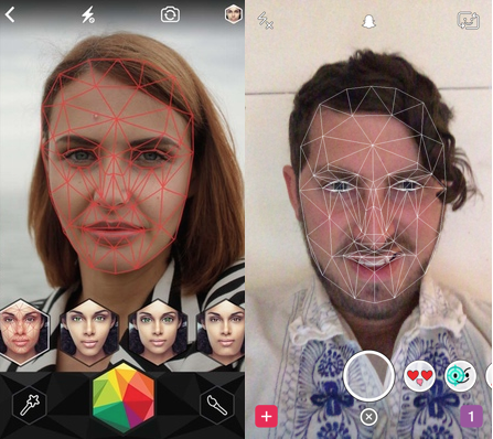
Looksery’s facial recognition on the left, Snapchat’s seemingly identical facial recognition on the right (via Tech Crunch)
What was your role? How big was your team? What type of team members did you have?
It was design made by designers for designers and that is not what we wanted
Since the very beginning of Looksery I was the only designer. On later stages (post launch) our design team grew up to three people. We were a small team and we were doing everything possible for our product to blossom, so we didn’t have very strict responsibility borders of or clearly defined roles.
Startup members usually need to be able to perform multiple tasks and we were lucky to have the crème de la crème” of design society.
And how did you go about designing the product?
At first we relied on speculation and past experience, using on our professional knowledge and more than ten years of design experience. We wanted our app to appear as innovative as possible so we used trendy UI features. It looked awesome.
It was design made by designers for designers and that is not what we wanted. The first user testing showed that people didn’t get how to use it. At the end of the day we wanted all users to enjoy our technology without even thinking about UI.
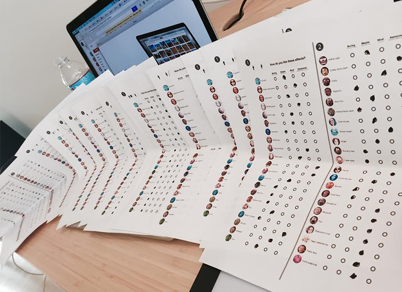
A sample effects survey
Talk a little bit about user testing. How did you administer the user tests?
We tried a lot of approaches at first. But step-by-step we figured out what our mistakes were and proceeded with our “polished” method. First we defined our audience. If we’re an entertainment app, who do we entertain? We decided that the main audience would be teenagers, students, and young people who are active in social media.
Every week we were communicating with our audience in both private testing (when we are talking about UI) and general testing (we were gathering people all together and showing them our special effects, to define which ones they’d use).
While conducting one-on-one testing we were trying to create a friendly relaxed atmosphere, giving our users simple tasks and asking them to comment everything they do while drinking coffee and eating cookies. That way you really see what your user is about, not when they feel like they are a lab mice.
We did testing every other week—even if it was small. That gave us flexibility to react, in case we were doing something wrong. Testing started long before the first launch and proceeded until the very end and, which was very important.
We ended up changing the UI completely after we started testing. At first we wanted to be like all those apps with awesome design that people post screenshots of on design web sites. But it appeared that those apps come and go. Really awesome apps that people like and use on a daily basis, those ALWAYS have a very simple, easy-to-use design.
And this is what we wanted to be. Not a screenshot on a UI design gallery, but an app that you open every day to chat with your friends.
Could you talk more about your user test findings?
The main problem was that people just wouldn’t hold camera the right way, so the face wouldn’t detect and the technology wouldn’t reveal itself—users needed strong lighting to capture their face sufficiently.
We needed to simplify the experience—to instruct the user on what to do without being annoying or making the app look complicated (because no one wants to play with a complicated app). We tried tons of concepts and none of them worked. But after enough testing we figured out that the best results were using walkthrough screens. So we decided to work in that direction.
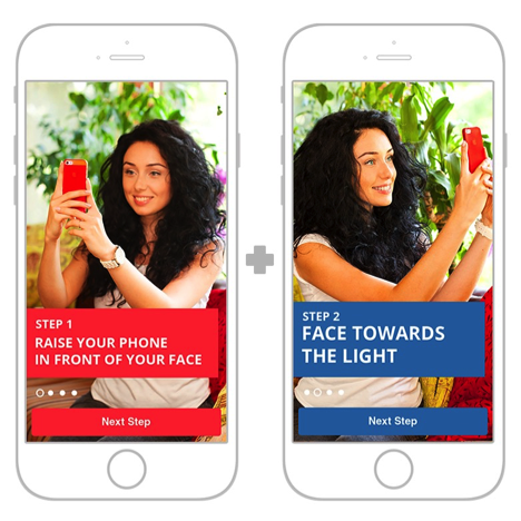
Initial walkthrough screens
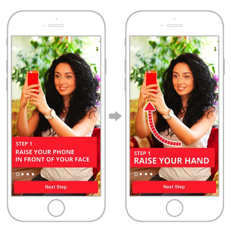
Simplifying the user experience. Why use eight words when you only need three?
We hired a model and a photographer and created new screens. The results were much better this time, but there were still room for improvement. What did we do then? We reduced the length of the titles, and added a “hint” arrow, showing what to pay attention to. We still were getting some funny results but it was working much better.
Any other major problems that you uncovered during testing?
Another problem was with a placeholder-picture that illustrated the photo-filters—the instagram-looking ones that are currently present in every camera.
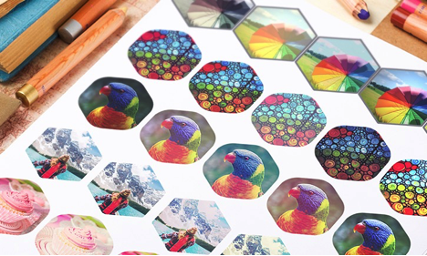
A few initial filter options
After looking through lots and lots of pictures we decided to go with a parrot because it had the best color scheme and the most optimal contrast and detalization. That brought up other issues. We started getting “why am I pressing it I’m not getting a parrot-look” complains but that is part of the learning process!
What are your major takeaways from the process?
A few things:
- Choose the right audience. If you are making app for professional taxi drivers, testing it on your teenage sister or your grandma (unless she is professional taxi driver) is not an option.
- Create a real environment where the app is meant to be used. If it’s a navigation app, test it while walking on the street or riding in a car. If it’s the kitchen recipes app, test it while cooking in the kitchen.
- Install the test app on a familiar device. Try to find something very similar rather than testing on a foreign device—people get used to their devices and other operational system and new phones can cause a lot of stress and irritation. In our case, people didn’t want to take selfies or test the sharing option on our devices, because they were afraid that those pictures can go public or used in the wrong way.
- Find and work with the optimal amount of people. With too few test subjects the result are not representative. With a huge number of subjects, the process might be time-consuming or expensive. Our optimal amount of users is five to seven people and certainly no more than 10. If you have major problems in your app, you’ll realize it after fourth or fifth person.
- Identifying the problem doesn’t necessarily mean the identification of its cause. You have to dig deeper. This is probably the most important point.

Vogue using another filter (full animation here)
Why are people are not sharing? Is the sharing button hidden? The button doesn’t look like a sharing button? Or people just don’t want to do it on your device while you are watching?
That’s extremely helpful. What is the next step for the product? Besides making the initial changes, how do you hope to use your learnings moving forward with product development?
As of a few weeks ago we are now part of a Snapchat team. Lots of celebrities are now using the app, such as Miley Cyrus (Miley Cyrus using Looksery Technology), Kim Kardashian, John Legend, Jimmy Fallon, models of New York fashion week. But me talking about Snapchat is a whole different story

Kim Kardashian West using Snapchat’s new features
My personal goal is to share our design experience, showcasing our mistakes and our attempts to make it better, to help others in their design process. People may choose not do user testing, rely instead on their own design experience, but I hope my experience will help someone in creating new awesome projects.