Save
If you’re new to mobile usability testing, fear not. It is not as hard as you might think but there are some key differences from testing a traditional website in a lab that you need to be aware of.
Over the past year I have done everything from testing a quit-smoking app with a woman whilst she breastfed her five-week-old on her sofa to testing a mobile car insurance website in a lab. I’ve conducted mobile usability testing with no recording technology out in the field as well as testing using a mobile sled system with webcams that feed into Morae usability test software.
In the hopes that I can save other UX professionals time and effort, here are eight things that I have learned from all of this mobile usability testing.
Lesson #1: How to test mobile paper prototypes
One of my favorite quotes comes from Frank Lloyd Wright: “Fix it on the drafting board with an eraser or on the construction site with a sledgehammer.” Testing paper prototypes with users has its merits but how do you test paper prototypes of mobile screens that require scrolling?
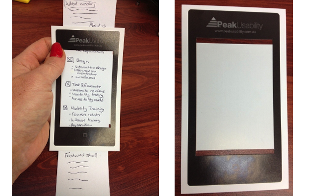
Showing users a paper mock-up of a full screen does not really test what they would do when they only see the first screen. My solution was to develop a cardboard template of a smart phone with two slits through which a paper prototype can be inserted. This simulates what users would see on one screen. You can easily create your own or download our smartphone template for paper prototype testing and print or stick on cardboard.
Lesson #2: Limitations with screen recorders
The obvious benefit of a using a smartphone screen recorder is that it is unobtrusive and does not get in the way of testing. Users can use the device as they typically would in any context or environment.
Unfortunately, Apple isn’t big on approving screen-recording apps for sale in the iTunes store. There are screen recording apps such as Display Recorder (from Cydia) that you can use to record screen activity but personally, I don’t want to jail break my iPhone in order to record a mobile test session. There are a few Android screen recorder apps available, but even if you find a screen recorder app for your smartphone, there are a few issues.
- Screen recorders don’t typically record users’ gestures, such as trying to tap 10 times on a tiny link or a user attempting to use a slider on a touch screen.
- They often have limited recording times and capabilities. You will fill your phone up very quickly if recording one-hour sessions.
- They generally can’t be used to record screen activity of another app so you may be limited to recording mobile web sessions only.
- You can’t use the test participant’s own device unless you want to install an expensive app on their iPhone, which they may not be too keen about.
- They don’t integrate with usability testing software such as Morae, which allows observers to unobtrusively observe a session in real time.
- You can’t typically record user’s facial expressions and verbal comments like you can with standard usability testing software such as Morae.
There are two iOS apps that I know of that partially address the last issue. One is called UX Recorder. It does a reasonably good job of recording screen activity, captures some user gestures (showing circles for taps and arrows for swipes), and records a user’s voice and face (picture-in-picture) using the iPhone’s own camera. Its biggest drawback is you can’t use it to test mobile apps. You can only use it to test mobile web.
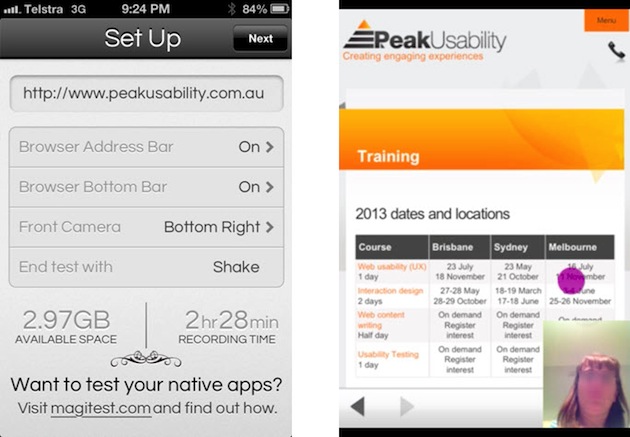
The second is a relatively new iOS app is called Magitest, which, in my view, is more usable than UX Recorder. Magitest captures tap gestures only at this point (although they are soon to add swipe capture, I believe), as well as user’s voice and face using the iPhone camera (picture-in-picture). More importantly, using Magitest Native you can also record screen activity using other iOS apps. It is also quite reasonable priced.
Magitest app and example output
Lesson #3: Benefits of using mobile testing sleds
The alternative to screen recorders is a mobile or tablet testing sled that will allow you to mount a small camera over the mobile device. There are a few key benefits in using sleds.
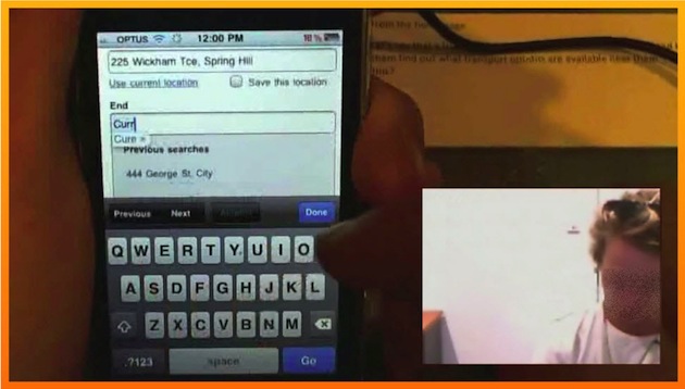
You can record users’ gestures, which are really important for mobile and tablet usability testing. We once had a user trying about 10 times to use a slider on a tablet before giving up. You can also plug your sled webcam into your computer and input into testing software such as Morae. The great thing about Morae is that it lets you input two cameras so you can also record the user’s face and voice using a second webcam. You can then record user’s screen activity, gestures, face, and voice and stream all of it live across your network to an observation room or create video clips later to effectively communicate issues to stakeholders.
Example output using a mobile sled for testing with Morae test software
Nearly all the UX practitioners I know are using DIY sled systems that they have made themselves. We have investigated a number of mobile test sleds and developed a few of our own over the last two years. Here are some of the things to be aware of:
- The sled must be light and easy for test participants to hold.
- The sled should not slow users down or get in their way.
- The sled should accommodate different sized devices so that you can use test participants’ own devices.
- The camera mount should ideally be adjustable to accommodate user preferences and different devices.
- The sled should allow users to easily switch device as well as orientation i.e. portrait to landscape view without having to move the camera position.
- The whole sled set up must still be stable and not move during testing.
Lesson #4: What cameras work best for mobile testing
When we started out with our first sled, we used two Logitech webcams: C910 and C615. These webcams offer good quality, high definition recordings, plug into Morae test software and have easy to use drivers. The main disadvantages are the size and weight. The Logitech C910 is also difficult to connect to a sled.
We found the Microsoft Lifecam offers good 720p resolution, works with Morae, and is easy to connect to the sled as it can bolt on. The downsides of this camera are also the size and weight, plus less flexibility in the camera mount and camera software we find difficult to use.
An alternative to webcams is the IPevo document camera. What we like most about this camera is that it smaller and very lightweight, has a very high resolution, plugs into Morae, and comes with a flexible plastic arm. The down side is that is it difficult to attach to a sled and the frame rate is a bit slow and jerky as it is meant for recording documents.
Our favourite webcam is the Hue HD webcam, which is very light, offers good resolution and frame rates, comes with a flexible bendable arm, and plugs directly into a PC and Morae. It even comes in pretty colours such as pink and green, but as we don’t want to draw attention to the camera we use plain old black.
Lesson #5: There are times when you should use no technology
So far, I’ve mainly focussed on mobile testing technology but there are times when I advocate using no technology (with the exception of the user’s phone, of course). As I mentioned, I recently conducted testing of a quit-smoking app designed for pregnant women. We ended up recruiting mothers with babies who had recently quit smoking or were attempting to quit. Given the sensitive nature of the topic (women who had tried to quit smoking when pregnant) and who I was testing with (new mothers with babies), I needed to conduct many of the test sessions in users’ homes.
As a mother with young children, it was easy to build rapport with these women and for them to open up to me as I attempted to make the testing as casual as possible. One of the test sessions was even run on a participant’s sofa while she was breastfeeding her 5-month-old. She had baby in one arm and tested the app with her iPhone in her other hand. Obviously it was not appropriate to record these sessions in any way and the intrusion of any additional technology would have potentially affected the results. Sometimes it is better not to record at all.
Lesson #6: Context may not always be as important as you think
We hear that context is critical for mobile design but it’s more important for some types of sites or apps than others. There are some interesting mobile web statistics from comScore that actually indicate that the highest use of mobile devices is actually early in the morning and after 8pm at night, presumably when most people are home.
My advice is that you need to consider where users are likely to use your app. For instance, many users of the quit smoking app for pregnant women said they would probably use the app alone at home when they have limited resolve and their phone is on hand. We also worked on a public transport journey planner for mobile, which would much more likely be used when users are out and about, walking down the street. For that mobile site, context was critical.
Lesson #7: How to simulate users’ context and environment
In a lab environment, we may have a stable wireless connection and might not be moving about, but this doesn’t happen often in real life. People use their phones on trains, buses, and while waiting in a queue. Signals drop out. Activity often occurs in short bursts (such as during TV ad breaks). So how do we test for this?
One of our insurance clients was interested in understanding users’ expectations regarding what would happen in the event they lost their signal or left their session and returned to it 30 minutes later. Halfway through their task of getting an insurance quote, I actually stopped users and said “imagine you were doing this on a train and the signal dropped out as you went through a tunnel.” I then asked them what they would expect to happen and showed them a screenshot to help determine what they would do. So even though we could not test on a train, I managed to simulate that experience.
When I conducted testing of the quit-smoking mobile app, some users preferred to come into our test lab. Instead of using our lab’s test room with cameras, desks, and computers, I tried to recreate a “home” like environment, running the sessions on our sofa in our test observation room without using any technology to record the session. Even though this wasn’t the users’ true context, we simulated their home environment and the test outcomes were consistent with sessions I ran in other users’ homes.
Lesson #8: Employing users’ own technology will discover more issues
When we conducted testing of a mobile insurance website, we found that Galaxy and iPhone users loved the pickers for date input. However, I had one user with a HTC phone that really struggled with the date picker for inputs such as years. The year values in the date picker were very slow, and he scrolled quickly it scrolled the whole page.
When testing a public transport journey planner, we used users’ own mobile carrier network connections and some screens/search results were really slow to load. This had an effect on the user experience and satisfaction. This was good information to understand and pass on to the client prior to launch.
By employing user’s own devices and network connections we found issues that we would not have picked up if we had just used our iPhone and fast office wireless connection.
In conclusion
With nearly a third of all page views now coming from mobile and tablets in some Western countries (and even more in many developing countries) UX practitioners and researchers need to embrace mobile. Mobile is no longer an area that a few UX people specialize in, and we need to start designing and testing everything for smartphones and tablets as well as computers.
Hopefully this article will save UX practitioners new to mobile some of the pain I have been through.
If you are interested in finding out more about our upcoming mobile test sled, which we are hoping to make available to the wider UX community, please contact [email protected].
Image of man using mobile courtesy Shutterstock.
- Analytics and Tracking, Android, Apple, Apple iOS, Contextual User Studies, Design, Design Tools and Software, Direct Observation Research, Human factors, Input devices, Prototypes, Psychology and Human Behavior, Research Methods and Techniques, Research Tools and Software, Tablet, Technology, Usability, User Acceptance Testing, Working With Stakeholders
Tania Lang
Tania Lang has been working as a user experience practitioner for a number of high profile clients since 1999. She is founder and principal of PeaXD, a UX Brisbane based consultancy, which she founded in 2003. She is proud to be called a UX Geek, is passionate about user experience and has been known to conduct ethnographic studies of users reading poorly designed toilet direction signs at airports. Tania is also a highly regarded and experienced trainer having delivered UX training to over 1200 participants both in Australia and Asia. She has also presented at several conferences including UX Australia. Tania has personally designed all training courses and interactive exercises. She enjoys sharing UX stories from the trenches and seeing participants gain the skills and confidence to apply in their workplace.
She has a Masters of Business by Research which involved researching how travel consumers use the Internet. She also has a Bachelor of Science, Grad Dip in Arts (Tourism) and a Graduate Certificate in Human Factors.
Specialties: User/customer research, UX design, customer journey mapping, usability testing, interaction design, information architecture, service design, UXtraining.


