
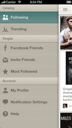
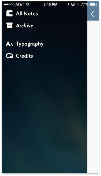
One of the most common implementations of menu views has been the “side drawer,” “basement,” or “side menu” made popular in apps such as Facebook and Path.
When a user taps the “Hamburger” icon to open a side menu, the main screen slides to the right (or left in some implementations) to reveal another screen below.
This works well in iOS 6 and earlier operating systems because the status bar exists in a 20pt tall area isolated from the rest of the application. In iOS 7, the status bar is overlaid on the screen below it. In other words, the app and the status bar are no longer two separate worlds, as was seen in iOS 6. This change utilizes more of the screen space but presents an interesting problem when implementing a side menu.
The Problem
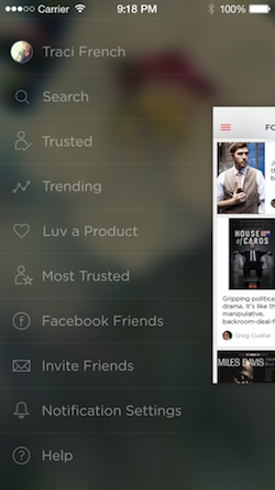
Because of this new setup, designers have had to come up with a way to show a top-level navigation menu without cutting the status bar up with a layer stacked on top of another layer. If developers were to implement the sidebar in the old style they would have a vertical break through the status bar information.
Our designers at Two Toasters first encountered this challenge while helping a client, Luvocracy, redesign their app for iOS 7 before it had publicly launched. Many of the design decisions made for the iOS 6 version were easily carried over or satisfied iOS 7 design guidelines. The side menu, however, was uncharted iOS 7 territory, with no clear-cut right or wrong approach.
We saw a unique opportunity to find a clever way of implementing the side menu
Despite having no defined solution, we saw a unique opportunity to find a clever way of implementing the side menu. Working with Luvocracy, we went back to the drawing board and gathered inspiration from the design community and Apple’s native UI elements in iOS 7.
The Inspiration
The first places we turned to were design communities like Dribbble. Before iOS 7 reached the general public, designers on Dribble were playing around with side menu implementation ideas. Our designers stumbled upon a few they felt were sleek and also made good use of the many of the attributes of iOS 7, such as layering and blurring. Those projects include an iOS 7 style inspired menu from Creativedash and a Side Menu concept from Jayson Lane demonstrating layering and translucency.

While Apple didn’t directly demonstrate how to implement a side menu in iOS 7, there were a few cues we picked up on in their native UI and incorporated into our final design. Namely, the zooming transition of the side menu—a transition seen all over iOS 7, from the App Switcher, to the home button, to the launching of apps.
Our Solution
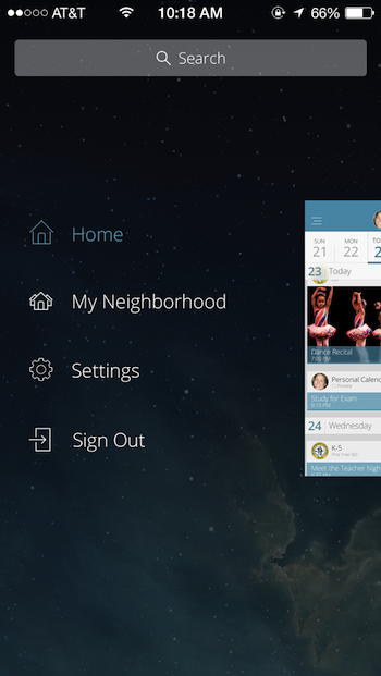
From the pieces of inspiration mentioned above, we landed on the following design for the side menu.
Using an objective-C library we created named TWTSideMenuViewController (subsequently open sourced on Github), we solved the side menu animation problem by moving and scaling the main view down and away from the status bar. We also improved the scaled down view by thinking of the menu and the main view as a single view with both of them in the same visual plane. In other words, we changed the viewport to focus on different aspects of the application as if zooming in or out like the new iOS 7 app switcher.
Other Solutions
While we can’t speak for the inspiration behind other solutions, we can share some notable alternatives we found in apps updated for iOS 7. Ones we took particular note of included American Airlines, Foursquare, Mailbox, Kindle, and Vesper—all of which can be seen in action in the following video:
American Airlines
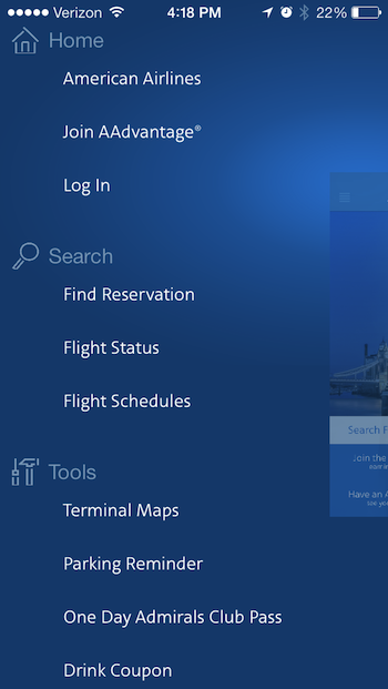
The American Airlines app follows fairly similar patterns to the Luvocracy app, but differs in how the screens animate back over top of the side menu and the speed at which it animates overall. Depending on what screen you are on before, a different animation will occur. When selecting a screen that is above your last one, the screen will animate down onto the view, likewise for an item below the current screen in the list, the screen will animate up onto the screen. The Luvocracy animation was designed to animate like a camera moving the point of view in and out, while the American Airlines app was designed as a shrinking animation.
Foursquare
For Foursquare the app fades out from behind the status bar and the sliding menu animates separately. Essentially, it doesn’t add anything new, instead forcing the old style to work for iOS 7.
Mailbox
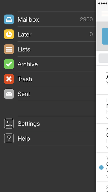
In Mailbox the app moves the status information completely off the screen and pushes the side menu all the way to the top. An interesting solution, but maybe not the best one, as it momentarily removes all status information from the screen and may be frowned upon by Apple as it may need to access things unavailable in the public API.
Kindle
Kindle had one of the more interesting solutions we came across. When accessing the menu, the sidebar slides above the main layer in the form of a glass overlay. This certainly seems inspired by Apple’s navigation to the Control Center and Notification Center in iOS7. Overall, Kindle is a great representation of a third-party app sticking to Apple’s guidelines. While we all love this approach, the designers had to be careful and make sure their design had a consistently dark background for the status bar to overlay.
Vesper
The Vesper app’s sidebar animates very much the same way most apps did in iOS 6— the app remains behind the status bar. It doesn’t obscure the information on the status bar, but perhaps isn’t the ideal solution given the visual break in the status bar area.
In Conclusion
As you can see, there are numerous solutions to the implementation of the side menu in iOS 7. If you are working on an iOS 7 app and thinking about including a side menu, I hope you found inspiration in some of the apps mentioned. Please share your experiences designing for iOS 7 in the comments below.
Hamburger icon image courtesy Timothy Miller.Ad by
[google_ad:WITHINARTICLE_1_234X60_ALL]
[google_ad:WITHINARTICLE_1_468X60]


