Flag

We stand with Ukraine and our team members from Ukraine. Here are ways you can help

Get exclusive access to thought-provoking articles, bonus podcast content, and cutting-edge whitepapers. Become a member of the UX Magazine community today!

Home ›› Business Value and ROI ›› 6 Key Questions to Guide International UX Research ›› The Future of Wearable Technology in Pictures

The Future of Wearable Technology in Pictures

by UX Magazine Staff
3 min read
Share this post on
Tweet
Share
Post
Share
Email
Print

Save

The winners of our Drawing Ideas giveaway use sketches to imagine hypothetical uses for wearables.

Last month we announced a contest to give away two copies of Drawing Ideas along with some stencils from UI Stencils. To enter, readers were asked to sketch a response to the following prompt:

“Show us where wearable technology is headed and what kind of ecosystem it will exist in.”

“Selecting outright winners was difficult,” Mark Baskinger and William Bardel, the authors of Drawing Ideas say. “We found all of the submissions to be intriguing and are thrilled to see that designers continue to sketch and visually communicate via hand-drawn methods. We thank all who took the time to participate in this competition. The winning submissions demonstrate a good craft of drawing, organized composition and layout, and clarity of intent.”

Click on any of the images below for full-size versions.

The 1st place submission comes from Błażej Krysiak, a UI/UX Architect from Poland. “Creating intuitive interfaces with perfect user experience is my obsession,” Krysiak says, “combining my passion for art with my daily work routine.” His sketch shows a system where users can run using wearable band to earn virtual coins. They can then use the coins to pay for items in special vending machines or get discounts at sporting good stores.

Błażej Krysiak wearable tech sketch

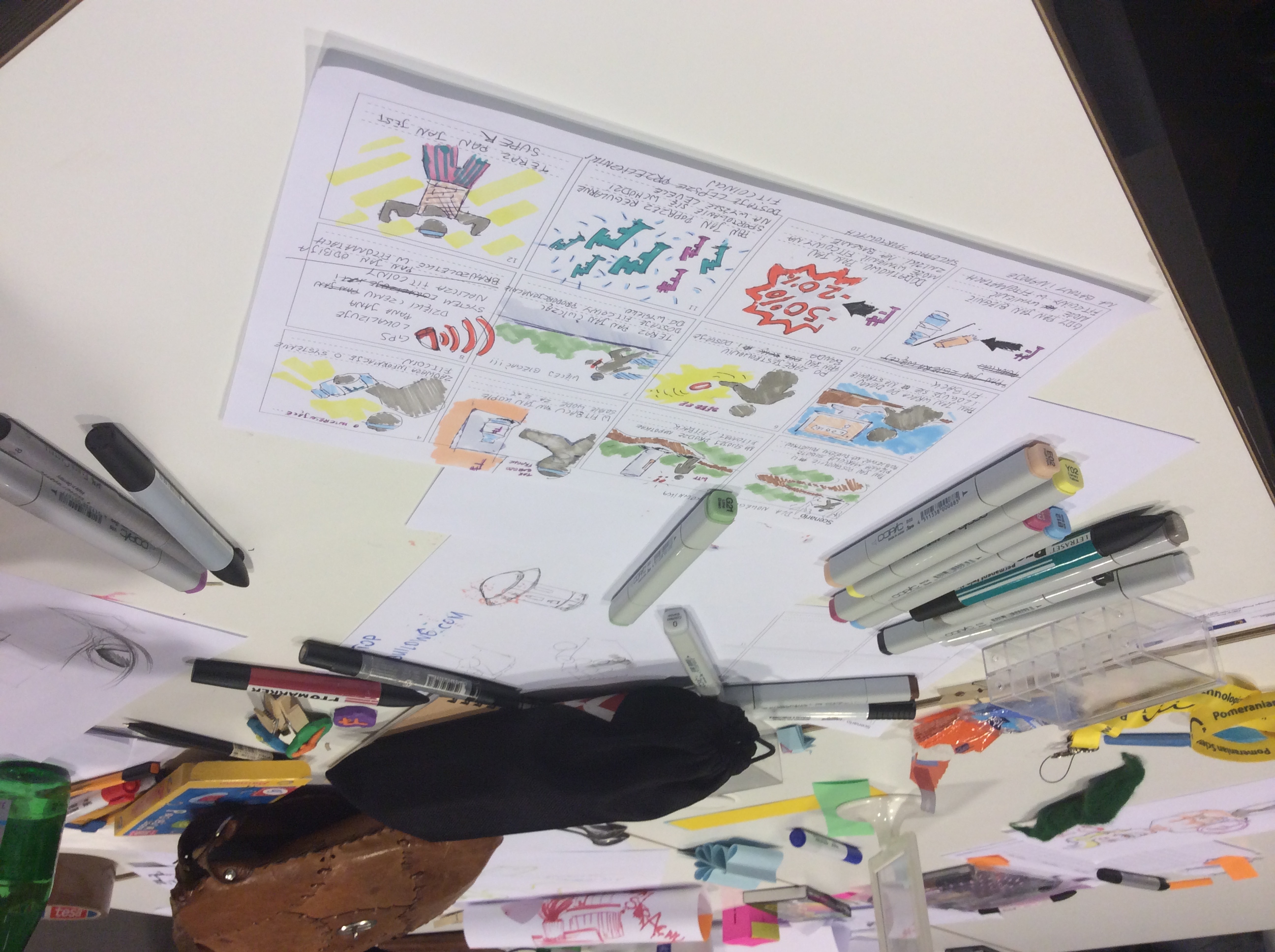
“The storyboard format is a great method for clearly ariculating time and relationships in a product system,” Baskinger and Bardel say. “This particular storyboard shows a range of ideas and connects them in interesting ways. Good use of color and form—overall, an engaging piece that shows the designer’s thinking and how products, technology, and people all fit together.”

Our 2nd place submission comes from Alecsandru Grigoriu, a Design Lead at Grapefruit, a product development agency in Romania who also does volunteer work as Global Design Ambassador for the Interaction Design Foundation. “In my free time I love to draw cartoon characters and listen to The Killers.”

He calls his concept “The Tagables” and it consists of an e-ink smartwatch and a pair of ring-controlled smartglasses. The watch’s e-ink display improves battery life. It isn’t touch friendly, and relies on a scrolling surface beneath it. With this surface the users can swipe and navigate through the interface. It also has a tap mechanism in order to confirm actions (as seen in the sketches).

Alecsandru Grigoriu wearable tech sketch

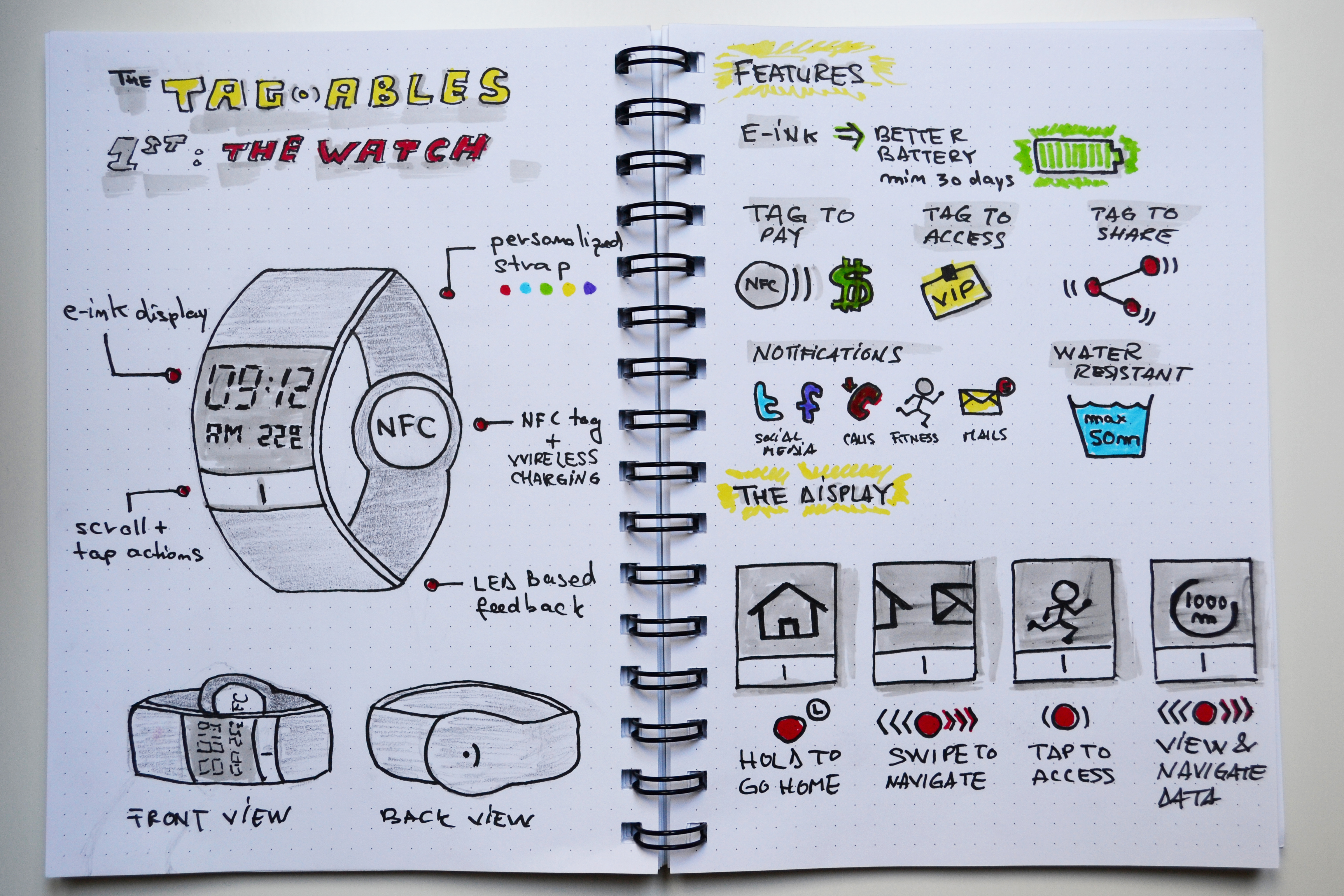
“At the end of the strap you have the NFC where you can make mobile payments (Tag to Pay), get access to certain events (Tag to Access) or share data (Tag to Share),” Grigoriu says. “You can also view fitness data based on its sensors (distance, calories etc.). You can view all kinds of notifications (Facebook, Twitter, Calls, Fitness, and Mail). The smart watch was designed to be an extension of our mobile phone. This means no clutter, no apps you won’t use—just the things you need to stay informed with your status.”

Alecsandru Grigoriu wearable tech sketch

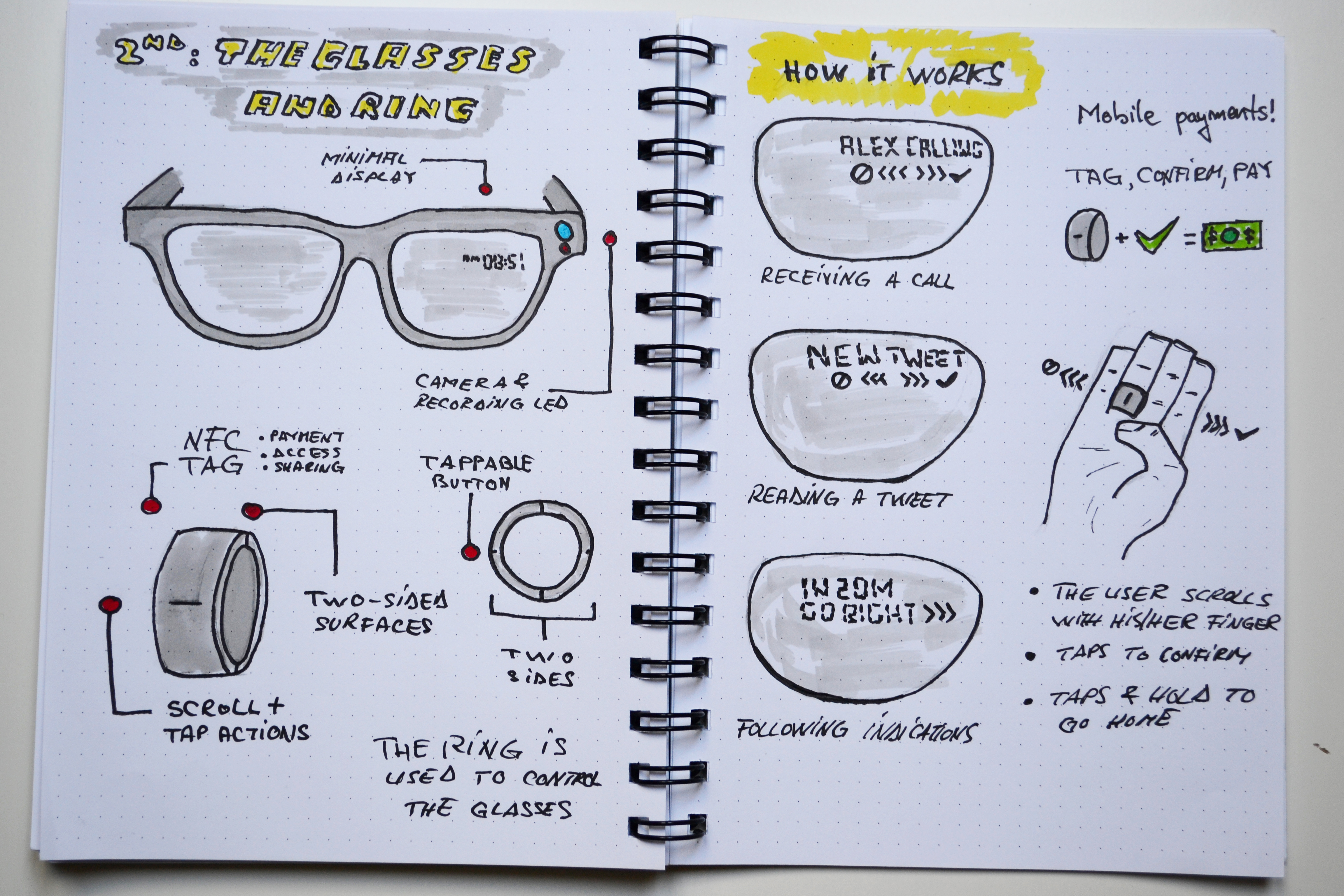
“The glasses themselves are pretty straightforward. They can display a minimum amount of data (to improve battery life and lower cost) and can record or take pictures. With the ring you can scroll right or left to and tap to confirm (just like the watch). For example, when receiving a call you can scroll/swipe right using the ring’s surface to receive the call or left to reject it. The same goes for taking picture (zoom-in, zoom-out, shoot etc.)”

Alecsandru Grigoriu wearable tech sketch

“Great use of a sketchbook spread to get some ideas down in an organized way,” Baskinger and Bardel say. “The sketches are loose and inviting, and provide enough detail to communicate the basic intent. Nice use of spot color and text to clarify the sketches.”

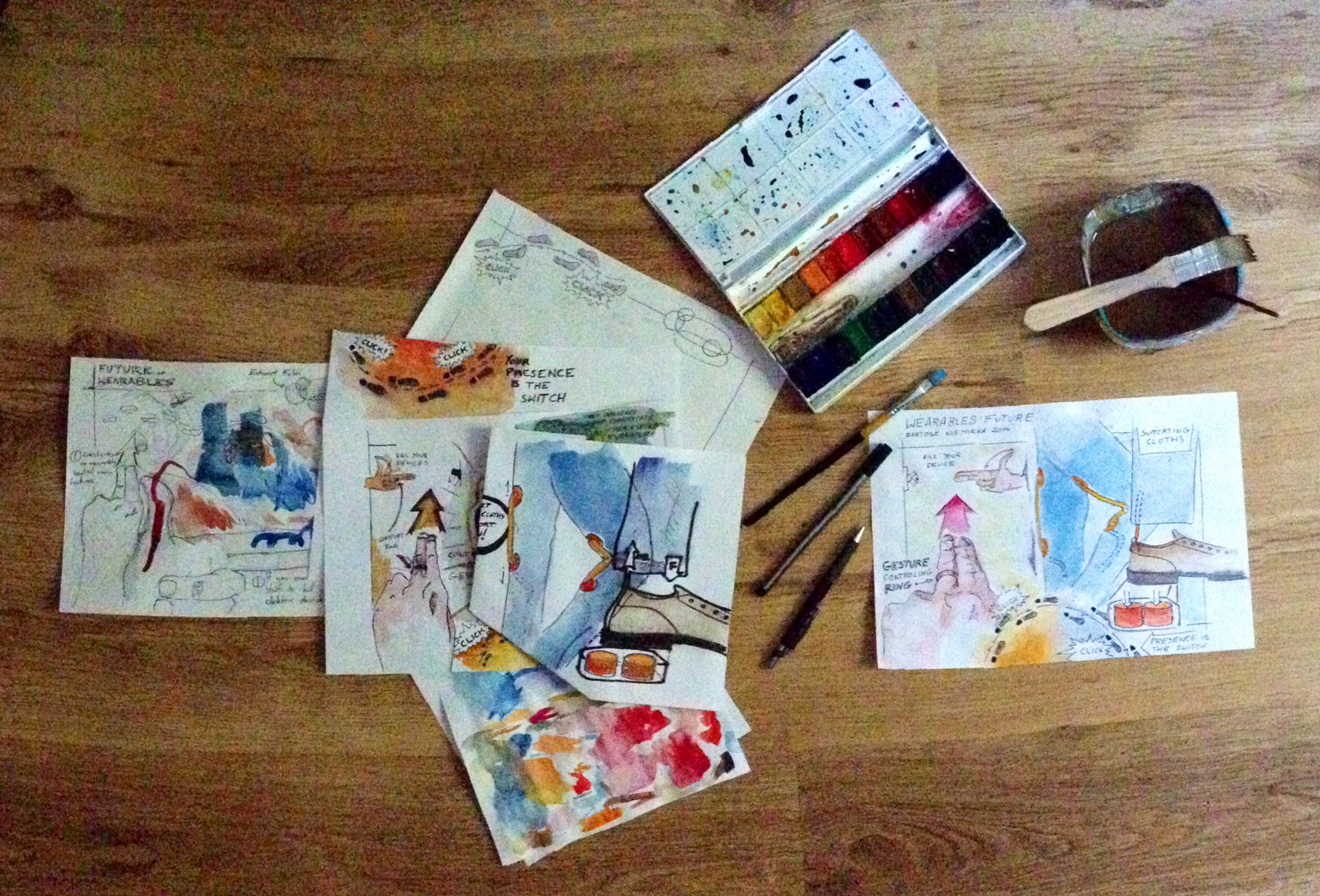
Baskinger and Bardel also selected an honorable mention submitted by Bartosz Niemirka, a graphic designer also based in Poland, where he works as a UI/UX expert at MicroStrategy. Niemirka studies art at the Polish-Japanese Academy of IT in Warsaw and loves seeing how technology converges with our daily lives, “becoming progressively invisible yet noticeable.”

Bartosz Niemirka wearable tech watercolor

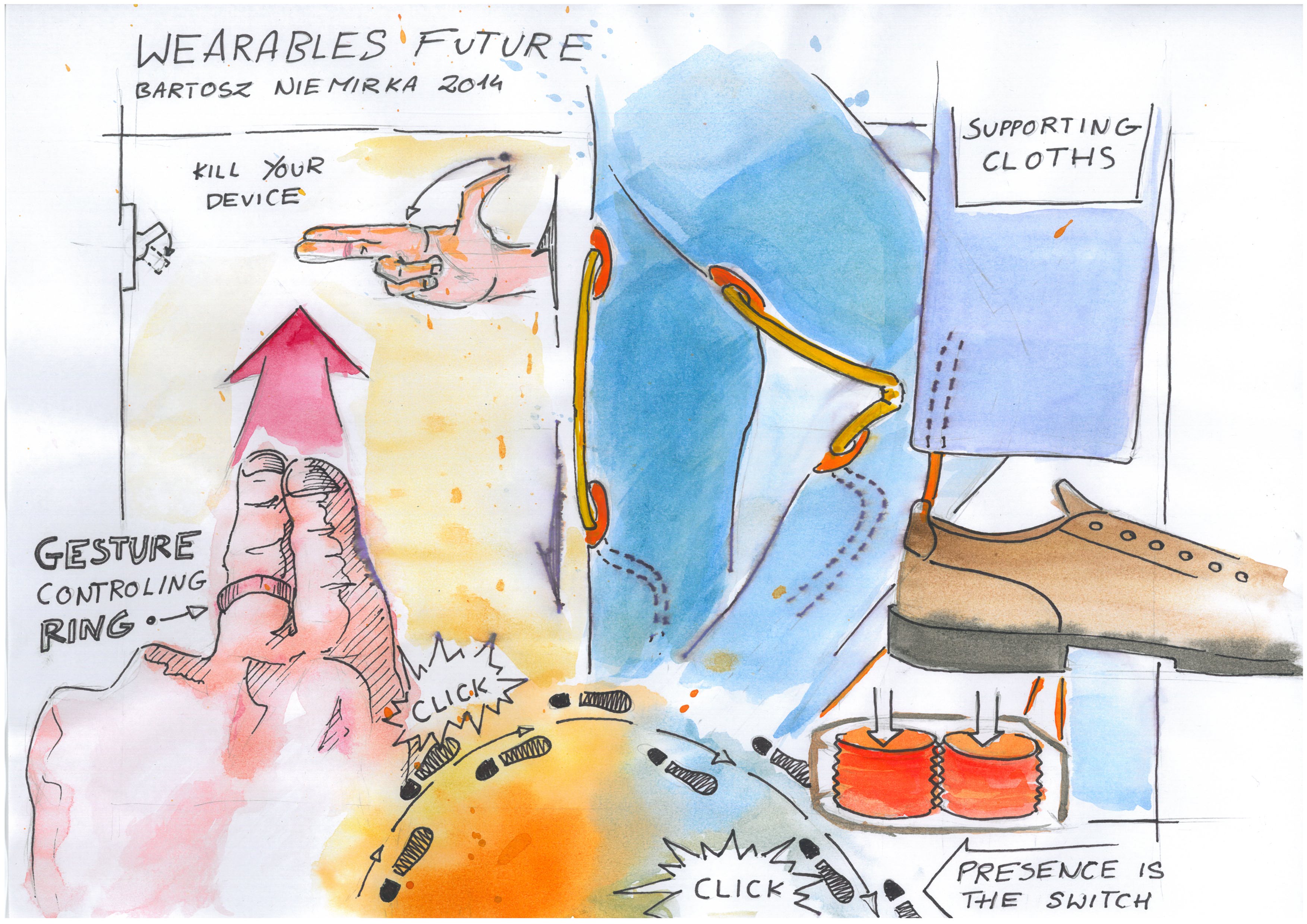
“This is a very engaging sketch done in an expressive way,” Baskinger and Bardel say. “We really like the use of watercolors to create the dynamic, yet soft feel. The concept is interesting and works as a loose collection of images within a theme.”

Bartosz Niemirka wearable tech watercolor

Want to get a better look at Drawing Ideas? Check out our video flip-through:

post authorUX Magazine Staff

UX Magazine Staff
UX Magazine was created to be a central, one-stop resource for everything related to user experience. Our primary goal is to provide a steady stream of current, informative, and credible information about UX and related fields to enhance the professional and creative lives of UX practitioners and those exploring the field. Our content is driven and created by an impressive roster of experienced professionals who work in all areas of UX and cover the field from diverse angles and perspectives.

Tweet
Share
Post
Share
Email
Print

Related Articles

Discover how AI is changing UX research. It’s not just making data analysis faster. It’s also encouraging people to think more deeply. Learn how to strike a balance between human insight and AI-driven efficiency to create more thoughtful designs.

Article by Charles Gedeon
How AI and Metacognition Are Shaping UX Research
  • The article talks about how AI can speed up data analysis and encourage people to think more deeply about biases and missed insights, which can improve the quality of user-centered design.
  • It shows that AI-powered UX research tools need to include reflection checkpoints. These checkpoints let researchers critically assess their assumptions and conclusions.
  • The piece highlights the collaboration between AI’s ability to recognize patterns and human judgment to make sure the research outcomes are meaningful and consider the context.
Share:How AI and Metacognition Are Shaping UX Research
4 min read

How can thoughtful workspace design transform collaboration and creativity? Discover how a human-centered approach reimagined 21,940 square feet into a flexible, inspiring environment that employees love.

Article by Aalap Doshi
Rethink Space: Designing a Human-Centered Workspace that Supports Flexibility, Collaboration, Privacy, Innovation, Creativity, and Transparency
  • The article explores how human-centered workspace design can improve collaboration, flexibility, and creativity by addressing employee needs.
  • It highlights solutions like open zones, quiet spaces, and pod-like configurations, showing how these changes boosted teamwork and morale.
  • The piece emphasizes the value of co-creation, adaptability, and clear communication in rethinking office spaces.
Share:Rethink Space: Designing a Human-Centered Workspace that Supports Flexibility, Collaboration, Privacy, Innovation, Creativity, and Transparency
7 min read

Why do designers grumble at the mere mention of PowerPoint? Discover smart strategies that turn frustration into creative solutions.

Article by Jim Gulsen
Why Designers Hate PowerPoint (and How to Fix It)
  • The article examines why PowerPoint often frustrates designers, from its limited design capabilities to inefficient workflows, and explores opportunities to bridge those gaps.
  • It highlights strategies like building systematic design elements, creating templates, and augmenting slides with other design tools.
  • The piece underscores the importance of collaboration, simplicity, and proactive planning to elevate design and streamline workflows.
  • It highlights practical methods to help designers balance quality and speed for presentations that are both functional and visually engaging.
Share:Why Designers Hate PowerPoint (and How to Fix It)
4 min read

Join the UX Magazine community!

Stay informed with exclusive content on the intersection of UX, AI agents, and agentic automation—essential reading for future-focused professionals.

Hello!

You're officially a member of the UX Magazine Community.
We're excited to have you with us!

Thank you!

To begin viewing member content, please verify your email.

Tell us about you. Enroll in the course.

    This website uses cookies to ensure you get the best experience on our website. Check our privacy policy and