When it comes to mobile experience design I find it extremely helpful and productive to focus my work through a framework I call Simplify, Prioritize, and Bulletproof. I’ve used this framework for several years on projects ranging from making an existing website smartphone-ready to mobile-only projects. Whenever I’ve used it, my framework has helped focus my design work and get it done faster and at a higher quality. It also serves as a check for me to see if I’m putting too much design into in a design.
Getting started on a mobile design project involves a lot of steps from user and task analysis, to uncovering essential functionality, to identifying desired target devices. I find my framework makes me more productive when the actual screen design work begins.
The framework is easy for me to follow, which is why I use it. It works like this:
- Simplify: Only put on a screen the things that actually need to be there for a user to complete a task.
- Prioritize: If your existing desktop application has a lot of features, prioritize which ones are really needed in the mobile context. If more features than you expected are needed, prioritize which ones should be presented first. This is about the ruthless curating the features and using progressive disclosure for those that are determined to be “must haves” in a mobile experience.
- Bulletproof: Plan for task failure. People’s fingers are imprecise input devices and they will make mistakes. Plan for those mistakes and how you are going to prevent them or help the user gracefully recover.
I’ll illustrate the framework with examples from popular websites and apps.
Simplify
Simplifying a mobile design is about asking what features or interface elements really need to be part of the experience. For example, when enrolling someone in a service on their mobile device, do you really need to ask them for a first and last name when a simple email address and password combination will get them enrolled faster? The first and last name may be an important part of the experience later, such as in communication between users and the service or between users themselves. But always ask if they need to be part of registration on a mobile device? They often don’t.
Plan for task failure. People’s fingers are imprecise input devices and they will make mistakes.
Below are examples from TripAdvisor, the popular travel and reviews website. In the desktop version of its signup it asks for a first and last name, while in the mobile version it does not. It appears the mobile-optimized version of TripAdvisor’s site is asking for the bare minimum amount of information needed to create an account in the mobile context. This allows people to immediately start consuming content and writing reviews (important TripAdvisor business goals).
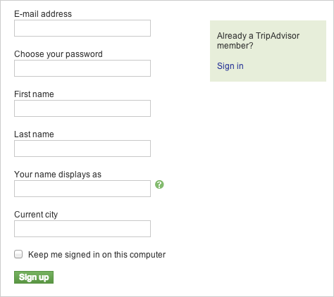
TripAdvisor’s desktop website signup form
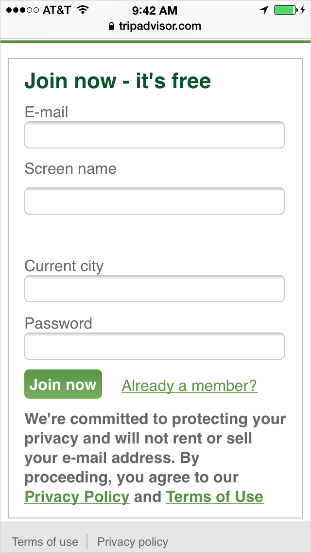
The version of the signup form presented to people using a mobile browser
Now let’s look at TripAdvisor’s member profile. TripAdvisor lets its members set various attributes of their profile when they are using the desktop site. This allows TripAdvisor to better target ads and make suggestions about hotels and destinations. But that same form would be quite unwieldy on a smartphone, and I question if anyone would ever complete it.
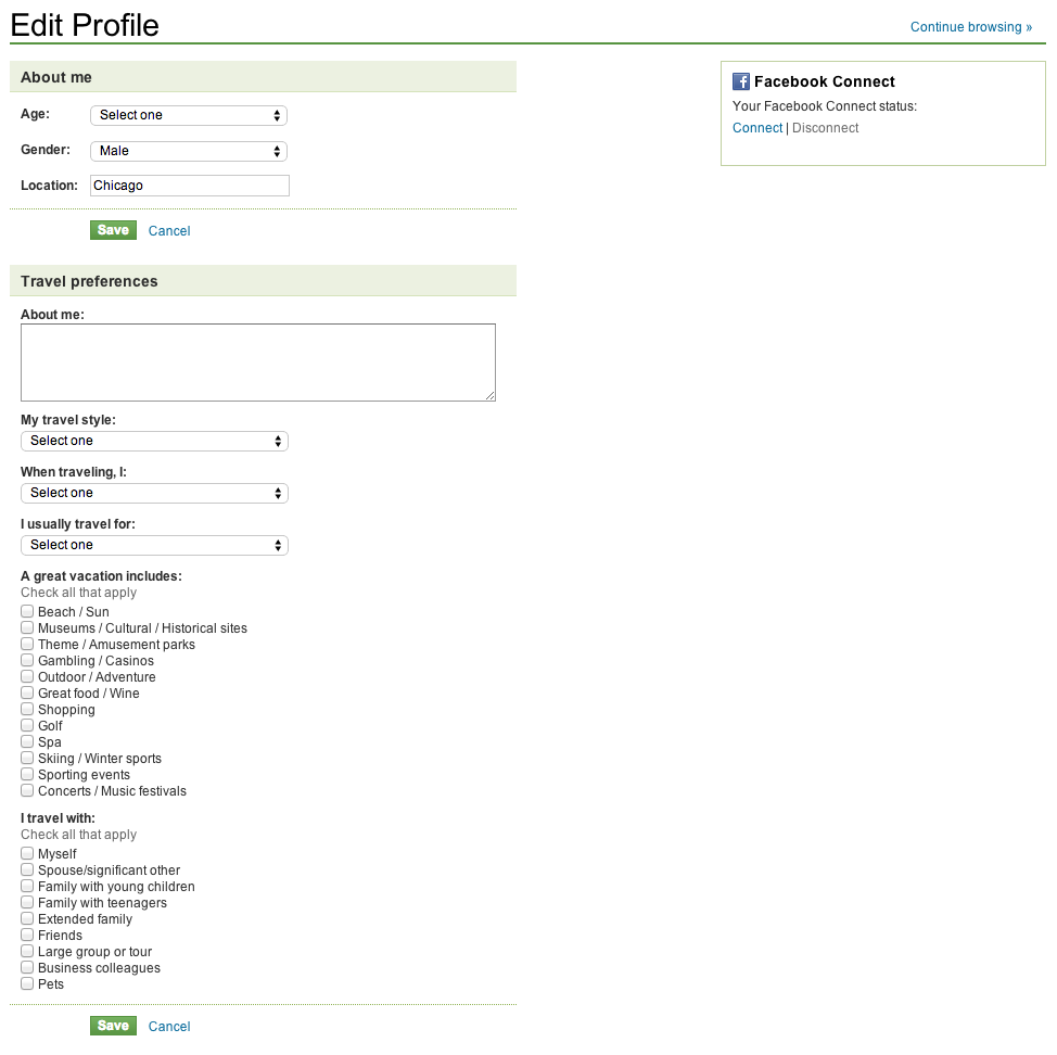
TripAdvisor’s desktop profile settings
Compare this to TripAdvisor’s mobile experience. Users of the site on a mobile device cannot edit their profile. However, they can set their currency and country. These are useful settings to be able to update when someone is traveling to Berlin and wants to set their currency to the Euro and see what things cost if they are using the local currency. Country is an important setting on the website in a mobile context because TripAdvisor has some country-specific sites, while its native apps can figure out where a user is using geolocation. TripAdvisor also allows country selection on the desktop version of its site to direct users to a country-specific version. While this may be limiting to its business in some cases, mobile-only users may be an edge case for TripAdvisor.
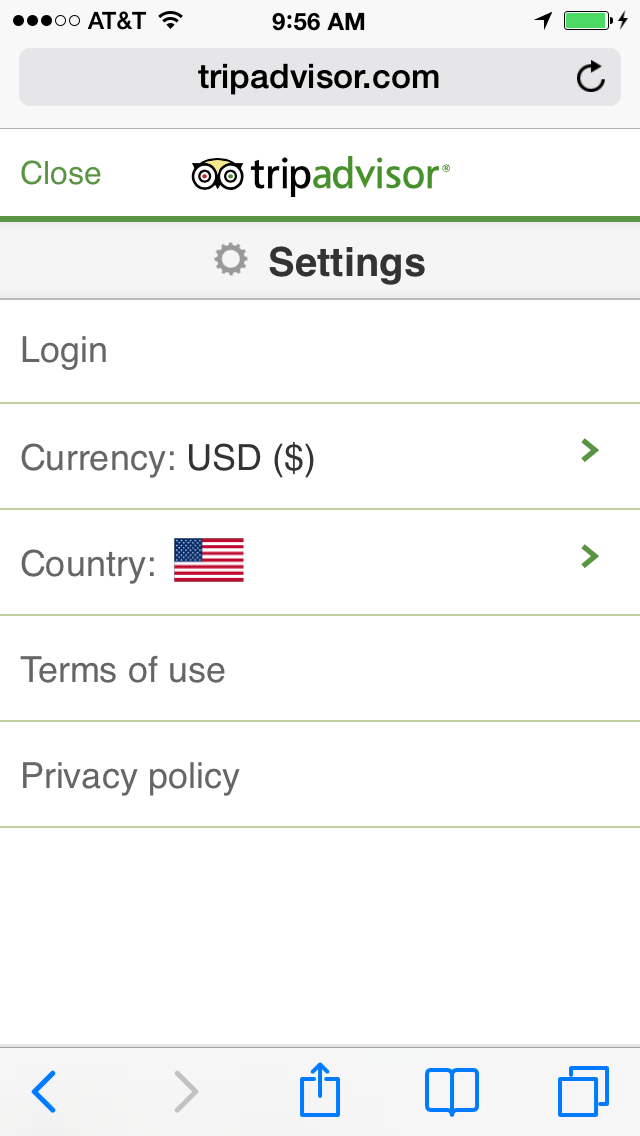
Settings available when TripAdvisor is used on a mobile browser
Instead of letting users set their country on its native iPhone app, TripAdvisor lets them set units of measure like miles versus kilometers. Setting units isn’t even available on the desktop experience because it wouldn’t make sense in most cases, but it makes sense in the mobile context if you want to see how far it is to that 5-star restaurant. These choices seem very focused on the mobile context of a traveler and indicate thoughtful design by the TripAdvisor team. I would, however, include selection of preferred units of measure on the website when viewed on a mobile device.
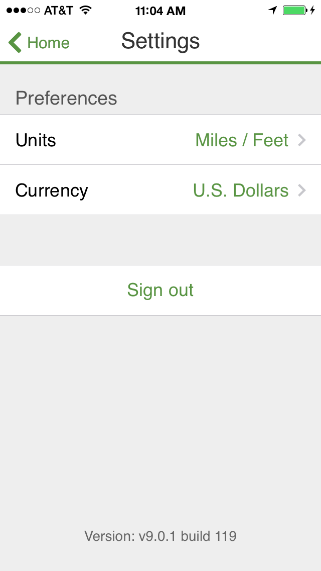
TripAdvisor’s mobile settings for its iPhone native app
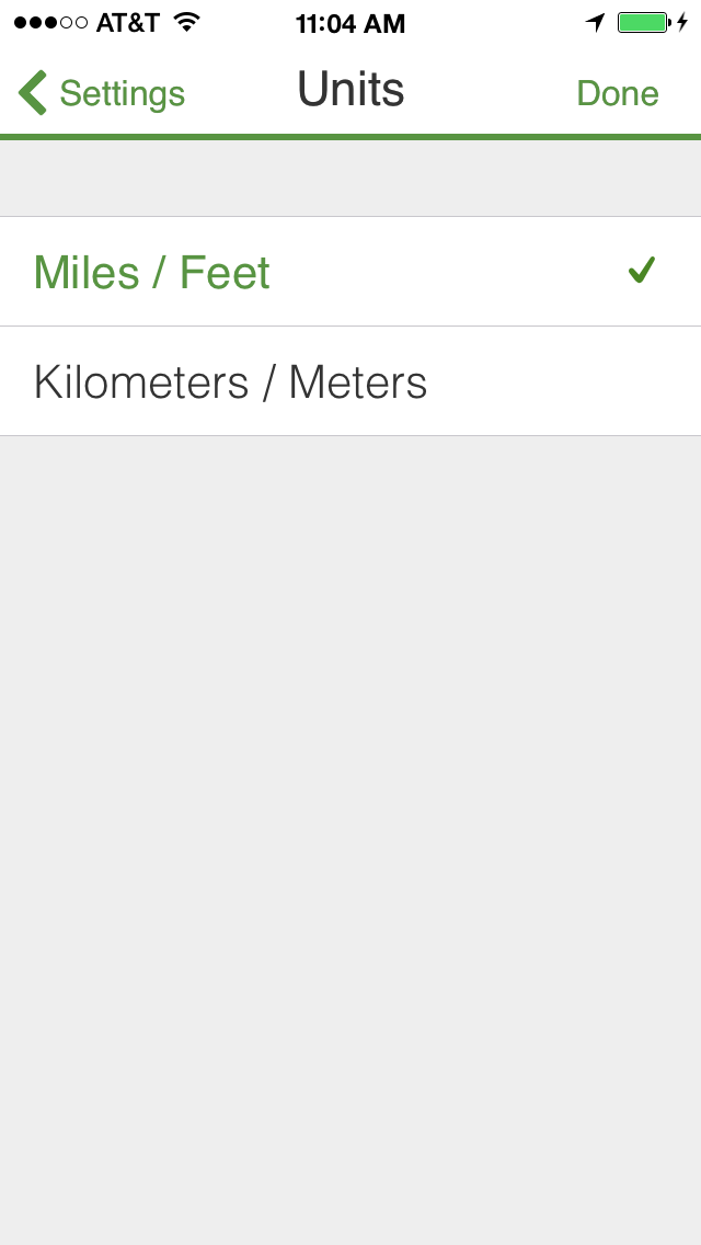
Settings for units of measure
It’s this type of thinking about what exactly is needed in the mobile context (and even what is appropriate for web versus app experiences) that’s at the heart of my Simplify step.
Prioritize
Prioritizing is a lot like simplifying but focuses on mobile experiences that for some reason need a lot of features. The goal of prioritizing is to put the most important features in front of the user first and let others take a lower priority.
Twitter is one of my favorite examples of prioritizing based on the mobile context. On the desktop website, a user can get suggestions on who to follow and see what topics are trending right from their main profile page. But Twitter’s mobile apps are totally focused on the feed, relegating suggestions of who to follow to the user’s profile page.
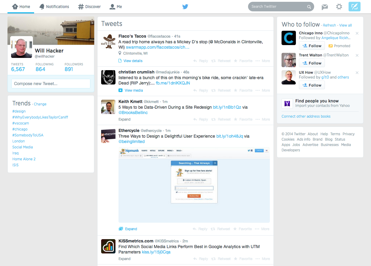
Twitter puts a lot of features, like suggestions of who to follow and trending topics, on the main user profile page of its desktop website
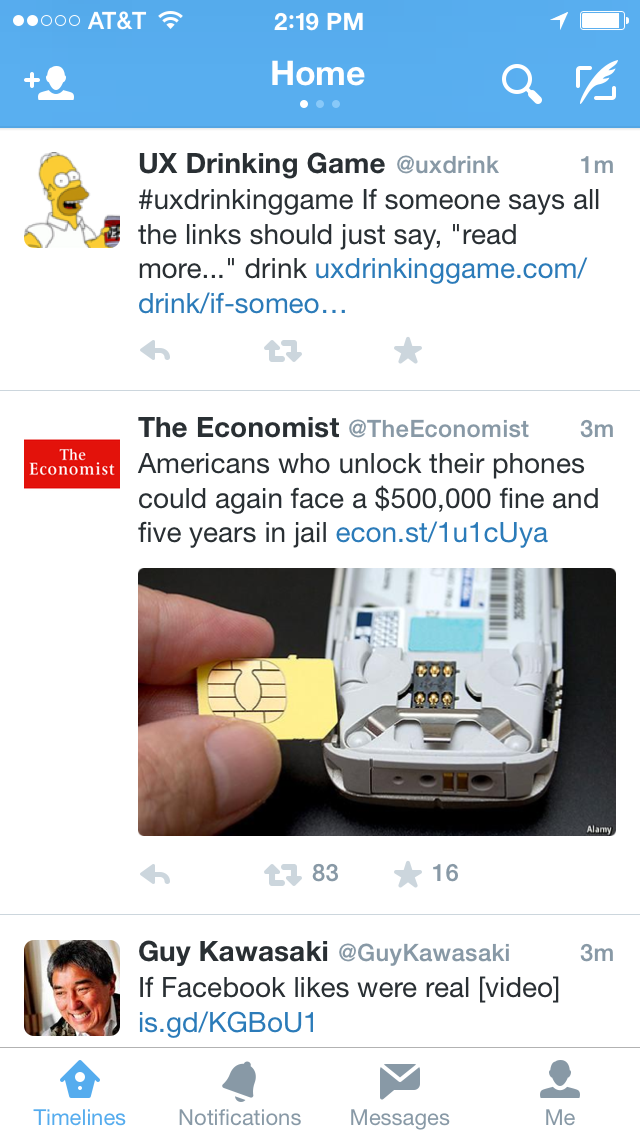
Twitter’s main screen on its iPhone app is all about the feed, with supporting navigation pushed to the edges of the screen
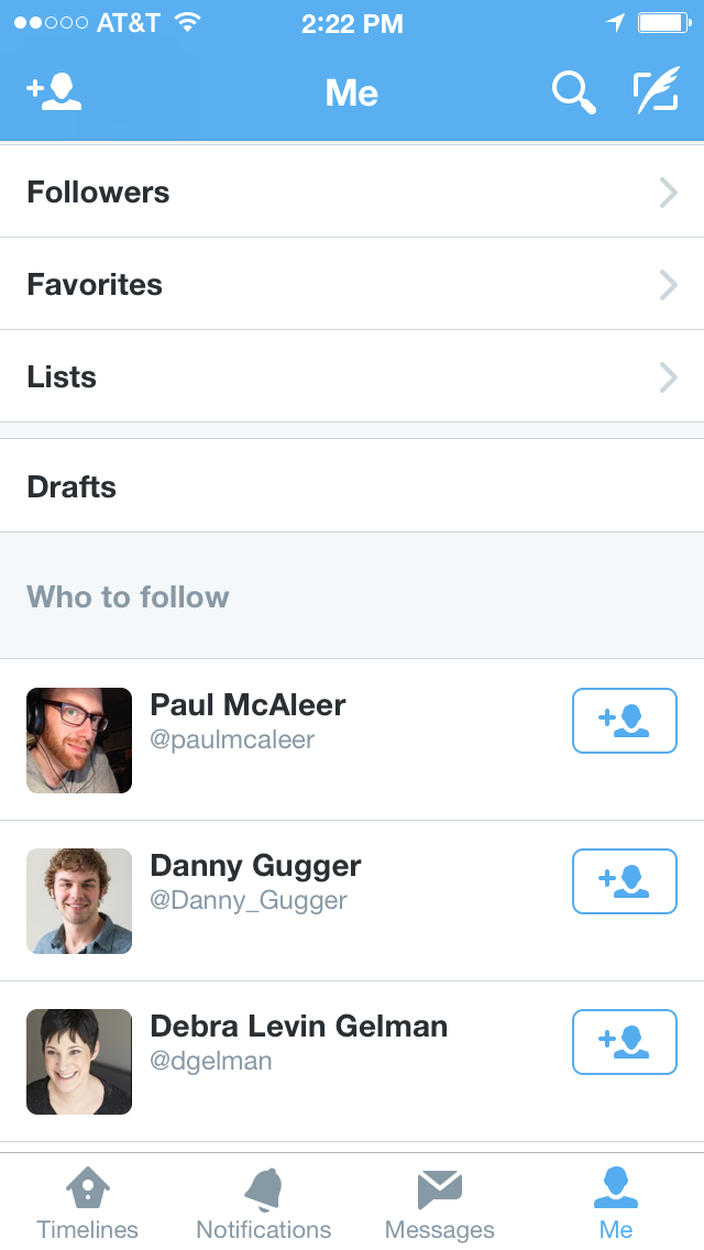
Features like suggestions of who to follow are moved to the profile page, where they are given a lower priority to a user who wants to read and post to their feed
Prioritizing is critical for apps like Twitter that have heavy mobile usage but also have important features that have to be part of both the desktop and mobile experiences. It’s the thoughtful balancing of the priority of these features for mobile users that makes Twitter such a successfully context-sensitive app.
Bulletproof
Who hasn’t inadvertently deleted an important email message on their smartphone and been forced to go to their trash folder to get it back? Mobile email apps should make it easier to recover the deleted message since many people often are reading their email in noisy, jostling environments like airports or riding in a public transit railcar that is bouncing around a bit. We all “fat finger” things on our phones, and it always seems that we accidently delete that important email from our boss.
Gmail provides a great example of bulletproofing. After deleting a message a panel briefly appears at the bottom of the screen that allows the user to undo their action with one tap. And the panel is placed at the bottom of the screen, close to the user’s thumb. This kind of thoughtful bulletproofing goes a long way toward helping users love an app.
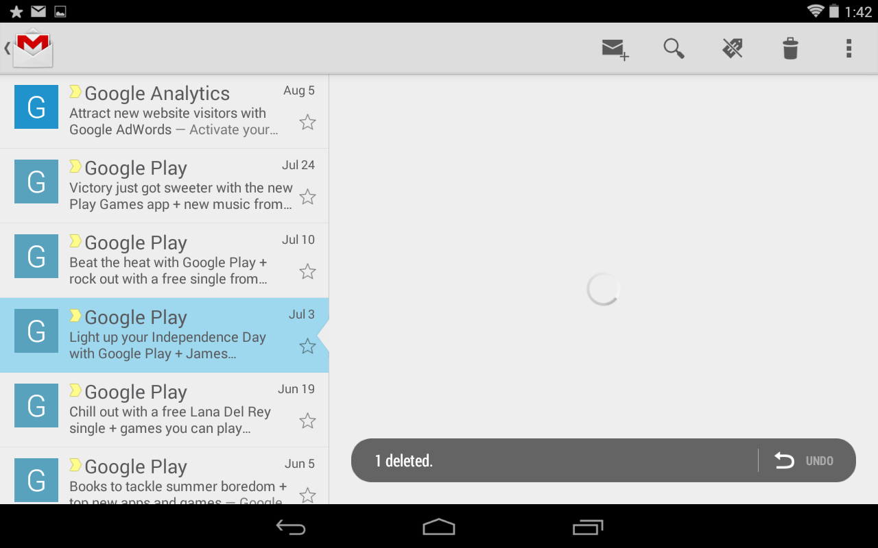
Gmail’s undo message delete feature on Android
Facebook provides another good example of bulletproofing. On its website and mobile native apps, a member can deactivate their profile. Deactivation takes a user off the network until they reactivate their profile.
On the desktop website, a member only needs to select one required radio button and click a button to deactivate their profile. But on its native apps for iOS and Android, a member has to re-enter their password. While this is extra work for the user, it helps prevent them from making a major mistake when editing their settings on a mobile device.
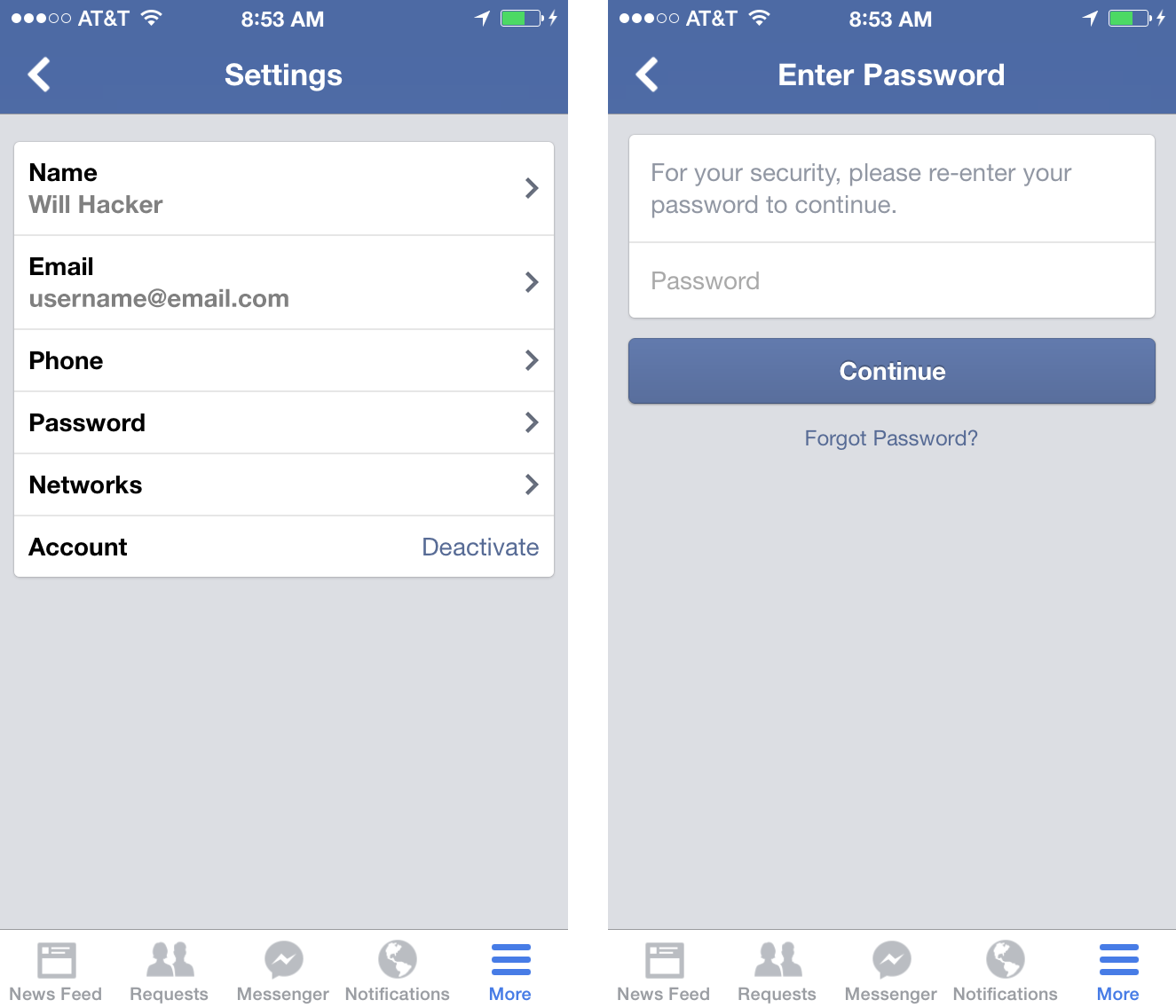
Left: Facebook’s mobile settings for iPhone – Right: Members need to re-enter their password to deactivate their profile
Conclusion
There are many considerations to make when designing a mobile experience, including what devices to target, whether device hardware features need to be accessed, and whether the app has to be online in order to function. By using the framework of Simplify, Prioritize, and Bulletproof designers can develop focused and contextually appropriate experiences. The framework also provides a useful check for designers to ask themselves if they are putting to much functionality and interface into a design.
Illustration of mobile device courtesy Shutterstock