Rewards fuel our motivation. They let us know we’re doing something right and enable us to continue on our quest to learn something new or achieve a goal. A variable schedule of rewards, those received unexpectedly, are even more effective at this because naturally, humans crave predictability. We look for patterns everywhere to try to make sense of the world. When we receive a reward unexpectedly, our minds work to identify the causality so we can receive that reward (and those positive feelings) again.
You can add variable rewards into your website and app design in the form of surprises that elicit joy, inspiration, or enlightenment. By eliciting these positive emotions in your audience, you will make your app more enjoyable to use. In turn, this will better engage your users and help build positive perceptions of your brand.
These surprises work best when they:
- Respond to a user’s interaction, exciting the user and making him/her keep an eye out for the next surprise
- Complement the user journey, ensuring that the surprises are non-intrusive to the user’s experience
Here’s a look at three brands that use rewards effectively, as a way to inspire your own thinking.
MailChimp
MailChimp, a web app for creating and sending e-mails, rewards users for deploying and scheduling their first e-mails by adding unexpected humor and positivity throughout the process.
I clicked into the final stage of my first MailChimp e-mail deployment nervously, “Should I revisit the creative one last time? A fourth QA wouldn’t hurt, would it?” The confirmation screen loaded, and Freddie, MailChimp’s adorable cartoon chimp, greeted me. A GIF played showing his sweaty chimp hand nearing a red button (Figure 1). Underneath the animation it read, “Prepare for launch. This is your moment of glory.” I laughed out a loud and a feeling of ease settled in. “This anxiety is perfectly normal. It’s your first launch, everything’s okay!” MailChimp understands that getting to this point in the process is no easy feat and rewards users with a laugh.
I exhaled and clicked “Send Now”. The page refreshed and Freddie returned, this time giving me a high five and celebrating this victory with me (Figure 2). Knowing the excitement that users feel when deploying e-mails, MailChimp rewards them with cheer.
Freddie made a surprise return again when I scheduled my first e-mail deployment (Figure 3). Rock on Freddie!
By adding these small and delightful surprises throughout the user journey, MailChimp makes sending e-mails a lot more fun. All of these surprises occur in response to a user interaction and complement the user journey. This ensures there are no intrusive or out-of-context prompts that you just want to close immediately.
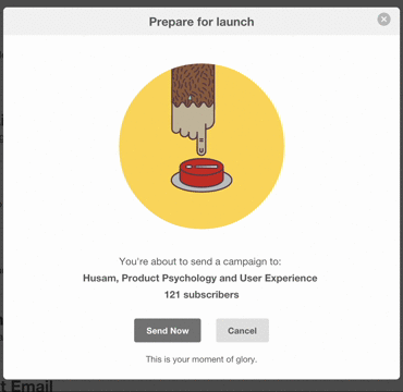
Figure 1 – MailChimp’s confirmation view uses light humor to ease a tense situation
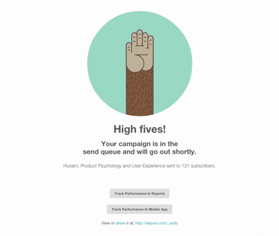
Figure 2 – MailChimp’s successful deployment view celebrates with you!
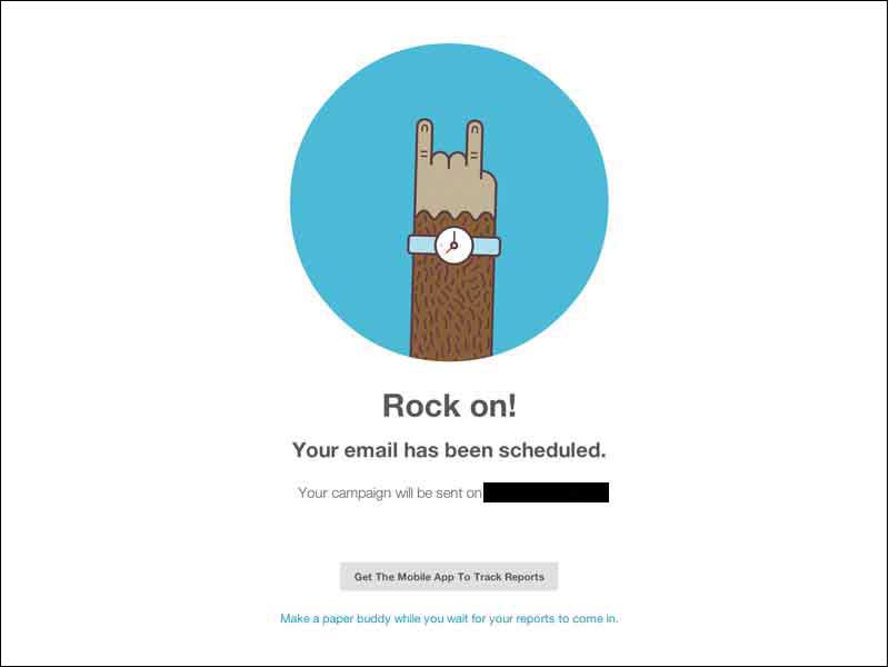
Figure 3 – MailChimp’s email scheduling view includes a playful surprise
Photojojo
Photojojo, an e-commerce store for photography accessories features a handful of rewards on their website, eliciting smiles and positive vibes that grow the more engaged the user is with the site.
When their homepage loads, their header copy reads “Truly unique gifts & gear for photographers.” Less than a second later, the word “Everyday” is typed in so it reads, “Truly unique gifts & gear for everyday photographers” (Figure 4). This word quickly gets replaced with “iPhone.” This simple animation put a smile on my face. As an iPhone photographer myself, this shows that Photojojo gets and appreciates the different types of photographers that visit their website. This is a really neat and subtle way for Photojojo to say “thank you for visiting our website.”
@Photojojo is rewarding users for spending time on their site
As you scroll down the page and look through their product grid, you’ll notice links to their blog posts peppered throughout (Figure 5). Their blog posts include DIY projects and photography tips. Here’s an e-commerce store that sells photography accessories offering up do-it-yourself freebies. Photojojo is rewarding users who have made it this far on their site by giving them free tips and tricks.
Make it all the way down to their footer and you’ll be greeted by a delightful gif animation of a cartoon dinosaur snapping a picture of you (Figure 6). Photojojo is rewarding users for spending time on their site, and ensuring that if users are ready to leave, they will at least leave with a smile.
Find yourself on their product page and you’ll be rewarded with yet another delightful surprise! This is my favorite one of all. There’s a lever titled “DO NOT PULL.” When you pull it (and you will, simply because it tells you not to) an animated hand comes from the top and takes you to the product details (Figure 7). Again, Photojojo is rewarding users with a unexpected smile.
By adding a number of delightful surprises that are user initiated and part of the user journey, Photojojo creates a memorable and fun shopping experience.

Figure 4 – Photojojo welcomes it’s audience with a witty hello
Figure 5 – Photojojo rewards users browsing through the products by sharing free content
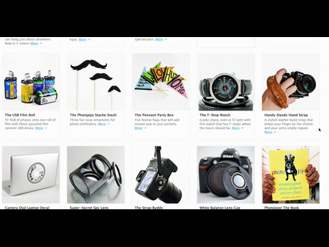
Figure 6 – Photojojo rewards users that make it to the bottom with a fun animation
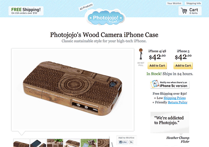
Figure 7 – Photojojo rewards users on their product page with another fun animation
GrubHub
GrubHub, an online food-ordering app, rewards their users with humor both on and off their website.
Prior to check-out, you can opt to sign in, create an account or check-out as a guest with the option “No thanks, I don’t like convenience” (Figure 8). The first time I saw that, I laughed out loud. By adding humor into this step of the journey, GrubHub rewards the user for making it this far.
On the order confirmation view, funny visuals and playful copy celebrate your successful food delivery with you. This is where your engagement with GrubHub comes to an end, and they use humor to leave you with a positive last impression (Figure 9).
This humor extends outside their website. Given I haven’t used GrubHub in about two months, I recently received an e-mail from them with the subject line: “Are you trying to break our heart?” I smiled and opened the email (Figure 10). Hilarious, I know. I get a ton of e-mails from brands due to inactivity and I ignore 99% of them because they’re all the same: “Act now! 30% off our yada yada,” “You’re missing out on your blah blah”, “ME ME ME!”. With this e-mail, GrubHub’s first intent was to reward with a smile. That’s a really nice and simple way to maintain the relationship.
GrubHub adds very light and funny surprises that make the online ordering experience a lot more fun. Most importantly, like MailChimp and PhotoJojo these surprises are always user-initiated and complement the user’s journey.
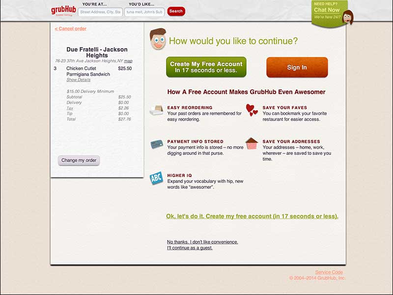
Figure 8 – GrubHub adds humor into their user journey
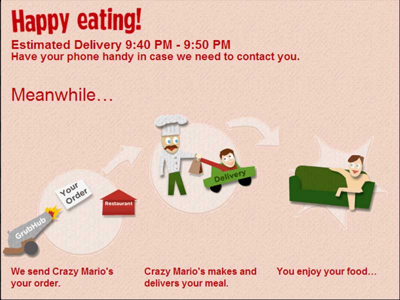
Figure 9 – GrubHub celebrates your successful order with you!
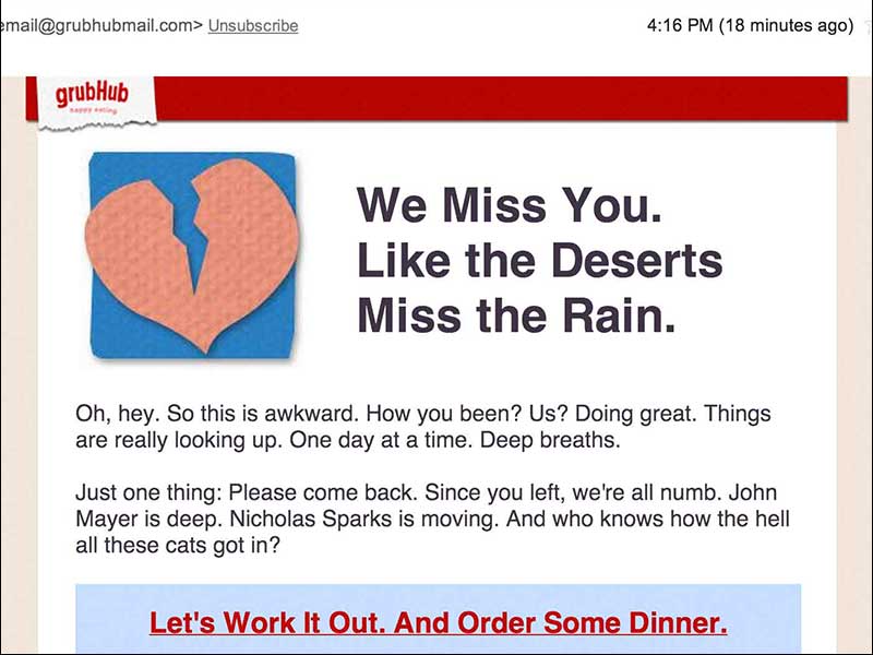
Figure 10 – GrubHub’s email aims to make you smile first and foremost
Adding Your Own Rewards
Re-visit each view of your website/app and identify where you can add your own rewards. Use your branding as a springboard when coming up with concepts for these rewards so you keep them aligned tonally with your brand personality. Lastly, remember that these rewards should be user-initiated and should complement your user journey.
Here are potential views/pages where you can add rewards:
- 404 pages: Turn a potentially awkward situation where a page can’t be found into something playful or light-hearted. Here are some of the best 404 pages out there.
- Loading screens: Use this filler time for something fun! Slack, a chat/collaboration app, makes great use of their loading screens by displaying a different line of copy each time. Some humorous, some inspiring, all positive.
- Portfolio/Case study pages: Complement your portfolio or case studies with delightful surprises. Teehan + Lax add on-scroll surprises to make their case studies far more enjoyable to read. As you scroll down their case study pages, graphical elements animate in and out. These graphical elements complement the copy and they keep the reader wanting more. Their Bell case study is my favorite.
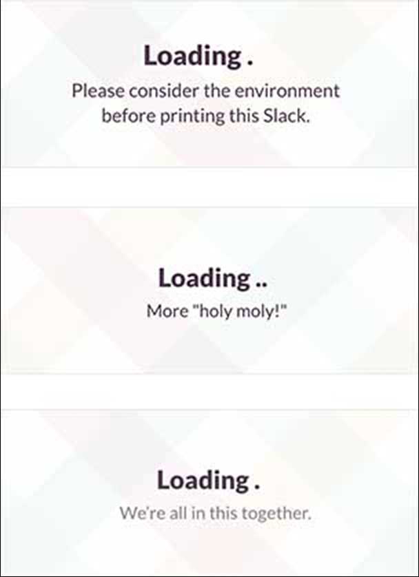
Figure 11 – Slack’s loading screens make great use of time
Which sites have you come across that surprise and delight you? Share examples in the comments below!
Image of smiling chimpanzee courtesy shutterstock.