
My bookshelves are filled with happy accidents. I’ve come to think of stumbling into ‘Aha!’ moments — where you suddenly realize a connection between ideas — as a gift. There’s something revelatory about accidental discoveries. They impart truths in a way that being told what to think never can.
For a while, I’ve had this vague concept in my head for an app. The idea was to employ AI-augmented left and right swipes to enable a kind of low-friction information foraging[1] through Wikipedia pages. Users would be able to skim through vast swaths of information until they stumble into something that piques their interest. Until now, it’s just been an idea.
As a designer-developer hybrid, I’ve been keen to explore approaches to designing a mobile app that is anchored around AI. (My toolkit for this project included React Native, Python, OpenAI’s API, and Figma.)
Design principles
From the beginning, I had a few principles I wanted the app to imbue:
- Deemphasize AI: AI should be in the background, subtly working on behalf of users. Users needn’t know about it.
- The UI should be fast and it should feel infinite: I want users to just swipe away with little or no friction, for as long as they like, with no dead ends.
- The AI should augment the user experience, but not dictate what the user can do: Users can browse Wikipedia in my app as they normally would, but can also enlist AI features whenever they like with a swipe.
- The app should be healthy for users to use long-term[2]: The idea is to get users to learn things they didn’t know they wanted to learn. But the same forces that make serendipitous discoveries thrilling are likely the same that make conspiracy theories alluring. I want everything users find to be factual to the extent possible. Therefore, Serenwikity is a layer on top of Wikipedia, and only points to Wikipedia pages or summarizes them.
The idea is to get users to learn things they didn’t know they wanted to learn. But the same forces that make serendipitous discoveries thrilling are likely the same that make conspiracy theories alluring.

Challenges
A big contradiction
There is a fundamental contradiction in the idea of Serenwikity. Design is sometimes described as being intentional about what users experience. I wanted users to experience serendipity, which inherently cannot be willed into existence; it manifests when people make a connection between ideas that were hitherto unforeseen.
Non-determinism
What’s more, Serenwikity revolves around prompt engineering, which is something of a dark art; LLM output is not always easy to predict. And to compound the problem, each swipe would be used to modify the next prompt. What would the user experience after two or three swipes right? What about 10? What about a combination of left and right?
I wanted users to experience serendipity, which inherently cannot be willed into existence; it manifests when people make a connection between ideas that were hitherto unforeseen.
Simulations
Simulation one: concept validation
Because of the challenges inherent in the project, I had doubts whether the idea would even work.
Before I wrote any code or sketched out ideas, I created a Python-based simulation to see if swiping through Wikipedia pages would yield a coherent and interesting experience. The simulation was fairly straightforward: I wrote LLM prompts for left and right swipes, then Python code to run simulations of users swiping.
From J.S. Bach to 12-tone modern classical
One simulation was particularly encouraging. It started with a page about Johann Sebastian Bach, then right-swiped to The Well-Tempered Clavier, one of Bach’s most famous works, which was intuitive and appropriate.
The simulation then veered to a page about an Austrian pianist, Friedrich Gulda, whose 1950s recordings of The Well-Tempered Clavier are well-regarded. That swiped to a contemporary pianist, and eventually modern classical and the 12-tone technique.
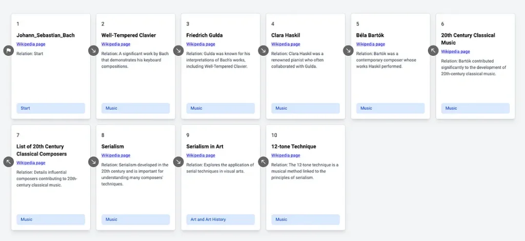
This is exactly what I was envisioning. It also got me to define what a “good right swipe” meant. A good right swipe should be both logical and surprising, i.e., serendipitous.
A good right swipe should be both logical and surprising. In other words, serendipitous.
Simulation two: code performance and the user experience
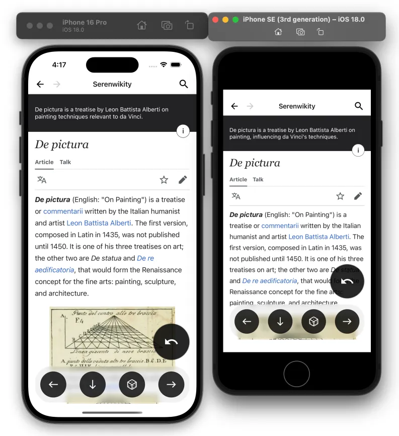
I created my next simulation in React to help me explore approaches to pre-loading Wikipedia pages. I needed to figure out how to make the UI feel fast and simple to the user, when in fact, there is a lot going on in the background.

Designing the UX
Interaction design
Once I had confidence in my idea, I tackled swipes, which were core to the app’s concept. I started with a quick sketch that conveyed key swipe interaction sequences, then went directly to code. I was especially interested in how the swipes would feel in my hands, so I created a prototype in React Native and started experimenting and refining it.

I worked in rapid, iterative cycles. My workflow went from exploring animations and gestures in code, to sketching ideas in Figma, and back to code. This back-and-forth helped me create ergonomic interactions and explore fun concepts like having right-swipe pages zoom in and left-swipes zoom out.

Getting the right swipe prompt right
Once I got the app working with real data, two problems with the right swipes began to emerge: One, they tended to repeat. Leonardo da Vinci would lead to Mona Lisa which would lead to Leonardo da Vinci. Two, when I added code to prevent URLs from repeating, the LLM would make up Wikipedia pages.
The solution I came up with works like this:
- The app takes the current page, say the Mona Lisa, and it extracts all of its URLs, which lead to topics like sfumato (the painting technique da Vinci used), Florence, portrait painting, etc.
- It then takes AI-generated summaries for the previous Wikipedia pages the user has right-swiped through (from say, the Italian Renaissance, Renaissance Art, and da Vinci) and compiles a prompt.
- The compiled prompt basically says, “These Wikipedia page summaries are in order and create a narrative. Read through these URLs and find one that would offer a logical continuation of the summaries”. The actual prompt is much longer, but that is the gist of it.

A moving narrative
The new right prompt creates cohesion as it connects each page to the last logically. The result is an open-ended, AI-assisted journey through logically connected ideas. It works something akin to a moving average — users can swipe right as long as they like, and the AI will sit in the background, acting as a subtle guide that weaves a constantly emerging narrative.
Intentional narrative deviation
Another problem with right swipes arose: they could be too predictable (i.e., boring).
I introduced a second prompt that works just like the first, with one small change. The second prompt has the LLM find a logical next page that “most people would find surprising or counterintuitive”. The app uses this prompt periodically at random.

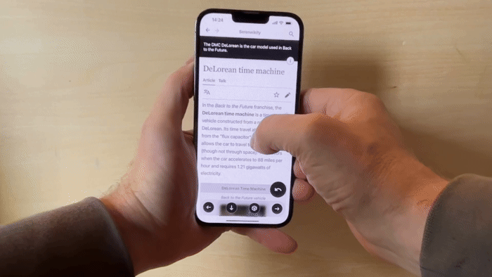
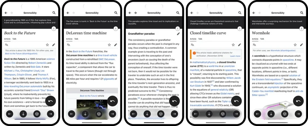
From Back to the Future to… animal welfare?
The deviating swipes seemed to get the right-swipe narratives out of their ruts. They could also be entertaining: In the 80s sci-fi classic, Back to the Future, Doc Brown, a mad scientist, put his Catalan Sheepdog in his DeLorean time machine and launched it one minute into the future. Apparently, a few people in test audiences in 1985 expressed concerns about the dog’s welfare and saw the demo as a kind of animal testing. They have a point.

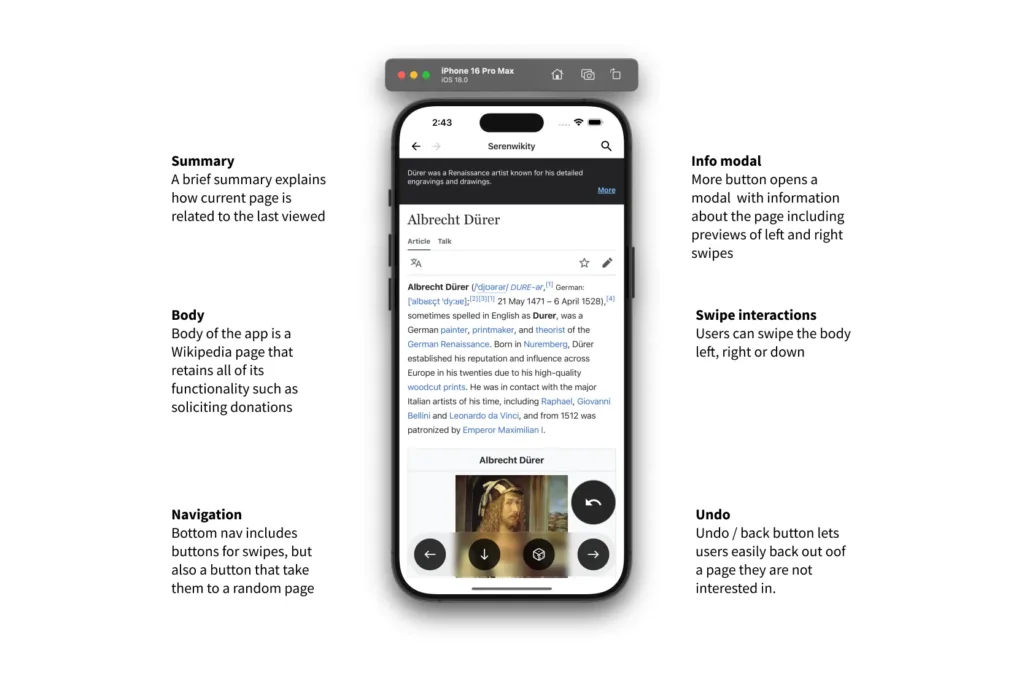
AI-augmented wayfinding
Everything in this app orbits around the right swipe. The right swipe is the functionality that allows users to skim through vast information spaces until something strikes them. But what if the user does not like where the app is taking them? I created several features that allow users to course-correct when things are not quite right:
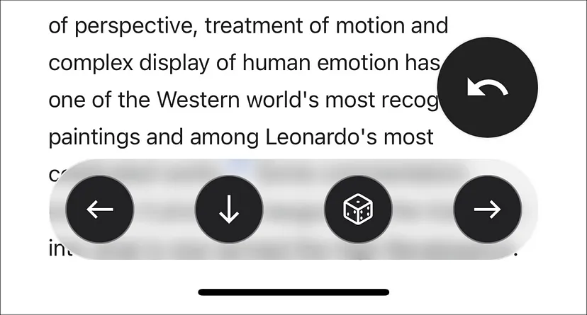
- Left swipe: When a right swipe leads to something that is not intriguing, the user can swipe left and go to a broader, related subject.
- Undo: If they swipe right and don’t like the page it takes them to, but like the narrative path they’ve been on, they can click <undo>.
- Random: If they want something totally new, they can click the <random> button.
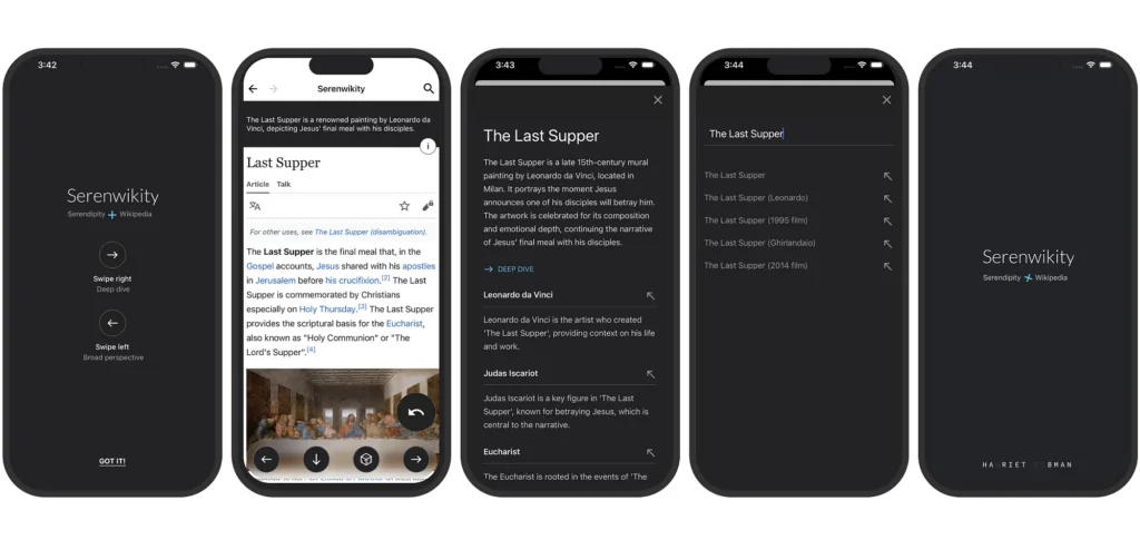
- Search: If they have a subject in mind they want to explore, they can search.
All of these features allow for a low-friction way to course-correct based on the user’s immediate intuition about what’s interesting to them. It’s a kind of wayfinding that is semi-free-form: it’s part AI-generated and part user-influenced.
Thoughts on design and code
When working on my self-directed projects, I find myself doing much of the design in React. Here are a couple of thoughts:
- Any value designers create only reaches users through production code. Keeping design tightly coupled with code keeps the design close to what users will actually experience.
- When designing an app with prompt engineering at the core, there is a lot of very fast back and forth between coding and design. I might alter a prompt, and then modify the UI. Keeping these iterations tight is critical.
- Our use of the word fidelity in design is peculiar. Its literal meaning is “the degree of exactness with which something is copied or reproduced”. Going from a high-fidelity Figma file to code means the thing that delivers value to users (production code) is of lower fidelity (i.e., a copy) than the Figma file. How design manifests as production code should be our focus, not Figma files.
- The final touches in the visual design process were always in code. I think this is the way. Designers shouldn’t create refined designs in Figma and then go through the ritual of being disappointed with the production version that reaches users.


At the threshold of change
I believe we are at the threshold of fundamental changes in how users interact with computers. The ability to explore ideas and be creative in code will be where new paradigms and UX patterns emerge.
Think about how an app like this might have been created 10 years ago, or even five. It would have needed a data science team, who would have needed months to ingest data and train it. What’s more, the team would have needed to dedicate time and money to a vague concept (Wikipedia with dating app-like features).
In other words, the app would have never existed.
In this new world we are in, designers who can code and know something about prompt engineering, can think of an idea, and then effectively conjure an app that a data science team has been working on for months. It’s pretty crazy when you think about it.
In this new world we are in, designers who can code and know something about prompt engineering, can think of an idea, and then effectively conjure an app that a data science team had been working on for months. It’s crazy when you think about it.
Key takeaways
In building Serenwikity, I learned that the boundaries between design, engineering, and AI are increasingly blurred in interesting and exciting ways. Here are a few takeaways:
- Simulations of the user experience are useful and should be in the UX design toolkit.
- Designing an AI app requires tight coupling between design and code. Frameworks like React enable hot reloading, which makes design-to-code iterations nearly instant.
- Prompt engineering could easily be called prompt design, and UX designers should learn to do it[3]. For AI apps, prompt engineering will likely sit at the center of the whole creative process for the foreseeable future.
- Designers should code. I’ve gone back and forth on this one for years, but it feels like the tide has shifted.
For any aspiring design technologists out there, I hope my project inspires you to learn some new skills and explore your own ideas. The future of how products and apps are created is changing profoundly, and designers who code will be at the center of it.
Notes
- [1] While creating Serenwikity, I came across a fascinating paper from the University of Pennsylvania on how people consume information on Wikipedia.
- [2] If you are interested in how automation AI can be applied in a way that is beneficial to users, check out this white paper from Microsoft Research: A Sports Analogy for Understanding Different Ways to Use AI.
- [3] For those who are more technical, I dove head-first into prompt engineering with OpenAI’s cookbooks on GitHub.
The article originally appeared on Medium.
Featured image: AI-generated.