Project overview
Space matters. We read space like we read people’s faces. Space is the foundation for the expression of our cultural values. Space is an instrument of collaboration and innovation. At MICHR, we realized that our workspace played a big role in how we functioned. As a result, the Rethink Space team was created as a grounds-up initiative to creatively and economically enhance our operating space into a flexible workspace that supports privacy, innovation, creativity, and most importantly a culture of collaboration.
My role
The team is made up of five extremely passionate and dedicated MICHR employees, including myself, who are all interested in enhancing the space around us in a human-centered way. I was the team lead.
Impact
The Rethink Space team has received positive anecdotal feedback from MICHR staff and guests suggesting that the new space is “more functional,” “matches their style of work,” “is more collaborative,” “is less intrusive,” “has more natural light,” and “is friendlier.” The team has won an Ergo Hero award from the University of Michigan for our creative efforts in building a multiple-purpose open space, thus improving communication and collaboration among staff.
- 90 employees positively impacted
- 21,940 square feet of space re-imagined
- $34,000 project cost
Process
Rethinking our space was a complex problem with a fuzzy goal. While we as an organization had a vague, nebulous idea of what we wanted our space to embody and stand for, there were too many unknowns to have any specifics. Our project involved creating a human-centered, participatory platform to support exploration and experimentation.
1. Hear: assessment of staff and organizational needs
This phase was all about generating empathy. We wanted to understand people and their lives at MICHR. We wanted to see them at work, hear what they hear, feel what they feel, and know what they think. Below is how we went about it. We did this through the following:
- Idea board
- In-context immersions
- Co-create workshops
- Surveys & polls


2. Understand: analyze findings
This phase involved surfacing themes from all the user research we had been through. It also involved spotting opportunities and converting them into stories to be shared. Here is how we did it and what we found.
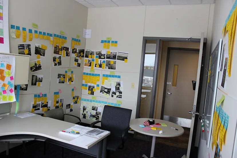
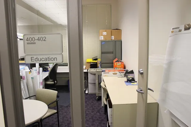
In order to externalize our knowledge and use it in our discussions, we turned one of the empty offices into a team room. We used the room to uncover and share insights gained from the “Hear” phase, identify opportunities, synthesize themes, and hold meetings. The team room contained affinity notes created from our interviews, grouped by categories, and marked with insights. It also contained the various artifacts that were generated from the “Hear” phase constantly reminding us of all that we had learned and making sure that we were always thinking about it. We also opened the team room to all MICHR staff, promoting transparency and co-ownership in the process.
The affinity diagramming exercise and insights generated from the other artifacts led us to see the emergence of the following high-level themes for staff and organizational needs the following:
- Lack of spatial colocation within teams
- Need for flexible workspaces
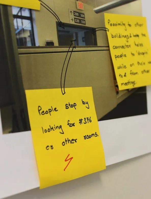
- Need for appropriate signage and wayfinding
- Noise level
- Space ownership


3. Create: propose solutions and get feedback
This phase involved using the insights gathered from the previous two phases to dream of an alternative future, share that future, and gather feedback. Some highlights of the design are listed below:
3.1 Guiding principles
One of the first things the Rethink Space team did in this phase was to create a series of guiding principles based on our design research that could guide us in redesigning our space. Here are the principles:
- Enhance, not replace
- Make space for change
- Leave room to evolve
- Design for social collisions
- People, not technology
- Bold is better than bland
- Small changes can have a profound impact
3.2 Zones

Zoning is a device of land-use planning used by urban planners around the world to designate permitted uses of land based on mapped zones. MICHR’s zones were created to use as a guide for space planning. They include an open zone, a collaboration zone, a quiet zone, and a zone for central services.
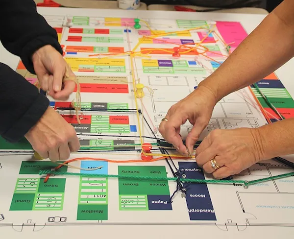
3.3 Colocation

As discussed in the “Understand” phase above, MICHR’s staff was spread out in an unsystematic manner. As can be seen from the maps in the figure above where each color represents a different MICHR program, the proposal aimed at getting teams spatially together to boost productivity, communication, and morale.
3.4 Cube configuration

Through our Hear phase, we realized that a pod-like cube configuration worked best for programs at MICHR. It allowed people to turn around and communicate with their team members, made impromptu conversations possible, and helped to uncover and solve problems faster. In our old space, only about half of our cubes were set up as pods.
3.5 Dedicated team spaces
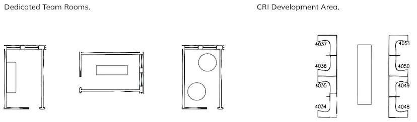
Our design research helped us see that there are teams across MICHR that need dedicated spaces to come together to perform specific tasks such as assembling packets, brainstorming, and project management. The proposed design included assigning offices to teams that needed them to be used as team rooms.
3.6 Open area and quiet space

The proposed open area was a flexible space in the open zone where staff could have lunch with their friends, grab their peers and collaborate, stand and work, organize and participate in events, or simply enjoy beautiful views of the courtyard. The open area would be created by consolidating the open, unused cubes, and making the area by the courtyard available to all. Technology and prototyping materials would be introduced in the space to provide for random collaborations and a bias toward action.
To balance the open active spaces around MICHR, the proposed design also contained a shared quiet space in the quiet zone. The quiet space would be available for anyone to walk into when they need quiet focused time to work or reflect.
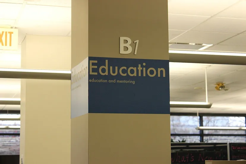
3.7 Wayfinding

The proposed design allowed us to come up with multiple wayfinding mechanisms to help MICHR employees and visitors find people and resources at MICHR. These included branding signs identifying programs in their space, directional signs directing people to various programs and services, and utility-related signs like “Kitchen” and “Supplies.”
Impact

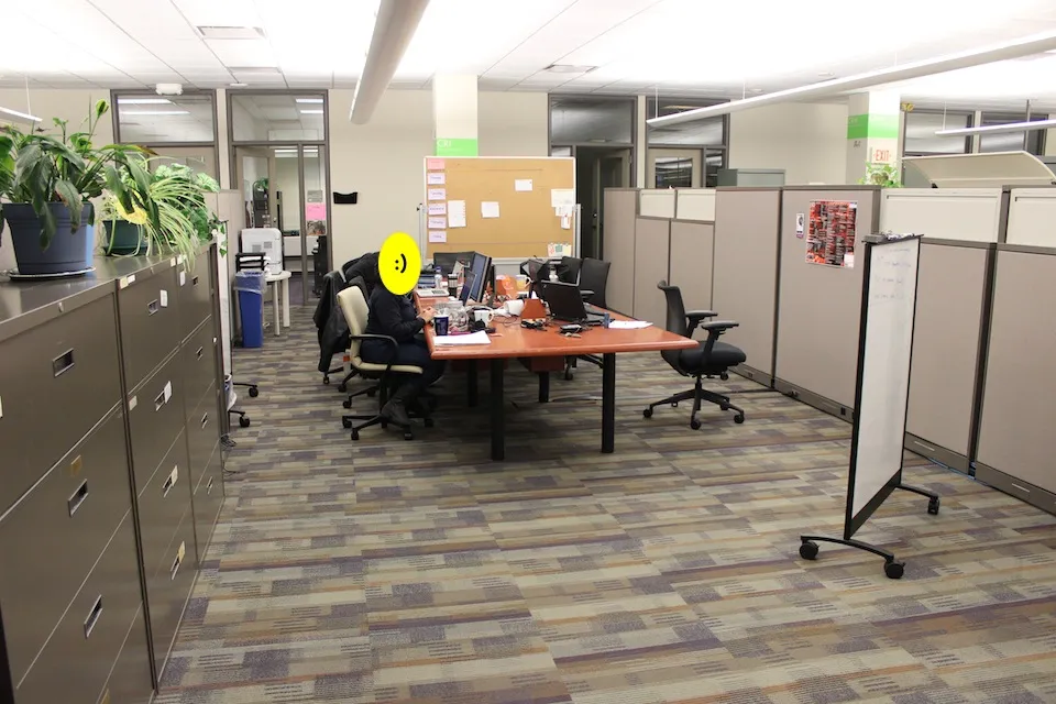
In the short time following the opening of the new space, the Rethink Space team has received positive anecdotal feedback from MICHR staff and guests suggesting that the new space is “more functional,” “matches their style of work,” “is more collaborative,” “is less intrusive,” “has more natural light,” and “is friendlier.” The project was nominated for a Medical School Administration team award by the staff. The team also won an Ergo Hero award from the University of Michigan for our creative efforts in building a multiple-purpose open space, thus improving communication and collaboration among staff. In terms of usage, we have observed that the open space is almost always occupied, either by a single large group or by multiple smaller teams. Attendance seems to have increased at MICHR events like the monthly all-staff meetings, lunchtime enrichment presentations, and celebrations, which are now all held in the open space. The quiet area is also occupied often and the dedicated team rooms are in use.
This creates a more inviting and welcoming atmosphere where people can come together to visit, collaborate and create synergy. — MICHR employee
It has really helped with team dynamics. — MICHR employee
Lessons learned
- Momentum is key
- Build with them, not for them
- You have to get creative to understand what people really want
- Over-communicate
- Be nice (and genuine)
- Be flexible
- Stay at it
- Baby steps
- Have fun
The article originally appeared on aalapdoshi.com.
Featured image courtesy: Curated Lifestyle.