Control of personal information in the digital space, and particularly on mobile devices, presents a unique design challenge.
Most people aren’t aware that their personal data is being collected and shared. Many don’t take the time to validate their expectations and most never read privacy policies.
People become aware of these issues only when something happens that doesn’t meet their expectations, like seeing their friend’s picture in a Facebook ad or banner ads that match a recent purchase. And when people do become aware and their expectations are violated, trust in the brand is eroded.
People want transparency and control, but they want it on their terms. They don’t want to have their activities interrupted, but they do want to set controls on what is being collected and how it is used.
The Goal
The goal of the Digital Trust Initiative is to create awareness of privacy issues while not getting in the way of the experience. This is an even bigger challenge for mobile interactions due to small screen real estate and the need for consistency across apps and sites. However, it is not insurmountable. By leveraging visceral design constructs such as sound and vibration, we can create new experiences surrounding personal data collection that are transparent and provide control.
The 6 Design Principles
In our previous article, “Control and Transparency,” we outlined our approach to establishing user needs: conducting foundational research into the context of use.
What do users care about? What triggers their actions to adjust privacy settings?
Through in-depth interviews, including asking participants to demonstrate how they use their mobile devices to access content, we gained a clear view of their experiences. Analyzing that data, we derived six design principles to guide the design process:
- Context: What are users’ mental models, beliefs, expectations, and task flows around maintaining their personal information?
- Motivation: What do users care about? What triggers their actions to adjust privacy settings?
- Awareness and attention: Do users know that a privacy status indicator exists? Once they realize that it’s there, do they pay attention to it when they are using their device?
- Discoverability: If users look for a privacy status indicator, can they find it? How visible does it have to be? Can it be something other than visual?
- Comprehension and retention: Do users understand and remember how to interact with or adjust settings via the privacy status indicator? Can they repeat processes?
- Usability: Can users interact with the status indicator? Is there a box that they can check for easy control?
From these six design principles, we dug deeper, arriving at a growing list of actions or best practices that DTI design must take into account. In this article, we will take a look at the first seven actions that we’ve solidified.
An Initial Set of Actions
These actions are essentially the barriers that must be overcome in order to earn users’ trust in the digital domain:
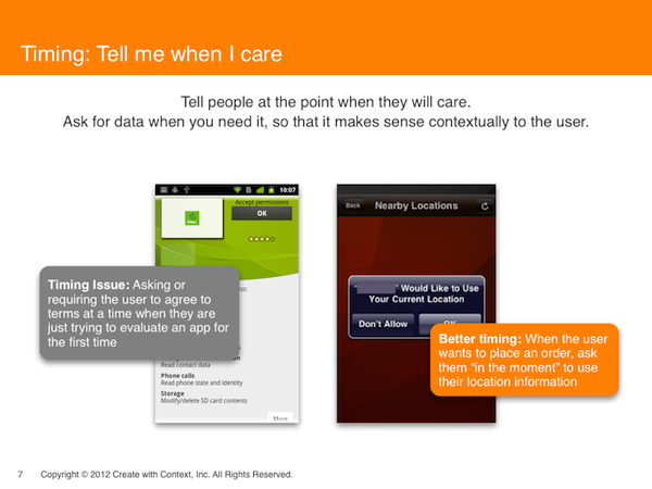
1. Timing: Tell me when I should care. Don’t interrupt me, and don’t force me to pay attention to something I’m not interested in at the moment. Ask for data when it is needed, at the moment when it makes sense intuitively and contextually.
- Bad timing is asking or requiring the user to agree to terms when they are just trying to evaluate an app for the first time.
- Good timing is requesting the user’s location in the process of placing an order; such an “in the moment” request seems perfectly natural, because users know the information is necessary to complete the transaction.
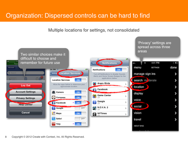
2. Organization: Why is the same action available in several places? Dispersed controls can be hard to find, and duplicative or similar-sounding controls are confusing. Provide access to all controls in one place, so that users can link them together easily. Simplify or consolidate similar controls to avoid user confusion.
- Similar-sounding choices, such as “account settings” and “privacy settings,” create a difficult choice that’s also difficult to remember.
- Privacy settings, when listed in several menu categories, make it unclear if they control the same or separate areas.
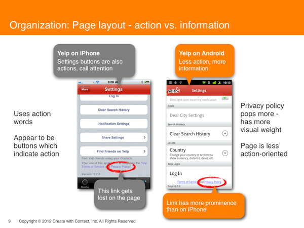
- Page layouts on different platforms communicate differently. One platform uses action words to call attention to information: heading words like “settings” look like buttons requiring a click. Amidst all this apparent need for action, the privacy policy link gets lost on the page. The other platform interface is less action-oriented and more information-oriented, relieving the pressure on the user to click. As a result, the “Privacy Policy” link has more prominence.
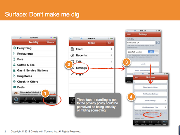
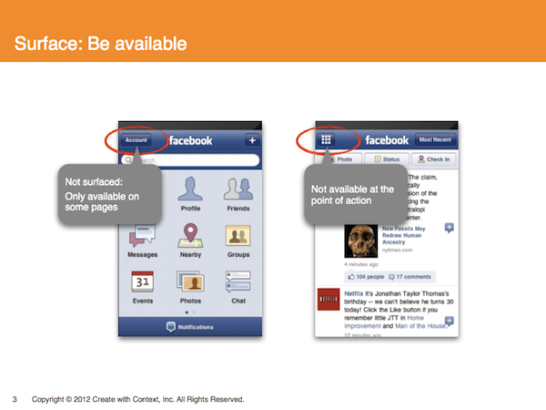
3. Surface: Be transparent. If users have to go hunting, then they worry that something is being hidden from them. That makes them less trusting and more wary of a site.
- Don’t make me look: people are not motivated to learn about privacy policies, so they will not look, and one click can be too much.
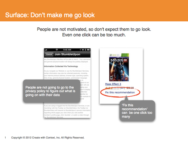
- Don’t make me dig: if it requires several taps and scrolling, it feels buried and “sneaky,” like the site might be hiding something.
- Be available: if a higher-level icon is not available on every page, or not at the point of action, that can lead to user frustration or mistrust.
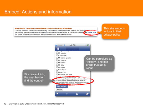
4. Embed: Don’t make me hunt. Put the link into the text, at a natural point when I am interested in finding more information. If the site doesn’t link its brief text to the full version, then the user has to go hunting for it. This can be perceived as “trickery,” eroding trust.
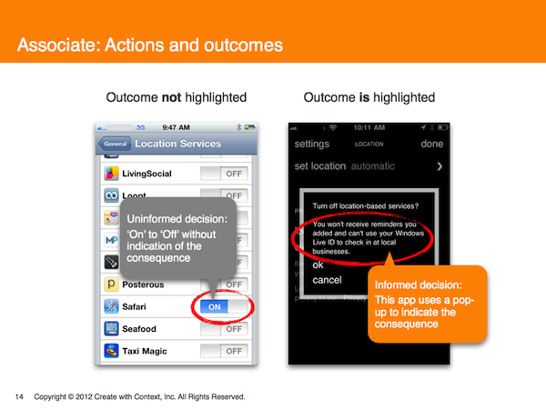
5. Associate: Tell me what the consequences of my actions are.
- Associate actions and outcomes—don’t just provide a bare on/off choice without letting users know what each choice means.
- An uninformed decision leaves the user in the dark as to the outcome of their choice to, for example, turn on Location Services for a search engine.
- Informed decisions can be made when the site highlights what the consequences of such a choice will be, and follows up with the option to continue or cancel.
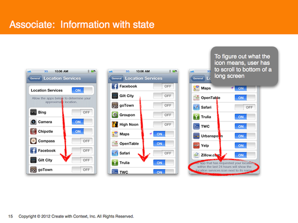
- Associate information with state–tell me on the same screen what the icon means; don’t make me scroll down a long screen to find out.
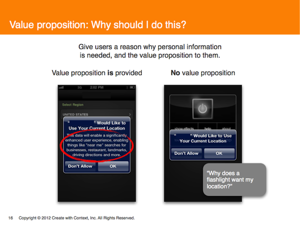
6. Value proposition and consequences: Why should I do this? Give consumers a reason why personal information is needed, and the value proposition.
- If an app requests permission to use current location, and also explains why, users are usually happy to comply. Brands earn trust when they clearly and simply outline the consequences of a choice.
- If an app doesn’t really need the user’s current location, and provides no justification for needing it, people aren’t likely to agree to giving the information up.
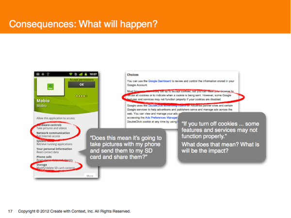
- Opaque statements like, “Hardware Controls Take pictures and videos” or warnings about consequences—“if you turn off cookies, some features and services may not function properly”—cause user anxiety: what does that mean? What will the impact be?
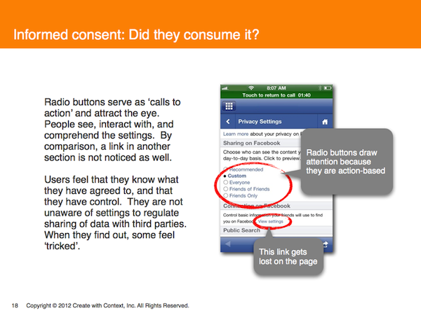
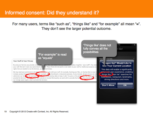
7. Informed consent: When did I say this was ok? Did the user make a choice, and did they understand what they were choosing? Give people the opportunity to understand and agree to the terms of providing their data. Be clear about what is being collected, and what can and cannot be controlled.
- Action-based radio buttons are an attention-getting way to both give the user a sense of control and to indicate a choice previously made. By contrast, links tend to get lost.
- Explanatory language that includes vague words—“such as,” “things like,” “for example”—does not fully convey all the possibilities, and may obscure the larger potential outcome.
Conclusion
While the six design guidelines and our growing list of actions have helped with initial design development, this is still just the beginning. Designing is a highly iterative process. As designers become involved, more design constructs enter the picture. This naturally leads to the identification of additional actions. In our current iterative design process, we have already identified at least two additional actions that will be addressed along with some other new actions in a future article.
The Digital Trust Initiative is an independent effort to study digital design and privacy policy in digital technology. The work of the initiative is funded, in part, by a variety of partners: Yahoo!, Create With Context, AOL, The Future of Privacy Forum (FPF), Verizon, and Visa. The views expressed in this article and the conclusions drawn do not reflect the views of these partners. Further, the partners have not independently verified the results of the study, nor do they make any representation as to the accuracy or value of any statements made herein.
Image of girl feeding Dalmatian courtesy Shutterstock.