Why do people tend to read a particular article on a news site while skipping another? When browsing through dozens of recipes on the web, what compels people to choose one over the other? What are the odds you’ll finish reading this article?
To understand the psychology driving human behavior, it’s important to note that incidental variables affect the way visitors evaluate a product more than one might imagine. Often, browsers are not aware of the environmental cues affecting their online decision-making. If asked, website visitors will generally explain their decisions as completely rational and based on a logic thinking process. However, when web users choose between several options, most of the time their decisions are based on automatic evaluations that occur without conscious awareness. They are often unaware of the variables that influence automatic decisions.
When dealing with a cognitive task, we subconsciously evaluate the amount of cognitive resources required for that specific task. If we have the available resources and motivation for the task, we will move forward with it. If, on the other hand, we don’t have the available resources or motivation for the task, we will skip it.
When Making Online Decisions, Visitors Tend to Choose the Easiest Way Possible
People are more likely to engage in a given behavior based on the amount of effort it requires. Thus, online visitors rely on the fluency of the information process to determine how they feel. People often misread the difficulty associated with processing information as indicative of their feelings about a product, and this misperception directly impacts their willingness to purchase a product or service, or to engage with a certain article.
People are sensitive to their feelings of ease or difficulty, but unaware of what triggers them.
When making online decisions, most visitors are applying a low level thought process, which is used when one is unable or unwilling to execute the cognitive assignment. For example, no matter how pleased a shopper is with a brand or product, the invisible cues delivered from online forms and questionnaires might cause the shopper to feel too mentally exhausted to fill them out. The low level process is governed by rules of thumb called heuristics, to infer the validity of the content that one is exposed to. Examples of such rules might include: “Messages with many arguments are more likely to be valid than messages with fewer arguments;” or “A message coming from a man dressed like a doctor may seem more valid than the exact same message coming from a guy in shorts.”
Online users tend to choose the easiest route possible and try hard to avoid high level processing. The surprising finding is that most users do so even when dealing with insurance websites, which demand high cognitive efforts. We’ve found that the lion’s share of online visitors base their decisions on simple intuitive calculations instead of going deeply into the details (more here). Internet users prefer to make decision as quickly and effortlessly as possible.
Thinking about thinking
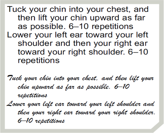
Consider for example the identical exercise instructions shown above. When presented in an easy-to-read font, readers assumed that the exercise would take 8.2 minutes to complete. But when the instructions were presented in a difficult-to-read font, readers assumed it would take nearly twice as long, a full 15.1 minutes (Song & Schwarz, 2008b; PDF). Readers also thought that the exercise would flow quite naturally when the font was easy to read, but feared that it would drag on when it was difficult to read.
Similar results were obtained when people read a recipe for a Japanese lunch roll (Song & Schwarz, 2008b; PDF). When the identical recipe was presented in the elegant but difficult-to-read Mistral font, they assumed that it would require more time and more skill than when it was presented in the easy-to-read Arial font. Other research shows that font can influence whether people make any decision at all or delay the decision to a later time (Novemsky et al., 2007; PDF).
People equate the difficulty of reading instructions with the difficulty involved in the exercise itself. Similarly, ClickTale‘s analysis of 10,000 of visitors to a major global brand’s website revealed that short articles with the ‘View More’ option attracted significantly higher percentages of visitors compared to the percentage of visitors who were presented with the same article in its full length. Since I cannot reveal our client’s identity, below I have selected sample web pages to illustrate the conclusions we drew based on our findings.
While watching recordings of anonymous web users’ online behavior for our clients, we saw the same pattern of behavior repeat itself again and again. When visitors would browse online publications, they would find an article, scroll all the way down, and then upon realizing its length, continued to browse without even considering the content of the article. In an instant, they decided it was too long. Meanwhile, when visitors were presented with just two paragraphs of the exact same article, along with a “Read More” button, the willingness to read the article significantly increased.

The “Read More” option makes the article seem less demanding. It doesn’t overwhelm visitors and even entices them to continue reading the hidden content. The result is that visitors remain engaged with the article. The discernible differences in visitor behavior here indicate that the evaluation of the article has nothing to do with its content; it has everything to do with the way it is presented. Similarly, we see from online user recordings that the likelihood of adding an item to one’s cart is affected by environmental factors such as the density of the text, the font and size of the wording and the amount of product information available.
For example, when comparing e-commerce product pages with detailed information (such as the representative e-commerce page above) with a new version of the page that seems exactly the same, but has the information hidden behind tabs (like the one below), the percentage of visitors who added the product to their cart was significantly higher.
Exposure to too much information and data forces customers to invest cognitive resources that they weren’t planning on investing. Although in reality they do not have to read all of the product data, once they are aware that additional information exists, most customers won’t allow themselves to overlook it. People misread the effort required by the cognitive process of reading the information as heuristic (or indicative) of how they should treat the purchasing process. The detailed information is thus used as an indication that the visitor should invest more effort in the thought process.
We also noticed that the look and feel of the home page directly affects its bounce rate. Home pages that contain a high level of visuals, pages that are text heavy, have an asymmetric layout (symmetric layouts are easier to process) and don’t contain white spaces—like ClickTale’s old homepage, pictured above—generate higher bounce rates, as visitors are unconsciously overwhelmed by the dense amount of stimulation that they are being forced process. If they have not accessed the website for a specific reason, they’ll often leave the website altogether, which lead ClickTale’s to rethink their homepage, as you can see below.
When designing your company’s website or evaluating its effectiveness, keep in mind that the likelihood of engaging in a certain mental activity online is heavily influenced by incidental factors. People are sensitive to their feelings of ease or difficulty, but unaware of what triggers these feelings. As a result, they misattribute the experienced ease or difficulty to whatever is in the focus of their attention. That causes them to delay decisions or avoid purchasing or reading, simply because the print font makes the information difficult to process or the way content is presented seems too time-consuming.
Image of from on branch courtesty Shutterstock.