- Accessibility, Customer Experience, Design, Form design, Interaction Design, Interface and Navigation Design, Psychology and Human Behavior
When deciding on your app’s login method, choosing between security and user convenience is a balancing act. Here are best practice login options and their metrics.
Article by Joseph Russell
App login design: Choosing the right user login option for your app
-
When deciding on your app’s login method, choosing between security and user convenience is somewhat of a balancing act. This article explores some options and the pros and cons of each.
-
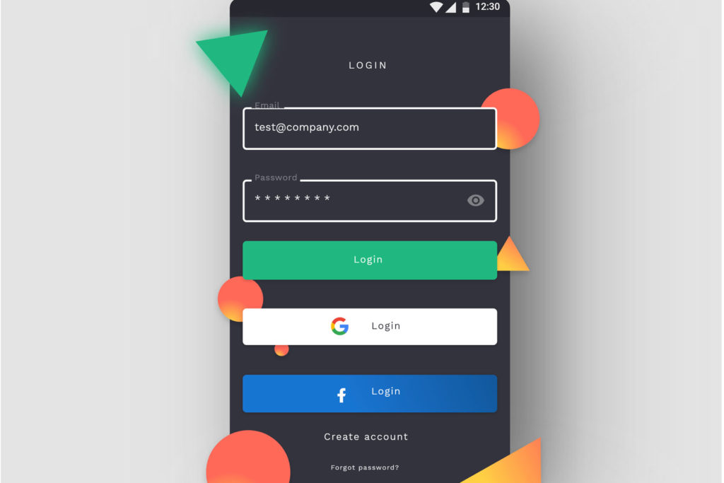
There are 4 common options to consider when designing an app login screen: an email with password login and registration UX, social and third-party login UX, mobile login and registration UX, multi-factor login and registration UX.
- Password login. Passwords are common but it can be hard for the user to remember all passwords. That is why security breaches could be caused by using password managers and using the same password for various apps/sites.
- Social login and third-party login. Users are grateful for having one less password to memorize, and developers happy with high conversions and all the data they receive asses to. This method is mobile-friendly and free to use. But developers have to rely on the 3rd party security and expect to lose users who do not trust social media.
- Mobile number login. The mobile number tends to be a much more unique identifier, and this method doesn’t require the user to remember passwords. On the other side, mobile numbers could change, and migrating accounts becomes complicated.
- Multi-factor authentication (MFA). Its main strength is security. You can find temporary pins, third-party authenticator apps, retina, biometrics, or fingerprint, among MFA methods. Often, it requires a second device that can be stolen.
Read the full article for a more in-depth breakdown of each login option.
Share:App login design: Choosing the right user login option for your app
Share this link
- June 29, 2021
9 min read


