Flag

We stand with Ukraine and our team members from Ukraine. Here are ways you can help

Home ›› Form design ›› Page 2

Form design

Read these first

Transformation has to be driven by everybody, not just by climate groups, and we have a responsibility to use our influence to drive this.

Article by Katie O’ Connor
Share:Using UX Design to Build a Sustainable Future
5 min read
ArticleImage

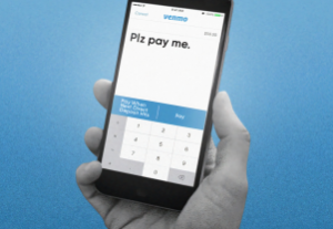
With over 40 million users, Venmo has mastered being an application that allows people to easily make payments and requests. However, it lacks group functionality.

Article by Selene Vitela
Share:UI/UX case study: How can Venmo streamline group payments?
4 min read
VenmoCaseStudy_ArticleImage

As it stands today, consumption of content is at an all-time high, and it’s on its way upwards.

Article by Kriti Krishan
Share:Bingewatch Culture: Netflix, UX and the slow demise of moderation
7 min read
Bingewatch_ArticleImage

If you could travel through time with a single idea from today, which idea would you choose and where would you travel to?

Article by Mitch Mills
Share:How a dated feature could be tomorrows usability standard
4 min read
DatedFeature_ArticleImage

LinkedIn’s messaging center recently shook up the function of the return key, causing users to make errors and feel apprehensive about future usage of the chat feature.

Article by Tammy Guy
Share:When Online Behavior Becomes Second Nature
4 min read
online-behavior-small

An excerpt from the new O’Reilly book, Information Architecture, 4th Edition, explores how information architecture infuses products with meaning and a sense of place.

Article by Lou Rosenfeld, Jorge Arango, Peter Morville
Share:Information Architecture: Design for Understanding
9 min read
oreilly-information-architecture-small

Tell us about you. Enroll in the course.

    This website uses cookies to ensure you get the best experience on our website. Check our privacy policy and