Internet usage has been part of our daily lives long enough that people have adopted certain learned behaviors that by now have become second nature to them.
Think about your morning routine. Mine feels as if I am on autopilot mode as I get up from bed and immediately walk to the kitchen where I turn on the coffee pot and grab my favorite mug. Compare this to online shopping – users browse and place items in the cart and when ready to checkout, their eyes as if on autopilot mode, gaze to the top right corner of the screen looking to find the little shopping cart icon. This learned behavior is acquired with time and with repetitive web site visits and is due to consistency in UI elements from one site to the next.
Consistency is a key ingredient in building successful user experiences
Humans need consistency in order to be able follow their second nature habits. When habits or repetitive functions are established, they are effortless. If my coffee pot would be placed at a different side of the counter each morning, it would shake up my routine and require some effort locating it. With e-commerce, if the shopping cart was placed at a different location on each web site, users would have to hunt for it separately on each site which will cause delay in their shopping experience and most likely frustration, leading to potential abandonment.
My usability tip today touches a keystroke that has become second nature to all who use computers: the return/enter key. While many people learn keyboarding and fast typing skills in early school years, some attain the knowledge simply by frequency of usage.
Regardless of which method was followed, it has become second nature to simply hit the return/enter key for formatting reasons, ending one line and skipping to the next. The only deviation from that and yet another behavior that has become second nature in recent years is the use of the return/enter key when used in a social chat forum (i.e. Skype, Facebook chat, etc.) where the same keystroke used to start a new line is now actually submitting a message.
It is important to differentiate the two functions:
- Paragraph writing (i.e. emails, documents, etc.) – return/enter key acts as a formatting tool.
- Social chats – return/enter key acts as Submit.
LinkedIn’s messaging center recently shook up this very basic second nature, causing me, and others to error and feel apprehensive about future usage of their tools. I received a message from a previous colleague and logged in to LinkedIn message center to respond (screen shot 1).
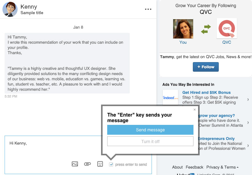
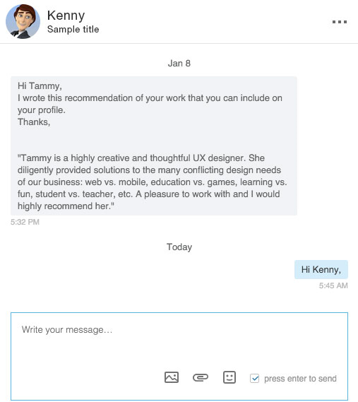
Once in the message center, I read my message and clicked into the response field ready to type. As if on autopilot, I started by saying Hi [name] and hit return/enter in order to properly format my message and skip to the next line. However, much to my surprise, my message was submitted as if I was in a social chat. (screen shot 2).
Looking at the screen shot, one must wonder – didn’t she see the huge dark bordered overlay explaining the new functionality with bold letters? It is right there, screaming and calling for attention—it might as well have jumped out of the screen and punched me in the face.
But I ignored it. I was on autopilot mode and in my form silo. I had learned to ignore pop ups and tend to close them without reading (another common online behavior one can argue became second nature.
Having been a LinkedIn member for over ten years and using the built in message center, I had gotten used to the professional email format communication system. After all, LinkedIn separated itself from other social sites by being a professional network where one would find resume type information on others and make work connections, as opposed to finding bikini photos of friends’ vacation or posts related to their recent lunch. I would therefore not expect to engage in a casual chat like conversation on this site.
Making this error forced me to re-learn the new enter/return function and by reading the check box label and un-checking it, I realized how to stop the chat function and bring back the old fashioned Submit button, which allows email style formatting. Unfortunately, this was after the error was made and I sent a double message (screen shot 3). Luckily, this happened with an old college and not a new connection I was trying to impress with my credentials for future work.
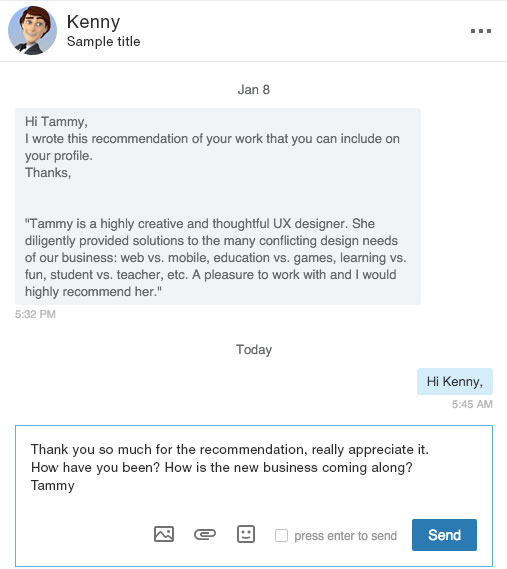
Screen shot 3: uncheck the check box displays the Send button
The response I received from my colleague assured me that I was not in this boat alone. I noticed a double entry of “Hey Tammy” from his side as well. Apparently, others let their second nature take over and are placed in an autopilot mode when using the return/enter key.
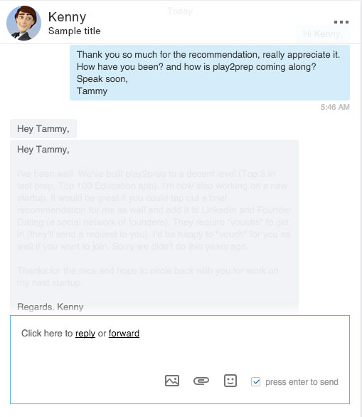
Screen shot 4: my colleague made the same error (note the double entry “Hey Tammy”).
Consistency is a key ingredient in building successful User Experiences. It is the ingredient that helps users flawlessly flow with the rhythm of the function, enter and exit with successful results. The chat function may be a useful new feature for LinkedIn members but it must be properly differentiated from the typical professional email style form in order to set expectations and allow users to shift gears seamlessly and avoid embarrassing errors.
While linking the two functions may be a creative concept, it disregards the typical “box” we always try to think outside of. That typical box we aim to break out of is the one that builds consistency and aids in effortless online behavior.
Image of office worker typing on keyboard courtesy of Shutterstock.