Flag

We stand with Ukraine and our team members from Ukraine. Here are ways you can help

Home ›› Form design ›› Page 4

Form design

Read these first

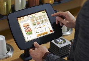
Fast-casual dining giant Panera Bread has given some of their restaurants an experience design overhaul that racks up more hits than misses.

Article by Will Scott
Share:The Pleasures and Pain-Points of Panera 2.0
6 min read
panera-2-0-review-small

The line-by-line guide to making your online form easy for users to fill out without extraneous errors and missed conversions.

Article by Andy Grogan
Share:The Anatomy of a Form
7 min read
anatomy-of-a-form-small

Users assess the perceived cognitive load of engaging with your product or service based on environmental cues they might not even be aware of—design accordingly.

Article by Liraz Margalit
Share:The Environmental Cues that Affect our Online Decisions
6 min read
environmental-cue-small

Adapting to user feedback in a timely and effective manner can be difficult, so product managers need a framework to process and analyze user engagement.

Article by Max Rosenbaum, Steven Cohn
Share:Take Insights in Stride: Using iterative experiments in product development
5 min read
take-insights-in-stride-small

Are sites slighting members by giving “Sign Up” buttons more prominence than “Sign In” buttons?

Article by Josh Tyson
Share:Don’t Make Your Members Feel Small #wtfUX
2 min read
sign-up-or-sign-in-wtfux-small

Tell us about you. Enroll in the course.

    This website uses cookies to ensure you get the best experience on our website. Check our privacy policy and