Flag

We stand with Ukraine and our team members from Ukraine. Here are ways you can help

Get exclusive access to thought-provoking articles, bonus podcast content, and cutting-edge whitepapers. Become a member of the UX Magazine community today!

Home ›› Content and Copy ›› A Problem with Passwords #wtfUX

A Problem with Passwords #wtfUX

by Josh Tyson
1 min read
Share this post on
Tweet
Share
Post
Share
Email
Print

Save

When creating a password, it’s nice when a service lets you double check your entry.

Creating passwords can be a stressful experience. Go too famliar (CHILDNAME) and you lose effectiveness, go too obscure (admiralalonzoghostpenis420YOLO) and you’re likely to forget it.

As Edward Snowden recently told John Oliver, “For someone who has a common eight-character password, it can literally take less than a second for the computer to go through the possibilities and pull that password out.”

Snowden reccomends concocting memorable non sequitir phrases like: “margaretthatcheris100%sexy.” Whatever your strategy, you want to make sure the password you enter—one generally obscured by black dots—is exactly what you intend it to be. This leads us to a frustrating bit of wtfUX sent our way by Indrani Stangl

“When I create a new account on a website, I rely on entering the password twice. This is a nice feature in case you are like me, a total spaz. I rarely type it correctly both times and need that safety net to make sure I can log in.”

password wtfUX

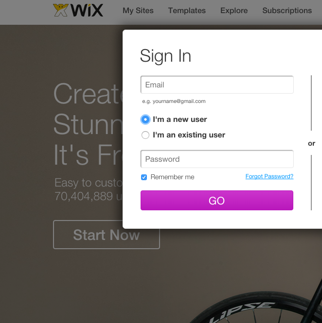
“Now the trend seems to be ‘enter a password,’ and once you do, you are logged in. Bad typists, beware. I am all for shortcuts, but this is a dumb one.”

Keep these coming. Send them to us via Twitter or Facebook using the hastag #wtfUX or email them to: [email protected] with “#wtfUX” in the subject line. Include as much context as you can, so we get a full understanding of what the f%*k went wrong.

post authorJosh Tyson

Josh Tyson
Josh Tyson is the co-author of the first bestselling book about conversational AI, Age of Invisible Machines. He is also the Director of Creative Content at OneReach.ai and co-host of both the Invisible Machines and N9K podcasts. His writing has appeared in numerous publications over the years, including Chicago Reader, Fast Company, FLAUNT, The New York Times, Observer, SLAP, Stop Smiling, Thrasher, and Westword. 

Tweet
Share
Post
Share
Email
Print

Related Articles

AI is reshaping UX, and Figma may be sinking. As AI-driven systems minimize UI, traditional design roles must evolve — or risk becoming obsolete. Are you ready to adapt?

Article by Greg Nudelman
AI Is Flipping UX Upside Down: How to Keep Your UX Job, and Why Figma is a Titanic (It’s not for the Reasons You Think)
  • The article explores the fundamental shift in UX as AI-first systems minimize the role of UI, rendering traditional design tools like Figma increasingly obsolete.
  • It introduces the “Iceberg UX Model,” illustrating how modern AI-driven interfaces prioritize functionality and automation over visual design.
  • The piece argues that UX professionals must shift their focus from UI aesthetics to AI-driven user experience, emphasizing use case validation, AI model integration, and data-informed decision-making.
  • It warns that designers who remain fixated on pixel-perfect layouts risk becoming obsolete, urging them to adapt by engaging in AI-driven UX strategies.
Share:AI Is Flipping UX Upside Down: How to Keep Your UX Job, and Why Figma is a Titanic (It’s not for the Reasons You Think)
7 min read

Data visualization isn’t just about charts — it’s about telling a clear and compelling story. This article unpacks a wide spectrum of essential principles for making data easy to understand, honest, and engaging. Ready to transform complex numbers into meaningful insights?

Article by Jim Gulsen
The Ultimate Data Visualization Handbook for Designers
  • The article serves as a comprehensive guide for elevating visualization work, combining technical expertise with design principles to help designers transform raw data into meaningful insights.
  • It provides a point of reference for strategies, methods, and best practices to create more effective and impactful data visualizations.
  • The piece recommends tools and resources that design professionals can immediately implement to enhance the clarity and persuasiveness of their data storytelling.
Share:The Ultimate Data Visualization Handbook for Designers
23 min read

Discover how breaking down silos and embracing cross-functional collaboration can lead to smarter, more user-centered design — and better products for everyone.

Article by Rodolpho Henrique
Beyond the Design Silo: How Collaboration Elevates UX
  • The article explores how siloed UX design practices can hinder product success and argues for cross-functional collaboration as essential to creating meaningful user experiences.
  • It outlines the benefits of working closely with product managers, engineers, and stakeholders to align user needs with technical feasibility and business goals.
  • The piece provides real-world collaboration examples across research, prototyping, design systems, and accessibility to show how teamwork leads to more innovative and effective UX outcomes.
Share:Beyond the Design Silo: How Collaboration Elevates UX
4 min read

Join the UX Magazine community!

Stay informed with exclusive content on the intersection of UX, AI agents, and agentic automation—essential reading for future-focused professionals.

Hello!

You're officially a member of the UX Magazine Community.
We're excited to have you with us!

Thank you!

To begin viewing member content, please verify your email.

Tell us about you. Enroll in the course.

    This website uses cookies to ensure you get the best experience on our website. Check our privacy policy and