Save

If you could travel through time with a single idea from today, which idea would you choose and where would you travel too? A simple yet truly fascinating question that gives way to a variety of answers, many in the hopes of achieving status or wealth by visiting the past. More interestingly however is just how few of us would think to carry that idea forward into the future.
Have you ever accidentally sent an incomplete message, or maybe made a transfer with the wrong amount to someone. These sort of blunders happen frequently, often all it takes is a tap of a finger.
Sometimes the unintentional press of a button can have dire consequences for a user, leading to the loss of data, requiring rewriting paragraphs of lost content, frustrating support calls, submitting tickets, and other various stressful situations. This phenomena is uncommon in testing, in fact over the last two years of conducting product testing I’ve only ever come across a situation like this once, and that was due to the lack of a modal dialog to prevent an unconfirmed deletion of an account; the traditional method in place aimed at preventing such occurrences.

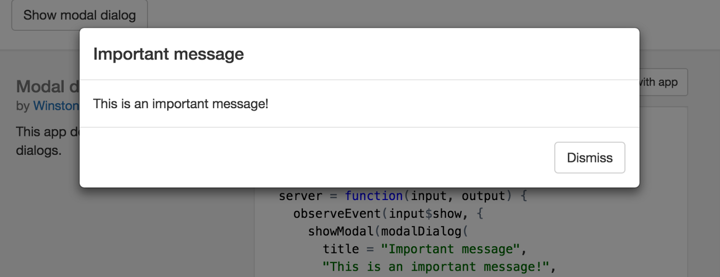
Modal dialog example.
This method in itself is tried and true, it provides security against unintentional action on the users behalf and only requires an additional tap, a universally agreed upon interaction cost.
Question Convention:
Are you familiar with the idea of synergy? Simply put, synergy is achieved when: “the whole is greater than the sum of its parts”. A common expression in the world of upper management, we strive to create team dynamics that help amplify our team members potential and output. When we look into the systems we create as experience / interface designers it’s not unlike that of a team (“things” working together to do “something” greater), so the principle of synergy remains true.
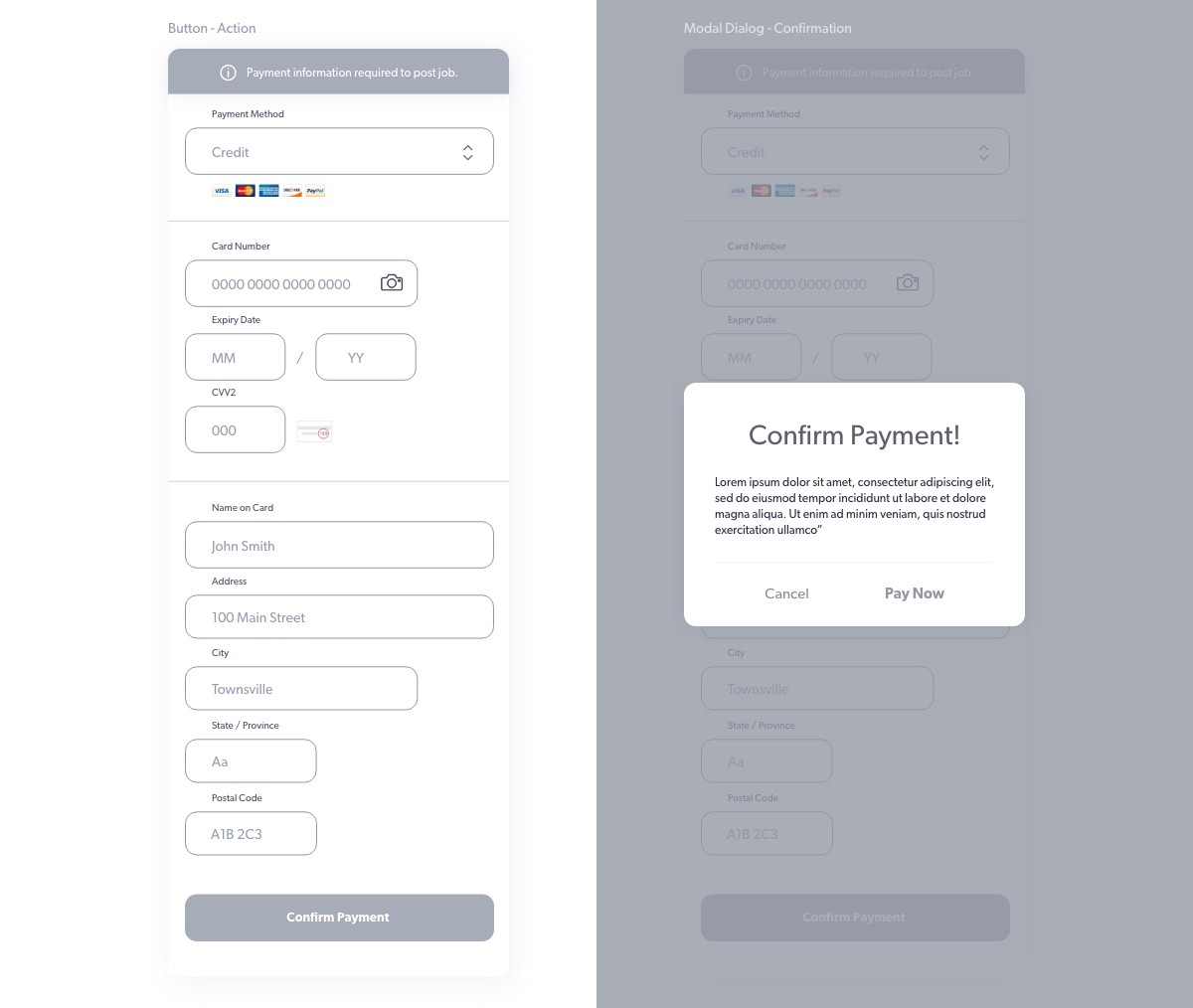
In the case of a modal, the user clicks “Do this thing”, and is then met with a window exclaiming “Please verify”… This takes two actions to achieve two things, firstly initiating an action and secondly confirming the action. In synergy terms its 1:1, not terrible but theres certainly room for improvement. Let’s strive to do more with less.
Exploring Solutions:
When I first began down this train of thought I hypothesized that it would be possible to reduce both an intent and confirmation of intent in a single action. Essentially, bypass the need for a modal, which seemingly flet like a bandaid for an otherwise inadequate interaction method at this point. I took inspiration from existing solutions; check boxes, captcha, hiding the button behind the fold, and so on. While some of these solutions were more elegant than others, they all required two steps to complete, be it a scroll to tap or multiple taps.

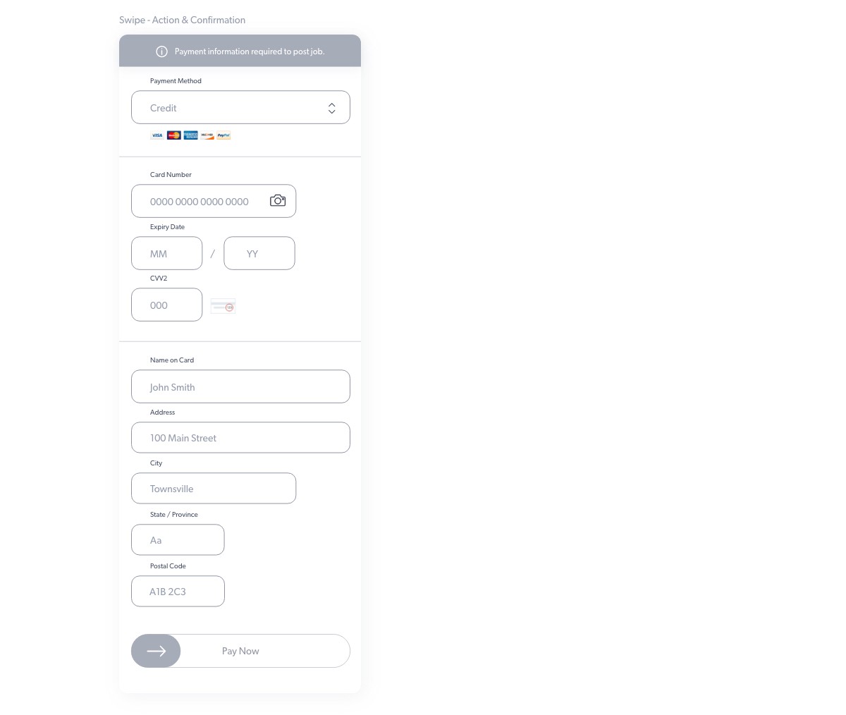
Slide to unlock in its traditional use, is a feature we haven’t quite seen in awhile, and for good reason. Hardware capabilities have allowed us to develop faster, more convenient and secure ways of entering our phones. Think biometrics or facial recognition. These innovations have effectively rendered this interaction unnecessary for the greater part of a decade. Looking back, this elegant solution to a lack of physical switches or buttons; leave it to apple, is exactly the type of interaction I was searching for. It achieve the interaction synergy at 1:2, one ‘input’ required to both perform an action and validate it.
Implementation:
Buttons are wonderful, multiple buttons less so. When looking at usability and UI its important to eliminate the complexity of a system, each interaction can be thought of as having a cost associated, ‘interaction cost’, the more a user is required to spend, the less likely they are to stick around your platform. Fortunately we were able to leverage on ‘old’ feature to help us achieve synergy in our interaction, as shown:

Traditional two step verification (Supported with haptic & audio feedback).

Single step verification (Supported with haptic & audio feedback).
We can see that in this particular case, leveraging an old feature allowed us to create a new standard of usability. We achieved synergy, ultimately improving usability and reducing interaction cost (friction). So let me ask you again, If you could travel through time with a single idea from today, which idea would you choose and where would you travel too?
Thanks for reading! I hope you enjoyed this article, gained some meaningful insights and find inspiration for tomorrow by looking at the past. If you want to collaborate, talk shop, or simply share a conversation over coffee, drop me a line at hello@mitchmills.com or connect via LinkedIn.
Mitch is a US Designer from Vancouver, BC. With extensive experience instilling UX best practices at startups; he mediates the space between people and the information they need by building intuitive, user-centric interfaces that engage, delight and communicate clearly across all devices.


