Save
If you ever had to rent an apartment, you (probably) can agree that searching for a place can get stressful.
There are numerous things that can go wrong and while we often can’t control the circumstances, some impediments shouldn’t even happen in the first place.
Browsing for an apartment online, for example, should aid your search and help to make the overall rental process smoother, without causing any troubles.
Unfortunately, that’s not always the case. Some rental websites only add to the frustration by overlooking major design flaws and prioritizing business over user value. This hurts everyone involved: users don’t get what they want and as a result, leave the website.
The good news is that a few simple adjustments are often enough to enhance user experience and consequently, reduce bounce rate.
So today, let’s look at one website in particular, ApartmentList.com, which is a perfect example of this problem. We will analyze what has gone wrong there and then suggest ways to improve it.
Expectations vs. Reality — User Flow on ApartmentList.com
Whenever I go to a rental website, I expect to start browsing right away. Once I scroll around for a few seconds and determine whether I like the listings overall, I begin applying filters to narrow down my search and see if there’s anything that would suit my preferences.
When I came across ApartmentList, I anticipated to follow the same routine. However, it didn’t happen.
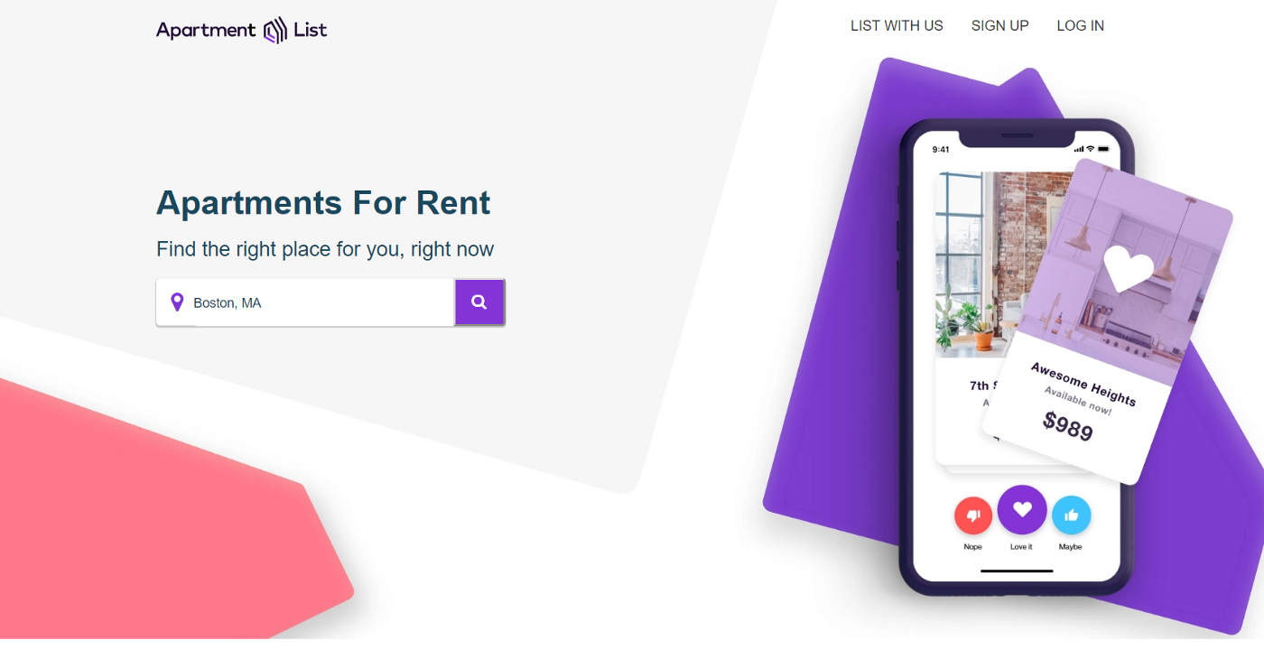
Landing page on ApartmentList.com
At first, it looked like it would be easy to get started. After all, the layout of the landing page is clear, there’s no unnecessary clutter, and the CTA is obvious. I was looking forward to interacting with the website.
Once I searched my desired location, I saw the following:
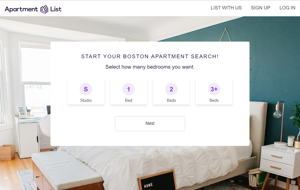
Even though I usually like to select apartment size after I browse around for a few minutes, I didn’t mind making that decision right away.
I selected Studio and 1 Bed and then clicked Next:

I got another question.
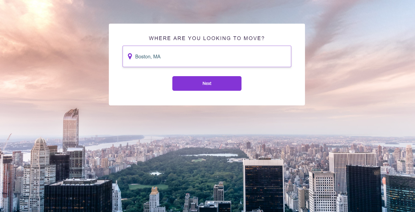
Wait, didn’t I already answer this one?
And then another.
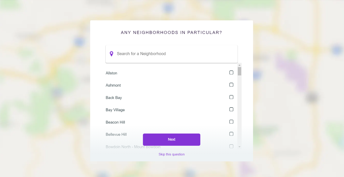
And one more.
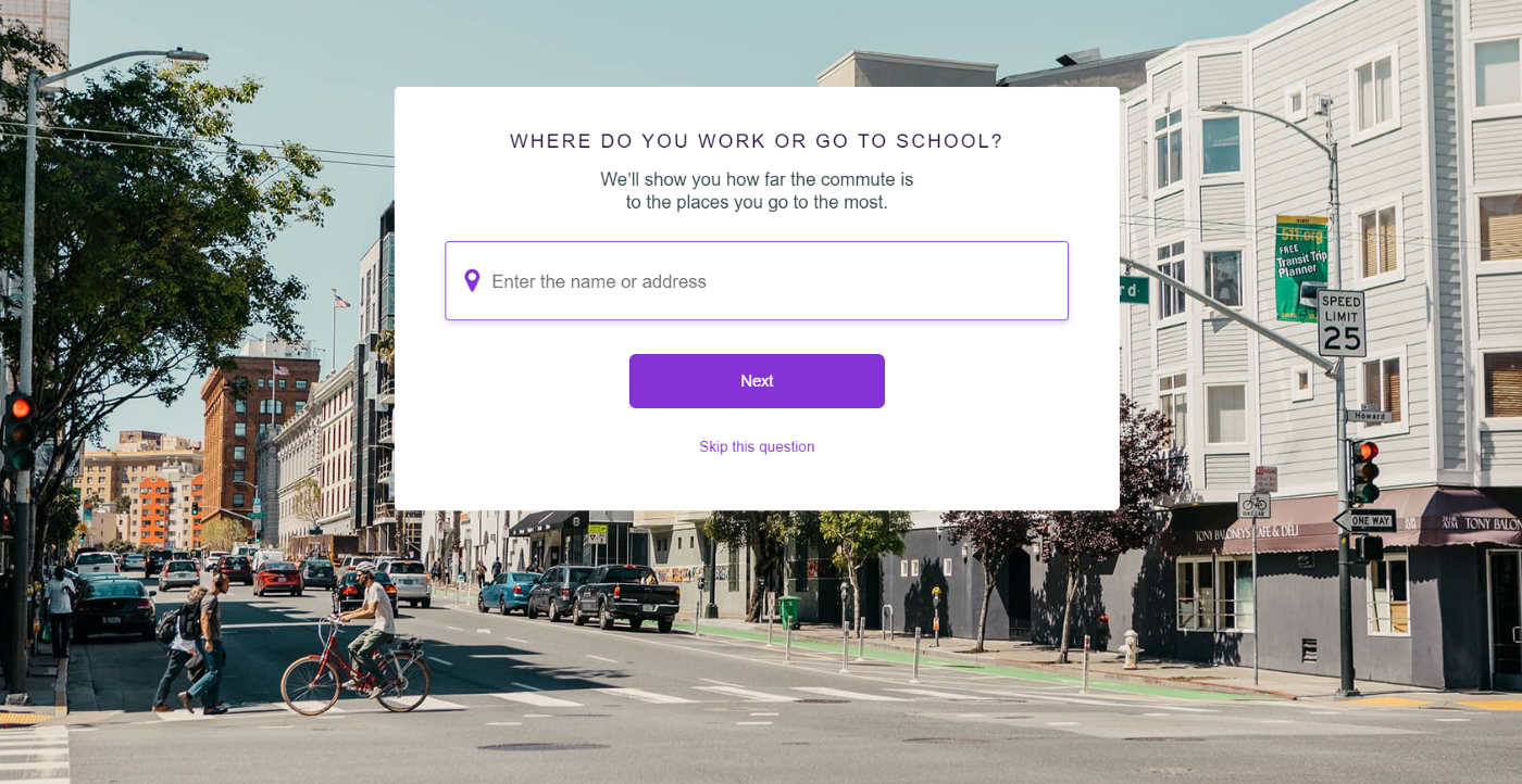
After clicking “Next” a few more times, it began to feel like the survey would never end.
I was going to call it quits right then. At the same time, my designer-self got too curious to find out how many questions there were total, which motivated me to complete the survey.
Although I won’t keep on adding screenshots of every single question, here’s a little recap:
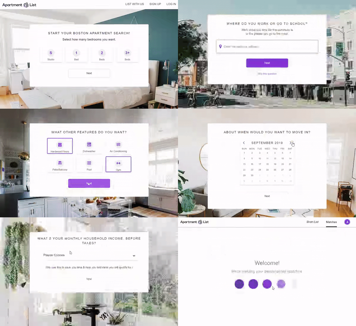
Pets, amenities, evictions, and other stuff
In summary, there were 18 (!) questions total and it took me about 5–7 minutes to answer them.
The moment I saw the Welcome screen, I felt relieved.
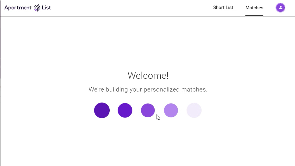
Loading / welcome screen
I even got excited to see my personalized matches — after all, I spent so much time on this survey!
However, my excitement faded away quickly. For a glimpse of a second, I saw the following teaser:
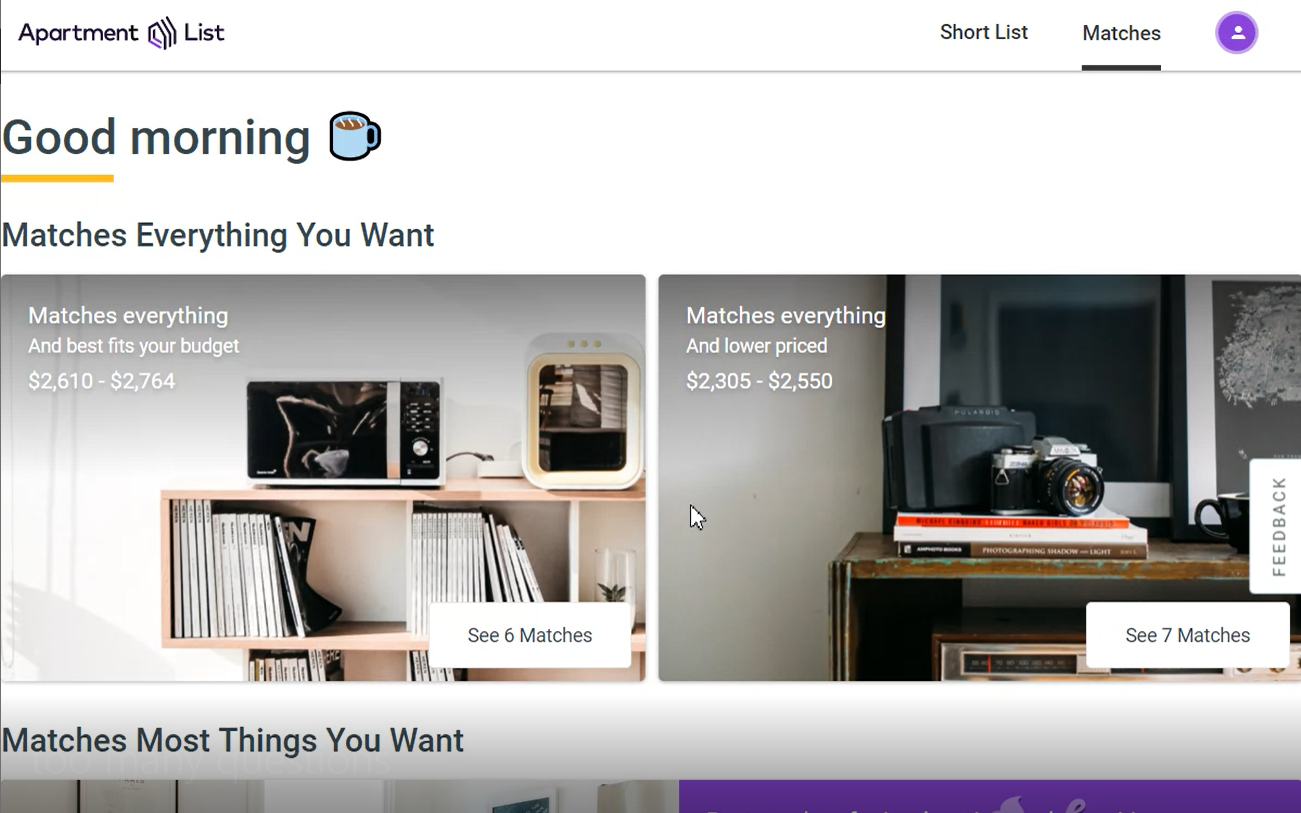
And then this happened:
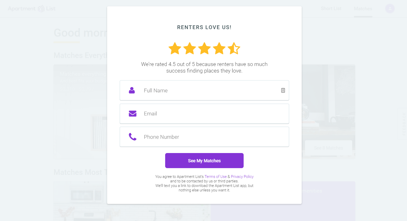
A popup.
The only thing worse than a popup is a popup that doesn’t have an exit icon. And this one was of that kind.
The moment I saw it, I gave up and closed the tab. It didn’t make sense for me to register on ApartmentList without even being able to look at the apartments first. Needless to say, I didn’t want to receive yet another newsletter in my inbox.
So what went wrong? The are two parts to the problem: the survey and the popup. Instead of letting me browse the listings right away, ApartmentList kept on asking for more information. There was also no guarantee that answering questions and signing up for an account would ever get me anything substantial in return.
Let’s see what exactly lead to frustration with these two and come up with ideas to modify them for the better:
Survey
Reason for frustration: It felt like the questions were taking forever, because I had no idea how many there were total and how long it will take me to answer them.
Good ways to fix:
- At the beginning, write something along the lines of “Please answer these questions to help us find better matches for you. This shouldn’t take more than 5–7 minutes.”
- Add a progress bar and/or indication of how many questions are remaining.
This will allow users to feel in control of their time. Moreover, visual progress will keep them motivated to complete the survey.
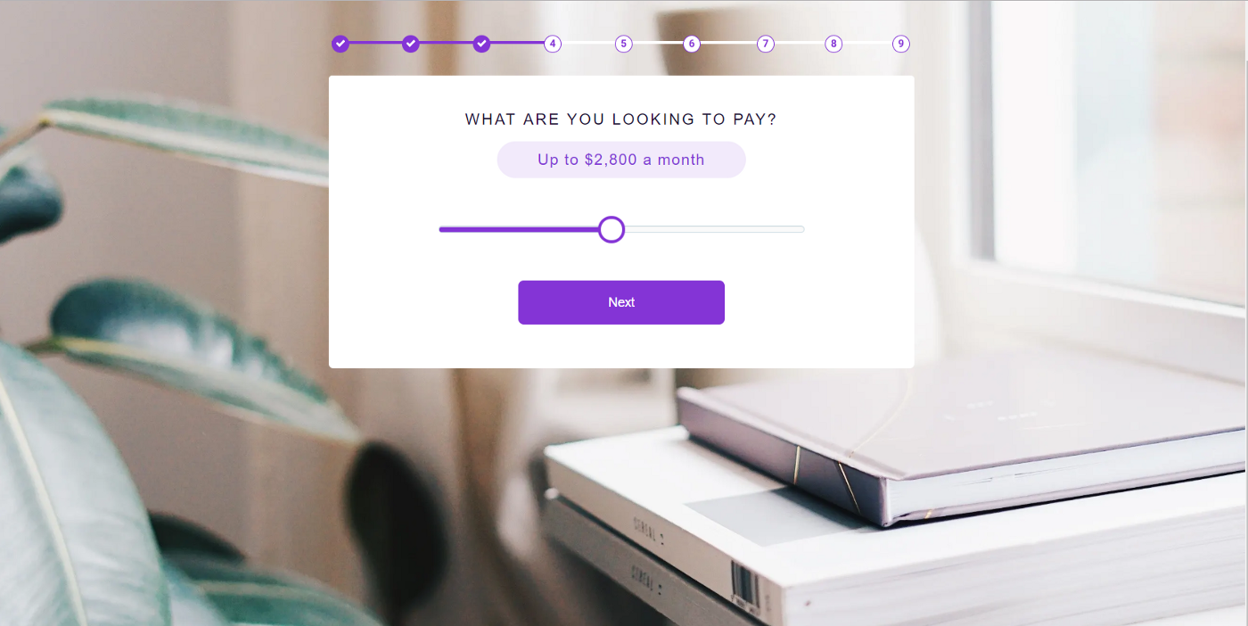
A progress bar at the top lets user know at which stage of the process they are.
Even better ways to fix:
- Allow user to skip the survey and come back to it later if they want to.
- Remove the survey altogether — these questions should be included in filters anyway.

A secondary button allows user to close the survey at any time.
Popup
Reason for frustration: ApartmentList didn’t let me look at the listings prior to signing up for an account, and I didn’t want to register without being able to look at the listings first.
Ways to fix:
- First and foremost, always let users close the popup.
- Instead of showing a popup right away, let users browse for a bit. If listings catch their interest, they will be more likely to sign up when a popup appears.
- In place of a popup, consider adding a floating button (or a bar) to make it easy for users to join mail-list / sign up for an account at any time — while they are browsing.
- If you don’t want users to browse without an account, you can create a set of listings which are only accessible to registered users.
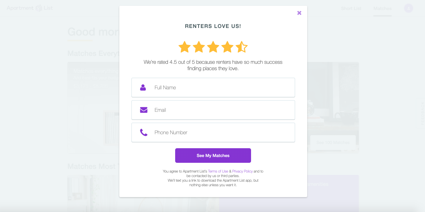
Close icon should be distinct and should appear on the screen right away, in the top right corner.
These are only a few suggestions, and I’m sure you can come up with even more ideas! As you can see, the fixes are relatively straightforward and shouldn’t require much effort to implement. The hardest part is to identify the problem in the first place.
While throwing a popup after a long survey may appear as a good strategy for getting more registered users (since they already invested so much time into answering questions and might as well complete the process), it could actually annoy them and cause them to abandon the website. On the other hand, letting users browse right away and customize their search as they wish might increase chances that they will find something of interest and that they will genuinely want to sign up.
A little empathy can go a long way, so never underestimate its power!
Thank you for reading!
Masha is a product designer/developer from Boston, MA. She currently works at LogicManager, a SaaS enterprise risk management platform.


