Every year on the 8th of March, we celebrate International Women’s Day all around the world. This has been a focal point for the movement for women’s rights and yet undoubtedly we are still far from gender equality. In 2019, Berlin, the first and so far only of the 16 German states, announced this day a public holiday. For a country you might assume has already done a great deal to foster gender equality, this marks an important step.
Diversity is tied to culture and financial performance
Slowly but surely companies are starting to understand the importance of diversity. Talking about diversity, I am not only referring to gender but a wide range of factors like gender, national origin, color, age, sexual orientation, disabilities, weight, religion, socioeconomic stratum, and many more. The bottom line is trying to achieve equal opportunity in the workplace.
It’s starting to move, however, from an extremely low level. Whereas, for example, executive boards in the US, France, and Sweden have more than one woman in the executive board this is still an exception in German companies.
In Germany, men still make up more than 90% of executive board members and only 9,3% are women. — AllBright 2019
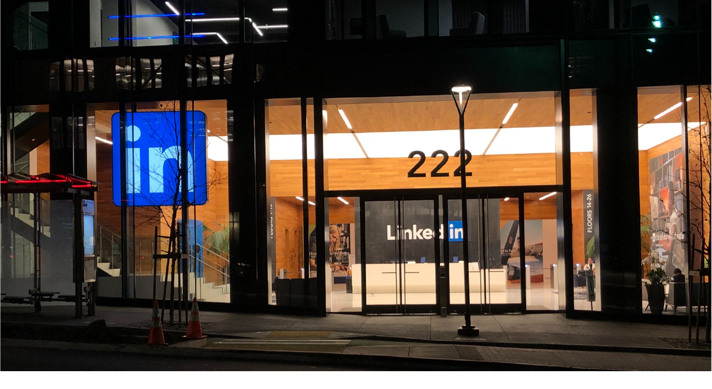
LinkedIn offers immense potential for diversity
With nearly 675M members in over 200 countries and territories, LinkedIn is the most powerful professional online network with 57% of its users being male and 43% being female.

Source: LinkedIn
However, LinkedIn users are 60% more likely to engage with a coworker than other connections. This reflects a larger social media trend towards private connections with people that matter. Indeed, LinkedIn launched the Teammates feature to allow its users to easily add their current teammates increasing healthy and meaningful user engagement.
Personally, I am an advocate for meaningful user engagement but if we only engage with our own bubble, aren’t we disregarding the great potential for diverse interactions LinkedIn offers us?
How to tap into LinkedIn’s diverse user base: a feature design challenge
LinkedIn is on a clear mission to make professionals more successful by connecting the global workforce and as we learned — diversity and success go hand in hand. I identified this opportunity to develop a feature and dug deeper. During my research, I found out that LinkedIn indeed attempted to roll out a career advice program in 2017. To this date, however, the feature has not been released. As there is no further information on why LinkedIn did not pursue this feature, I still saw an opportunity and decided to ask the user.
The research goal was to find out more about the pain points of junior and senior professionals creating meaningful professional connections. I decided to launch a user survey and gathered 35 responses of whom 40% identified to be at a senior and 60% at a junior career level.
The insights from junior professionals:

Clearly, Juniors have a hard time approaching Seniors for mentoring. The opportunity for LinkedIn is of making mentorship more accessible to junior professionals.
The insights from senior professionals:

Overall, surprisingly, Seniors don’t aim for compensation, even though Juniors see a clear benefit in mentorship and would even be willing to pay (71% of the survey respondents would be willing to pay for the mentorship). Senior professionals are rather seeking non-monetary remuneration guided by altruistic motives.
There is a problem that no competitor solves
We have observed that LinkedIn is not granting accessibility and the curated matching of junior and senior professionals which is causing a lack of meaningful networking and professional success.
The LinkedIn mentorship feature is mostly competing with the recently launched Facebook mentor feature. However, as Facebook is rather used as a private than a professional network, LinkedIn would take the niche of an external and professional mentorship provider.

Market Positioning Mape of the LinkedIn mentorship feature
After carefully analyzing the Facebook mentor feature as well as internal, company-specific mentorship providers such as Tandemploy, Mentorloop, mentorcliQ, and Everwise, I moved on to sketching wireframes for the LinkedIn mentorship feature.
Rolling up the sleeves, designing the solution
I worked the idea up into wireframes and flows. The focus of wireframes and prototyping was the happy path of the senior professional seeking to become a mentor.

Happy path of senior professionals

Mid-fidelity wireframes

Style tile LinkedIn mentorship feature
Designing the high-fidelity wireframes, I was led by LinkedIn’s recently updated brand guidelines. Reverse engineering LinkedIn’s look and feel, I also took the opportunity to make minor improvements, such as the Icons of the bottom tab bar. LinkedIn’s custom font, Community, was substituted by Source Sans Pro as the closest open source font.


The UX writing of this feature was based on the great insights into motivational factors of senior professionals gained in the research phase. Giving a sufficient choice to base the matching upon without overwhelming and discouraging the user in the process, was one of the challenges of this project.
Based on the preferred approach, format, availability, motivation and the top skills to offer as well as to develop, mentor and mentee are matched. It is up to them to establish a mentorship relation, as the user research showed that good chemistry between mentor and mentee is essential to the users and something that can hardly be predicted.
Prototype LinkedIn Mentorship Feature
What comes next
The next steps would be to perform user testing with the high-fidelity prototype and to iterate on the prototype. The focus lay on the mentor’s point of view, as this appeared to be the limiting factor of the two-sided networking. The user flow of the mentee is yet to be designed as well as further after-match services granting guidance and fostering the success of the mentorship.
Final thoughts
This case supports the need for a well designed and thought-through LinkedIn mentorship feature. If the pain points and motivations of both sides, junior professionals and senior professionals are adequately considered, mutually beneficial mentorship will lead to diverse and meaningful networking.
Designing a multi-sided platform solution increased the complexity and underlined the necessity of well-conducted user research. This challenge only scratched the surface but will hopefully inspire LinkedIn to roll out the mentorship feature in times where diversity is at the center of social discourse and this feature could make a real impact.
Please note that this is an unsolicited feature design project and views are my own. I had a blast doing this project and I hope you enjoyed reading about it too. Make sure to leave some claps, comments or suggestions.
Thank you for reading and thanks to Ayumi Sugawara, Irina Buruiana, Lolla Massari and Irina Spicaka for the support.