Save
If you’re reading this from your laptop or mobile device, then you would have come into contact with multiple micro-interactions in order to get to this point. Likely, you didn’t notice everyone — and that’s the point. Micro-interactions are designed to be subtle yet engaging with the power to create a seamless user experience. They are single-purpose events found all over devices and apps which transform the mundane and tedious into spellbinding, creating moments that are engaging, welcoming, and above all, memorable.
Micro-interactions are useful because they provide feedback to the user by letting them know the status of an interaction, like a loading bar, for instance. Helping users see direct, real-time results of their interactions enhance the sense of direct manipulation to which users respond favorably — when they press a button, they immediately know action has been triggered, giving a sense of control.
How they work
Micro-interactions mechanics can be broken down into 4 parts: trigger, rules, feedback, and loops and modes.
Trigger: this is what initiates micro-interactions and is often presented as a floating icon that encourages the user to swipe, click, tap, scroll, or pull. Triggers come in the form of either a user-initiated trigger or a system-initiated trigger (where the system detects a particular operation is met, which then initiates a reaction).
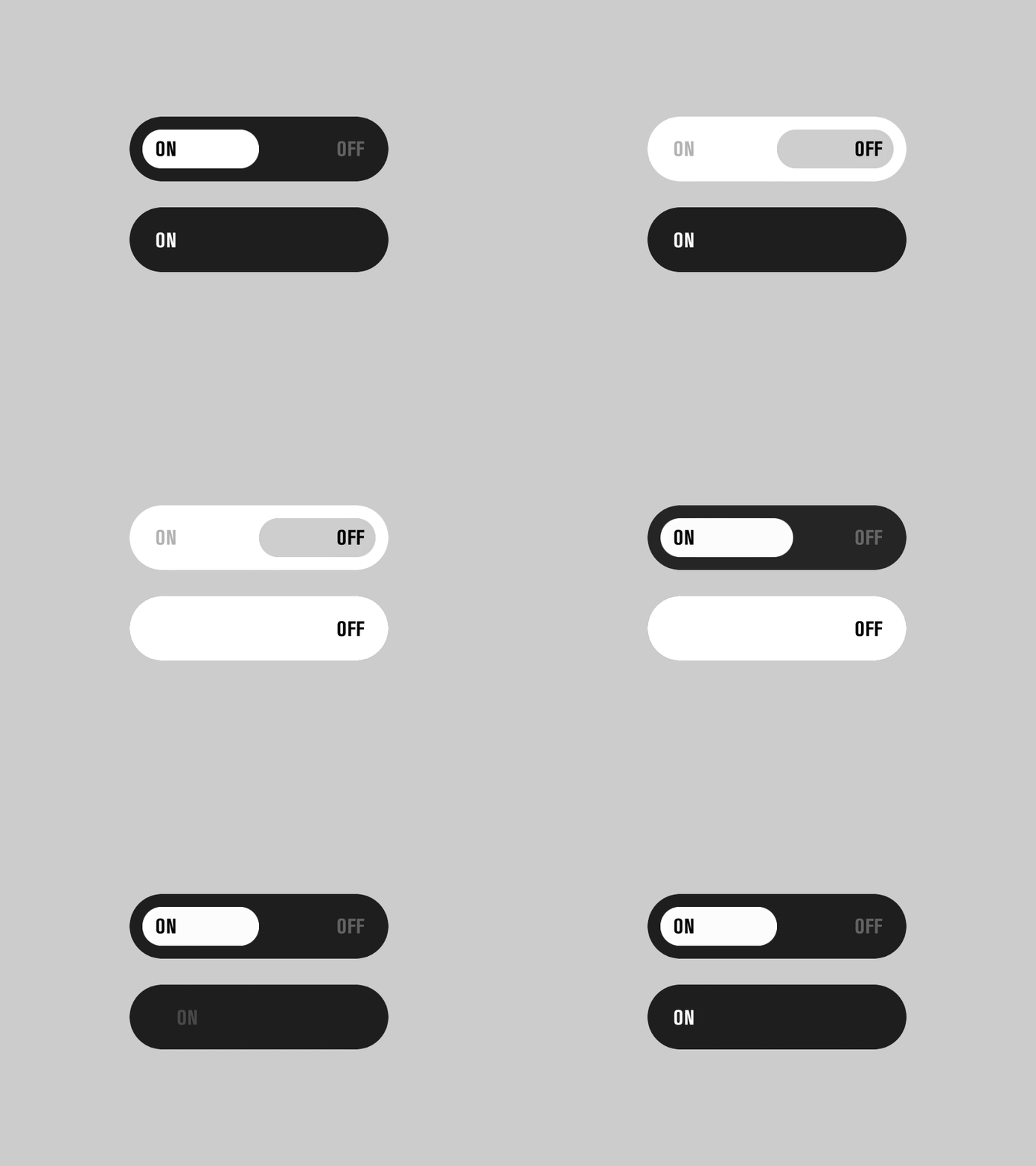
Courtesy Dribble
Rules: this determines the actions taken by the system once a micro-interaction is triggered. The success of this is based on how natural it feels for the user — if the action is jarring the entire purpose is lost.

Courtesy Dribble
Feedback: this lets the user know precisely what is happening once the micro-interaction has been triggered. This usually appears as a loading bar, color-fill of an icon or basic icon animation. Anything a user sees or hears during a micro-interaction is considered feedback.
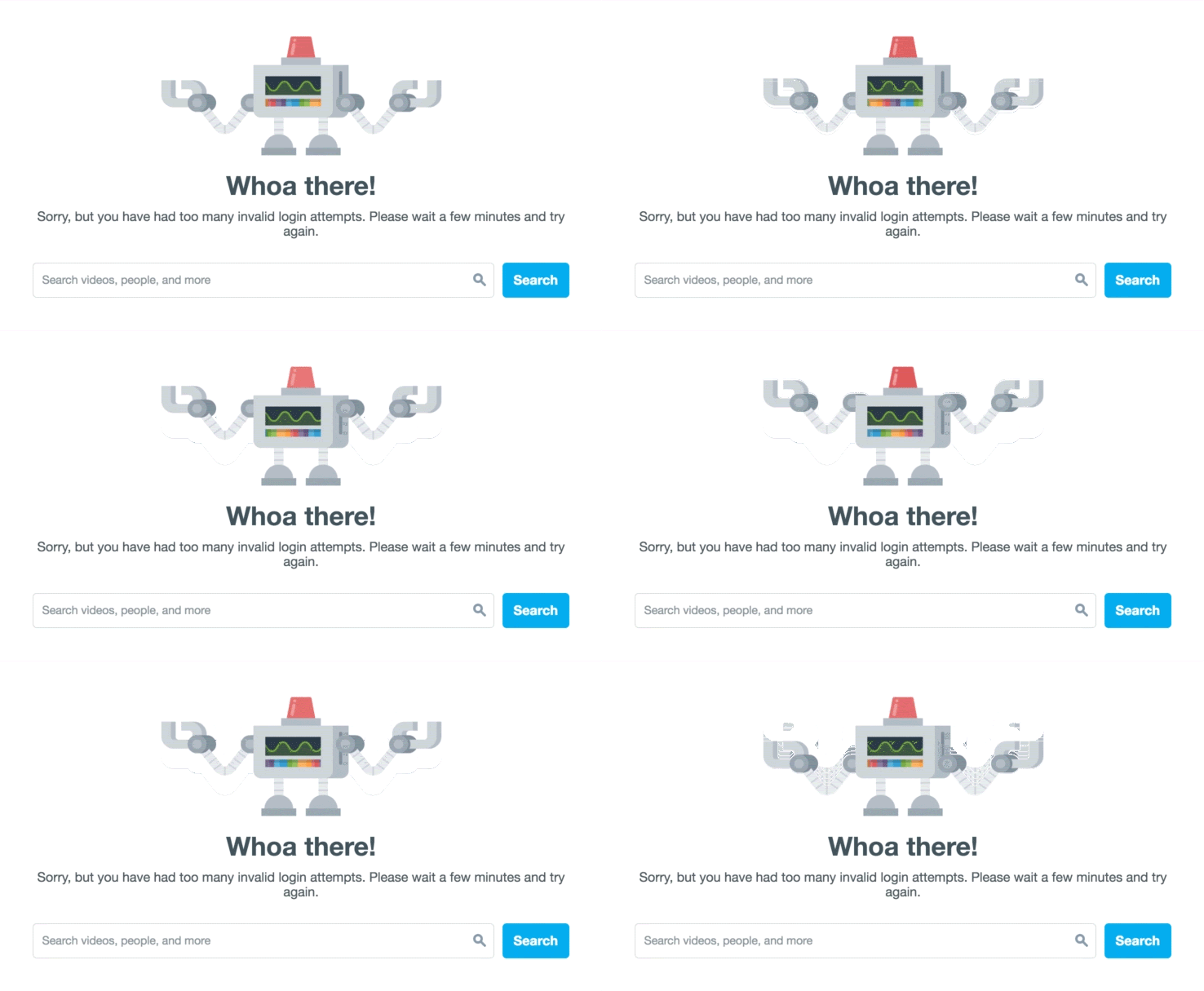
The bad getaway screen in Vimeo
Loops and modes: this determines the specific principles of the micro-interaction, for instance, the length of its display. Micro-interactions may change over time so each one has its own set of loops and modes.
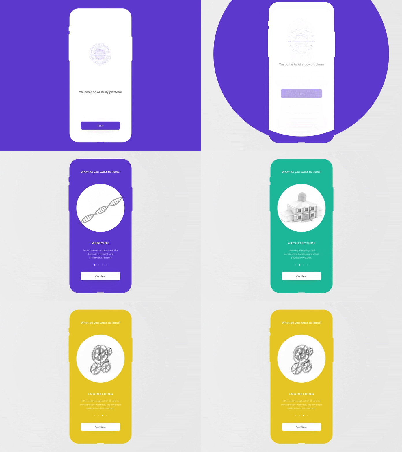
Onboarding process through micro-interactions. Author: Cuberto Digital Agency
Why they matter
The most significant element of micro-interactions is that they exist solely for the benefit and enjoyment of the user. When businesses pamper and put customers first, they create an experience so enjoyable that they will keep coming back for more. The same applies to the digital realm. Attention to detail is what transforms an ordinary website or application into a memorable one. And micro-interactions are playful, fun, and engaging ways to do this.
But how exactly do they benefit the user and create memorable experiences? In many subtle and creative ways, it turns out. First off, micro-interactions make it easier for users to navigate and interact their way through a website which already adds ease and comfort. They keep users constantly informed and updated through information relevant to their actions (in the form of tips and helpful hints), which increases the time they spend on a page. When users are forced to actively seek out information it annoys them tremendously and prompts them to turn to another source. Retaining the attention of users is fundamental in any digital interaction. Micro-interactions provide users with helpful, engaging, and unique experiences that create an emotional connection to the information and the brand as a whole.
Due to the immediate feedback created by micro-interactions, users begin to slowly learn how to work with the system. This is done in subtle ways as to not come across preachy or heavy-handed. It has to be fun and simple, after all.
How to properly use them
The most important thing to keep in mind when designing micro-interactions is the K.I.S.S. principle — Keep It Simple, Silly! Users are bombarded with micro-interactions every day on every device and application, so the trick is to lessen the clutter of each interaction. If they are too complicated it could easily lead to frustration for the user. The sweet spot when it comes to micro-interaction design is to add value and meaning rather than gimmicks.
The best interactions often go by unnoticed because they link seamlessly with the user’s interaction with a website or application. Here, consistency is critical. Each micro-interaction needs to fit into the overall design and also be noticeable (interactive) enough to give enjoyment to the user. They need to follow similar rules and patterns within the chosen overall theme. Unexpected surprises will come across as jarring and unfamiliar and negatively affect the user experience.
One of the most simple, yet effective micro-interactions that consistently saves the user time and makes a site easier to use is the auto-fill functionality for forms. It’s been around a while now and isn’t we glad it is. Having said that, there are still forms that you can’t avoid, like filling in payment details. But there are ways to remove the tedium from the task. For example in Basecamp, when you’re filling in your form you can hear the typical chimes of overly boring ‘elevator’ music playing, and as soon as you’re done a bell rings. Using humor to help the tedious tasks along makes the user experience memorable.
Another smart little idea we’ve seen recently has borrowed the right/left swipe from Tinder and it’s pretty great!

Filling and fixing data access with a swiping effect. Author: Colin Garven
This interaction allows you to swipe right to move through your login process and gives a little rattle when your input isn’t correct. The immediateness takes the frustration from clicking submit the form only to be alerted to errors by a big red X, as the screen returns to the original form. Another helpful tip is to combine short, sharp, and powerful copy to micro-interactions for greater impact.
A few micro-interaction design best practices
It is important to remember when designing micro-interactions that each one needs to have a purpose. This may seem elementary but it is easy to get creatively carried away at times, mostly because they are just so damn cool to create. Never lose sight of the purpose of the micro-interaction — that is to provide meaning and relevance for the user.
Don’t be annoying. Bombarding users with too many micro-interactions, or designing them to be complicated or too irreverent will have the opposite effect of why you created them in the first place. Users don’t want to be annoyed (duh!) so keep it simple, engaging, and subtle.
If it’s possible to do something in one step then adding an additional step to make your micro-interaction work isn’t good for the user. Even if you think it makes the engagement more fun, it doesn’t. It just wastes time.
Conclusion
Micro-interactions are powerhouses of communication with users tied into small packages. They are great ways to engage with them in fun, dynamic and meaningful ways. They are impressive because they provide delight for the user which increases their engagement with the content and establishes an emotional connection through subtle yet effective ways. But it takes thoughtful and precise design to gain the full benefits from micro-interactions. Above all, don’t forget to K.I.S.S.!
Micro-interactions are beginning to get macro-interest in the awards sphere so here’s a little link to the Awwwards current nominees. Some are just simply brilliant!
Samantha Wolhuter
I am a marketing professional skilled in content and creative strategy. I have both a strong strategic and creative background. I have experience in through-the-line advertising, working on some of the world's biggest and greatest brands, ensuring that I have keen insight into brand building. I have experience in B2C and B2B marketing, and I currently work within the digital marketing industry. I am one of the few in the industry pioneering the importance of real content strategy.


