Save
A couple years ago, I sold the experience design agency I co-founded. The same year, I decided to pursue a curious product passion of mine: democratizing the conference room with a portable, modular, dry-erase board system. I went through SolidWorks courses to immerse myself in CAD. I purchased a large-format, high-resolution 3D printer to build prototypes. I believed I was equipped to create an amazing product.
A few months later, I felt confident entering the small, windowless conference room of a local plastic injection company. I sat at a blue pop-up kitchen table with mismatched chairs around it. The wallpaper in the room was peeling and the floors were covered in old peel-and-stick laminate. The room was a far cry from the large enterprise conference rooms I’ve been in hundreds of times, running through UX projects with executives. Still, this dilapidated room was the first one I was ever laughed out of after sharing my design for something I wanted to produce. I had a lot to learn.
Over the last two years of functional prototyping, field-testing, and research, I’ve realized that I have learned a number of things developing a physical product that are making me a better experience design professional. Here are six of them:
1. Digital is Easy
Okay, so maybe “easy” is the wrong word, but with digital there are many luxuries that don’t exist when creating a physical thing. Compared to manufactured product development, launching a mobile or web product is dramatically less complicated. I’m not just talking about the development tools we have, but also the fact that we have the ability to launch something before it is fully baked. Unlike an app that lives online, once you launch a physical product, you can’t re-work the design for those customers that have made a purchase. There is no version 1.0. Instead it’s “launch it right the very first time or you are probably out of business.”
In the beta launch environment, we have become too quick-to-launch. We don’t take the necessary time to make a product great before we expose our customers to it. We are too caught up in having the first-mover advantage. Part of the problem is that we don’t see a digital experience as product that is purchased (purchasing an app would, of course, be the exception). The reality is that every digital experience is a point of sale. Money does not change hands, but there is something being sold. You are selling a good first impression and a positive experience.
The ROI is the user’s willingness to return and go through the experience again. If it’s true that you only have one shot at getting a manufactured product right, then it holds that you only have one chance to make a good first impression with a digital experience. A study EffectiveUI commissioned with Harris Interactive proves this out: a negative app experience does lasting damage to your brand. There is a huge market opportunity for more thoughtful products that take years, instead of months, to launch.
2. Prototype is a Verb
I’ve often listed “functional prototype” as a deliverable in a statement of work to a client. I realize now that there is no such “thing” as a prototype. Prototype is a concept we borrowed from the traditional product development because we didn’t have a better word for what we were doing. Prototype is an action—something we do in order to solve a particular business, design, or technical problem.
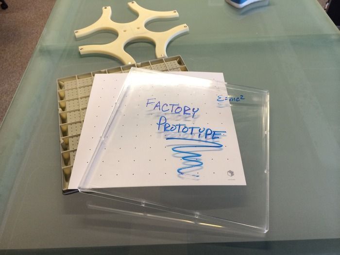
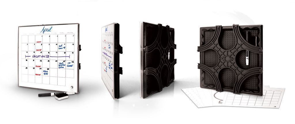
Clients expect prototypes, but they do little to serve the product, mostly because there is an expected fidelity of any design deliverable. I prototyped my portable whiteboards (called mc squares) to get the feel just right; to make sure the wall-mounting system worked perfectly; to test manufacturability; to watch people use the system for design improvements; etc. I never considered a prototype as a “deliverable”—at least not in the same way I did on a software project. As the person responsible for creating a good product, prototyping was simply my preferred design process.
3. Designers Have to “Own” the Product
In the digital product world we have project mangers, product owners, business analysts, technical architects, developers, and (hopefully) experience designers. In the past, I’ve always struggled with the question, “who owns the product?” The process of physical product design has definitively answered that question for me: the lead designer owns the product. The lead designer is responsible for understanding the business goals, the users, and the stakeholders. This person is also responsible for ensuring the product is intuitive and draws on empathy to guide users.
This means that there is a significant responsibility for designers to understand how something will be built. It’s next to impossible to design something great without knowing how it will be engineered, which leads me to my next point.
4. Engineering is Design
For me, software design is more intuitive because I use software, and I was once a practicing software engineer myself. I can design something with perspective on how it will be built. When I started 3D printing prototypes, however, I focused on the utility, the form, and the feel of the product. I assumed that what was 3D printable (prototype-able) was also manufacture-able. That assumption, and the following laughter, was what lead to me being escorted out of that little conference room in the middle of a local plastic injection company.
Honestly, given my background and experience, I should have known better. But I didn’t. Even worse: I was surprised by the rejection. This gave me a ton of empathy for designers who have never coded anything into a production environment. I’ve developed a more profound respect for designers who intuitively recognize they can’t design effectively until they fully understand how a product is going to be engineered.
5. One Product at a Time
As I was writing this article, one of my project managers came to me for advice on a problem she was having on an account. A client basically terminated a contract with us, explaining that they did not have the capacity to manage a vendor. I asked her about the person on the client side who was responsible for our relationship. It turns out, that person was their internal designer, who was also responsible for two other products and their website redesign—all of them due at the same time.
As the product owner, the lead designer must be held accountable for one (and only one) product at one time. They need time to create, think, experiment, problem solve, fail, and create again. In other words, they need the space and freedom to prototype. The creative process is difficult enough with necessary deadlines. Once you add distractions you wind up with “okay” visual design on products that have not been design architected; you wind up with pretty products that don’t fully serve your customers in the way they deserve.
6. Expand the Scope of Your Empathy
We often say that we must develop empathy for our users in order to create great digital products, but know now that we also need to develop empathy for the other disciplines as well. If a designer places a demand on an engineer, then the designer should have some idea of the workload that demand creates. Conversely, engineers need to understand the “whys” of the design. People should be allowed the time in their workday to “play” in a different discipline.
I’m a better designer because I took on something outside of my day-to-day responsibilities and pushed my skills well beyond my comfort zone. If you’re a designer, I encourage you to take on a side project that is not directly in your area of expertise. If you manage designers, encourage them to create something on their own that might not even have anything to do with your business. They will be better designers for it.
If you’re interested, you can take a peek at the mc squares dry-erase system on Kickstarter.
Image of Edison blub courtesy Shutterstock.
- Business Value and ROI, Consumer products, Design, Design Tools and Software, Development, Empathy, Marketing and Brand, Product design, Project Management, Prototypes, Research Methods and Techniques, Sketching, Software, Strategy, Team Dynamics, Technology, Usability, User Acceptance Testing, Vendor-Client Relationships, Visual Design, Working With Stakeholders
Anthony Franco
Anthony Franco is a serial entrepreneur and design leader who founded Effective, the world's first user experience agency, where he pioneered human-centered design for Fortune 100 companies. After founding seven companies and successfully exiting six, Anthony now focuses on helping organizations operationalize AI through his frameworks, AI First Principles and the WISER Method. He co-hosts the How to Founder podcast and serves as a consultant, where he guides businesses through intelligent automation and strategic exits.


