Design for the mobile web been a subject of much discussion over the past few years.
The sharing of information and experience has helped us all to gain a better understanding of best practices, pitfalls, and considerations when designing mobile products.
However, as with any topic that gets widespread attention, a few myths have emerged within the large body of useful information.
In this article we’ll try to dispel some of these myths in the hope that we can all continue to get better faster.
What is Mobile Anyway?
In the spirit of setting a level playing field, let’s start by defining what we’re talking about when we say “mobile.” From a purist’s perspective, any technology that a person may use to access Internet functionality away from a fixed location can be considered mobile. This range spans from laptops to low-end, browser-equipped feature phones. However, most articles and statistics that refer to mobile are really only talking about smartphones and tablets. Therefore, to talk apples-to-apples, and because those parameters will be most useful, we’ll stick with this convention.
When we refer to mobile Internet, whether the access is via an app or browser or any other technology is not material for this discussion—these myths apply to how people are relating to functionality on mobile devices, not on the technical underpinnings or access points.
Myth #1 – Mobile Devices are Used on the Go
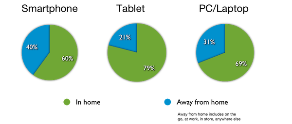
In Google’s annual survey of mobile users, they found that 60% of smartphone use takes place in the home. Google’s definition of “away” includes use inside the office, so actual “on the go” is probably well under the 40% remainder. Even more staggering is that 79% of tablet use is in the home: PCs and laptops clock substantially more road use than tablets.
This misconception is relatively benign. By planning for a worst case scenario, one where bandwidth is probably constrained, the connection is spotty, and in which the user won’t want to negotiate multiple layers of navigation to reach desired information, then we are likely producing a design that works better in any environment.
Too often we seem to be treating mobile design as if it were a desert island or some unknown void
Taken to its extreme, however, when we limit information available to the user to only “mobile use cases such as nearby store locations, we do the user a disservice. We can’t limit features and information to only those hypothetical mobile use cases, as that user might not even be mobile. Even if he or she is on the go, we should not jump to conclusions about the breadth or depth of information required for their current task.
Myth #2 – Only Mobile Users are Distracted
“We have to be mindful that the user is on the street, there is noise and glare, there are sidewalks and obstacles to navigate. The user won’t be paying full attention.” I’ve heard this in one form or another a thousand times, but the myth here is that only mobile users are distracted.
We’ve already seen that more than half of mobile usage takes place in the home—presumably an environment where a user can focus on one task (not that this sounds like my home; how about yours?). Admittedly, desktop users don’t have curbs and pedestrians to contend with. But aside from physical obstacles, people multitask at work, at home, and on the go. Even if they aren’t doing two things at once, people are usually thinking about several things at once. We’ve acknowledged for years that people only scan text and that they rarely develop accurate mental models of products. All users are distracted all of the time.
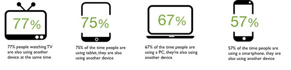
Google’s survey of US mobile use revealed that people are most often using more than one device at once. In fact, 77% of people reported using a computing device while watching television.
Ironically, smartphone users are more likely to be paying attention solely to that device. Of course, this is the one device that people seem to be taking with them on the bus, to the store, and to other locations where it might get our (somewhat) undivided attention.
Again, this myth is relatively benign: whatever you were going to do to combat the distractions for mobile use you should probably do for all interfaces. We might try applying techniques like service design and journey mapping to help build and share understanding of the comprehensive and variable environments in which our users operate. These same techniques can help us to design for activities that take place across multiple devices as well.
Our core principles remain fully relevant here: to be as readily comprehensible, learnable, and intelligible as we can; to prevent errors when possible, fail gracefully, and play well with others.
Myth #3 – Mobile Should Support a Pared-Down Set of Tasks
In the early days of mobile, accessing the Internet meant using the browser on your feature phone. Input was limited to the number pad and data connections were slow and expensive. Under these conditions, narrowing down website options to the bare minimum probably made sense—people were certainly only accessing a site for a specific, immediate need and were not particularly inclined to explore. Those days have been gone for approximately 10 years, yet the mindset that a mobile user wants only select time-sensitive tasks remains prevalent.
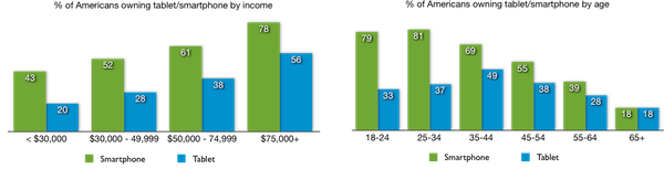
For a large segment of Americans, mobile devices are the principal access point to the Internet. According to Pew Internet, 59% of Americans who make less than $30,000-per-year have no internet access at home. For these people, mobile (almost always phone) is their only means of connection. For 18-29 year olds, mobile may not be the only way, but is the preferred means of access—45% of this age group does most of their web browsing via mobile. Overall, 17% of Americans who own cell phones (not just smartphones) reported in 2012 that they go online mostly via phone. If content is not available on mobile, for these populations, that content might as well not exist at all.
When a person visits a site first via mobile, they will inevitably expect that what they see is all the site offers. The likelihood that the person will visit the full site from another machine to see if there is more to explore is vanishingly small. And if the person first visits a site from a full site, then finds reduced functionality when visiting later from mobile, then the most likely reaction is going to be frustration.
We also have to consider that the user is at home simply choosing to conduct his or her research on the device closest to hand at the moment.
Much of the work we do to design for mobile should apply also apply to traditional web design. We are acutely focused on mobile screens to make sure that a user accesses the most important information or functionality first. Why do we assume that the traditional web user wants any less consideration?
Over the past few years, one noticeable shift in behavior is that mobile users have moved from wanting only content highlights to preferring full access to long-form content. Given that mobile may be these users’ only or primary access point, we are responsible for giving it to them. The traditional approach of making content scannable and easily consumable has not changed—this remains a best practice for all channels.
Myth #4 – Users are all Thumbs
Since the advent of touch-screen mobile devices, the conventional wisdom is that users’ thumbs are the primary means of accessing and controlling mobile interfaces. There is certainly some truth behind this belief: any quick scan of smartphone users will show that a healthy majority of users do rely on their thumbs for most actions. Most good smartphone interfaces place functions where a user’s thumb will easily reach them. Of course, since a user’s thumbs will easily reach anywhere on a standard smartphone screen, this may or may not be intentional. The bottom line is that thumb use is convenient and it works and it predominates.
When we get to tablet interaction, however, it’s an entirely different story. The prevailing assumption seems to be that since tablets are mobile devices and they look like phones, people will use them like phones. As we now know, people use tablets almost exclusively at home. This means that they aren’t carrying the devices during use.

Typical phone posture: holding phone with thumbs forward.
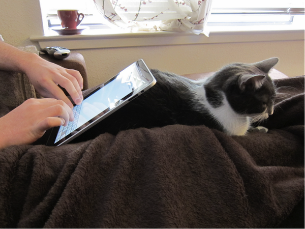
Typical tablet posture: user is reclined and the tablet is propped on a stand of some sort.
Most often, people using tablets are typically sitting slightly reclined with the tablet propped on a stand of some sort. This leaves both hands free for accessing the interface. Only when a person is using the tablet extended from their body as with the camera or a motion-sensitive game—essentially the smartphone posture—does tablet manipulation narrow to thumb-only navigation. Even when using a tablet while standing, people generally carry it cradled more like a book, again leaving a full hand free to control the screen.
Lately, several new design patterns have been proposed to support the notion that navigation and use of tablets depends primarily on thumb use. Even more surprisingly, some of these patterns leave the center of the screen blank since a user can’t easily reach this section.
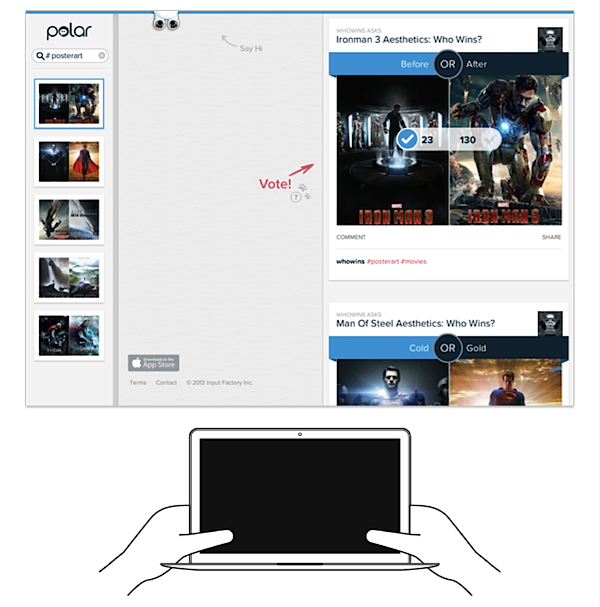
Design pattern optimized for thumb management of tablet screen.
We wouldn’t have fallen into this misconception if we simply followed our cherished principle of observing user behavior. While there was a time when tablets were speculative—they hadn’t yet been launched, so we could only guess at how people would use them—now we have ample qualitative and quantitative data to be able to design for users in the real world.
Myth #5 – Mobile has Matured
There’s a new myth that has just started to emerge that mobile has reached its saturation point and that design patterns have reached a level of maturity.

This myth may stem from our finally having settled on some common design patterns, such as the menu button/handle pictured at left and sliding navigation, which work really well for mobile and will only improve as more people become familiar with them.
Still, technology is changing, both in mobile device capabilities and development kits. Functionality is still migrating to mobile, which is spurring us to find new ways to solve old problems. Massive new populations are coming aboard. These populations will present us with design challenges we haven’t anticipated.
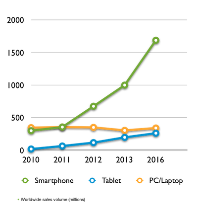
It’s true that smartphones now account for approximately 75% of all phones sold in the US. Growth of the tablet market has skyrocketed in just three years to comprise half the volume in units as PC and laptops. At the end of 2012, about half of Americans owned a smartphone. That means a bit less than half of the US has yet to adopt mobile (not all will, roughly 12% of Americans don’t own even a cell phone) . Other developed markets such as UK and Germany show similar patterns.
Source: Gartner
In emerging markets, mobile adoption is exponential, but overall penetration is still very low—it will be years before we reach even a 50% worldwide penetration level. With it’s lower cost of entry and infrastructure requirements, mobile is how these people are becoming internet-enabled. In these emerging markets we can’t assume the same infrastructure as we have here. For these people, mobile can create new systems and opportunities such as how M-Pesa has brought peer-to-peer money transfer to people in Kenya and Tanzania who have no access to a banking system. Similar innovations in education, healthcare, and other domains we can’t even dream of are inevitable.
Perhaps the greatest wave of mobile innovation at the moment is taking place in the healthcare arena. Mobile apps now can monitor a person’s heart rate and rhythm and send that information to their physician. Mobile apps that are used to manage obesity and diabetes programs have been proven to substantially improve patient compliance and overall outcomes. mHealth is just beginning to emerge, and with it whole new patterns that don’t even have traditional analogs. Certainly innovations on that front will find applications in other domains as well. As these products become available, they will spur additional people to go mobile.
On the device front, Google Glass and Apple’s iWatch are only two of the new mobile device form factors on the horizon which could drive another furious round of innovation in interaction models, functional opportunities, and more. Mobile is evolving rapidly and its simply too soon to think that it is ubiquitous or in any way mature.
Looking at this from a different point of view, mobile design can’t possibly be considered mature, because the number of companies offering a complete, satisfying mobile experience is so small. While people are using their mobile devices two-plus hours a day, they are still running into sites optimized for desktop viewing or stuck with incomplete mobile experiences.
Our quest to make every interaction easy, useful, and enjoyable will never end. Mobile still isn’t old news. When we reach full mobile maturity we’ll enjoy a world where we can do what we want and accomplish what we need to using whatever device is convenient or available at the moment.
Myth #6 – Mobile is Different
All of this really boils down to a final, fundamental myth: that mobile is different.
Yes, there are certain constraints and technological variations between a desktop environment and a mobile environment—screen size on a tablet is (usually) smaller than it is on a laptop and connections are (usually) more intermittent with mobile. We might use specific controls or techniques to optimize the experience across platforms, as we do when we collapse site navigation on a mobile device or substitute clicks for swipes.
A person’s intentions don’t change based on the device he or she uses. We need to look at the user’s experience across devices as a single experience. We research our processes and our products in as natural environment we can, and once we launch, we observe in order to learn more. We design for consistency and continuity across channels and touchpoints.
Too often we seem to be treating mobile design as if it were a desert island or some unknown void. It shouldn’t be: the people using mobile devices are the same ones using PC’s and laptops. More importantly, they are using them for generally the same reasons and to achieve the same goals. Our guiding principles of product design never change:
- Listen to and observe what the users are doing
- Anticipate their needs
- Design for their reality
- Aim to delight
Conclusion
It’s a great time to be a designer. Not only do we have daily occasions to be creative and to create meaning for our customers, but we also have a tremendous community for sharing and learning from each other. With the rapid changes in technology, we have endless opportunities for learning and trying new approaches. By leveraging our powers of observation, experimentation and insight we can create a truly relevant and exciting experience for our users. We don’t need myths.
Image of on-the-go mobile courtesy Shutterstock