In the following excerpt from her new book, Design for Kids: Digital Products for Playing and Learning (available now from Rosenfeld Media), Debra Levin Gelman looks at how the relationship between children and technology has changed over the last three decades.
Thirty years ago, computers were rare, special, fragile machines that kids got to play with for a few hours a week during computer time at school. Now they are ubiquitous, gracing desktops, counters, and classrooms across the globe. Twenty years ago, children were given floppy disks and monitored closely as they learned BASIC and played games. Today, they’re handed laptops and tablets and allowed to explore freely. Ten years ago, fear of the unknown had kids shying away from this thing called the World Wide Web. Now, children are boldly tackling the Web—in addition to apps, social media, and MMORPGs—with little to no fear holding them back.
This generation of kids is digitally native, meaning that technology has and always will be a part of their lives. Unlike previous generations, these digital natives believe that technology exists to serve them, instead of the other way around. They have always known “reset” and “undo” and “play again.” They see technology as a tool for expression, experimentation, and communication. And designing for these little people is more challenging and more exciting than it’s ever been before.
Let’s take a look at what it meant to design for kids back when the Internet was a child and what it means now that the Internet is well into its adolescence.
Designing for Kids, Then…
The first children’s website I ever designed was back in 1998 for Georgia Public Television. It was a companion site for a TV show called Salsa, which taught preschool kids basic Spanish. The website had yellow text on a dark green background, a few animated gifs, some really choppy videos, and a game that I had cobbled together in Shockwave. The navigation was complicated, and there was way too much instructional copy. But I was proud of it, and it even won a public-television award for “Best of the Web” or something like that.
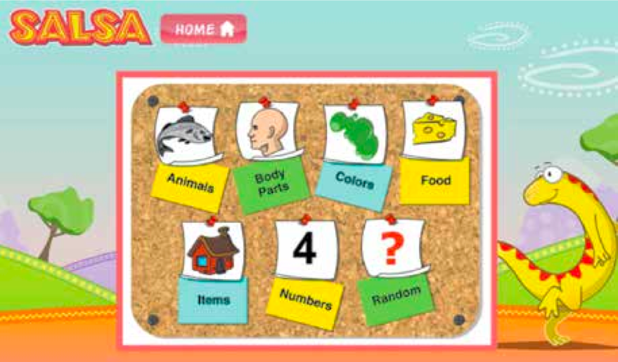
A screenshot from my first kids’ site, circa 1998.
The show Salsa is still around, but the website is long gone. Back in the early days of the Web, we designed websites for kids just like we designed them for adults. The differences were that we used a lot more pictures, a lot more color, and bumped up the font size a few more points. We figured that “bigger” meant it would appeal more to children. True, we were limited by modem speeds, Web-safe colors, and smaller monitors, but, constraints aside, we didn’t really challenge ourselves to think of different and better ways to approach designing websites specifically for kids.
In fact, quite the opposite was true. We were concerned with keeping kids away from the Web and protecting them from the sudden onslaught of unmoderated news, pictures, and information surging into our homes from all over the world. While “educational” sites were cropping up all over the place, the assumption was that they’d be used alongside a responsible adult who could help navigate the difficult and rocky terrain. Because kids couldn’t be trusted with this crazy, scary new technology.
We’re starting to realize that we need to maximize the time that children spend using technology
The screenshot below shows a perfect example and prototypical turn-of-the-century kids’ website called Enchanted Learning, which was meant to be used with parent or teacher assistance. This site featured some interesting educational content for kids, but the antiquated design, overuse of color, limited grid, and tiny images made it difficult for children to understand and use. However, when the site was first created in 1996, it represented the best that we had to offer young people in terms of digital design. Those were the days before Flash, when interactivity and engagement were limited, and we assumed that all our users could read, use a mouse, and had the patience to wait for a bunch of pictures to download. Boy, were we ever wrong!
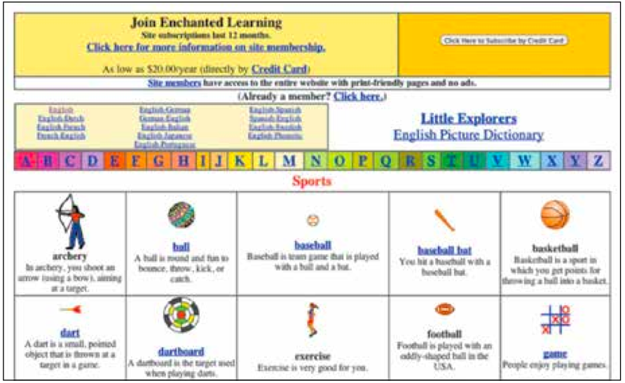
Enchanted Learning is a typical kids’ website from the mid-1990s.
…And Now
Now, fortunately, we know better. Advances in technology, a deeper understanding of how kids use this technology, and a greater sense of comfort and trust have given us a broader toolkit with which to work and design. So the result is a renewed commitment to designing top-notch experiences for kids, as evidenced by Apple’s new app-store “Kids” category, as well as exciting, cross-channel experiences that bridge the gap between the physical and the virtual. We’re starting to realize that we need to maximize the time that children spend using technology so that it truly meets their cognitive, developmental, emotional, and intellectual needs. But, as you’ll soon see, there is still a lot of work remaining to be done.
Just for comparison’s sake between then and now, let’s look at DIY, an example of what a great new digital experience for kids entails today. DIY is a website (with a companion app) that is really and truly for kids. Its judicious use of color, its large, touchable buttons, and its straightforward navigation and flow make DIY a great omni-channel experience for children and their ever-evolving cognitive abilities. DIY enables kids to find creative projects online, which they can then create “in the real world” and go back and share with their digital community. DIY maps perfectly to how kids ages six and up like to use technology—to browse, to sort, to filter, and to support the activities they do in the real world. Younger kids have a harder time separating what they do in a physical space from what they do in a digital one, and DIY’s seamless cross-channel presence makes this separation all but unnecessary.
In addition to a clear, strongly executed creative design, DIY uses interaction design patterns that work perfectly for kids under 12. Straightforward flows, lots of options to choose from presented in a manageable and understandable format, and obvious navigation help kids know exactly what the site is for and how to use it.
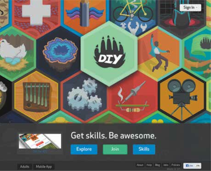
DIY is a cross-channel experience that represents the new direction in digital design for kids.
The Good and Bad News
The good news is that we’re seeing more and more sites and apps like DIY that are available for kids today. The bad news is that we’re not seeing enough of them. There are still far too many mediocre experiences for kids out there—apps, sites, games, even toys—thrown together with little to no regard for how children learn and play. As designers, we have a tremendous, untapped opportunity and responsibility to design great experiences for kids.
The Council on Communications and Media1 reported the results of a study conducted in October 2013, which found that children in the United States average about eight hours of screen time a day, including TV, video games, websites, and mobile devices. While we’re not looking to increase those hours, our goal as designers should be to improve the quality of children’s apps by creating better interfaces, better experiences, better content, and better tools for them.
To learn more about what it takes to create designs that connect with fickle young users, pick up a copy of Design for Kids: Digital Products for Playing and Learning from Resenfeld Media.