Access to big data is growing at an incredible pace. With increased information from various sources available on smartphones and tablets, many companies now realize winning services will be those that transform big data elements into personalized data experiences. As Fjord predicts in our 2013 Digital Trends report, the companies that can make sense of big data for the little guy will likely be the most successful.
The key to creating great service experiences lies with uncovering data and using it in meaningful contexts that have real benefits to users. Recent advances in wearable tech, location-based data and sensors are driving greater interest by consumers in personalized data experiences. Google Glass and the Nike FuelBand are pushing boundaries on what users can expect inside the services of tomorrow.
For designers, however, data presents a very interesting challenge: How can we better understand the value of data and leverage it to make digital experiences more meaningful?
Learning from Disruptive Service Creators
Here are some examples of emerging companies that are embracing the conceptual power of data to create truly breakthrough services.
Neighborland: Empowering users with data
Founded by Candy Chang and Dan Parham, the social website Neighborland has unleashed citywide campaigns to solve some of America’s most challenging issues. The company empowers users with data ownership in an effort to improve the lives of people in local neighborhoods.
The site allows users to easily discover like-minded locals who share their interests to better their communities. By allowing users to designate with terms like “I want the RTA to share their GPS data in New Orleans,” we see how data and opinion connect and form a peer network. On Neighborland, insights and ideas are social at first, but then become shared and soon after owned.

In Neighborland’s case, the “I” changes to “We” once another individual agrees to the comment suggested by selecting “Me too.” The idea then hopefully leads to action that takes places locally in that community.
Neighborland is becoming a powerful tool for cities to discover and create their own source of data that ties a direct line of ownership to the people who live in that location. Inhabitants are being led to have clearer priorities on what should be done for their city.
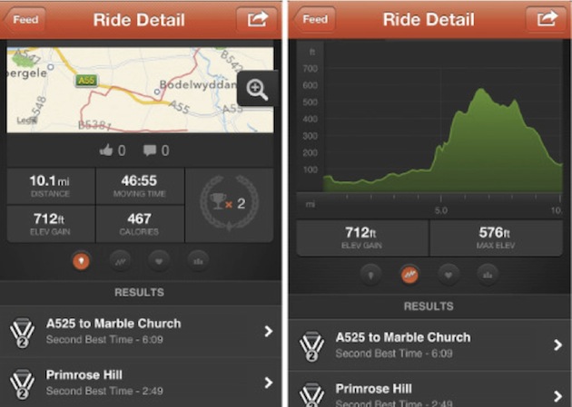
Strava: Expressing yourself and competing with performance data
Strava is a running and cycling iOS app that allows users to go beyond just seeing stats by also giving them the ability to compete with others within their network. Strava prompts users to create what they call “segments.” These are public courses or runs that other users can join in and compete on.
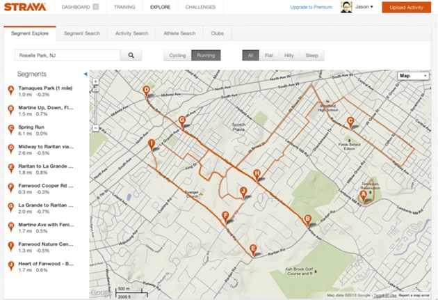
By creating your own segment or simply hopping on someone else’s, you immediately enter the standings. For a runner, times are recorded and, if the app is synced with a social graph, performance stats are visible to outside friends from social networks like Facebook. Strava also allows inputs (sensors) to monitor physical heart activity—what they call their “suffer score.” Similar in some ways to Nike’s FuelBand, Strava creates and contextualizes standard location-based data and makes it personal, allowing others to follow and compete within segments.
Strava is a great example of how people are personalizing their own data. If you really want to see how people are doing physically in your town, just tune-in to the map. If you want to be the best, get on the street and start running.
Managing Mountains of Data
Just as we experience benefits of data, users will have an even greater responsibility in maintaining data as it becomes personalized and more widely available from different sources and locations. Today, much of what we create requires us to remember, filter, or even set privacy or protection on who can view what. Manual maintenance of data will be a growing a problem we face as we embrace more services.
Everyone already feels this burden by managing family photos and emails in disparate locations on different devices. It’s hard to say who should ultimately bear the responsibility for how users of services organize and understand their data. Nonetheless, empathetic designers will find themselves caught in the middle, trying to come up with solutions for how users manage data.
From a consumer perspective, we instill a lot of trust in apps and websites. With emerging issues such as Facebook’s user privacy policy criticism and Netflix’s class action suit involving users’ personal info, we see services battling with the obligation of making users aware of, and confident in, how their personal information is being stored and used. The emerging problem will be about how we best design for data management. Tools that prove this point are already in development such as Tweetdeck, Retaggr, DandyID, and HootSuite Enterprise.
As service designers, we’ll need to further recognize cerebral human factors such as cognitive overload and stress. As a critical part of empathizing with the natural order in users’ lives, services need to keep data experiences simple and accessible.
To do this, designers need to bake into their process a way of examining data and deciding on the right approach to their data problems. We’ve outlined some key approaches to take when working to create value in personalized data experiences:
Data as Currency: The golden ticket
By using data as a currency, consumers are now able to gain access to services, groups, or people. Services like eHarmony, Facebook Connect, and LinkedIn Profiles offer promises of exclusivity and status that have given consumers a more vested interest in giving up their personal information. Even simple data such as eye color, birthdays, or shoe sizes can allow users to connect in interesting ways that create social circles.
Data as Management: “Change it now!”
Accessing personal data such as lists, emails, and files is important from your smartphone. What’s just as important is making sure that the same information is just as consistently accessed and managed across all devices and digital touchpoints: mobile, Web, or desktop. Enable clear design languages to lead users to recognize patters and gain access to data in a consistent way. (Google Mail/Google+, iCloud)
Data as Ownership: “Make it mine”
In the same way as Neighborland and Strava, look at data as a way to personally own a space, an object, or a time period. Data can have inherent value by being associated with the physical environment. It can be used powerfully and virtually to claim ownership of real things. (Foursquare, Yelp)
Data as Expression: “It’s all about me”
Allow data to express its type through users’ interests, desires, and performance. Today, everyone wants to self-express and be heard. Personalization is a lot about how we enable data to represent objects, experiences, and places that identify with our core behavior. Allow data to invoke a user’s voice. (Feltron, Vizify, Strava)
Data as Beauty: Elegant simplicity
Data can be elegant, simple, and beautiful. Visually stunning data will immediately enable a user to recognize and desire it. Take into consideration universal forms found in nature and mathematics. These universal forms are already embedded in our understanding of the world. (Read Design by Nature; watch Between the Folds)
Data as Insight: “I didn’t know that!”
Big data is almost always cloudy and messy. But when filtered just right, it provides great discovery. Shape data to focus on certain areas of its meaning and narrative. This approach will allow you to create unique footprints that are easily understood and uniquely remembered. (Facebook Worldwide friendships mapped, InArticle.org, Charles Minard’s map of Napoleon’s March)
Data as Tools: Getting stuff done
Binary data is boring. It’s also fairly useless. Push data to create value by enabling it to act as a customizable tool to solve a problem. Useful data is the best data there is as it addresses particular human demands and needs. (Google Analytics, Mint)
In Conclusion
The data design challenge can be a complicated one for many businesses, especially when there is a sea of possible variables, approaches, and APIs. However, it’s important service creators have clear principles on how they communicate with data even before any designing begins.
Principles, at minimum, should align with how users expect their data to work within services now and predictively in the future. At the end of the day, consumers and customers don’t really care about data being “big.” They care about how it fits into their lives and plays a beneficial role. It’s up to designers to invent these amazing new benefits without compromising users’ trust and bandwidth in the process.
Image of circuit courtesy Shutterstock.