Apple is king when it comes to great mobile experiences as the iPhone (along with a team of world-class designers) continues to set mobile design trends. I’m looking to upgrade from my 4S and wanted to set out to find some great mobile experiences that didn’t fall from the Apple tree.
The methodology was simple: grab a couple of the latest, popular, non-Apple devices and explore some of their most talked-about user interface conventions—the ones that provide experiences that set the devices apart from the iPhone. In my evaluation of the UI, I looked at hardware features and basic operating system (OS) capabilities on Android and Windows smartphones.
At Siteworx, the digital agency where I work, we use a combination of real devices and emulators to test the experiences we design and build. We create everything from iPhone and Android native apps to hybrid experiences and many responsive design sites, and we always have a wide range of devices on hand to perform quality assurance. This ensures we are considering a full range of user experiences for various devices and technologies. Fortunately, I was able to use our bank of devices to analyze the Moto X and Nokia Lumia 1020.
Moto X
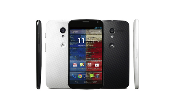
I chose the Moto X over the recent Note or S4 primarily because of its size and interface enhancements, such as the lock screen notification system, active display, and the profiling system.
The phone is smaller with a more common screen size making it easier for users to find the touch points and manage. Of course, the smaller size also makes it easier to take with you and put in your pocket.
The Moto X may run a vanilla version of Android 4.2.2, but it’s in no way a Nexus phone. It’s not for tinkerers and it’s not for enthusiasts looking for a “pure Google experience.” Motorola has made some recent tweaks to the UI to make the Moto X more of a mass-market phone designed to make ordinary people fall in love with Android. As such, it requires some pretty hefty software modifications to take advantage of the Moto X’s custom hardware.
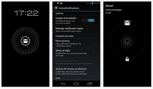
The most important of these UI modifications are improving the lock screen notification system, adding a smart profile switch that runs in the background, and enabling always-on voice recognition. In terms of notifications, you can review them by tapping the blinking icon onscreen and then fully access them by sliding your finger upwards. You can manage which notifications show up, when they show up, or even prevent them from displaying altogether.
Another cool feature is the active display. This feature can be initiated just by pulling the phone out of your pocket or flipping the phone over, specifically if it’s been positioned face down on a flat surface. This is an especially great experience, because it does not require me to do anything even remotely strenuous to see information I am looking for.
The profiling system is automatically configured to switch based on the user’s environment. It uses the phone’s GPS to detect when the user is driving and proactively asks you if you want messages read aloud and will even announce an incoming caller’s name so you don’t have to take your eyes off the road. The only issue with this functionality is it would be annoying if you were the passenger and not the driver. The voice recognition software that’s ever present is a huge help in this use case as well.
[google_ad:WITHINARTICLE_1_234X60_ALL]
Like most phone users, the camera is an important feature for me. I found the camera on the Moto X disappointing and one of its weaker attributes. The hardware itself isn’t impressive and the UI controls for pictures seem to be overly simplistic. If you are counting on this camera for great pictures, it will prove inconsistent at best. Many of the other new Android models showcase better performance. Although, there are some interesting user experience elements, one of which is the gesture activation. If you twist the phone like a doorknob, the camera launches without having to punch in your security code or unlock the screen. This functionality cuts out the extra step of having to look for one of the phone buttons to activate the camera.
Overall, the phone has a decent user experience across the board, including clean UI features for Android users and decent add-ons that make it stand out from the crowd. It’s clear that with the introduction of the Moto X, Google is making an attempt to make their phones more experience-centered.
Nokia Lumia 1020n
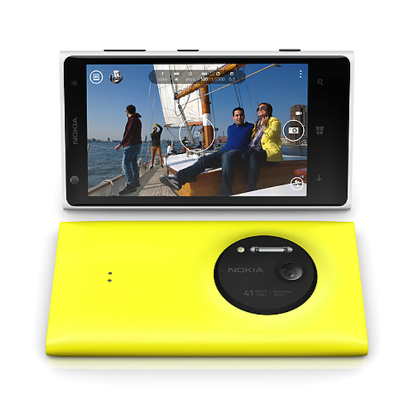
The Nokia Lumia 1020 was intriguing and worth further investigation because of how it has placed the Windows Phone into the competitor’s circle with Android. The device is most widely known for its 41-megapixel camera and image stabilization features. The phone’s camera has a wide-angle lens that can be a powerful tool for exaggerating depth and relative size in a photo. To Windows’ credit, it seems like they’ve done a good job creating a camera that takes some pictures with great clarity. However, it’s also one of the most difficult types of lenses to learn how to use. The camera utilizes a real Xenon flash, which is more similar to flash on your typical digital camera and not your average smartphone.
In order to take full advantage of the camera’s features, it’s better to use the Nokia PRO app instead of the stock Windows 8 OS app. The Nokia app has some great, simple UI features that allow you to zoom in and focus with one hand by just sliding one finger upwards on the screen (not the two-finger pinch required by iOS). The app also has a lot of advanced features for camera buffs such as exposure compensation, shutter speed, ISO, focus, and white balance toggles. By selecting the camera button on the right, the UI expands from that circle and overlays on top of the image, allowing you to use the sliders for each feature.
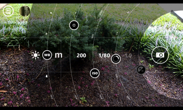
Another component I really like with this UI is that if you adjust the shutter speed and leave everything else normal, the UI underlines the attribute in red. Furthermore, the camera identifies when you are pointing at an object or letting too much light into your picture. In other words, the app gives you feedback about the quality of your picture so you can adjust before snapping. The lens even has real optical image stabilization, which is great for taking videos. The ability to crop and reframe shots has been advertised a lot recently and lives up to its word as you can position the image within the frame with a single touch of a finger. A few downsides include a significant delay between taking shots, colors that seem to be off when taking some pictures and video, and a camera hump so big that it sometimes disrupts use of the rest of the phone. Finger placement on the back of the phone is awkward and prevents your hand from coming around it fully. Also, the phone does not lay flat on a table.
Windows 8 doesn’t have the polish of its competitors, but continues to improve with every update
So, is there more to this phone’s user experience other than the fancy camera features? The Windows Phone 8 OS on this phone uses a very minimalistic metro style design in its basic interfaces. It’s meant to use very little actual design elements and focus on the content with clarity and readability. Even in some base OS screens, they use a one-pixel line to separate content areas (you can actually see the pixilation of that line on their screen, which is not so impressive).
It also uses active tiles which at first seems like they would be really cool and slick, but after a while the small animation and changes to the screen detract from your ability to identify and select the tile you desire. However, controls to toggle the sizes of your active tiles between small, medium, and large do provide more customization capabilities on your home screen. If you swipe to the right, an alphabetical listing of your apps is presented for scrollable browsing.
In terms of overall design, the settings screen on the Windows phone is really bland and doesn’t use icons to identify different areas for customization. In addition, there is no specific location to manage notifications or to look at your notifications on the Windows phone; unlike both the Android and Apple phones. Windows also lacks a real digital assistant and instead utilizes a Bing search application that accepts voice commands only and does not audibly read back to the user.
In all, Windows 8 doesn’t have the polish of its competitors, but continues to improve with every update.
Conclusion
After diving deep into the experiences I’ve outlined, I’m still set on buying the iPhone 5s as the holistic user experience is just too comfortable and familiar for me to pass up. As a whole, I was surprised with how many new camera features the 5s included. The added fingerprint scanner is pretty incredible—plus, it’s fun and easy to use. Ultimately it would be great to roll all the best features of these phones in to one ideal phone, but I don’t see that happening just yet.
Hopefully I’ve broadened the horizons of some Apple fans and given some credit to great design outside of the Apple “empire.” While I was impressed with the functionality of the other devices, it ultimately comes down to superior user experience. Apple has mastered the art of tapping into learned behavior and anticipating user needs. As our lives become even more task-oriented, intuitive application is key. Apple’s design and one-touch model is easily dismissed as simple. But as UX professionals can attest, the simplest designs are the most complicated to execute, but ultimately produce the most robust experience.
Image of pears hanging from a tree courtesy Shutterstock.