As central as design is to user experience, its definition has largely been subjective. Ask 100 well-read professionals what the meaning of design is and you’ll get 100 different answers.
That’s not surprising, given the broad uses and meanings of the word. As a noun, design is used to describe everything from the pattern on bed sheets, to the new camera features on smartphones. Design can also be used as a verb, as in, “Artists are designing the 9/11 Memorial.” All too often, it simply serves as a vague notion of how an app “just works.”
The Problem with Design Subjectivity
The source of this design subjectivity rests within the UX industry itself. If you ask 100 designers what design is, you’ll get another 100 answers to add to those of general professionals. This shows that the definitional problem we face with design is not an individual semantic issue, but a deeper, systemic one. This lack of a commonly understood definition negatively impacts design value and credibility. It also allows for subjective meanings to spread, clouding common understanding of what design is and affecting evaluation and delivery of design solutions.
It’s also important to note that while conventional belief holds that design equates to visual style, this is not entirely true. Design also encompasses high-level functionality and strategy that are often ignored.
The Solution: Taxonomy
Mitigating design subjectivity will add tremendous value to UX environments, solving some of the biggest business, social, and cultural challenges currently faced in design. On a good day, design can saves lives; on a bad day, it pins personal tastes against each other.
The conventional belief is that design equates to visual style. While partially true, this belief will lead investments in design to be disadvantaged and lacking higher level functional, strategic, or innovative value.
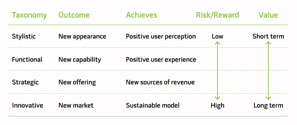
To better define and recognize design value, I propose the following Common Design Taxonomy:
Level 1: Stylistic Design
Goal: Fresh new appearance
Level 2: Functional Design
Goal: New capability
Level 3: Strategic Design
Goal: New source of value
Level 4: Innovative Design
Goal: Reaching new markets
Examples of Successful Design Implementation
Below are a few examples of each design category that demonstrate the viability and value of this new taxonomy.
Level 1: Stylistic Design
Stylistic design helps to create a pleasing appearance to customers. By doing so, they are more likely to enjoy a product because of its aesthetic appeal. Examples include Apple’s iPhone 5c color options (white, blue, green, red, or yellow); Motorola’s MotoX “Moto Maker” feature, which allows customers to choose from many colors and material options for the phone’s exterior; and advertising design (POS, print ads, etc.).
Level 2: Functional Design
Functional design helps to create a desired feature set within a product, geared specifically toward consumer needs. At this level, UX design, product design, and engineering teams are typically involved. Examples include the iPhone’s new camera features introduced in iOS7 and Kindle’s updated E-Ink display technology.
Level 3: Strategic Design
Strategic design pushes a product into a new market or demographic. A larger coordinated team of designers, marketing representatives, and engineers are jointly engaged at this level. Examples include Apple’s CarPlay, an extension of iOS installed in a car dashboard; and Amazon Kindle Fire’s color monitor, installable applications, and support for numerous media file types.
Level 4: Innovative Design
Innovative design defines a new product category and/or environment for a given technology through a combined use of stylistic, functional, and strategic design. Examples include Apple’s iPhone and Microsoft Windows.
iPhone: When launched, the iPhone provided an unprecedented user experience via a unique combination of hardware, software, and service design that has since disrupted both the mobile phone and PC markets. It took only six years for sales to reach $88 billion and ignite the post-PC revolution. The iPhone spawned a new mobile product design revolution that included the mobile application market, iPads/tablets, new UI paradigms, and mobile services.
Microsoft Windows: For nearly 30 years—and boasting a combined 1.5 billion users—Microsoft Windows has defined the PC user experience. The Windows environment spawned an extended family of products and services as a result of its success, including Office, Exchange, SQL, Windows Server, and Cloud, to name a few.
Risks of Ignoring Design Taxonomy
There are risks to ignoring design taxonomy. Negative consequences can include improperly used resources, miscommunication of design problems, poor decision-making, and inefficient products. Subjective, poorly defined approaches to design tend to focus on stylistic design efforts while ignoring functional and strategic design, or vice-versa. This typically results in pretty products that don’t work well, or functional products that don’t offer a compelling user experience. Both lack the full value of complete design.
Ask 100 well-read professionals what the meaning of design is and you’ll get 100 different answers
Examples of Failed/Improper Design Implementation
Consider the following examples of failed design below, all of which failed to address the type of design problem they needed to solve, which, in turn, is a problem of common understanding.
Level 1: Stylistic Design
The Tropicana Orange Juice package redesign, circa 2009, is a failure of perceptions. The updated appearance left consumers thinking it was a generic product, not a premium one. Sales plunged 20-percent in the first month as a result. The package reverted back to its original design after two months and a $33 million profit drop.
Level 2: Functional Design
Apple’s dramatic redesign of Final Cut Pro X alienated many proficient users with new unwelcome changes such as Magnetic Timeline (vs. track-based timelines) and omitting support for EDL, OMF and XML and drove them to competing products. Another example is the failed Apple Maps launch that was riddled with improperly labeling of building and places and many reports of driving misdirection.
Level 3: Strategic Design
Microsoft’s young consumer KIN phone was a strategic design mistake. With no apps or games available for use or download and a generally horrible user experience, KIN lacked functional value and clear market appeal. Launched in May of 2010, it lasted only 48 days on the market due to dismal sales. Instead of expanding Microsoft’s smartphone market share, it diverted resources and focus away from other viable products. Other examples of strategic design failure include Microsoft Vista, Apple Ping, Google Wave, and Microsoft Zune.
Level 4: Innovative Design
The Microsoft Tablet is one of the most notable innovation failures of late. While Microsoft designed the first tablet device about a decade before the first iPad, it completely failed to lead mobile technology into the post-PC era. Why? Microsoft feared cutting into their highly profitable software business while allocating funds for un-vetted hardware pursuits. This innovation apprehension sounds all too similar to the recent narratives at GM, Blackberry, and Eastman Kodak.
Conclusion
With design definitions are as varied as UX and UI experiences—and with many success stories in the technology industry that draw on these varied definitions—some may question whether a clear design taxonomy is important. After all, developers often shrug design failure off as the cost of doing business. But intentional, thoughtful design as part of product development can, in its best forms, save lives. In its worst forms, bad design can lead to tragedies like airplane disasters and nuclear reactor meltdowns. These can be greatly mitigated or altogether avoided by overcoming design subjectivity.
The solution is adherence to clear taxonomy. By considering stylistic, functional, strategic, and innovative design together in product development, businesses will find that they are not only financially successful, but pave the way for new types and uses of technology. As surely as this will revolutionize user experience, it will also ensure efficient, stable product design and a satisfied consumer base.
Image of twins seeing eye-to-eye courtesy Shutterstock.