Spend a significant amount of time in the iOS app business, and chances are good that you’ll hear “the HIG” thrown around. Short for Human Interface Guidelines, this Apple document is a wide-ranging attempt to outline best practices for app experience on the platform.
While the HIG does discuss general principles, the bulk of it is dedicated to guiding the usage of built-in containers and components—those found in apps like Mail, Contacts, Calendar, and Mobile Safari—and as such, it has become shorthand for a “standard” iOS user experience.
Bringing up the HIG in a group of app designers tends to invite strong reactions. Some treat it as gospel, while others think it’s inflexible and outdated in light of UX developments on other mobile platforms. Some apps have largely abandoned the standard widgets and conventions defined in the HIG in favor of more unique, cutting-edge designs (something games have done almost from day one).
Philosophical debates aside, when it’s time to design and build an iPhone or iPod Touch app, it’s important to understand the practical options that are available. (I’ve chosen to leave the iPad for a later discussion, since it’s a different beast from a UX standpoint).
An app that departs wildly from the norms of the HIG is definitely one option, since many such apps appear in the store with good ratings. However, there are situations where you may want to create a more standard iPhone experience that leverages people’s familiarity with iPhone conventions and platform UX work Apple has already done. There are plenty of successful, big-name apps in the store that largely stick to the HIG.
The HIG detractors are right about one thing, though: if you don’t plan carefully, and just chain screens together with the ubiquitous “left-right push” pattern popularized on the original iPod, it’s easy to wind up with an app that’s rigidly linear or hierarchical, making it difficult for both you and your users to reassemble the pieces in different ways as new situations and needs arise.
On the other hand, if you take some care in your UX architecture and dig a bit deeper, old man HIG has a lot of potential life left in him. Here are four guidelines I’ve uncovered in the course of building iPhone apps (often by doing the wrong thing the first time) that will help you avoid painting yourself into a HIG corner.
Follow the Mental Model
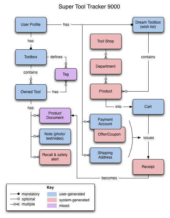
Rather than letting HIG patterns (especially whichever ones you’re most familiar with) dictate the organization of your app, do some work upfront to identify the concepts you’ll be presenting and think about how they can be structured logically. Having a strong conceptual model will allow you to figure out where various HIG patterns make sense. Use those patterns to weave an experience that reinforces the development of a clear mental model in the minds your users.
To get a handle on your conceptual model, ask yourself:
- What “objects” or nouns will users of this app deal with? (Examples might include things like documents, notebooks, pages, boards, recipes, stores, friends, orders, or user accounts)
- How do these objects relate to one another from a user perspective? (Notebooks contain pages, orders have a payment method)
- What actions are possible on each object? (Submit an order, create or delete a recipe)
Keep in mind this model may evolve over time. You don’t have to cram in everything you might ever need to deal with, but try to account for some degree of flexibility for the future. If you can organize or visualize your model into a few succinct diagrams, you’ll have a clear picture of the relationships between the key concepts in your app.
This process is important to any design effort, but the presence of the HIG and its pre-made navigation components can sometimes deceive people into thinking they can skip this kind of problem solving. Without going through this exercise, you’re unlikely to succeed in crafting a great user experience.
Remember that Chains Don’t Push Well
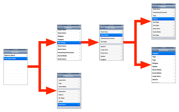
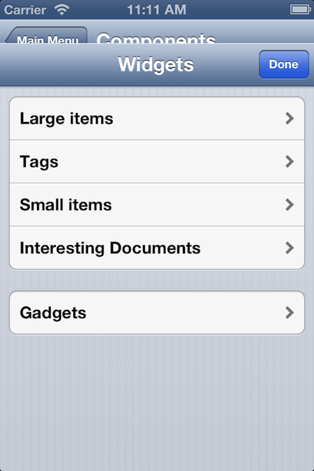
Once you’re ready to get started laying out screens, there’s one important rule of thumb to keep in mind: if you end up with a “chain” of sequential views—pushed side-by-side—that is more than four or five screens deep, you’re probably doing something wrong. Psychological studies have shown that most people’s working memory is around four to seven items; go deeper than that, and you risk getting your users lost.
Typically, such chains imply overuse or misuse of the standard “push” transition offered by iOS’s Navigation Controller component. While this is the most familiar transition and screen relationship on the iPhone, it’s far from the only one available.
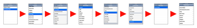
Start by breaking the chain down into smaller sub-groups where possible. It may be helpful to divide these along the lines of your conceptual model. For example, you might break a checkout flow with five or six steps into sub-groups around payment, shipping, and confirmation. Redesign these in such a way that each group could be accessed independently if needed.
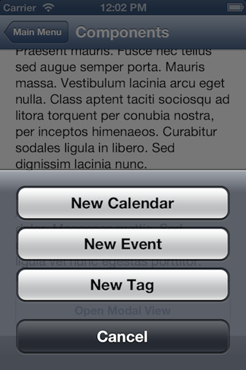
Then, consider how you could provide non-linear navigation to and among these conceptual groups. The simplest way to invoke any screen on demand is to present it modally. In the most common form, it slides up over the current view, and then slides back down when dismissed. iOS offers other transitions as well (such as flip and partial curl), though these usually imply a stronger spatial relationship between the two screens involved and therefore are not as appropriate for random access.
While useful in some cases, modal presentation has limitations. Such views must be dismissed to move on, and since they usually cover everything, it can be easy to lose a sense of the context from which they were invoked. A more powerful option to consider is adding or substituting some container beyond the familiar Navigation Controller.


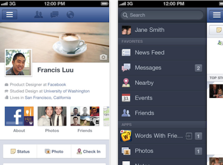
iOS offers the well-worn Tab Bar and Segmented Control for this purpose, but Apple also endorses building your own container view controllers to implement non-linear navigation in other ways. One popular approach right now is a transient sidebar that the user can uncover at any time by pushing application content over to the right, like this one found in Facebook‘s app.
Dig Deep in the Context Toolbox
One of the criticisms leveled against the iPhone HIG is that it doesn’t provide much in the way of contextual shortcuts for acting on the current screen or content. While it’s true that iOS standards lack the “context menu” and “action bar menu” concepts that Android has, there are actually a number of components available out-of-the-box that can help you provide quick, contextual shortcuts for your users to blaze their own navigation path through your app. Consider the following while designing your content views:
- Detail Disclosure Buttons and Info Buttons: You can use any button to invoke any functionality you like, of course, but Apple provides a couple of standard options that can be helpful. A Detail Disclosure Button reveals “additional information or functionality related to a specific item” (the HIG says it should be shown on a separate screen). An Info Button flips the view over to show “configuration details or options.”
- Toolbars: Toolbars have been on the iPhone since first generation Mail, and they aren’t particularly sexy. But flip this on in your Navigation Controller, and you have an instant spot to provide a set of “commands that make sense in the current context.” It’s important to ensure that any icons you use are understandable; check Apple’s list of standard icons first.
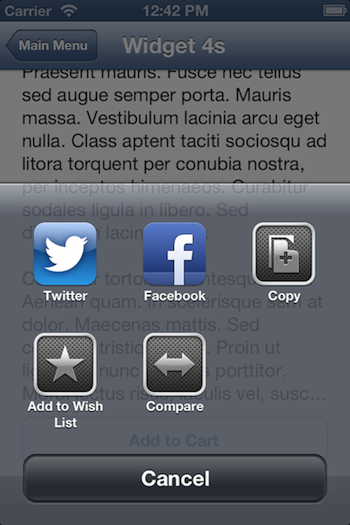
- Action Sheets: The bigger and more refined brother of the popup alert, this is a panel that slides up over the bottom part of a view and provides options related to some task or action the user has asked to perform. Launching this from a button on a toolbar or navigation bar is one potential way to create a menu of contextually relevant options around a particular view.
- Activity Views: These are similar to an action sheet, but provide “services”–contextually relevant ways to process content. The system provides a number of built-in services like posting to social networking, printing, and so on, but you can suppress any of these and add your own, in activity views that you present. According to the HIG, you should use the system-defined share button to open this, but there’s nothing that says you can’t provide services that “share” content to somewhere else within your own app. As an example, Mobile Safari’s web page toolbar contains a share button that presents an activity view with internal services for “Bookmark” and “Add to Reading List.”
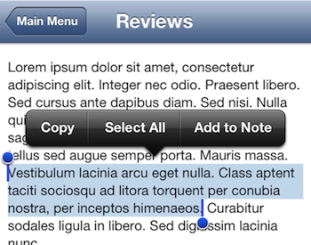
- The Edit Menu: The standard edit menu that appears for text, with Select, Copy, and Paste, can be extended to include custom actions for the selection context, and can be used with your own custom views. Keep in mind, though, that since this menu is invisible until invoked by the right gestures, custom options in here may have discoverability problems.


All of these components are available in iOS 6. If you’re targeting an earlier version, check the documentation to ensure that you can use them.
Watch for the INCOMING!
A good test of whether or not your UX design is sufficiently flexible is to evaluate possible external events that could affect the state of your app’s interface. It may be tempting to stop at a design for the obvious path, where someone launches your app from the home screen and initiates everything that happens from there, but in reality, things don’t always work this way.
Take the next step, and ask yourself the following questions:
- Where in the experience should a user land if they invoke my app by selecting one of its notifications on the lock screen or in the notification center?
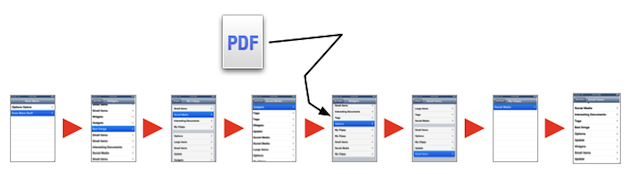
- What happens when someone launches my app by sending it a supported file type or custom URL to open from another app?
- Are there time-based or concurrent events that could happen while someone is using my app, or while it’s in the background, that would affect the experience (for example, a login or subscription expires, products in a cart change availability, or some app content that lives in the cloud is edited from another device)?
- And perhaps most importantly, once any of these things occurs, how will the user regain a sense of orientation within my app? Can they cancel or go elsewhere without a bunch of backtracking?
- If any of these questions defy a clear, straightforward answer, that’s a sign your UX architecture may be too linear or otherwise inflexible. For example, if you have a long chain of screens, it’s going to be difficult to jump into or out of the middle of that chain without becoming disoriented, not to mention the code and testing issues that can result. Or, if you assume all navigation will flow through a website-like “home page” view in your app, this may break down quickly when someone links into your app with a specific item in hand.
Conclusion
To paraphrase the old Forest Service admonition: only you can prevent inflexible UX. The HIG won’t guarantee it, but neither will scrapping the HIG and building your own whiz-bang experience from scratch.
Whichever approach you use, be sure to test your designs and assumptions with actual users, as you go. Hint: if your usability test plan consists of “see if Apple approves it, and what kind of ratings people give it,” you’re probably hosed.
Finally, this should go without saying, but read the HIG. Yes, the whole thing. Apple is constantly updating it for new versions of iOS, so even if you’ve read it before, it’s worth revisiting from time to time. There are little gems sprinkled through it that even seasoned iPhone app veterans can learn from. Approached with the right perspective, it can be the helpful guide it was intended to be.