We know the impact design has on a user’s experience and a product’s adoption. But many product designers don’t realize that design can also be used as an effective strategy when it comes to positioning a new product. In this excerpt taken from my upcoming book How to Transform Your Ideas into Software Products, you’ll learn about companies that have effectively positioned based on design, and how to evaluate a competitor’s design to position your own offering.
At the end of last year, my best friend Jessica got engaged to her longtime boyfriend, Ben. Since I do a lot of public speaking, she requested that I officiate the wedding. I was honored to accept, but I had never officiated a wedding before.
I remembered a couple of my friends mentioning that they had officiated weddings, and in order to get authorization, they just went online and filled out some documents. So, I did a couple searches and came across the Universal Life Church, which was highly rated and had some seemingly reputable testimonials.
I sat down one Saturday afternoon and signed up to be an officiant. The whole process took only a few minutes. It seemed too short. I’m more accustomed to official processes that require hours of wait time, multiple documents, and a countless number of steps. I was immediately worried and thought, “How could something like marrying two people only take a few minutes?”
To double check, I emailed a friend who had officiated before, and they confirmed: “Yes, it is that easy.”
Whew!
While the process seemed too simple, its simplicity made my life easy and helped me accomplish my goal: to become an officiant.
Accomplishing goals and feeling great is the exact outcome we want users to experience so that they fall in love with our software products!
The Universal Life Church is a prime example of an organization that has done a great job designing a simple experience for its users. As a result, it has millions of users who have become officiants online within minutes.

Officiating Jessica & Ben’s wedding
Using Design to Get a Competitive Edge
Positioning is the process of creating an image or identity in the customer’s mind. You can position based on a number of factors: price, packaging, promotion, distribution, and competition. We’re of course focused on positioning based on packaging, a.k.a. design.
History of Product Design as Competitive Differentiation
In the ‘90s and early 2000s, people were building products that were really feature rich. Somehow, engineers and product managers were taught to believe that piling on features meant that the product was really robust, which would translate to more sales.
What it actually did was require users to read verbose manuals to understand how to use the product; or, it required them to pay for training. This, of course, assumed that users had the time, budget, and patience. For a good period of time, companies were able to get away with selling complicated products because there weren’t many people putting software products on the market.
However, companies can no longer get away with this approach. The clunky products of the early Internet and shrink-wrapped software era have most recently been outdone by much simpler products entering the market—ones that have just a sliver of the features of their bloated predecessors.
Why?
Because people now have simple alternatives to choose from! As a result, they have grown extremely frustrated with feature-rich products and have decided that it’s a waste of time to learn how to use these products. Now, customers demand tools that are intuitive and easily navigable.
Both my startups, Mint.com and BizeeBee, were based on the idea that people are time-starved and want a simple software solution to perform complex tasks like managing their personal finances or their small businesses.
Case Study: Differentiating Mint.com by building a dead-simple user experience
Mint.com was born out of a growing frustration that the founder, Aaron Patzer, had with existing software products like Quicken and Microsoft Money. It took Aaron hours each weekend to download transactions from his financial accounts and categorize them in order to finally achieve his end goal: knowing how much money he really had.
One of the goals of software is to automate complex tasks, but products like Quicken and Money weren’t doing a good job of automating the process of managing money.
Even getting set up on these products took hours!
After one exceptionally aggravating Sunday, Aaron decided enough was enough! He’d take matters into his own hands and build a simpler solution to manage his personal finances.
From the beginning, we knew design would be one of Mint’s positioning tactics. We designed every part to be as simple to use as possible, starting with getting set up. Mint connects to a user’s financial institutions, then automatically downloads and categorizes the financial transactions. It only takes a few minutes and very minimal input from a user for them to see how much money they have.
We highlighted the difference in design in all of our marketing efforts to send a clear message to prospective customers.
Case Study: How Olark gained market share by making customer setup a cinch
Olark is a startup that makes a live chat product for online and e-commerce businesses, helping them improve sales and handle customer support. Just like with Mint.com, getting set up with Olark is pretty simple. There is just one snippet of code that people need to cut and paste in order to embed the widget on their websites.
The chat widget looks like Google’s GChat. Some might consider this a ripoff, but it’s actually taking advantage of the familiarity people have with another credible and highly-used product. If the experience is familiar, then people will instinctively think this product is as easy to use as the other and are more likely to adopt it.
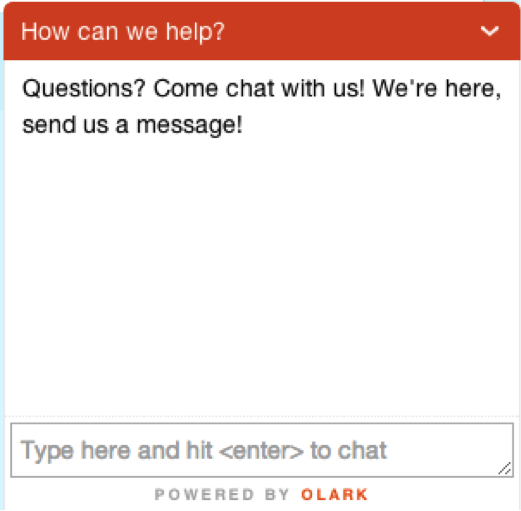
While there are a number of other live chat products on the market, they’re difficult to use. Even something as simple as connecting to another human being can take minutes, lead you through a number of redirect loops, and require you to provide a lot of information before you can start chatting.
With Olark, you get a pretty simple and elegant popup at the bottom of your website that customers can access anywhere.
Olark also makes it super simple for operators (people who are answering chat messages) to respond and keep track of conversations between customers easily.
The company focused on making their product as easy to set up as possible for anyone who wants to have live chat on their site. This not only increased its adoption rate, but also increased its number of paying customers.
They also baked marketing into the design of their product by including their logo in every widget and having customers install the widget on their website.
How You Can Differentiate Your Design
Over the years, people have become obsessed with UI and UX , especially when it comes to web or mobile products. User interface is what a user sees, and user experience refers to how a user is able to move through the product and accomplish tasks.
In order to design a product that has good UI/UX, you need to understand the following two concepts: information architecture and workflows.
Information architecture is how information is organized, whether it’s in a hierarchy or packaged in way that helps people make decisions. This is especially important in data-rich applications like Mint.com. Just spitting out a bunch of data would have really pissed users off and not been much different from just logging into a bank or credit card account.
Instead, Mint.com takes transactions across a number of accounts (banks, credit cards, student loans, etc.) and then automatically creates “pretty pie charts” that have aggregated all the transaction data into categories like food, rent, etc.
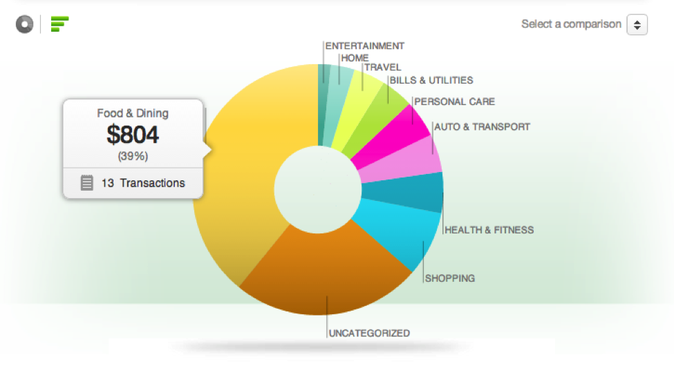
Presenting data in this way lets people get a big picture of what’s going on. Then, they can drill down further to understand their spending habits and maybe even decide to change them.
The most important thing to realize is that Mint takes the time to design how the data will be represented by understanding the end goal of its users: to see where their money went.
Too often, people think that the product just needs to be pretty. Aesthetics are important, but what’s really important is that the product is functional (i.e., helps a user perform a task and ultimately accomplish a high-level goal).
Creating hierarchies of information in terms of importance or relevance is one way to help users accomplish goals by presenting the key information they need to make high-level decisions.
When it comes to information architecture, a good product designer will focus on making sure the data can be inputted into the product seamlessly. The designer makes sure information is kept clean, is organized, and is presented in such a way that makes it easy to make decisions.
Workflows are essentially the steps that people need to perform in order to accomplish a task. Most of the time, people think products are hard to use or unintuitive because of poorly-designed workflows. If you’ve ever signed up for a product and then asked yourself the question, “Now what?” it means that no one took the time to think through the onboarding workflow for you.
Onboarding a user is an extremely critical workflow, because it is essentially a user’s first impression of your product. If their first impression is, “This looks complicated,” or “This is going to take time to set up,” then chances are they won’t come back after signing up and will look for a simpler solution.
Onboarding is an extremely critical workflow—essentially a user’s first impression of your product
The same is true for other features. If, as a user, you’re just expected to “figure it out” or have an endless list of steps to perform, then someone hasn’t done their job in making the product user-friendly.
Does it seem like this is quite a lot to do and think about when designing a product? Well, remember our end goal: building a product customers will fall in love with and pay for!
If we want to accomplish that goal, then we have to make customers feel good as they are using our product, which means that they need to have positive experiences each time they use it.
However, I don’t want you to conflate positive experience with perfection. This can be a treacherous path that rarely leads to shipping a product.
Exercise: Critique competitors’ product designs
Objective: Spot design-related issues in your competitors’ products as you look at onboarding workflows, general usage workflows, information architecture, and even aesthetic. Understanding your competitors’ UI/UX weaknesses will help you design a better product.
Directions: Take a look at three competing products and answer the following questions:
- How long does it take to sign up and get set up? Are all these steps necessary and easy to follow for a first-time user?
- Based on your first interaction with the product, did you experience the benefits the company publicized? Or, do you feel like it will require more work on your part to receive value?
- As you moved through the product, what did you find particularly helpful or confusing?
If there isn’t a competing product or service to examine, then consider substitutes that people might be using. For example, at BizeeBee, a number of studio owners I met with showed me how they were managing their businesses on paper, index cards, or Excel. I’d have them walk me through their workflows so that I could get a deep understanding of the steps and processes they went through to keep track of customers and manage their businesses.
While you don’t want the competitor’s product to stifle or influence your product design too heavily, you now have a better sense of what a customer’s experience is with the competitor’s product.
Use that information to guide the design and experience a customer will have with your company. Finally, highlight the differences to position your product in the market.
Learn more about the process for designing, building, shipping, and selling software products in How to Transform Your Ideas into Software Products. It will give you a step-by-step process for validating your ideas and bringing them to life, plus save you the agony of having to learn it all on your own! Sign up here to for a notification when the book launches.
Image of rock formation courtesy Shutterstock.