I am an apple guy. I have been since I got my first Mac when I was 16. I’m typing this on a MacBook Pro that’s sitting beside my iPhone 6. So when Google announced it’s new design language, Material Design, at Google I/O in June I quickly disregarded the announcement.
But as time went on and Google products that I regularly used began adapting the look, I started questioning what it meant to me as a user and to the design world as a whole.
What is Material Design?
Google defines Material Design as “design by seeking to build experiences that surprise and enlighten our users in equal measure.” In a nutshell, it’s a refreshing, simplified design language that encourages interaction and implies depth. Here’s why I believe in it:
It Will Bring Uniformity to Google Products Across Devices
Material design will bring visual and experiential uniformity to Google products across devices, thus strengthening the brand and ultimately the company as a whole while encouraging the continuity principle.
Material design will bring Google something it’s lacked for so long—uniformity across products. There are clear contrasts in both user interfaces and user experiences across products like Android, Chrome, and Gmail.
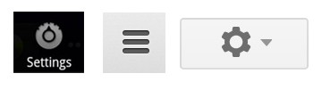
Something as simple as accessing settings is done three different ways across these products alone
While the Google name is strong, its products lack a consistency that, if implemented well and fully across products, will strengthen its name and brand image—akin to.
Hamburger Menus Are Becoming More and More Common in Web and App Design
What Google has done by including a “+” and hamburger menu as the two main forms of navigation is simplify the user experience dramatically. The user really only has two options accessing actions within the application (not including card interactions, which we will touch on that later).
The “+” is a clear indication that selecting it will create something or add something. Though vague, it limits the users actions to only a few logical assumptions as to its meaning even without an explicit label.
Even though hamburger menus are ambiguous and generally discouraged without having some kind of label, they’re becoming more and more adopted in web and app design as a catch all for “everything else.” Where else will users click to perform an action if not wanting to add or create something? Logic says this hamburger button.
Card Displays, Lists, Interactivity, and Depth Encourage Scrolling
In addition to tying related items together, cards are “typically an entry point to more complex and detailed information” (Material Design Guidelines). In applications like Inbox, cards contain message content. Their shadows, typography and buttons imply depth à la additional content within each card. Accessing additional card information requires a click.
It’s only a matter of time before Material Design is the norm
Although not necessarily an intuitive action, learning it is essential to Material Design and translates consistently across applications. When the cards expand or contract upon selection, they change states—often with an increase in shadow and opacity, subtly drawing users’ attentions to that item only. This minor, fun action increases interactivity and changes the way we see the design.
The stacked card display also encourages scrolling. This suits mobile devices well, considering horizontal scrolling is a poor user experience and despite popular perception, users will scroll vertically if your content is intriguing to them.
The Interactions Make Sense
Both interactivity and depth are natural outside of digital so it only makes sense to translate them onto devices. The user learning curve is therefor lowered, thus the design becoming more intuitive.
It’s Refreshing and Exciting
The Roboto font face, flat iconography, and vibrant color palette are several items that breathe freshness into Material Design. Establishing a design language is also a bold step for Google and counters Apple’s distinct and matured look.
Its UI is Defined
Having clearly defined colors schemes, spacing, and rules makes material design easily duplicable. This will help the style grow more rapidly and remain consistent across sites and devices.
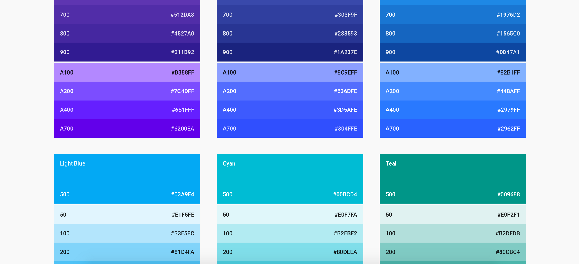
Sample colors
I Have To Believe in It
Between Google Search, Gmail, and Android, Google has one of the largest reaches of any tech company in the world. It’s only a matter of time before Material Design is the norm. It’s Google’s world, we’re just living in it.