Save

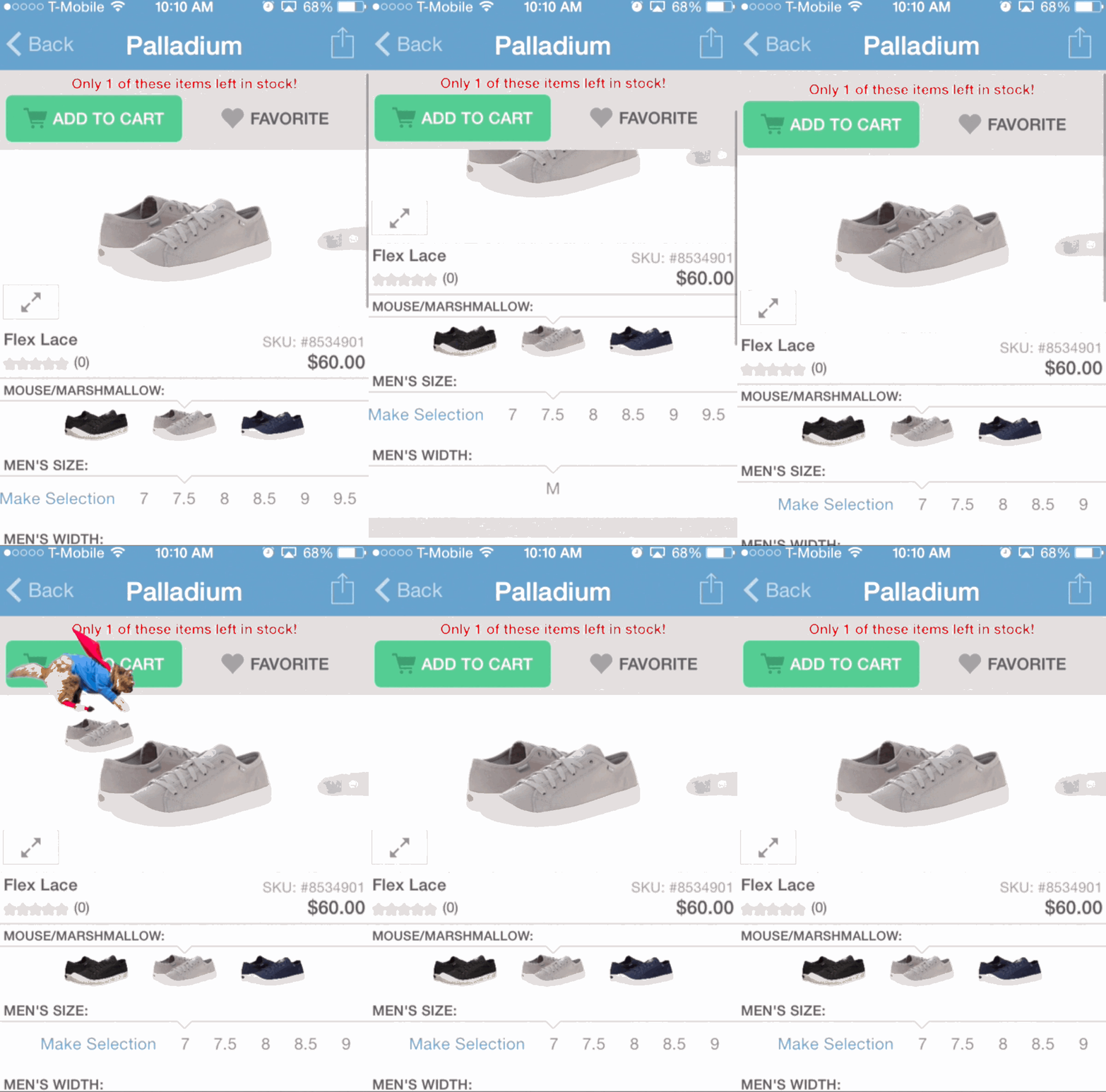
I love Zappos. My UPS driver and I are friends and I feel no shame in ordering several shoe options—often in multiple sizes. When I think about why I feel deeply loyal, why Zappos makes me smile, and why I use their app as often as I do, it’s not because of the caped squirrel that carries my selections into my shopping cart.
Maybe the squirrel gives me a deeper sense of Zappos’ personality, but my delight as a customer comes from free overnight shipping, a massive selection of shoes, and VIP treatment without judgment when I return a lot of what I order. Truly meaningful emotional connection requires more than a sprinkling of emotional delighters.
Zappos isn’t the only site peppering their experience with delighters. A visit to the “Things I want page” on shopping site Wanelo triggers a rainstorm of spinning cat heads (often wearing bow ties). Refreshing your list of options in the Yelp app produces an animation of a rocket ship launching.
Some of these additions make us smile or laugh, some annoy us or feel cheesy, but this is the kind of stuff that passes as delight online. Delight should be more and do more.
I work at Intuit, where we’re looking to create emotional connections in tax preparation, personal finance, and accounting. As you might imagine, these domains require delight to have a greater sophistication and deeper resonance than many of the superficial delighters that exist in consumer apps.
It’s no secret among designers that if you create an experience that connects with users on an emotional level, you’ve succeeded. Emotion is what makes an experience an experience. Emotional reactions create bonds between users and products, signifying that they are experiencing something memorable.
So, the question isn’t if emotional connection is important, it’s how to do it—and how to do it well. At Intuit, we believe doing it well means thinking of emotion as something core, not separate from, the functional benefits of our products.
Emotion and Function Are Tied Together
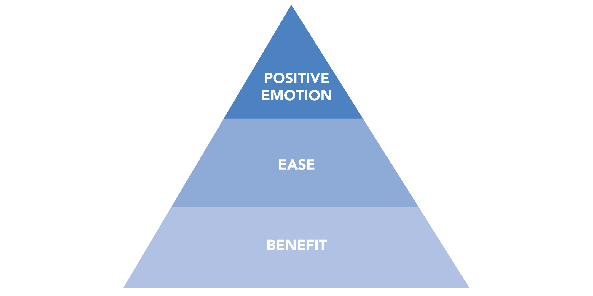
Our journey toward a deeper understanding of emotion in design began by measuring customer delight. We developed an Awesome Product Experience (APEx) model that identified benefit, ease, and positive emotion as the three components of delight.
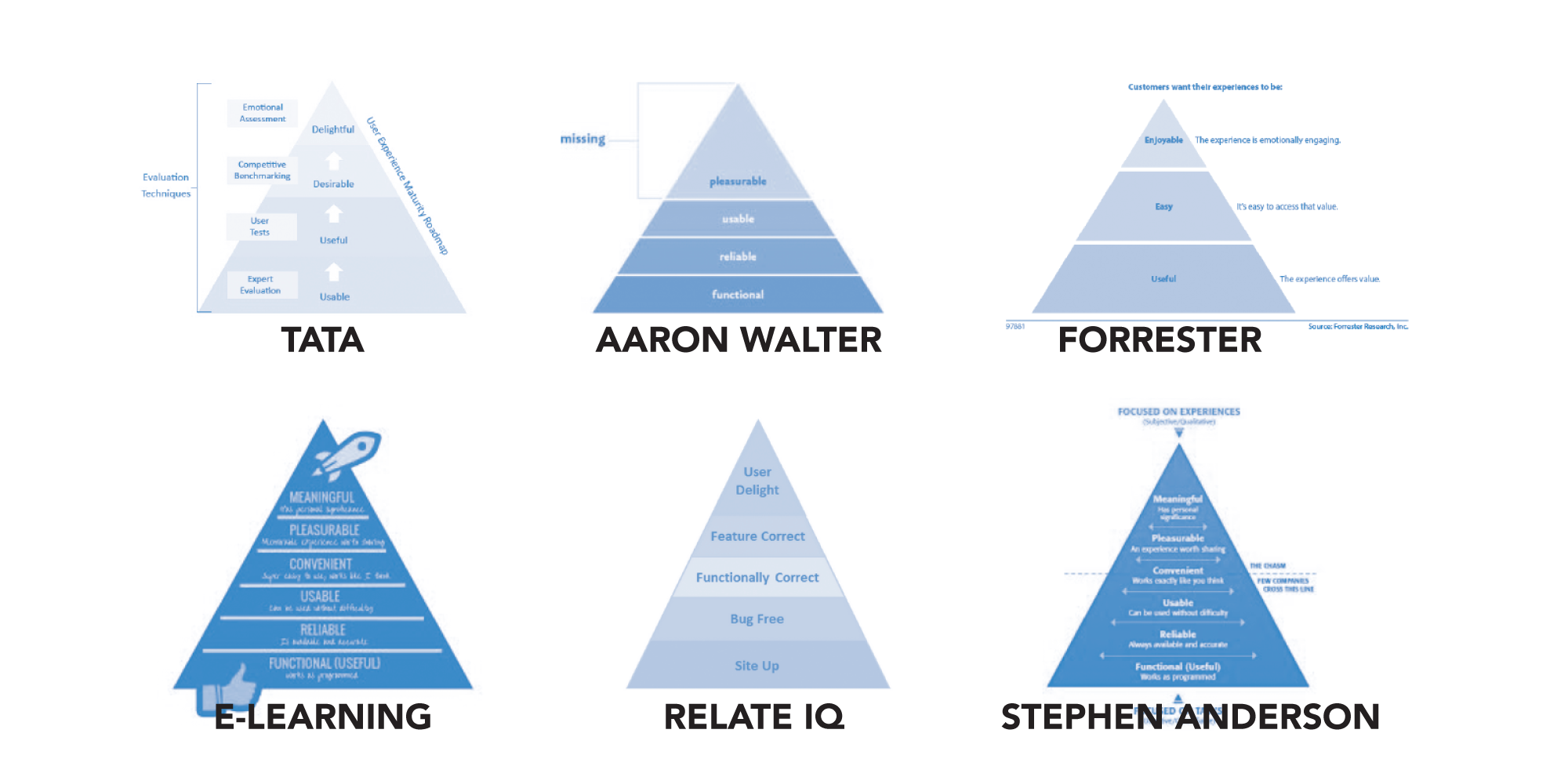
Like many organizations, we put emotion at the top of the pyramid which makes sense, as emotional connection is the ultimate goal.
The problem is that linear cultures like ours view this conceptual model as a prioritization model, where we start at the bottom and work our way up. Emotion is prioritized last, even though we know it matters most. Emotion is added as a superficial layer, or worse, the emotional element gets pushed to a later release so we can get to market sooner. This model makes getting to emotion hard be cause it separates it from the functional benefits of the product.
When I think back to my feelings for Zappos, I don’t make this distinction. I have one experience with their product and frankly, it’s entirely emotional. I feel grateful for overnight shipping, appreciated as a VIP shopper, and connected to the real human on the other side of their support live chat.
Delight isn’t achieved though a formula of adding benefit, then ease and finally emotion. Delight is something customers feel when all of those elements work well together. At Intuit, our focus has shifted from trying to understand what delight is made of to understanding how delight feels and how to create experiences to evoke that feeling.
Delight Feels Magical and Meaningful
Any experience that feels magical and meaningful is likely also beneficial, easy to use, and has emotional resonance. What’s different about designing for Magic and Meaning is that it allows teams to focus on how the experience should feel as a whole, rather than just what it should do. It also means we try to have an element of Magic and Meaning in every software release, rather than pushing that special sauce off to a later date.
So, what is magic and meaning? An experience feels magical when it seems to know what the user wants and automatically delivers on that need without being asked. An experience feels meaningful with it feels relevant, right for me, and human. These two elements need to work together to create an emotionally rewarding experience. Meaning makes magic believable and valuable. Magic deepens meaning and often makes it more noticeable.
- Magic without meaning: Google glass. It’s magical technology, but people are still struggling to understand what it means to them and the role it plays in their lives.
- Meaning without magic: Craigslist. It serves a real and meaningful need, but requires too much work for people to find what they need.
- Magical and meaningful: Uber, Apple Pay, Club W, and True & Co. (company names are hyperlinked)
- UBER: Instead of fumbling with how much to tip or arguing with the driver about why you have to pay with a credit card, Uber allows you to simply step out of the car and go on your way. That feels meaningful and magical.
- Apple Pay: Like Uber, Apple Pay delivers Magic and Meaning by removing significant friction from the experience. But, what’s interesting about Apple Pay is they brought together existing technology (RFID chips in credit card machines, the ability to unlock your phone with your thumb print, the fact that Apple accounts already have attached credit cards) in a new way to create a magical and meaningful payment experience.
- Club W: This online wine club and recommendation site shows that sometimes Magic and Meaning are created not by just removing friction but by deeply knowing you. Their approachable quiz asks questions like, “How do you take your coffee?” “How do you feel about salt?” and “Do you like mushrooms?” Answers are translated to determine your specific wine palate. Every month Club W recommends 3 wines for you and over time, with your feedback, they learn more about you and you learn your wine preferences.
- True & Co: As an online lingerie recommendation site, their success relies on their ability to garner the exact information their customers don’t want to share—honest details about their body. While there could have been a faster way to ask customers for their info, True & Co’s questionnaire works because it doesn’t just ask about body shape, it uses validation and education to make the woman feel better about herself and know herself better with each question.
At Intuit, Magic and Meaning is core to our product visions all the way from our brand promise of Simplifying the Business of Life to the specific challenges of our core products: Make Tax Prep Obsolete with TurboTax; Make Accounting Invisible with QuickBooks; Build Hope through Everyday Financial Triumphs with Mint, to name just a few.
Designing Magical and Meaningful Experiences
Acknowledging that true emotional connections come from experiences that feel magical and meaningful is really only half the battle. Getting it from our hearts and minds and into our customer hands is the hard part. Doing so requires focusing on the key moments that define our customers’ experiences.
Three principles for bringing Magic and Meaning to life in our products
1. Own the moments that matter to our customers: The first step to delivering magic and meaning is orienting ourselves to what the customers care about. This is obvious and should come as no surprise to any designer, but it can be dangerously easy to find yourself viewing the customer’s world through the product lens rather than the other way round. To give you an example, in QuickBooks, we often think about invoicing and running reports whereas customers think about getting paid and understanding the status of their business. This may seem like a minor difference, but when it comes to differentiating between a purely functional solution and one that feels magical and meaningful, it can make all the difference.
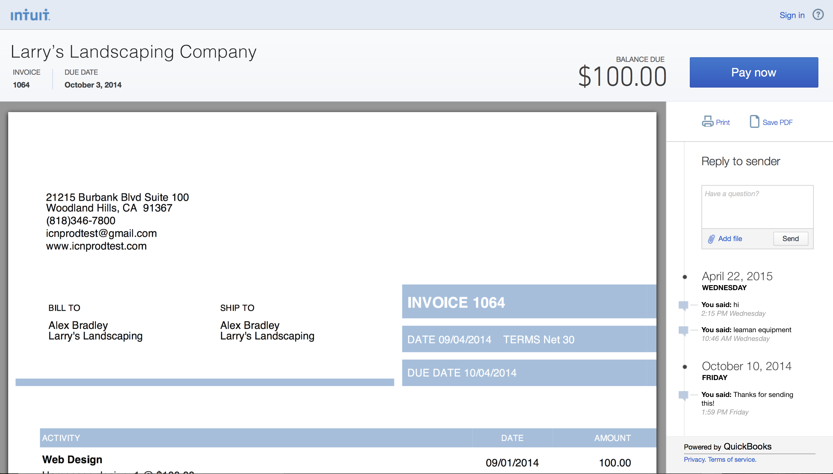
For example, our recent launch of E-Invoicing is an early sign of us adopting what matters most to our small business customers—in this case that’s prioritizing their relationship to their customers. Digitally sending invoices and receiving payments helps small businesses get paid twice as fast, but it’s not a new phenomenon. Where E-Invoicing shines is the ability to unite the functional act of invoicing with the human relationship that accompanies it. E-Invoicing shows small business owners receipt-and-view status and enables them to directly message their customers within the invoice. This brings typical out-of-product activities like following up, answering questions, and tracking progress into the product experience. Thus, removing friction and making the moment about more than just the invoice, it’s about a small business connecting with their customer.
We believe there are two ways to own these moments, by removing friction and by adding a human touch. Removing friction isn’t about eliminating clicks; it’s about eliminating tasks. Think about stepping out of an Uber, knowing that the ride has already been paid for, or paying for groceries with just the tap of your phone. Make Accounting Invisible, our grand challenge for QuickBooks, is no less bold.
True emotional connections come from experiences that feel magical and meaningful
It isn’t always about shortening the experience. Sometimes magic and meaning comes from slowing things down, adding a human touch and context to increase customers’ comfort. Think back to Club W and True & Co. In both cases customers feel more engaged and empowered because the quizzes feel human and give them a sense of ease and greater control. These same emotions are equally powerful when it comes to taxes.
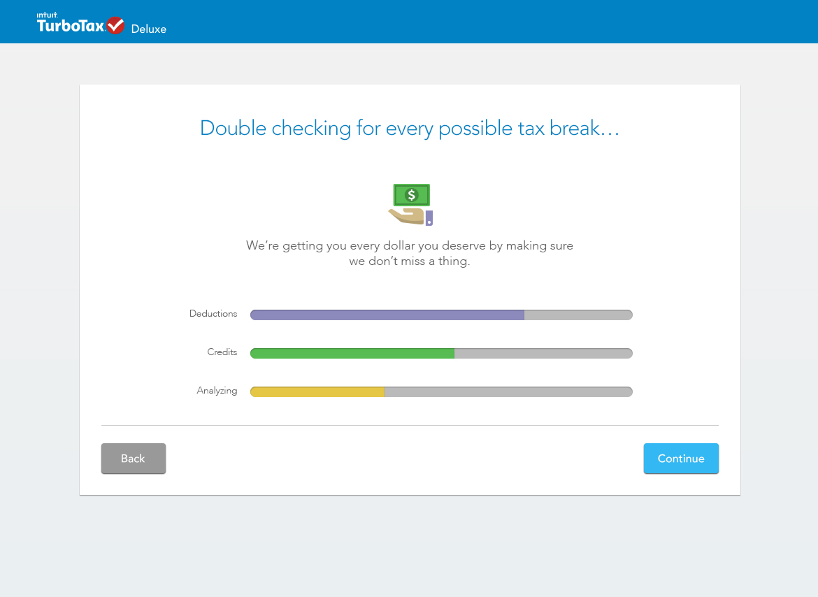
Our newly redesigned TurboTax online experience balances removing friction with slowing the experience down. TurboTax now responds to your specific answers by personalizing the experience. For example, if during set up a customer says they have kids, TurboTax automatically creates a Child Tax Credit in the tax break section. This removes redundancy and the expectation that a customer has to remember when and where to repeat critical info. This removal of friction is appreciated, but Turbo Tax also understands that sometime seeing time pass can also be valuable. For example, when TurboTax double checks for additional tax breaks, the animation calls out the passing of time. The “slowness” of this experience is what increases people’s confidence that all elements are being checked thoroughly. In this case, speed isn’t the answer.
2. Embrace the moments that are hard: It’s our primary goal to eliminate pain points for our customers, but there are some things about doing your taxes, running a business, and managing your finances that are going to be hard, no matter what. While it’s natural to want to downplay moments of tension and conflict, they are actually excellent opportunities to deepen connection by surpassing expectations.
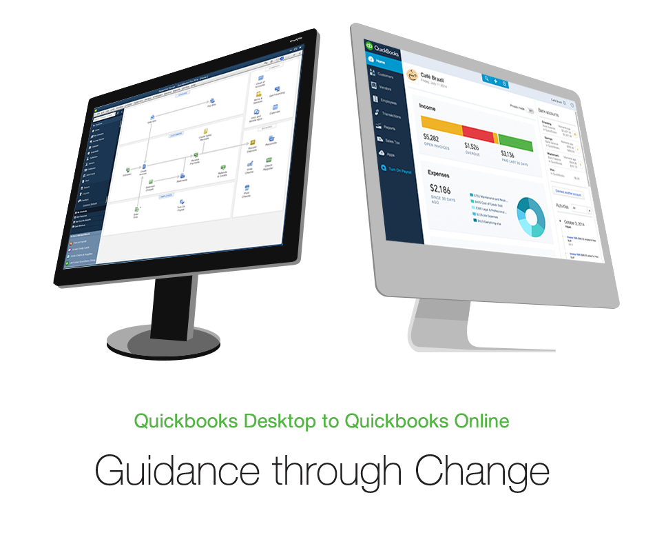
We see change, difficulty, and conflict as the main elements of hard moments. Change is never easy, but it’s especially hard when it’s unexpected. This is the case for our QuickBooks Desktop customers who move to QuickBooks Online. Often they are expecting the same desktop product, just online and land in something that feels unfamiliar. That change can make running their business feel more difficult and create unwanted conflict. To address this, our first area of focus is to get our existing customers up and working as fast as possible in QuickBooks Online. It starts with the first moment they land in QuickBooks Online. We’re candid and acknowledge that QuickBooks Online looks different, but beyond that we see this as opportunity to deepen connection. We can show them that though they may feel like they don’t know us anymore, we still know them. By pre-populating their most common tasks from desktop and providing guided walk-throughs on how to complete those tasks in QuickBooks Online, we’re making their business needs our first priority.
3. Create new moments of rapport: The previous two principles focus on moments that already exist. This one is about remembering to pause and create new moments. Taking the time to build rapport when it may seem unnecessary is like putting trust in a bank account so that when things get inevitably difficult or sticky, we aren’t drawing on a deficit.
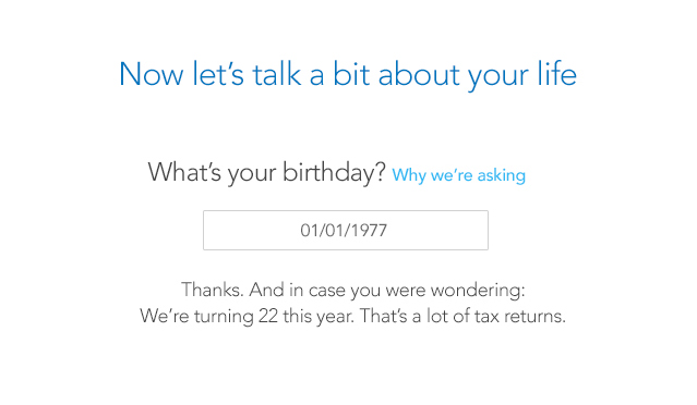
Rapport is especially valuable when asking customers to trust us to guide them through their taxes. TurboTax has been prioritizing voice and tone throughout the experience as a way to build a bridge with our customers. In the newly launched set up experience, TurboTax speaks back. As a customer types in their birthday, TurboTax says, “We’re turning 22 this year.” When they enter their zip code, Turbo tax recognizes their location and says “We’re from San Diego, by the way.”
It may seem small, but the simple act of speaking to our customers like humans, reminds them that there are people just like them on the other side of the software. Letting software facilitate a conversation makes it feel less faceless and cold, it takes a simple transaction and makes it an opportunity to build a relationship. That alone can feel Magical and Meaningful.
The challenge with rapport is that it needs to be balanced with credibility. Rapport deepens trust but only when it appears are the right time. We need to be very conscious of what mode our customer is in so we can meet them where they are. Casual banter may feel nice during set up but inappropriate when calculating deductions. When a customer’s anxiety rises, so should our expertise and our humanity.
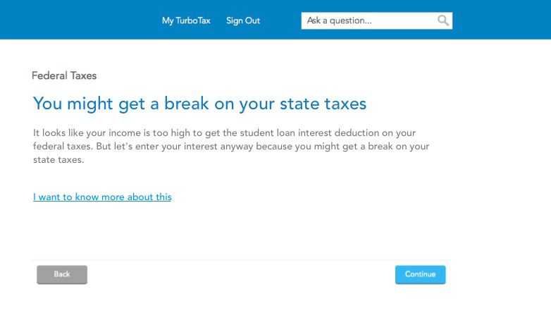
For example, rather than just stating a customer isn’t eligible for a student loan refund, TurboTax explains why and offers a different way to discover a refund. The content conveys expertise, but the tone is human.
As designers, we all aim to see the world from our customer’s perspective, but how do we go from empathizing with them to truly embracing their worldview? When a child gets separated from their parents at Disney Land and they ask for help, cast members respond by saying “We’re so sorry to hear you’re parents are lost, but don’t worry, parents get lost here all the time.” That to me embodies really orienting an experience around your customer’s point of view.
More than a Feeling
Most of all, our exploration into emotion is highlighting the need for each of us to tap into our own emotions: to feel vulnerable; to feel uncomfortable at times; and above all, to bravely protect the soul of our design solutions to ensure they land in our customers hands. Nothing truly worth doing is ever easy, so when designing for emotion feels hard, it usually means you’re on to something.
Special thanks to Husam Machlovi for his help creating the mobile gif in this article.
- Analytics and Tracking, Business Value and ROI, Consumer products, Content and Copy, Content Strategy, Customer Experience, Design, Design Tools and Software, Emotion, Flow and Immersion, Information Design and Architecture, Interface and Navigation Design, Internal Company Dynamics, Personal and Professional Development, Product design, Product Releases and Redesigns, Project Management, Psychology and Human Behavior, Research Methods and Techniques, Strategy, User Reported Feedback
Amanda O'Grady
Amanda O’Grady is a design strategist at Intuit where she brings emotion into the design and development process to deliver product experiences that feel magical and meaningful.
As a leader of strategic innovation programs for Intuit’s Design, Innovation and Growth team, her job is to make messy problems simple. By embedding with product teams she ensures each program goes beyond a clear story and makes a tangible impact on the product.
Amanda splits her time between San Francisco, CA and Sun Valley, ID. She is happiest growing food in her garden, cooking and exploring the world with her husband and daughters. Follow her on Twitter: @amandamogrady.


