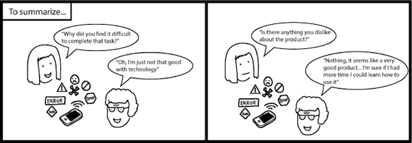
Administering many sessions of usability testing has shown us that people either attribute their failures to forces outside of their control (e.g. “The website doesn’t work and needs to be fixed) or to things they have influence over (e.g. “I’m not that good with computers but I could probably learn how to use it”).
A person’s perceived influence over outcomes is known, in psychobabble, as their ‘locus of control’ and it has a profound effect on usability testing results.
Qualitative data and verbatims from individuals with an internal locus of control often reflect a positive user experience, even when they have made several errors performing tasks. Similar to the respondent in the scenario depicted in the cartoon below, these individuals attribute their errors to their own actions, rather than failures of the product being tested.
Although qualitative research is the most popular form of usability testing, it leaves open the risk of an incomplete measure of usability. Working at Objective Digital we’ve learned to leverage the benefits of quantitative research and eye tracking to ensure we capture the complete user’s experience.
Quantitative research is all about measuring relationships between variables and relies primarily on numbers as the main unit of analysis. In our experience, quantitative data provides a better understanding of the usability of a product because it allows you to measure the effectiveness (Can users successfully achieve their objectives?) and efficiency (How much effort and resource is expended in achieving those objectives?) of your product—key constructs in the ISO’s definition of usability.
Quantitative metrics and eye tracking help us to better measure a consumer’s experience, as the verbal response given to the question “Do you like this product?” may not always be the true answer due to cognitive biases. Describing the user experience with numbers allows you to compare your product against your competitor’s and/or benchmark it against earlier versions. It allows you to set measurable goals and clear performance objectives, and then monitor your product’s performance over time. Essentially, quantifying the user’s experience is the first step toward a higher performing product.
Here is a sample of statistically valid and reliable metrics we incorporate into our usability testing sessions to provide our client with a quantitative understanding of their product from their users’ perspective.
Task-Based Metrics
The following metrics are implemented after each task to quantify effectiveness and efficiency. These measurements are sensitive to usability problems allowing you to pinpoint the errors.
- Task Time: The average time users take to complete a task is the best way to measure a product’s efficiency. A long task time is usually an indication your users may be having problems interacting with the interface. However, it’s often difficult to determine if a task has taken too long to complete if the ‘right’ time hasn’t been defined. Use benchmarks, previous versions, or some reasonable criteria to bring meaning to average times. Take care in analysis as task time data can be positively skewed because of large individual differences among users. Nonetheless, demonstrating a reduction in user task times is a powerful way to show improvements in productivity, and more so, return on investment.
- Completion Rate: The effectiveness of your product can be partly judged by a user’s ability to complete core tasks. A binary measure of pass or fail (1 or 0) provides a simple metric of success. Consequently, a task needs a clearly defined end goal to assess whether the user has completed it. Completion rates are extremely beneficial in environments where the consequences of failure are higher. Knowing that only 40% of your users were able to purchase a product on your website is a clear indication that the remaining 60% translates to the amount of sales lost.
- Error Rate: Effectiveness is also determined by measuring the amount of errors users make on a set of tasks. Errors provide insight into the “why” behind the longer task times, failed tasks, and lower satisfaction ratings. A missing field-hint or auto correct can be a simple mistake in the interface, but difficulty finding a product in the navigation can be seen as a user interface problem. Alternatively, a simple slip in a task (e.g., a typo) can be an unintended action and shouldn’t be mistaken for an error. In all, error-free completion of tasks is important in both business and consumer applications.
End-of-Session Metrics
The following metrics were designed by experts in the field and can be employed at the end of a testing session. These measurements provide more stable estimates of users’ overall impressions of your product’s usability.
- Net Promoter Score (NPS; Reichheld, 2003): The NPS is defined as the ultimate customer-relationship metric. By asking one simple question (How likely are you to recommend this product to a friend or colleague?) you can get a clear measure of your product’s performance through your customers’ eyes. Based on responses, users are categorized either as Promoter (loyal enthusiasts who keep engaging with a product and refering others), Passive (satisfied but unenthusiastic customers who are vulnerable to competitive offerings), or Detractor (unhappy customers who can impede growth). The NPS has been critiqued as an attitudinal measure of intention to recommend, rather than actual behavior, which can also be influenced by environmental factors such as company perceptions. Despite this, companies with an NPS score of twice the industry average (such as Amazon and Apple) have been shown to grow more rapidly than their competitors.
- System Usability Scale (SUS; Brooke, 1996): Known as the “quick and dirty” usability scale, the SUS provides a global view of subjective assessment and sub scales of usability and learnability. The 10-item questionnaire produces a single score that allows you to carry out comparisons of usability between products, no matter how dissimilar they are. The simplicity of the SUS is both a benefit and a drawback. Results won’t shed much light on why users are responding the way they are and doesn’t assist with diagnosing usability problems. However, its versatility, brevity, and wide-usage has meant it has become a valuable evaluation tool.
- Likelihood to Recommend (LTR; Lewis & Sauro, 2009): Another way to quantify the user experience is to predict your users’ likelihood to recommend a product from their SUS score. Substituting a user’s SUS score into the following equation, LTR = 1.33 + 0.08(SUS), provides an indication of the users likelihood to promote or discredit your product. SUS scores above 80 will usually place a user in the Promoter range.
Eye Tracking
Eye tracking is a neuromarketing tool, which provides insights into how people view and interpret visual stimuli. Eye tracking allows us to explore unconscious reactions during a usability testing experience. It can reveal what attracts consumers’ attention without relying on human recall. In isolation, eye tracking provides minimal insight into why people behavior the way they do. Conducting in-depth interviews (qualitative research) while playing back eye-tracking results can reveal this aspect of a user’s experience, a practice known as Retrospective Think Aloud. As such, eye tracking provides a compliment to conventional research methods.
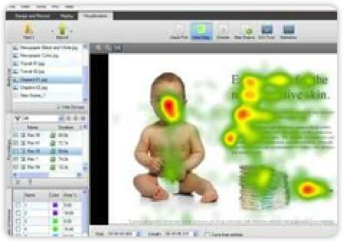
A visual representation of where people looked on the advertisement. The red areas indicate the areas of most attention.
Eye tracking also provides hard metrics on:
- Eye gaze, using heat maps (i.e. what was, and was not, looked at?) and gaze plots (i.e. what was the gaze sequence and viewing pattern?)
- Time to first fixation (i.e. how quickly a customer could find certain visual aspects?)
- Time spent in each section (i.e. which “areas of interest” had the most visual appeal or conversely areas that were responded to with surprise or frustration?)
- Percentage who engaged with certain areas of interest (e.g. did they look at the call to action?)
- Individual or aggregated data (e.g. how did individuals behave versus the overall group?)
Conclusion
Together, quantitative data and eye tracking can compliment each other in explaining the users’ experience, more than qualitative data. Having moderated usability tests like the scenario illustrated earlier, we’ve experienced first-hand that each participant’s quantitative and eye-tracking data paint a very different picture than their qualitative responses.
After hearing a user attribute her errors to her own actions, we had a closer look at the quantitative data. During one task, the participant depicted in the earlier illustration spent a significant amount of time scrolling down the page (task time) to use the footer as a navigational tool. She then proceeded make several errors (error rate) while attempting to find her destination (completion rate). To strengthen our interpretation of the findings, we considered what the user looked at. Her eye tracking data indicated she missed the small menu icon in the top left corner because the flashing imagery in the center was diverting her attention.
Incorporating quantitative measures and eye tracking into your next usability test can provide the foundation for a more mature approach to measuring usability. Numbers are powerful and offer a simple way to communicate usability findings and speak a language that executive stakeholders understand.
Image of eye courtesy Shutterstock