Save
Applications that recognize speech are more dependent upon good user interface design because there is much more room for ambiguity in spoken language than in other input types. This makes the clarity of context and capturing intent very important.
Speech applications also present a very linear experience where users cannot easily backtrack or change their mind after making a choice. While there’s art involved in any design, it’s a methodical process that leads to a well-constructed dialog and the kind of grammars—structured lists of the words and phrases that can be recognized at any given time—that achieve the best possible results.
Here are nine steps will help ensure a high quality user experience.
Step 1: Determine Goals and Requirements for the System
Like all good user interface design, speech application design begins with a clear understanding of the app’s goals, requirements, and use cases. It’s important to remember that user experience design is in service of the user, so it’s vital to fully understand what users want and need. Best practice suggests designing speech interfaces with a discovery process that seeks to answer the following fundamental questions:
- Who are the various types of users that will use the application? Are they all young, mobile, repeat users who are knowledgeable about the subject matter or do they exhibit differing levels of experience with new technology?
- Why are users interacting with the system in the first place? What are the business goals or functional tasks they seek to accomplish?
- What functionality must the app provide in order for the user to accomplish the intended goal? Are some functions critical and some optional? Will the optional ones help or confuse the user?
Step 2: Choose Between Natural Language and Directed Dialog
Discovery requires interviewing key clients, users, and stakeholders to answer these questions. One of the first things a discovery interview will reveal is whether the application will need to make use of “natural language” or “directed dialog.” A natural language application, like Apple’s Siri, allows users to speak naturally while a directed dialog prompts them to use specific phrases, similar to your bank’s automated phone system.
While natural language applications can create a more human-like user interface, directed dialog applications are considerably easier to design and, in most cases, serve the user’s needs just as well or better. If the application has a limited scope centered on discrete tasks, then directed dialog is almost always a better choice.
Step 3: Choose the Application Persona
The discovery process is also a good time to begin exploring any personality or branding: requirements for the application. During the late ‘90s and early ‘00s, it was trendy to build speech applications that made use of very specific voice personas to match a brand, though this has largely fallen out of fashion. Most application designers have focused on simple professionalism over the last several years.
An important consideration for selecting a persona is how and where the application will be used. The system may need to use less formal language if its users are ordering pizza than if they are reserving a tee time at a golf course, due simply to cultural differences. Since the language for prompting the user will affect how that person responds, it is a good idea to keep any cultural distinctions in mind.
Step 4: Map the Voice User Interface Structure
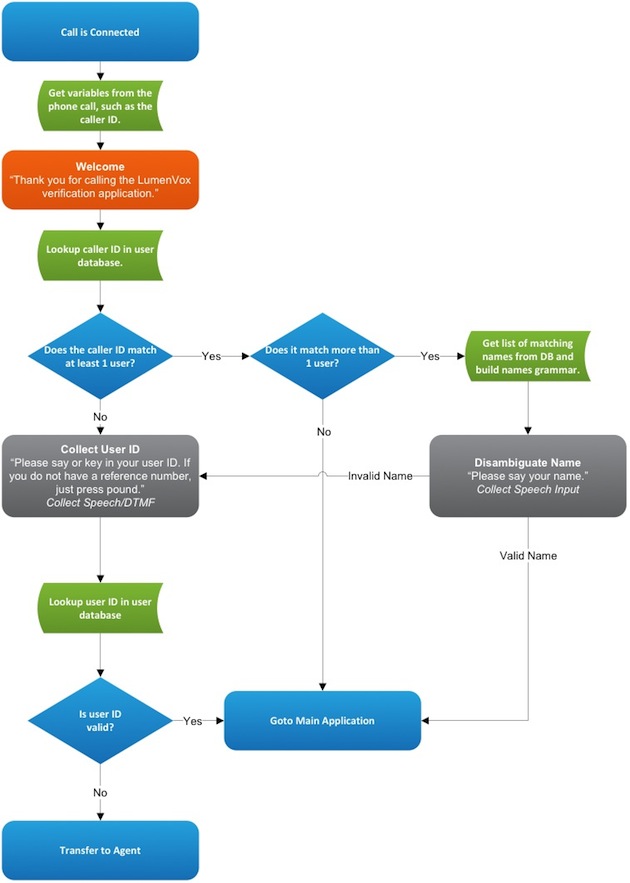
Once you’ve answered these basic questions about design and approach, it’ i’s appropriate to start building rough skeletons mapping how the user will interact with the system. One advantage of designing voice user interfaces over graphical interfaces is that VUIs can be modeled very well in flow charts, so this is the preferred approach for initial design.
Figure 1: A basic user verification system. The application makes use of external data (such as the caller ID of the person calling the system), plays out prompts, and collects both speech and DTMF key presses from the user’s phone and acts accordingly.
Using a flow chart similar to the one above, a designer can represent each dialog state in the application as a different box with arrows leading to other dialog states based on what the user says. Speech applications—especially directed dialog applications—also tend to be very task-oriented with relatively linear user paths through the application. Thus, flowcharts are a very good planning tool.
Step 5: Finalize the VUI Design
At this point in the discovery process, a developer should have:
- Clear sets of requirements, goals, and use cases/user stories.
- A decision on whether or not the application will support natural language.
- Guidelines about the application’s branding and personality requirements.
- Skeletal flow charts indicating the basic paths through the application.
The application framework can be completed by adding and refining details—collating the work that has been done into a draft design document that can be circulated to the project’s stakeholders. Begin incorporating their feedback and finalizing your call flows. It’s also important to identify exactly what the user can do at each dialog state before moving on to the next one.
Step 6: Incorporate Error Handling
At this point in the process, it’s appropriate to address error handling in order to maximize user satisfaction. Some users will not be understood correctly because of accents, background noises, or unexpected phrases. What will the application do in these cases? Will it keep track of the number of errors and transfer to an operator if the counter reaches a certain threshold? Will it begin confirming (“Did you say _____?”) more frequently? Will it begin playing more verbose help messages?
Step 7: Design Grammars
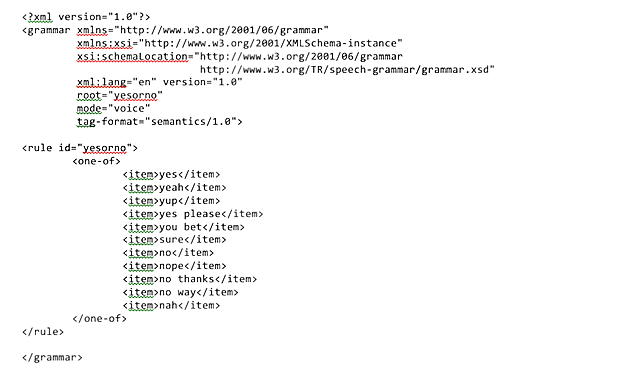
If you are designing a directed dialog application, you will now begin designing grammars. As mentioned above, a grammar is a structured list of all the words and phrases that a user is expected to say at any given time. Grammars may often require collaboration between a designer and a programmer or speech expert because they must be written in a very structured format—akin to programming but with the nuance and understanding of human behaviors. A number of tools and interactive development environments exist that seek to help automate grammar generation, but they are still frequently written “by hand.” There are some basic grammar tutorials online, but writing good grammars is a somewhat specialized task.
Figure 2: A simple grammar file allowing the user to say “yes” or “no” and various synonyms. A grammar is an XML file that contains information about what kinds of things a user can say at any point.
From a designer’s perspective, a grammar corresponds to a dialog state. If the dialog state is something like “Checking account menu,” then the grammar will allow input such as “Get balance” or “Transfer funds.” A good grammar encompasses everything users are likely to say and nothing extra because the larger a grammar is, the less accurate the speech recognition will be. For more information, see our whitepaper on the subject: “Grammars: The Heart of Your Speech Recognition Application.”
Step 8: Refine Prompt Language
The last major design task is to finalize the prompt language that will be spoken to users. There is a subtle but important relationship between what prompts say and the words spoken when a user responds. Users are likely to mimic words or phrases used in the prompt. Thus, a good speech application will use prompts that closely match a user’s options in any dialog.
Prompts often have goals that are at odds with each other. A prompt should be long enough to tell users exactly what they can do in each dialog state, but short enough that they don’t waste a user’s time. They must be verbose enough that users aren’t lost, but they must not overload the user with too much information or too many options. A common design strategy to help with this is to use prompt tapering.
A tapered prompt is short the first time a user hears it, but becomes an expanded and more descriptive prompt if the user is having trouble. As an example, the application may ask “Did you want to speak with John Doe?” If the user gives a response the system doesn’t understand, it can re-prompt and provide more clear direction: “I didn’t understand you. Please say yes if you want to speak with John Doe, otherwise say no.”
Step 9: Tune the Speech
Prompt language is generally the last piece of design work. There is, however, one more stage of the development process that is unique to speech application development, and with which the UX designer should be heavily involved. This stage is called speech tuning, and it is an iterative process in which changes are made to the prompts, grammars, and menu choices based on closely monitoring the experiences of live users.
Tuning is a very complicated topic that is outside the scope of this article, but it is important to keep in mind that users will surprise you. This is true when designing any kind of interface, but it is especially true when using speech recognition simply because there are so many different ways to say similar things. As users interact with the speech application, detailed logs should be kept to allow tuners to understand exactly where users are having problems. The majority of tuning involves adjusting prompt language to elicit more predictable responses from users, and adding or removing grammar entries to change what users can say based on how users are speaking to the application.
The Same Process Serves Big and Small Alike
Whether you are building a complex application for a large company or a very basic one with more modest goals, the steps are the same for developing quality speech recognition interfaces. The objective is not just achieving a superior level of recognition accuracy, but also ensuring that the UI has the richness to handle errors and language variability and, ultimately, to produce a high completion rate with minimal user frustration. A rigorous UI development process ensures that customers will enjoy using the new speech recognition application right at the outset.
- Agile and Iterative Process, Apple, Apple iOS, Data visualization, Design, Development, Human factors, Information Design and Architecture, Interface and Navigation Design, Marketing and Brand, New and Emerging Technologies, Personas, Product design, Psychology and Human Behavior, Research Methods and Techniques, Voice & Natural Language
Stephen Keller
A Solutions Architect at LumenVox, a leading provider of speech recognition and text-to-speech software, Stephen specializes in the design and development of complex voice user interfaces (VUIs) as part of their client services team, working to improve the user experience for anyone interfacing with speech technologies.
He has worked on dozens of speech applications, ranging from simple yes/no-style interactions to complex, multi-slot natural language interfaces. His role at LumenVox encompasses a variety of functions, including pure design/consultation work and also development and training.


